Button toolbar item
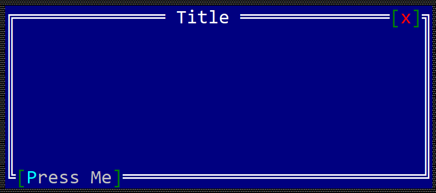
A toolbar button is a item that can be positioned on the top or bottom part of a windows (like in the following image).
To create a button within a toolbar use the toolbar::Button::new(...) method:
#![allow(unused)]
fn main() {
let toolbar_button = toolbar::Button::new("content");
}
or the toolbaritem! macro:
#![allow(unused)]
fn main() {
let toolbar_button_1 = toolbaritem!("content,type=button");
let toolbal_button_2 = toolbaritem!("content='Start',type:button");
let toolbal_button_3 = toolbaritem!("content='&Stop',type:button,tooltip:'a tooltip'");
let toolbal_button_4 = toolbaritem!("content='hidden button',type:button,visible:false");
}
Using the character & as part of the button caption will associate the next character (if it is a letter or number) as a hot-key for the button. For example, the following caption St&art will set Alt+A as a hot-key for the button.
The following parameters are supported for a toolbar button:
| Parameter name | Type | Positional parameter | Purpose |
|---|---|---|---|
text or caption | String | Yes (first positional parameter) | The caption (text) written on the button |
type | String | No | For a button use: type:Button |
tooltip | String | No | The tooltip associated with the button |
visible | Bool | No | true if the toolbar item is visible (this is also the default setting) or false otherwise |
Besides the default methods that every toolbar item has (as described here), the following methods are available for a toolbar label:
| Method | Purpose |
|---|---|
set_caption(...) | Set the new caption for a button. The width (in characters) of the button is the considered to be the number of characters in its content |
caption() | Returns the current caption of a button. |
Events
To intercept button clicks, implement ToolBarEvents for the current window, as presented in the following example:
#![allow(unused)]
fn main() {
#[Window(events=ToolBarEvents)]
struct MyWin { /* data members */ }

impl ToolBarEvents for MyWin {
    fn on_button_clicked(&mut self, handle: Handle<toolbar::Button>) -> EventProcessStatus {
        // process click events from a toolbar button
    }
}
}
Example
The following example creates two buttons on the bottom right part of a window toolbar that can be used to increase the value of a number.
#[Window(events = ToolBarEvents)]
struct MyWin {
    increase_button: Handle<toolbar::Button>,
    decrease_button: Handle<toolbar::Button>,
    text: Handle<Label>,
    number: u32,
}

impl MyWin {
    fn new() -> Self {
        let mut win = MyWin {
            base: window!("'My Win',a:c,w:40,h:6"),
            increase_button: Handle::None,
            decrease_button: Handle::None,
            text: Handle::None,
            number: 10,
        };
        // create a group
        let g = win.toolbar().create_group(toolbar::GroupPosition::BottomRight);
        // add buttons
        win.increase_button = win.toolbar().add(g, toolbar::Button::new("+"));
        win.decrease_button = win.toolbar().add(g, toolbar::Button::new("-"));
        // add a label
        win.text = win.add(label!("10,a:c,w:2,h:1"));
        win
    }
}
impl ToolBarEvents for MyWin {
    fn on_button_clicked(&mut self, handle: Handle<toolbar::Button>) -> EventProcessStatus {
        match () {
            _ if handle == self.increase_button => self.number += 1,
            _ if handle == self.decrease_button => self.number -= 1,
            _ => {}
        }
        let h = self.text;
        let n = self.number;
        if let Some(label) = self.control_mut(h) {
            label.set_caption(format!("{}", n).as_str());
        }
        EventProcessStatus::Processed
    }
}

fn main() -> Result<(), appcui::system::Error> {
    let mut a = App::new().build()?;
    a.add_window(MyWin::new());
    a.run();
    Ok(())
}