Getting started
In this chapter we will introduce the AppCUI framework and write your
first (very simple) application in Rust.
What is AppCUI
AppCUI is a cross-platform TUI (Text User Interface / Terminal User Interface) / CUI (Console User Interface) framework designed to allow quick creation of TUI/CUI-based applications.
AppCUI includes many out-of-the-box controls (such as buttons, checkboxes, radioboxes, windows, tab controls, lists, comboboxes, etc.), and provides macros to help you create custom controls quickly.
The core of AppCUI is written completely in Rust and is designed to be fast and efficient. It is based on a handle-based system, where each control is represented by a handle. This allows for easy manipulation of controls and their properties.
Installation
To install AppCUI, add it to your Cargo.toml as follows:
[dependencies]
appcui = <version>
Then you can use the following import in your code:
use appcui::prelude::*;
First Application
Let's start by building a simple window that prints Hello World
on the screen.
First, make sure that you have the following dependency added to your
project's Cargo.toml file:
[dependencies]
appcui = <version>
Then, replace your main.rs with the following snippet:
use appcui::prelude::*;

fn main() -> Result<(), appcui::system::Error> {
    let mut app = App::new().build()?;
    let mut win = Window::new(
        "First Window",
        LayoutBuilder::new().alignment(Alignment::Center).width(30).height(9).build(),
        window::Flags::Sizeable,
    );
    win.add(Label::new(
        "Hello World !",
        LayoutBuilder::new().alignment(Alignment::Center).width(13).height(1).build(),
    ));
    app.add_window(win);
    app.run();
    Ok(())
}
Or use macros to make the code more compact:
use appcui::prelude::*;

fn main() -> Result<(), appcui::system::Error> {
    let mut app = App::new().build()?;
    let mut win = window!("'First Window',a:c,w:30,h:9");
    win.add(label!("'Hello World !',a:c,w:13,h:1"));
    app.add_window(win);
    app.run();
    Ok(())
}
After compiling and executing this code you should see something like this:
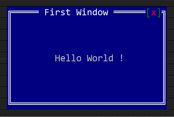
Note: Depending on your terminal and other settings, the result may look different from the screenshot.
Basic Concepts
In this chapter we will discuss the basic concepts of AppCUI:
- Application
- Terminals
- Screen area and sizes
- Surface
- Input
Application
An application in AppCUI is the context that holds all of the framework data together (it keeps all controls, passes messages between controls, manages terminals and system events). There can be only one application per program that uses AppCUI (this is enforced by the framework: subsequent attempts to create an application will fail).
To create an application, three APIs can be used:
-
App::new(). This will create an application and choose the best-fit terminal available on the current operating system. The result of thenew()method is aBuilderobject that can further be used to configure how the terminal looks. -
App::with_backend(backend_type). This will create aBuilderobject, but you will choose the backend to be used instead of having one chosen for you automatically. You can read more about backend availability and types in the Backends section. -
App::debug(width, height, script). This is designed to help you with unit testing (see more on this way of initializingAppCUIin the Debug scenarios section).
Example (using the default backend):
let mut a = App::new().build().expect("Failed to create an AppCUI application");
Example (using the windows console backend):
let mut a = App::with_backend(appcui::backend::WindowsConsole)
                 .build()
                 .expect("Failed to create an AppCUI application with WindowsConsole backend");
Builder
Using App::new or App::with_backend creates a builder object that can further be used to set up how the application will be constructed. For example, you can change the terminal size, colors, font, etc. using this object. Keep in mind that not all settings apply to each terminal, and using the wrong configuration might lead to an initialization error. Currently, the Builder supports the following methods:
.size(terminal_size)to set up a terminal size.title(terminal_title)to set up a terminal title.desktop(custom_desktop)if you want to use a custom desktop instead of the default one.single_window()if you want a single window application.app_bar()to enable the application top app bar.command_bar()to enable the application command bar.theme(custom_theme)to set up a custom theme or another predefined theme. Read more on themes in the Themes section..timers_count(count)to set up the number of timers that can be used in the application (if not specified the default value is 4).log_file(path,append)to set up a log file where logs will be displayed. This option will only be valid in debug mode. Once the file was specified, any call to log! macro will be recorded in that file..color_schema(enabled)if set this flag will try to use the terminal color schema, otherwise it will use AppCUI predefined values (e.g. forColor::DarkBluewill useRGB(0,0,128)). This flag is enabled by default..restore_screen(enabled)if set the backend will attempt to restore the original screen status (content, cursor position, etc.) as it was before the application started. This option is enabled by default. Keep in mind that not all backends have this kind of support.
After setting up the configuration for an application, just call the build() method to create an application. This method returns a result of type Result<App,Error> from where the appcui application can be obtained via several methods such as:
unwrap()orexpect(...)methods?operatorif letconstruct
A typical example of using these settings is as follows:
let mut a = App::new().size(Size::new(80,40))       // size should be 80x40 chars
                      .app_bar()                    // top application bar should be enabled
                      .command_bar()                // command bar should be enabled
                      .log_file("debug.log", false) // log into debug.log
                      .color_schema(false)          // use AppCUI predefined colors
                      .restore_screen(true)         // restore original screen when finished
                      .build()
                      .expect("Failed to create an AppCUI application");
Errors
If the .build() method from the Builder object fails, an error is returned. You can use the .kind member to identify the type of error. Currently, the following error classes are provided:
ErrorKind::InitializationFailure— a failure occurred when initializing the backend API (this is usually due to some OS constraints).ErrorKind::InvalidFeature— an invalid feature (configuration option) that is not compatible with the current terminal was used. For example, an attempt to set up DirectX for the NCurses backend will be invalid.ErrorKind::InvalidParameter— a valid feature but with invalid parameters was used. For example, an attempt to instantiate a terminal with the size of (0x0) will trigger such an error.
To get a more detailed description of the error, use the description() method from the Error class, as in the following code snippet:
let result = App::new().size(Size::new(0,0)).build();
if let Err(error) = result {
    // we have an Error - let's print it
    println!("Fail to instantiate AppCUI");
    println!("Error: {}",error.description());
}
Execution flow
Usually, each AppCUI program consists of the following steps:
- Create an application.
- Add one or more windows to that application (use the
add_windowmethod on structApp). - Run the application via the
runmethod. This method consumes the object, so you cannot use the application anymore after this method ends.
A typical main.rs file that uses AppCUI framework looks like this:
use appcui::prelude::*;

fn main() -> Result<(), appcui::system::Error> {
    // 1. build an application
    let mut app = App::new().build()?;
    // 2. add one or several windows
    app.add_window(/* a window */);
    // 3. run the application
    app.run();
    Ok(())
}
Debug scenarios
When using AppCUI and needing to test the interface, it is recommended to write unit tests using the App::debug(...) method. This method allows one to write a succession of system events (mouse clicks, keys being pressed, etc.) and validate whether the output is the expected one. This succession of commands is considered an event script, formed from multiple commands, each command written on a line. A command can have parameters. You can also use // to comment out a command.
General format for a script
Command-1(param1,param2,param3)
Command-2()
// comment
Remarks:
App::debug(...)will panic if the script is incorrect (a command is not valid, the number of parameters is incorrect, etc.).AppCUIallows only one instance at a time (this is done via a mutex object). If you have multiple unit tests and you try to run them with thecargo testcommand, you might get an error as cargo might try to use multiple threads to do this, and it is likely that one thread might try to start anAppCUIapplication while another one is already running on another thread. The solution in this case is to run the tests using a single thread:
cargo test -- --test-threads=1
Mouse related commands
Mouse related commands are a set of commands that simulate various mouse events
| Command | Purpose |
|---|---|
Mouse.Hold(x,y,button) | simulates an event where the mouse button is being pressed while the mouse is located at a specific position on screen. The parameters x and y are a screen position, while the parameter button is one of left, right or center |
Mouse.Release(x,y,button) | simulates the release of the mouse buttons while the mouse is located at a specific screen position. The parameters x and y are a screen position, while the parameter button is one of left, right or center |
Mouse.Click(x,y,button) | simulates a click (hold and release). It is equivalent to - Mouse.Hold(x,y,button) - Mouse.Release(x,y) |
Mouse.DoubleClick(x,y,button) | simulates a double-click (for a specific button) |
Mouse.Move(x,y) | simulates the movement of the mouse to coordinates (x,y). No mouse buttons are being pressed. |
Mouse.Drag(x1,y1,x2,y2) | simulates the movement of a mouse from (x1,y1) to (x2,y2) while the left button is being pressed |
Mouse.Wheel(x,y,direction,times) | simulates the mouse wheel being rotated in a direction (one of up, down, left, right) a number of times. The times parameter must be greater than 0. |
Keyboard related commands
| Command | Purpose |
|---|---|
Key.Pressed(key,times) | where the key parameter can be a key name or any combination of a control key and a regular key, such as- Z (for pressing the Z key)- Enter (for pressing the Enter key)- Alt+T (Alt + T combination)- Ctrl+Alt+F1 (Ctrl+Alt+F1 keys). The times parameter can be omitted. If present, it has to be greater than 1 |
Key.TypeText(text) | where the text parameter is text that is being typed.Example: Key.TypeText('Hello world') will trigger the following keys to be pressed: H, e, l, l, o, Space, w, o, r, l, and d. |
Key.Modifier(modifier) | Simulates pressing a modifier key (such as Shift, Ctrl, or Alt). The modifier parameter can be a combination of Alt, Ctrl, and Shift separated by +, or None if no modifier is changed. For example: Key.Modifier(Alt+Ctrl) will simulate pressing the Alt and Ctrl keys at the same time. |
Usually the key parameter can have several forms:
keymodifier-1+keymodifier-1+modifier-2+keymodifier-1+modifier-2+modifier-3+key
where the list of all keys supported by this command is:
- F-commands (
F1toF12) - Letters (
AtoZ) - with upper case - Numbers (
0to9) - Arrows (
Up,Down,Left,Right) - Navigation keys (
PageUp,PageDown,Home,End) - Deletion and Insertions (
Delete,Backspace,Insert) - White-spaces (
Space,Tab) - Other (
Enter,Escape)
and the list of modifiers consists of Shift, Ctrl, and Alt.
Paint related commands
| Command | Purpose |
|---|---|
Paint(state_name)or Paint() | paints the current virtual screen to the current screen using ANSI codes and colors. This command also computes a hash over the current virtual screen and prints it. The state_name is a name that can be used to reflect the current execution state. This is useful if multiple Paint commands are being used and you need to differentiate between them. |
Paint.Enable(value) | enables or disables painting. value is a boolean value (true or false). If set to false all subsequent calls to command Paint will be ignored. By default, all paints are enabled. |
System events
| Command | Purpose |
|---|---|
Resize(width,height) | simulates a resize of the virtual terminal to the size represented by width and height parameters |
Clipboard commands
| Command | Purpose |
|---|---|
Clipboard.SetText(text) | sets a new text into a simulated clipboard. That text will be available to all controls if they want to paste it |
Clipboard.Clear() | clears the text from the simulated clipboard. |
Validation commands
| Command | Purpose |
|---|---|
CheckHash(hash) | checks if the hash computed over the current virtual screen is as expected. If not, it will panic. This is useful for unit testing. |
CheckCursor(x,y) | checks if the cursor (caret) is at a specific position |
CheckCursor(hidden) | checks if the cursor (caret) is hidden (not visible). You can also check this by using false instead of hidden. |
CheckClipboardText(text) | checks whether the clipboard contains specific text. This method is used to validate whether the Copy/Cut to clipboard command from a control worked properly. |
Error.Disable(value) | enables or disables errors when testing the hashes or cursor position. value is a boolean value (true or false). By default, errors are NOT disabled. |
Example
Let's consider a scenario where we want to test if moving a window with a mouse works as expected. For this we will create a test function, with the following code:
#[test]
fn check_if_window_can_be_moved() {
    let script = "
        Paint('initial state')
        CheckHash(0xB1471A30B30F5C6C)
        Mouse.Drag(30,3,35,5)
        Paint('window was moved')
        CheckHash(0x419533D4BBEFE538)
    ";
    let mut a = App::debug(60, 10, script).build().unwrap();
    let w = Window::new("Title", layout!("a:c,w:20,h:5"), window::Flags::None);
    a.add_window(w);
    a.run();
}
Let's break the event script in pieces and see exactly what is supposed to happen:
Paint('initial state')- this will print the virtual screen. It should look like the following (but with colors):
    +================================================================+
    | Name  : initial state                                          |
    | Hash  : 0xB1471A30B30F5C6C                                     |
    | Cursor: Hidden                                                 |
    | ---------------------------------------------------------------|
    |             11111111112222222222333333333344444444445555555555 |
    |   012345678901234567890123456789012345678901234567890123456789 |
    | ---------------------------------------------------------------|
    | 0 ▒▒▒▒▒▒▒▒▒▒▒▒▒▒▒▒▒▒▒▒▒▒▒▒▒▒▒▒▒▒▒▒▒▒▒▒▒▒▒▒▒▒▒▒▒▒▒▒▒▒▒▒▒▒▒▒▒▒▒▒ |
    | 1 ▒▒▒▒▒▒▒▒▒▒▒▒▒▒▒▒▒▒▒▒▒▒▒▒▒▒▒▒▒▒▒▒▒▒▒▒▒▒▒▒▒▒▒▒▒▒▒▒▒▒▒▒▒▒▒▒▒▒▒▒ |
    | 2 ▒▒▒▒▒▒▒▒▒▒▒▒▒▒▒▒▒▒▒▒▒▒▒▒▒▒▒▒▒▒▒▒▒▒▒▒▒▒▒▒▒▒▒▒▒▒▒▒▒▒▒▒▒▒▒▒▒▒▒▒ |
    | 3 ▒▒▒▒▒▒▒▒▒▒▒▒▒▒▒▒▒▒▒▒╔════ Title ════[x]╗▒▒▒▒▒▒▒▒▒▒▒▒▒▒▒▒▒▒▒▒ |
    | 4 ▒▒▒▒▒▒▒▒▒▒▒▒▒▒▒▒▒▒▒▒║                  ║▒▒▒▒▒▒▒▒▒▒▒▒▒▒▒▒▒▒▒▒ |
    | 5 ▒▒▒▒▒▒▒▒▒▒▒▒▒▒▒▒▒▒▒▒║                  ║▒▒▒▒▒▒▒▒▒▒▒▒▒▒▒▒▒▒▒▒ |
    | 6 ▒▒▒▒▒▒▒▒▒▒▒▒▒▒▒▒▒▒▒▒║                  ║▒▒▒▒▒▒▒▒▒▒▒▒▒▒▒▒▒▒▒▒ |
    | 7 ▒▒▒▒▒▒▒▒▒▒▒▒▒▒▒▒▒▒▒▒╚══════════════════╝▒▒▒▒▒▒▒▒▒▒▒▒▒▒▒▒▒▒▒▒ |
    | 8 ▒▒▒▒▒▒▒▒▒▒▒▒▒▒▒▒▒▒▒▒▒▒▒▒▒▒▒▒▒▒▒▒▒▒▒▒▒▒▒▒▒▒▒▒▒▒▒▒▒▒▒▒▒▒▒▒▒▒▒▒ |
    | 9 ▒▒▒▒▒▒▒▒▒▒▒▒▒▒▒▒▒▒▒▒▒▒▒▒▒▒▒▒▒▒▒▒▒▒▒▒▒▒▒▒▒▒▒▒▒▒▒▒▒▒▒▒▒▒▒▒▒▒▒▒ |
    | ---------------------------------------------------------------|
We can inspect whether the position of the window is correct. We can also see the hash computed for the entire virtual screen: 0xB1471A30B30F5C6C (this can help us perform further checks).
-
CheckHash(0xB1471A30B30F5C6C)- this computes the hash for the entire virtual screen and then checks it against the expected one. The usual scenario here is that we first apply aPaintcommand, validate it, and then write theCheckHashcommand with the hash obtained from thePaintcommand. This way, if something changes in the logic or code of the program, the new hash will be different. If the hash for the virtual screen is not as expected, the application will panic. If used in a test, this behavior will fail the test. -
Mouse.Drag(30,3,35,5)this command does the following:- moves the mouse to the (30,3) coordinate (over the title of the window)
- click and hold the left mouse button
- moves the mouse to a new position (35,5) (since we hold the mouse button, we expect the window to move as well)
- releases the left mouse button
-
Paint('window was moved')now we should see something like the following. Notice that indeed, the window was moved to a new position. We also have a new hash for the virtual screen:0x419533D4BBEFE538
    +================================================================+
    | Name  : window was moved                                       |
    | Hash  : 0x419533D4BBEFE538                                     |
    | Cursor: Hidden                                                 |
    | -------------------------------------------------------------- |
    |             11111111112222222222333333333344444444445555555555 |
    |   012345678901234567890123456789012345678901234567890123456789 |
    | -------------------------------------------------------------- |
    | 0 ▒▒▒▒▒▒▒▒▒▒▒▒▒▒▒▒▒▒▒▒▒▒▒▒▒▒▒▒▒▒▒▒▒▒▒▒▒▒▒▒▒▒▒▒▒▒▒▒▒▒▒▒▒▒▒▒▒▒▒▒ |
    | 1 ▒▒▒▒▒▒▒▒▒▒▒▒▒▒▒▒▒▒▒▒▒▒▒▒▒▒▒▒▒▒▒▒▒▒▒▒▒▒▒▒▒▒▒▒▒▒▒▒▒▒▒▒▒▒▒▒▒▒▒▒ |
    | 2 ▒▒▒▒▒▒▒▒▒▒▒▒▒▒▒▒▒▒▒▒▒▒▒▒▒▒▒▒▒▒▒▒▒▒▒▒▒▒▒▒▒▒▒▒▒▒▒▒▒▒▒▒▒▒▒▒▒▒▒▒ |
    | 3 ▒▒▒▒▒▒▒▒▒▒▒▒▒▒▒▒▒▒▒▒▒▒▒▒▒▒▒▒▒▒▒▒▒▒▒▒▒▒▒▒▒▒▒▒▒▒▒▒▒▒▒▒▒▒▒▒▒▒▒▒ |
    | 4 ▒▒▒▒▒▒▒▒▒▒▒▒▒▒▒▒▒▒▒▒▒▒▒▒▒▒▒▒▒▒▒▒▒▒▒▒▒▒▒▒▒▒▒▒▒▒▒▒▒▒▒▒▒▒▒▒▒▒▒▒ |
    | 5 ▒▒▒▒▒▒▒▒▒▒▒▒▒▒▒▒▒▒▒▒▒▒▒▒▒╔════ Title ════[x]╗▒▒▒▒▒▒▒▒▒▒▒▒▒▒▒ |
    | 6 ▒▒▒▒▒▒▒▒▒▒▒▒▒▒▒▒▒▒▒▒▒▒▒▒▒║                  ║▒▒▒▒▒▒▒▒▒▒▒▒▒▒▒ |
    | 7 ▒▒▒▒▒▒▒▒▒▒▒▒▒▒▒▒▒▒▒▒▒▒▒▒▒║                  ║▒▒▒▒▒▒▒▒▒▒▒▒▒▒▒ |
    | 8 ▒▒▒▒▒▒▒▒▒▒▒▒▒▒▒▒▒▒▒▒▒▒▒▒▒║                  ║▒▒▒▒▒▒▒▒▒▒▒▒▒▒▒ |
    | 9 ▒▒▒▒▒▒▒▒▒▒▒▒▒▒▒▒▒▒▒▒▒▒▒▒▒╚══════════════════╝▒▒▒▒▒▒▒▒▒▒▒▒▒▒▒ |
    | -------------------------------------------------------------- |
CheckHash(0x419533D4BBEFE538)- finally we check the new hash to see if it matches the one we expect.
Remark: Using unit tests (while it works with the Paint command activated) might look strange on the actual screen (especially if all you need is to validate an example). As such, it is best that after an example such as the previous one has been validated, you add another command at the beginning of the script: Paint.Enable(false). This will not change the logic of the script; instead, it will not print anything on the screen. The final test function should then look like this:
use appcui::prelude::*;

#[test]
fn check_if_window_can_be_moved() {
    let script = "
        Paint.Enable(false)
        Paint('initial state')
        CheckHash(0xB1471A30B30F5C6C)
        Mouse.Drag(30,3,35,5)
        Paint('window was moved')
        CheckHash(0x419533D4BBEFE538)
    ";
    let mut a = App::debug(60, 10, script).build().unwrap();
    let w = Window::new("Title", layout!("a:c,w:20,h:5"), window::Flags::None);
    a.add_window(w);
    a.run();
}
and its execution should produce an output similar to the next one:
running 1 test
test check_if_window_can_be_moved ... ok
Recording Events
Writing complex debug or unit-test scenarios might be a tedious task. However, it can be automated with the record events feature from AppCUI.
The first step is to enable this feature in Cargo.toml: add the EVENT_RECORDER feature to your default features, as in the following snippet.
[features]
default = ["EVENT_RECORDER"]
DEBUG_SHOW_WINDOW_TITLE_BOUNDERIES = []
EVENT_RECORDER = []
Once you do this, any program that uses AppCUI will enable a special hotkey Ctrl+Alt+Space that will allow you to open a special configuration window similar to the one from the next image:
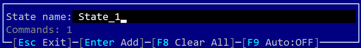
You can use this window to perform the following actions:
- Add a new state (by typing its name and pressing
Enter)—this will effectively add newPaintandCheckHashcommands. - Enable automated mode (via the shortcut
F9). Enabling auto-record mode will effectively detect whenever the screen changes because of an action performed and automatically addPaintandCheckHashcommands. It will also filter out all other raw events (related to keystrokes and the mouse). - Clear all events recorded up to this moment (via the hotkey
F8).
The typical way of using this feature is as follows:
- Enable the feature from
Cargo.toml. - Run your application.
- If you prefer to do this manually, perform actions that change the state of the application, then press
Ctrl+Alt+Spaceand, in the configuration menu, type the name of the new state and pressEnter. - If you prefer automated mode, press
Ctrl+Alt+Spaceand enable automatic mode via theF9shortcut. - Once you finish your scenario, exit the application. At that point a file named
events.txtwill be written next to your application. You can use its content as part of a unit test or for debugging.
Logging
AppCUI supports an internal logging mechanism that can be used to log messages to a file. The logging mechanism is available only in debug mode and can be used by calling the log! macro. The macro has the following syntax:
log!(TAG, format, ...)
To enable the logging mechanism, you need to specify a log file when creating the application. This can be done by calling the log_file method when AppCUI is initialized. This method has two parameters: the path to the log file and a boolean value that specifies whether the log file should be appended to or overwritten.
App::new()
    .log_file("debug.log", false)
    .build()
    .expect("Failed to create an AppCUI application");
Example
let x = 10;
log!("INFO", "The value of x is: {}", x);
The logging mechanism has zero overhead when the application is compiled in release mode. In release mode, logging is disabled and the log! macro will not generate any code.
Screen area and sizes
The screen in AppCUI is a 2D matrix of characters, with different widths (w) and heights (h).
It is important to note that each character is going to have the same size. For each character we have the following attributes:
- Foreground color (the color of the character that we are printing)
- Background color (the color of the character background)
- Attributes: Bold, Italic, Underline, Boxed
The following colors are supported by AppCUI via Color enum from AppCUI::graphics module:
| Color | Enum variant | RGB | Color |
|---|---|---|---|
| Black | Color::Black | Red=0, Green=0, Blue=0 | |
| Dark Blue | Color::DarkBlue | Red=0, Green=0, Blue=128 | |
| Dark Green | Color::DarkGreen | Red=0, Green=128, Blue=0 | |
| Dark Red | Color::DarkRed | Red=128, Green=0, Blue=0 | |
| Teal | Color::Teal | Red=0, Green=128, Blue=128 | |
| Magenta | Color::Magenta | Red=128, Green=0, Blue=128 | |
| Olive | Color::Olive | Red=128, Green=128, Blue=0 | |
| Silver | Color::Silver | Red=192, Green=192, Blue=192 | |
| Gray | Color::Gray | Red=128, Green=128, Blue=128 | |
| Blue | Color::Blue | Red=0, Green=0, Blue=255 | |
| Green | Color::Green | Red=0, Green=255, Blue=0 | |
| Red | Color::Red | Red=255, Green=0, Blue=0 | |
| Aqua | Color::Aqua | Red=0, Green=255, Blue=255 | |
| Pink | Color::Pink | Red=255, Green=0, Blue=255 | |
| Yellow | Color::Yellow | Red=255, Green=255, Blue=0 | |
| White | Color::White | Red=255, Green=255, Blue=255 |
Besides this list, a special enum variant Color::Transparent can be used to draw without a color (or in simple terms to keep the existing color). For example, if the current character has a foreground color Red writing another character on the same position with color Transparent will keep the color Red for the character.
Additionally, if the TRUE_COLORS feature is enabled, the following variant is supported:
Color::RGB(r, g, b)- this is a custom color that is defined by the RGB values.
REMARKS:
- Not all terminals support this exact set of colors. Further more, some terminals might allow changing the RGB color for certain colors in the palette.
- Enabling
TRUE_COLORSfeature does not mean that the terminal supports 24-bit colors. It only means that the AppCUI framework will use 24-bit colors for the screen, but the terminal might still need to convert them to the terminal's color palette. - Enabling
TRUE_COLORSfeature will make the size of theColorenum to be 4 bytes (instead of 1 byte without this feature). If memory is a concern and you don't need true colors, it is recommended to NOT enable this feature.
The list of attributes available in AppCUI is described by the CharFlags enum from the AppCUI::graphics module and includes the following flags:
Bold- bolded characterUnderline- underlined characterItalic- italic characterDoubleUnderline- a character that is underlined twiceCurlyUnderline- a character with a curly underlineDottedUnderline- a character with a dotted underlineStrikeThrough- strike through character
These flags can be used with | operator if you want to combine them. For example: CharFlags::Bold | CharFlags::Underline means a character that is both bolded and underlined.
Character
As previously explained, a character is the basic unit of AppCUI (we can say that it is similar to what a pixel is for a regular graphical UI). The following method can be used to build a character:
#![allow(unused)]
fn main() {
pub fn new<T>(code: T, fore: Color, back: Color, flags: CharFlags) -> Character
}
where:
foreandbackare the character colors (foreground and background)codecan be a character (like'a'or'b') or a value of typeSpecialCharacterthat can be used to quickly access special characters (like arrows). Any type of UTF-8 character is allowed.flagsare a set of flags (likeBold,Underline, ...) that can be used.
The list of all special characters that are supported by AppCUI (as described in the SpecialCharacter enum) is as follows:
Box lines and corners
| Variant (appcui::graphics::SpecialCharacter enum) | Unicode code | Visual Representation | |
|---|---|---|---|
SpecialCharacter::BoxTopLeftCornerDoubleLine | 0x2554 |
| |
SpecialCharacter::BoxTopRightCornerDoubleLine | 0x2557 |
| |
SpecialCharacter::BoxBottomRightCornerDoubleLine | 0x255D |
| |
SpecialCharacter::BoxBottomLeftCornerDoubleLine | 0x255A |
| |
SpecialCharacter::BoxHorizontalDoubleLine | 0x2550 |
| |
SpecialCharacter::BoxVerticalDoubleLine | 0x2551 |
| |
SpecialCharacter::BoxCrossDoubleLine | 0x256C |
| |
SpecialCharacter::BoxTopLeftCornerSingleLine | 0x250C |
| |
SpecialCharacter::BoxTopRightCornerSingleLine | 0x2510 |
| |
SpecialCharacter::BoxBottomRightCornerSingleLine | 0x2518 |
| |
SpecialCharacter::BoxBottomLeftCornerSingleLine | 0x2514 |
| |
SpecialCharacter::BoxHorizontalSingleLine | 0x2500 |
| |
SpecialCharacter::BoxVerticalSingleLine | 0x2502 |
| |
SpecialCharacter::BoxCrossSingleLine | 0x253C |
|
Arrows
| Variant (appcui::graphics::SpecialCharacter enum) | Unicode code | Visual Representation | |
|---|---|---|---|
SpecialCharacter::ArrowUp | 0x2191 |
| |
SpecialCharacter::ArrowDown | 0x2193 |
| |
SpecialCharacter::ArrowLeft | 0x2190 |
| |
SpecialCharacter::ArrowRight | 0x2192 |
| |
SpecialCharacter::ArrowUpDown | 0x2195 |
| |
SpecialCharacter::ArrowLeftRight | 0x2194 |
| |
SpecialCharacter::TriangleUp | 0x25B2 |
| |
SpecialCharacter::TriangleDown | 0x25BC |
| |
SpecialCharacter::TriangleLeft | 0x25C4 |
| |
SpecialCharacter::TriangleRight | 0x25BA |
|
Blocks
| Variant (appcui::graphics::SpecialCharacter enum) | Unicode code | Visual Representation | |
|---|---|---|---|
SpecialCharacter::Block0 | 0x20 | ||
SpecialCharacter::Block25 | 0x2591 |
| |
SpecialCharacter::Block50 | 0x2592 |
| |
SpecialCharacter::Block75 | 0x2593 |
| |
SpecialCharacter::Block100 | 0x2588 |
| |
SpecialCharacter::BlockUpperHalf | 0x2580 |
| |
SpecialCharacter::BlockLowerHalf | 0x2584 |
| |
SpecialCharacter::BlockLeftHalf | 0x258C |
| |
SpecialCharacter::BlockRightHalf | 0x2590 |
| |
SpecialCharacter::BlockCentered | 0x25A0 |
| |
SpecialCharacter::LineOnTop | 0x2594 |
| |
SpecialCharacter::LineOnBottom | 0x2581 |
| |
SpecialCharacter::LineOnLeft | 0x258F |
| |
SpecialCharacter::LineOnRight | 0x2595 |
|
Other
| Variant (appcui::graphics::SpecialCharacter enum) | Unicode code | Visual Representation | |
|---|---|---|---|
SpecialCharacter::CircleFilled | 0x25CF |
| |
SpecialCharacter::CircleEmpty | 0x25CB |
| |
SpecialCharacter::CheckMark | 0x221A |
| |
SpecialCharacter::MenuSign | 0x2261 |
| |
SpecialCharacter::FourPoints | 0x205E |
| |
SpecialCharacter::ThreePointsHorizontal | 0x2026 |
|
Other character constructors
Besides Character::new(...) the following constructors are also available:
-
#![allow(unused)]
fn main() {
 pub fn with_char<T>(code: T) -> Character
}
this is the same as calling:
#![allow(unused)] fn main() { Character::new(code, Color::Transparent, Color::Transparent, CharFlags::None) } -
#![allow(unused)]
fn main() {
 pub fn with_color(fore: Color, back: Color) -> Character
}
this is the same as calling:
#![allow(unused)]
fn main() {
Character::new(0, fore, back, CharFlags::None)
}
Note: Using the character with code 0 means keeping the existing character but changing the colors and attributes.
Macro builds
You can also use the char! macro to quickly create a character. The macro supports the following positional and named parameters:
| Position | Parameter | Type |
|---|---|---|
| #1 (first) | character | character or string (for special chars) |
| #2 (second) | foreground color | Color for foreground (special constants are accepted in this case - see below) |
| #3 (third) | background color | Color for background (special constants are accepted in this case - see below) |
and the named parameters:
| Name | Type | Optional | Description |
|---|---|---|---|
value or char or ch | String | Yes | The character or the name or representation of a special character. If string characters ' or " are being used, the content of the string is analyzed. This is useful for when the character is a special token such as : or = or ,. If not specified a special character with value 0 is being used that translates as an invariant character (meaning that it will not modify the existing character, but only its color and attributes.) |
code or unicode | Hex value | Yes | The unicode value of a character. Using this parameter will invalidate the previous parameter |
fore or foreground or forecolor or color | Color | Yes | The foreground color of the character. If not specified it is defaulted to Transparent. |
back or background or backcolor | Color | Yes | The background color of the character. If not specified it is defaulted to Transparent. |
attr or attributes | Flags | Yes | One of the following combinations: Bold, Italic, Underline |
The following values can be used as color parameters for foreground and background parameters:
| Values | Color | Enum variant | Color |
|---|---|---|---|
black | Black | Color::Black | |
DarkBlue or db | Dark Blue | Color::DarkBlue | |
DarkGreen or dg | Dark Green | Color::DarkGreen | |
DarkRed or dr | Dark Red | Color::DarkRed | |
Teal | Teal | Color::Teal | |
Magenta | Magenta | Color::Magenta | |
Olive | Olive | Color::Olive | |
Silver or Gray75 | Silver | Color::Silver | |
Gray or gray50 | Gray | Color::Gray | |
Blue or b | Blue | Color::Blue | |
Green or g | Green | Color::Green | |
Red or r | Red | Color::Red | |
Aqua or a | Aqua | Color::Aqua | |
Pink | Pink | Color::Pink | |
Yellow or y | Yellow | Color::Yellow | |
White or w | White | Color::White |
For Transparent color you can use the following values: transparent, invisible or ?.
You can also specify special characters by either using their specific name from the SpecialCharacter enum or by using certain annotations as presented in the following table:
| Value | Variant (appcui::graphics::SpecialCharacter enum) | Visual Representation | |
|---|---|---|---|
up or /|\ | SpecialCharacter::ArrowUp |
| |
down or \|/ | SpecialCharacter::ArrowDown |
| |
left or <- | SpecialCharacter::ArrowLeft |
| |
right or -> | SpecialCharacter::ArrowRight |
| |
updown or up-down | SpecialCharacter::ArrowUpDown |
| |
leftright or left-right or <-> | SpecialCharacter::ArrowLeftRight |
| |
/\ | SpecialCharacter::TriangleUp |
| |
\/ | SpecialCharacter::TriangleDown |
| |
| <| | SpecialCharacter::TriangleLeft |
| |
| |> | SpecialCharacter::TriangleRight |
| |
... | SpecialCharacter::ThreePointsHorizontal |
|
Character attributes
Sometimes, you might want to use a character with a specific color and attributes. For example, you might want to use a bolded character with a red color on a yellow background. This is particularly useful when building a theme where you select the attributes and colors and then apply them to the characters.
AppCUI provides a specific structure called CharAttribute that allows you to define colors and attributes for a character.
To create a CharAttribute you can use the following methods:
#![allow(unused)]
fn main() {
impl CharAttribute {
    pub fn new(fore: Color, back: Color, flags: CharFlags) -> CharAttribute {...}
    pub fn with_color(fore: Color, back: Color) -> CharAttribute {...}
    pub fn with_fore_color(fore: Color) -> CharAttribute {...}
    pub fn with_back_color(back: Color) -> CharAttribute {...}
}
}
Or the macro charattr! that works similarly to char! but returns a CharAttribute object. The macro supports the following positional and named parameters:
| Position | Parameter | Type |
|---|---|---|
| #1 (first) | foreground color | Color for foreground (special constants are accepted in this case - see below) |
| #2 (second) | background color | Color for background (special constants are accepted in this case - see below) |
and the named parameters:
| Name | Type | Optional | Description |
|---|---|---|---|
fore or foreground or forecolor or color | Color | Yes | The foreground color of the character. If not specified it is defaulted to Transparent. |
back or background or backcolor | Color | Yes | The background color of the character. If not specified it is defaulted to Transparent. |
attr or attributes | Flags | Yes | One of the following combinations: Bold, Italic, Underline |
Examples
Example 1: Letter A with a red foreground on a yellow background:
#![allow(unused)]
fn main() {
Character::new('A',Color::Red,Color::Yellow,CharFlags::None)
}
or
char!("A,red,yellow")
or
char!("A,r,y")
Example 2: Letter A (bold and underlined) with a white foreground on a dark blue background:
#![allow(unused)]
fn main() {
Character::new('A',Color::White,Color::DarkBlue,CharFlags::Bold | CharFlags::Underline)
}
or
char!("A,fore=White,back=DarkBlue,attr=[Bold,Underline]")
or
char!("A,w,db,attr=Bold+Underline")
Example 3: An arrow pointing left in red, while keeping the current background:
#![allow(unused)]
fn main() {
Character::new(SpecialCharacter::ArrowLeft,Color::Red,Color::Transparent,CharFlags::None)
}
or
char!("ArrowLeft,fore=Red,back=Transparent")
or
char!("<-,red")
or
char!("<-,r")
Example 4: An arrow pointing left in dark green, bold and underlined, while keeping the current background. We will use a CharAttribute for this example:
#![allow(unused)]
fn main() {
let attr = CharAttribute::new(Color::DarkGreen,Color::Transparent,CharFlags::Bold | CharFlags::Underline);
let c = Character::with_attr(SpecialCharacter::ArrowLeft,attr);
}
or
let attr = charattr!("DarkGreen,Transparent,attr:Bold+Underline");
let c = Character::with_attr(SpecialCharacter::ArrowLeft, attr);
or
let attr = charattr!("dg,?,attr:Bold+Underline");
let c = Character::with_attr(SpecialCharacter::ArrowLeft,attr);
Surface
A surface is a two-dimensional array of Characters that can be displayed on the screen. It is the basic building block of the UI system. Surfaces can be created and manipulated using the Surface class.
A surface has the following properties:
- a clipper area that restricts the drawing operations to a specific region of the surface
- an origin point that is used as the reference point for all drawing operations
- a cursor (that can be moved, enabled or disabled)
- an array (vector) of characters that represent the content of the surface
Remarks: A screen is in fact a surface that covers the entire console visible space and it is created automatically when the application starts.
Creating a Surface
To create a new surface, you can use the method Surface::new() - with two parameters, width and height - that returns a new surface with the specified dimensions. Both width and height must be greater than zero and smaller than 10000. Any value outside this range will be clamped to the nearest valid value.
The surface will be filled with the space character ' ' with a White foreground and Black background. The surface will have the origin set to (0,0) and the clip area will be the entire surface. The cursor associated with the surface will be disabled.
#![allow(unused)]
fn main() {
use appcui::graphics::{Surface};
let mut surface = Surface::new(100, 50);
}
Remarks: Creating a surface is rarely needed, as the library will create the main screen surface automatically when the application starts and will provide a mutable reference to that surface whenever the on_paint event is called for a control.
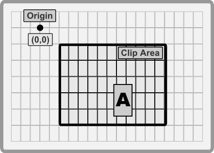
Clip Area and Origin point
Every surface has a clip area and an origin point. The clip area restricts the drawing operations to a specific region of the surface. The origin point is used as the reference point for all drawing operations.
For example, if the clip area is set to (10,10,20,20) and the origin point is set to (5,5), then the drawing operations will be restricted to the area (15,15,25,25) of the surface.
The following methods can be used to manipulate the clip area and the origin point of a surface:
| Method | Description |
|---|---|
set_origin(...) | Sets the origin point of the surface |
reset_origin() | Resets the origin point |
set_clip(...) | Sets the clip area of the surface. This methods take 4 parameters (left, top, right and bottom) |
set_relative_clip(...) | Sets the clip area of the surface relative to the current clip area. This methods take 4 parameters (left, top, right and bottom) |
reduce_clip_by(...) | Reduces the clip area of the surface. This methods take 4 parameter (left margin, top margin, right margin and bottom margin) |
reset_clip() | Resets the clip area of the surface |
Example:
#![allow(unused)]
fn main() {
use appcui::graphics::*;

let mut surface = Surface::new(100, 50);
// Set the origin point to (10,10)
surface.set_origin(10, 10);
// Set the clip area to (10,10,20,20)
surface.set_clip(10, 10, 20, 20);
// draw a border around the clip area
surface.draw_rect(
    Rect::new(0,0,9,9), // left,top,right,bottom relativ to origin
    LineType::Single,
    CharAttribute::with_color(Color::White, Color::DarkRed)
);
// reduce the clip area by 1 character on each side
// so that we will not draw over the border
surface.reduce_clip_by(1, 1, 1, 1);
// draw something else
// ...

/// finally, reset the clip area and origin point
/// to the entire surface
surface.reset_clip();
surface.reset_origin();
}
Cursor
Every surface has an associated cursor that can be moved, enabled or disabled. The cursor is used to indicate the current position where the next character will be drawn. Depending on the terminal, the cursor can be a blinking rectangle, a blinking underline or a blinking vertical line.
The following methods can be used to manipulate the clip area and the origin point of a surface:
| Method | Description |
|---|---|
set_cursor(...) | Sets the position of the cursor relativ to the origin point. If the cursor is within the clip area, it will be visible. Otherwise it will be hidden. |
hide_cursor() | Hides the cursor |
Example:
#![allow(unused)]
fn main() {
use appcui::graphics::{Surface};

let mut surface = Surface::new(100, 50);
surface.set_cursor(10, 10);
}
Drawing characters on a Surface
The most basic operation that can be performed on a surface is drawing a character at a specific position. This allows for more complex operations like drawing text, lines, rectangles, etc. to be built on top of it.
A surface has the following methods that can be used to manipulate characters and how they are drown on the surface:
| Method | Description |
|---|---|
write_char(...) | Writes a character at the specified position. If the position is outside the clip area, the character will not be drawn. |
char(...) | Returns the current character at the specified position or None if the position is outside the clip area or invalid. |
clear(...) | Clears/Fills the entire clip area with the specified character. If the clip area is not visible, the surface will not be cleared. |
Example:
#![allow(unused)]
fn main() {
use appcui::graphics::*;

let mut surface = Surface::new(100, 50);
// Set the origin point to (10,10)
surface.set_origin(10, 10);
// Set the clip area to (10,10,20,20)
surface.set_clip(10, 10, 20, 20);
// Clear the clip area
surface.clear(Character::new('*', Color::Silver, Color::Black, CharFlags::None))
// write a character at position (5,5) relativ to the origin
// point (10,10) => the character will be drawn at position (15,15)
surface.write_char(5, 5, Character::new('A', Color::Yellow, Color::DarkBlue, CharFlags::None));
}
Lines
Drawing lines is a common operation when building a UI. In AppCUI there are two methods that cen be used to draw lines (vertical and horizontal) on a surface.
- use special characters to draw the line (like single lines, double lines, etc) that are designed to be used in this context
- use a generic character to draw the line
Using special characters to draw lines
The following methods can be used to draw lines on a surface using special characters:
| Method | Description |
|---|---|
draw_horizontal_line(...) | Draws a horizontal line on the surface. The line will be drawn from left to right. |
draw_vertical_line(...) | Draws a vertical line on the surface. The line will be drawn from top to bottom. |
draw_horizontal_line_with_size(...) | Draws a horizontal line on the surface with a specific length. The line will be drawn from left to right, starting from a given point and a width. |
draw_vertical_line_with_size(...) | Draws a vertical line on the surface with a specific length. The line will be drawn from top to bottom, starting from a given point and a width. |
draw_line(...) | Draw a line between two points using a specific line type and character attributes |
These methods take a parameter line_type that specifies the type of line that will be drawn. The line type can be one of the following values:
| Value | Characters being used |
|---|---|
Single | ─, │, ┌, ┐, └, ┘, ├, ┤, ┬, ┴, ┼ |
Double | ═, ║, ╔, ╗, ╚, ╝, ╠, ╣, ╦, ╩, ╬ |
SingleThick | ━, ┃, ┏, ┓, ┗, ┛, ┣, ┫, ┳, ┻, ╋ |
Border | ▄, ▀, █ |
Ascii | \|, -, + |
AsciiRound | \|, -, +, \\ , \/ |
SingleRound | ╭, ╮, ╯, ╰, ─, │ |
Braille | Braille characters |
Example:
#![allow(unused)]
fn main() {
use appcui::graphics::{Surface, LineType, CharAttribute, Color};

let mut surface = Surface::new(100, 50);
surface.draw_vertical_line(10, 10, 20,
                            LineType::Single,
                            CharAttribute::with_color(Color::White, Color::Black));
}
Using a generic character to draw lines
The following methods can be used to draw lines on a surface using a generic character:
| Method | Description |
|---|---|
fill_horizontal_line(...) | Fills a horizontal line on the surface. The line will be filled from left to right with a provided Character |
fill_vertical_line(...) | Fills a vertical line on the surface. The line will be filled from top to bottom with a provided Character |
fill_horizontal_line_with_size(...) | Fills a horizontal line on the surface with a specific length. The line will be filled from left to right with a provided Character |
fill_vertical_line_with_size(...) | Fills a vertical line on the surface with a specific length. The line will be filled from top to bottom with a provided Character |
fill_line(...) | FIlls a line between two points with a given Character |
Example:
#![allow(unused)]
fn main() {
use appcui::graphics::{Surface, CharAttribute, Color, Character};

let mut surface = Surface::new(100, 50);
let c = Character::new('=', Color::White, Color::Black, CharFlags::None);
surface.fill_horizontal_line(10, 10, 20, c);
}
Rectangles
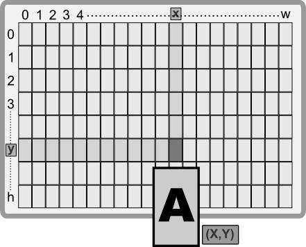
Rectangles are the most basic shape you can draw on a surface. They are defined by a position and a size. The position is the top-left corner of the rectangle, and the size is the width and height of the rectangle.
In AppCUI a rectangle is defined based on the following structure:
#![allow(unused)]
fn main() {
#[derive(Copy, Clone, Debug)]
pub struct Rect {
    left: i32,
    top: i32,
    right: i32,
    bottom: i32,
}
}
A rectangle can be created using the following methods:
Rect::new(left, top, right, bottom)- creates a new rectangle based on the provided coordinates.Rect::with_size(left, top, width, height)- creates a new rectangle based on the provided position and size.Rect::with_alignment(x, y, width, height, align)- creates a new rectangle based on the provided position, size and alignment.Rect::with_point_and_size(point, size)- creates a new rectangle based on the provided point and size.
The alignment in the third method is defined as follows:
#![allow(unused)]
fn main() {
#[repr(u8)]
#[derive(Copy, Clone, PartialEq, Debug)]
pub enum RectAlignment {
    TopLeft = 0,
    Top,
    TopRight,
    Right,
    BottomRight,
    Bottom,
    BottomLeft,
    Left,
    Center,
}
}
| Alignment | Decription | Preview |
|---|---|---|
TopLeft | (X,Y) represents the top-left corner of the rectangle | 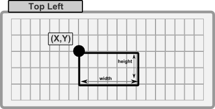 |
Top | (X,Y) represents the top-center of the rectangle | 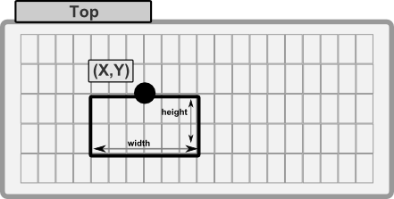 |
TopRight | (X,Y) represents the top-right corner of the rectangle | 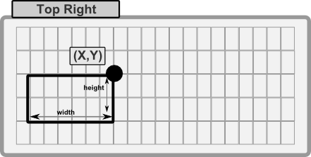 |
Right | (X,Y) represents the right-center of the rectangle | 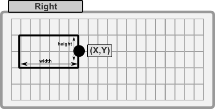 |
BottomRight | (X,Y) represents the bottom-right corner of the rectangle | 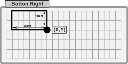 |
Bottom | (X,Y) represents the bottom-center of the rectangle | 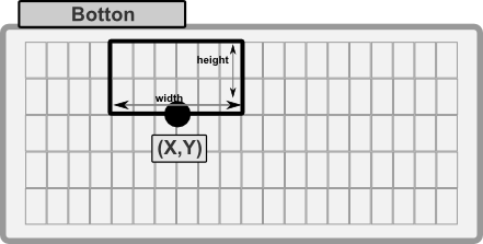 |
BottomLeft | (X,Y) represents the bottom-left corner of the rectangle | 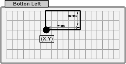 |
Left | (X,Y) represents the left-center of the rectangle | 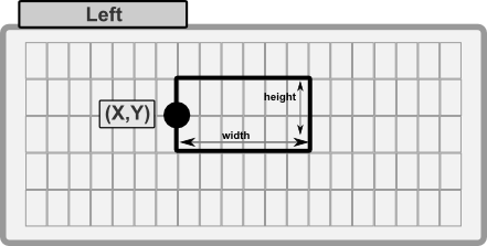 |
Center | (X,Y) represents the center of the rectangle | 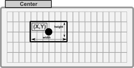 |
To draw a rectangle on a surface, you can use the following methods:
| Method | Description |
|---|---|
draw_rect(...) | Draws a rectangle on the surface by providing a Rect object, a line type and a character attribute. |
fill_rect(...) | Fills a rectangle on the surface by providing a Rect object and a character attribute. |
Example:
#![allow(unused)]
fn main() {
use appcui::graphics::*;

let mut surface = Surface::new(100, 50);
let r = Rect::new(10, 10, 20, 20);
// fill the rectangel with spaces (dark blue background)
surface.fill_rect(r, Character::new(' ', Color::White, Color::DarkBlue, CharFlags::None));
// draw a border around the rectangle (white on black)
surface.draw_rect(r, LineType::Single, CharAttribute::with_color(Color::White, Color::Black));
}
Methods
A rectangle has the following methods:
| Method | Description |
| -------------------- | ------------------------------------------------------------------------------ |
| left() | Returns the left coordinate of the rectangle. |
| top() | Returns the top coordinate of the rectangle. |
| right() | Returns the right coordinate of the rectangle. |
| bottom() | Returns the bottom coordinate of the rectangle. |
| width() | Returns the width of the rectangle. |
| height() | Returns the height of the rectangle. |
| size() | Returns the size of the rectangle as a Size object. |
| center_x() | Returns the x coordinate of the center of the rectangle. |
| center_y() | Returns the y coordinate of the center of the rectangle. |
| center() | Returns the center of the rectangle as a Point object. |
| top_left() | Returns the top-left corner of the rectangle as a Point object. |
| top_right() | Returns the top-right corner of the rectangle as a Point object. |
| bottom_left() | Returns the bottom-left corner of the rectangle as a Point object. |
| bottom_right() | Returns the bottom-right corner of the rectangle as a Point object. |
| contains(...) | Checks if a point is inside the rectangle. |
| contains_rect(...) | Checks if a rectangle is fully inside (no intersections) the rectangle. |
| inflate_with(...) | Inflates the rectangle by the given amount in left, top, right, bottom. |
| translate(...) | Translates the rectangle by the given amount in x and y. |
| set_left(...) | Sets the left coordinate of the rectangle, optionally preserving the width. |
| set_top(...) | Sets the top coordinate of the rectangle, optionally preserving the height. |
| set_right(...) | Sets the right coordinate of the rectangle, optionally preserving the width. |
| set_bottom(...) | Sets the bottom coordinate of the rectangle, optionally preserving the height. |
Text
Writing text on a surface is a common task in GUI programming, that can be achieved using the following methods:
write_string(...)- writes a string (Stringor&str) on the surface starting from a specific position, color and character attribute.write_ascii(...)- similar to write_string, but it writes only ASCII characters.write_text(...)- a more complex method that allows alignment, wrapping and text formatting.
Write a string
The write_string(...) method writes a string on the surface starting from a specific position. The method has the following signature:
#![allow(unused)]
fn main() {
pub fn write_string(&mut self,
                    x: i32,
                    y: i32,
                    text: &str,
                    attr: CharAttribute,
                    multi_line: bool)
}
The multi-line parameter specifices if the text should interpret new line characters as a new line or not. if set to false the code of this method is optimized to write the text faster. The text will be written from left to right, starting from the specified position (x,y).
Example:
#![allow(unused)]
fn main() {
use appcui::graphics::{Surface, CharAttribute, Color};

let mut surface = Surface::new(100, 50);
surface.write_string(10, 10,
                    "Hello World!",
                    CharAttribute::with_color(Color::White, Color::Black),
                    false);
}
Write an ASCII string
The write_ascii(...) method writes an ASCII string on the surface starting from a specific position. The method has the following signature:
#![allow(unused)]
fn main() {
pub fn write_ascii(&mut self,
                   x:i32,
                   y:i32,
                   ascii_buffer: &[u8],
                   attr: CharAttribute,
                   multi_line: bool)
}
The multi-line parameter specifices if the text should interpret new line characters as a new line or not. if set to false the code of this method is optimized to write the text faster. The text will be written from left to right, starting from the specified position (x,y).
Example:
#![allow(unused)]
fn main() {
use appcui::graphics::{Surface, CharAttribute, Color};

let mut surface = Surface::new(100, 50);
surface.write_ascii(10, 10,
                   b"Hello World!",
                   CharAttribute::with_color(Color::White, Color::Black),
                   false);
}
Write a formatted text
In some cases, you may need to write a text that is formatted in a specific way (like alignment, wrapping, etc). The write_text(...) method allows you to do this. The method has the following signature:
#![allow(unused)]
fn main() {
pub fn write_text(&mut self, text: &str, format: &TextFormat)
}
where the TextFormat structure can be created using the TextFormatBuilder in the following way:
| Method | Description |
|---|---|
new() | Creates a new TextFormatBuilder object |
position(...) | Sets the position where the text will be written (X and Y axes) |
attribute(...) | Sets the character attribute for the text (forecolor, backcolor and other attributes) |
hotkey(...) | Sets the hotkey attribute and position for the text (if any) |
align(...) | Sets the text alignment (left, right, center) |
wrap_type(...) | Sets the text wrapping type of the code (WrapType enum) |
chars_count(...) | Sets the number of characters in the text (this is useful to optimize several operations especially if this value is aready known) |
build() | Builds the TextFormat object |
Example:
#![allow(unused)]
fn main() {
use appcui::graphics::{Surface, CharAttribute, Color, TextFormatBuilder, WrapType};
let format = TextFormatBuilder::new()
    .position(10, 10)
    .attribute(CharAttribute::with_color(Color::White, Color::Black))
    .align(Alignment::Center)
    .wrap_type(WrapType::Word(20))
    .build();
surface.write_text("Hello World!", &format);
}
Once a TextFormat object is created, you can modify it and use it using the following methods:
| Method | Description |
|---|---|
set_position(...) | Sets the position where the text will be written (X and Y axes) |
set_attribute(...) | Sets the character attribute for the text (forecolor, backcolor and other attributes) |
set_hotkey(...) | Sets the hotkey attribute and position for the text (if any) |
clear_hotkey() | Clears the hotkey attribute from the text |
set_align(...) | Sets the text alignment (left, right, center) |
set_wrap_type(...) | Sets the text wrapping type of the code (WrapType enum) |
set_chars_count(...) | Sets the number of characters in the text (this is useful to optimize several operations especially if this value is aready known) |
The WrapType enum is defined as follows:
#![allow(unused)]
fn main() {
pub enum WrapType {
    WordWrap(u16),
    CharacterWrap(u16),
    MultiLine,
    SingleLine,
    SingleLineWrap(u16),
}
}
with the following meaning:
| Method | Multi-line | Description |
|---|---|---|
WordWrap(width) | Yes | Wraps the text around a specific width not separating words. The text will be printed on the next line if a new line character (CR or LF or combinations) is encountered or if the current word if printed will be outside the specfied width. |
CharacterWrap(width) | Yes | Wraps the text around a specific width separating words. The text will be printed on the next line if a new line character (CR or LF or combinations) is encountered or when the position of the current character is outside the specified width. |
| MultiLine | Yes | The text will be printed on the next line only if a new line character (CR or LF or combinations) is encountered. |
| SingleLine | No | The text will be printed on the same line, ignoring any new line characters. |
SingleLineWrap(width) | No | The text will be printed on the same line, but it will be wrapped around a specific width. One the width is reach, the printing stops. |
Let's consider the following string Hello World!\nFrom AppCUI. This text will be printed as follows:
| WrapType | Result |
|---|---|
| WrapType::WordWrap(10) | Hello World! From AppCUI |
| WrapType::WordWrap(20) | Hello World! From AppCUI |
| WrapType::CharacterWrap(10) | Hello Worl d! From AppC UI |
| WrapType::CharacterWrap(20) | Hello World! From AppCUI |
| WrapType::CharacterWrap(5) | Hello Worl d! From AppCU I |
| WrapType::MultiLine | Hello World! From AppCUI |
| WrapType::SingleLine | Hello World!\nFrom AppCUI |
| WrapType::SingleLineWrap(5) | Hello |
| WrapType::SingleLineWrap(10) | Hello Worl |
| WrapType::SingleLineWrap(20) | Hello World!\nFrom Ap |
Images
While AppCUI is developed for CLI usage, it can still use images to some degree, meaning that it can store images as an array of pixels and it has various methods to represent them using characters and combinations of existing colors.
To create an image, use the class Image with the following construction methods:
Image::new(width,height)creates an image with a specific size. That image will be filled with a transparent pixel that you can later changeImage::from_str(...)creates a 16 color image based on a string representation.Image::from_buffer(buffer, size)creates an image from a buffer of pixel values encoded as u32 ARGB values.
Methods
Once an image is created you can use the following methods to manipulate it:
| Method | Purpose |
|---|---|
clear(...) | Fills the entire image with a specific pixel |
pixel(...) | Provides the pixel from a specific coordinate in the image or None otherwise |
set_pixel(...) | Sets the pixel from a specific coordinate in the image |
width() | The width of the image in pixels |
height() | The height of the image in pixels |
size() | The size (width and height) of the image in pixels |
render_size(render_options) | The size (in characters) needed for a surface object to allow the entire image to be painted. It requires a RenderOptions object to compute |
remove_alpha() | Removes the alpha channel from all pixels, making them fully opaque |
Pixel
A pixel is a simple structure defined as follows:
#[derive(Copy, Clone, Debug, PartialEq, Default)]
pub struct Pixel {
    pub red: u8,
    pub green: u8,
    pub blue: u8,
    pub alpha: u8,
}
You can create a pixel in the following way:
- using direct construction:
let px = Pixel { red:10, green: 20, blue:30, alpha: 255 }; - using the
.new(...)constructor:let px = Pixel::new(10, 20, 30, 255); - using the
.with_rgb(...)constructor:let px = Pixel::with_rgb(10, 20, 30); - using the
.with_color(...)constructor:let px = Pixel::with_color(Color::Aqua); - using the From implementation from an u32 (in an ARGB format -
AlphaRedGreenBlue).let px = Pixel::from(0xFF005090u32); - using the Default implementation (this will create a transparent pixel where
Red=0,Green=0,Blue=0andAlpha=0)let px = Pixel::default();
Usage
A typical way to create an image is as follows:
- create a new
Imageobject - optionally, fill the entire image with a different pixel than the default one
- use
.set_pixel(...)method to fill the image. At this point additional crates that can load an image from a file can be used to transfer the content of that image into this object.
The following example draws a horizontal Red line on a Blue background image of size 32x32:
let mut img = Image::new(32,32);
img.clear(Pixel::with_color(Color::Blue));
for i in 5..30 {
    img.set_pixel(i,10,Pixel::with_color(Color::Red));
}
Building from a string
A more common usage is to build a small image from a string that specifies colors for each pixel. The format in this case is as follows:
- each line is enclosed between two characters
| - outside of these characters any other character is being ignored (usually you add spaces or new lines to align the text)
- each line must have the same width (in terms of the number of characters that are located between
|characters )
for example, a 5x5 image will be represented as follows:
let string_representation = r#"
      |.....|
      |.....|
      |.....|
      |.....|
      |.....|
"#;
Within the space between the characters | the following characters have a color association:
| Character | Enum variant | RGB | Color |
|---|---|---|---|
0 (space).(point) | Color::Black | Red=0, Green=0, Blue=0 | |
1B(capital B) | Color::DarkBlue | Red=0, Green=0, Blue=128 | |
2G(capital G) | Color::DarkGreen | Red=0, Green=128, Blue=0 | |
3T(capital T) | Color::Teal | Red=0, Green=128, Blue=128 | |
4R(capital R) | Color::DarkRed | Red=128, Green=0, Blue=0 | |
5M or m | Color::Magenta | Red=128, Green=0, Blue=128 | |
6O or o | Color::Olive | Red=128, Green=128, Blue=0 | |
7S(capital S) | Color::Silver | Red=192, Green=192, Blue=192 | |
8s(lower s) | Color::Gray | Red=128, Green=128, Blue=128 | |
9b(lower b) | Color::Blue | Red=0, Green=0, Blue=255 | |
g(lower g) | Color::Green | Red=0, Green=255, Blue=0 | |
r(lower r) | Color::Red | Red=255, Green=0, Blue=0 | |
A or at(lower t) | Color::Aqua | Red=0, Green=255, Blue=255 | |
P or p | Color::Pink | Red=255, Green=0, Blue=255 | |
Y or y | Color::Yellow | Red=255, Green=255, Blue=0 | |
W or w | Color::White | Red=255, Green=255, Blue=255 |
So ... to create an image of a red heart ♥ you will need to create the following string:
let heart = r#"
    |..rr.rr..|
    |.rrrrrrr.|
    |.rrrrrrr.|
    |..rrrrr..|
    |...rrr...|
    |....r....|
"#;
let img = Image::from_str(heart);
Rendering images
AppCUI framework relies on characters. As such, an image cannot be displayed as it is. However, there is one method in the Surface object that can be used to approximate an image:
impl Surface {
    // other methods
    pub fn draw_image(&mut self, x: i32,
                                y: i32,
                                image: &Image,
                                render_options: &image::RenderOptions
                    ) { ... }
}
This method attempts to draw an image using characters and the available colors. The RenderOptions object controls how the image is rendered and can be created using the builder pattern:
RenderOptionsBuilder Methods
The RenderOptionsBuilder provides a fluent interface for configuring render options. All methods return Self for method chaining:
| Method | Parameter Type | Default | Purpose |
|---|---|---|---|
new() | - | - | Creates a new builder with default settings |
scale(scale) | Scale | NoScale | Sets the scaling factor for the image |
character_set(char_set) | CharacterSet | SmallBlocks | Sets the character set for rendering |
color_schema(schema) | ColorSchema | Auto | Sets the color schema for rendering |
luminance_threshold(value) | f64 | 0.5 | Sets the luminance threshold (0.0-1.0) for black/white conversion |
build() | - | - | Finalizes the builder and returns a RenderOptions object |
Example:
let render_options = image::RenderOptionsBuilder::new()
    .scale(image::Scale::Scale50)
    .character_set(image::CharacterSet::AsciiArt)
    .color_schema(image::ColorSchema::Color16)
    .luminance_threshold(0.3)
    .build();
The following rendering options are available:
Character Sets
SmallBlocks- Uses small block characters (default)LargeBlocks- Uses large block charactersDitheredShades- Uses dithered shadingBraille- Uses braille charactersAsciiArt- Uses ASCII art characters
Color Schemas
Auto- Automatic color detection (default)Color16- 16-color modeTrueColors- True color mode (if feature enabled)GrayScale4- 4-level grayscaleGrayScaleTrueColors- True color grayscale (if feature enabled)BlackAndWhite- Black and white mode
Scaling Options
Scale::NoScale=> 100%Scale::Scale50=> 50%Scale::Scale33=> 33%Scale::Scale25=> 25%Scale::Scale20=> 20%Scale::Scale10=> 10%Scale::Scale5=> 5%
Let's consider an image of Cuddly Ferris and see how it will be displayed using different rendering methods:
| Methods | Result |
|---|---|
| SmallBlocks | 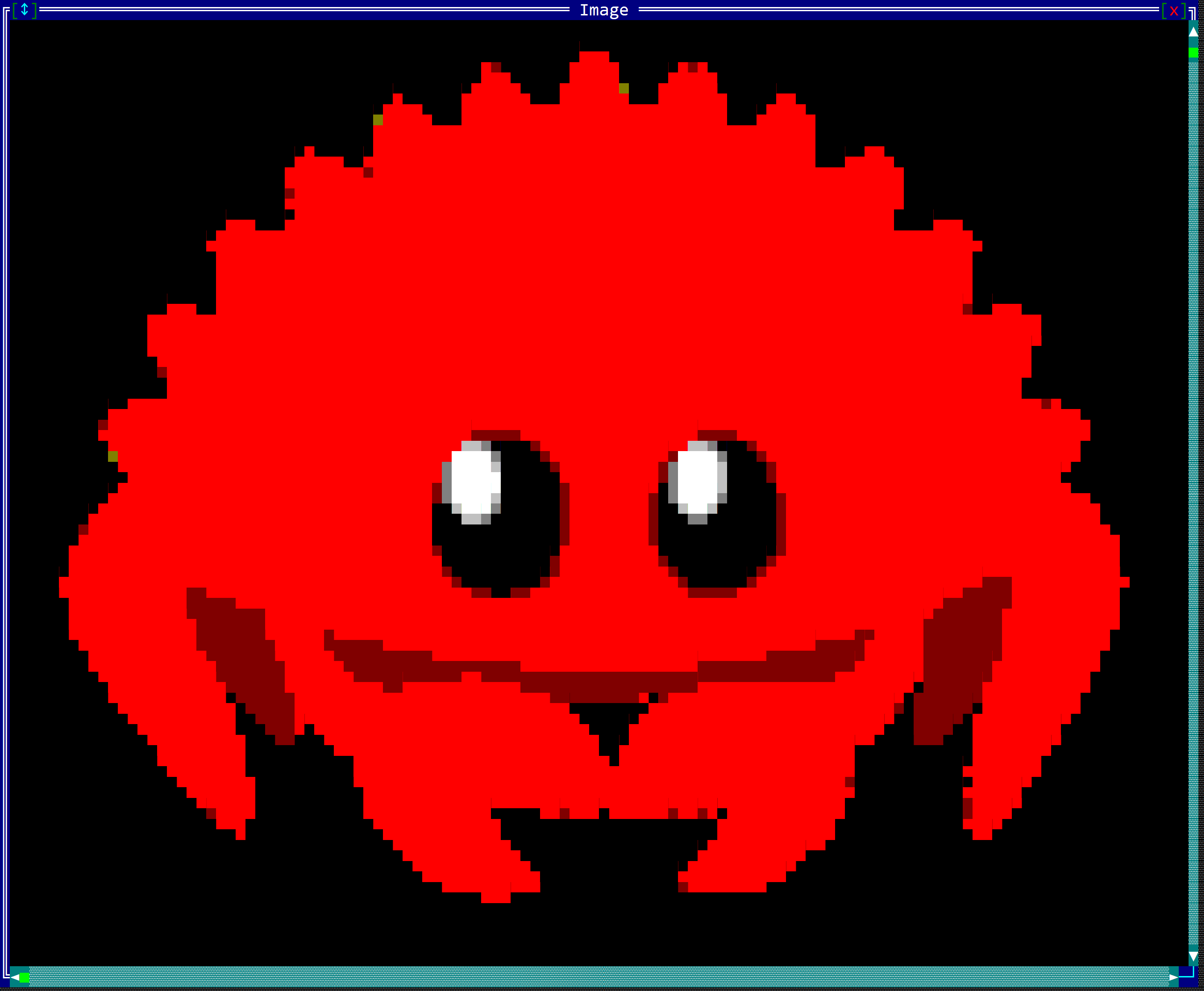 |
| LargeBlocks | 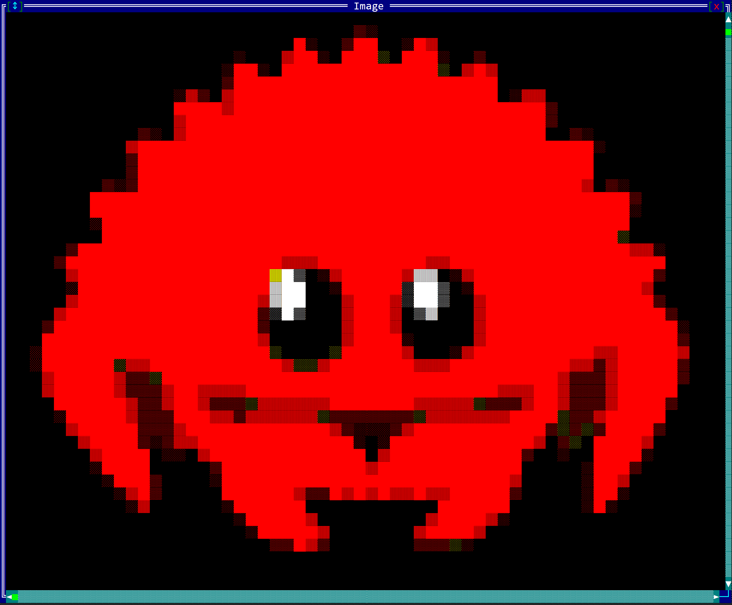 |
| DitheredShades | 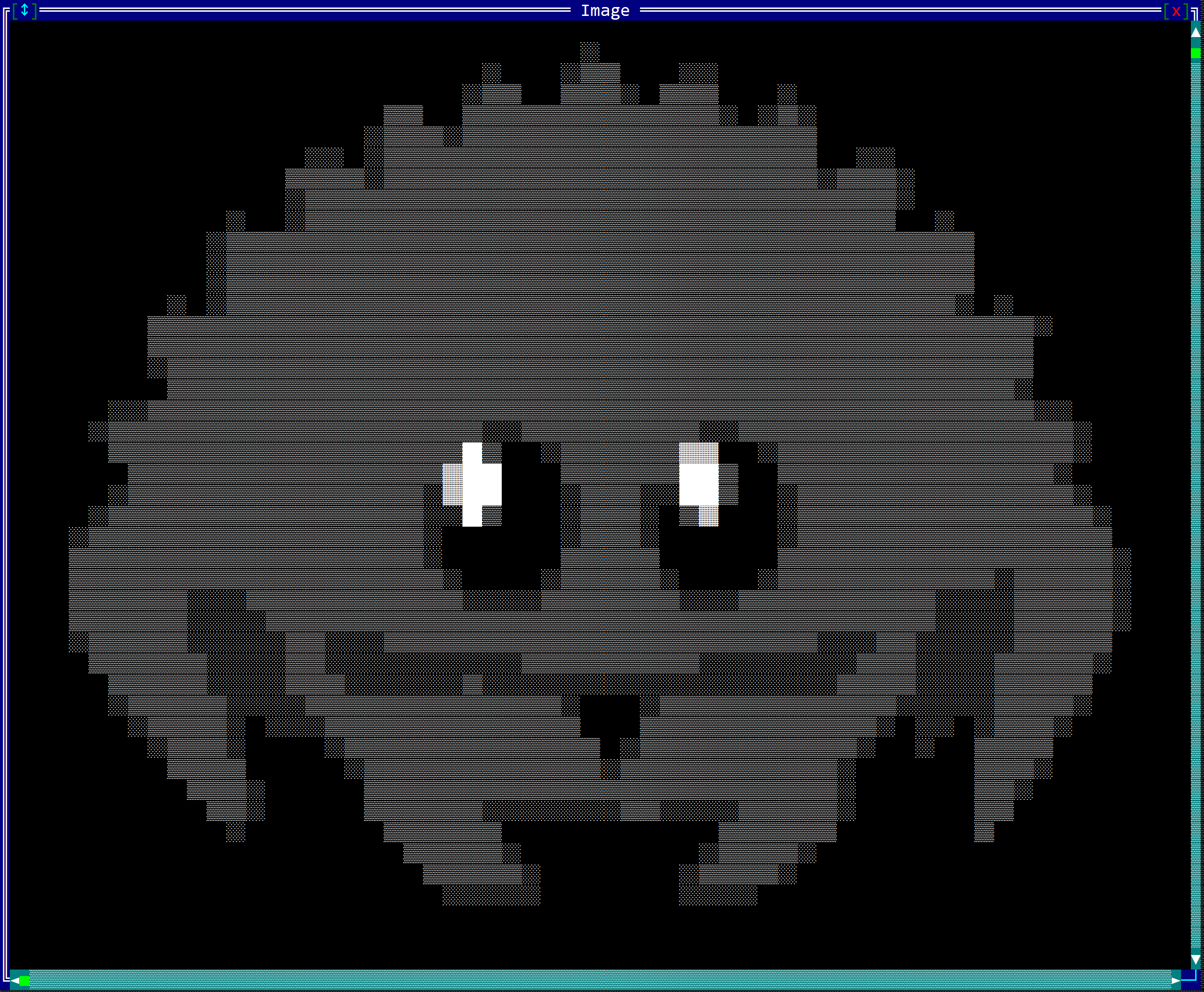 |
| AsciiArt | 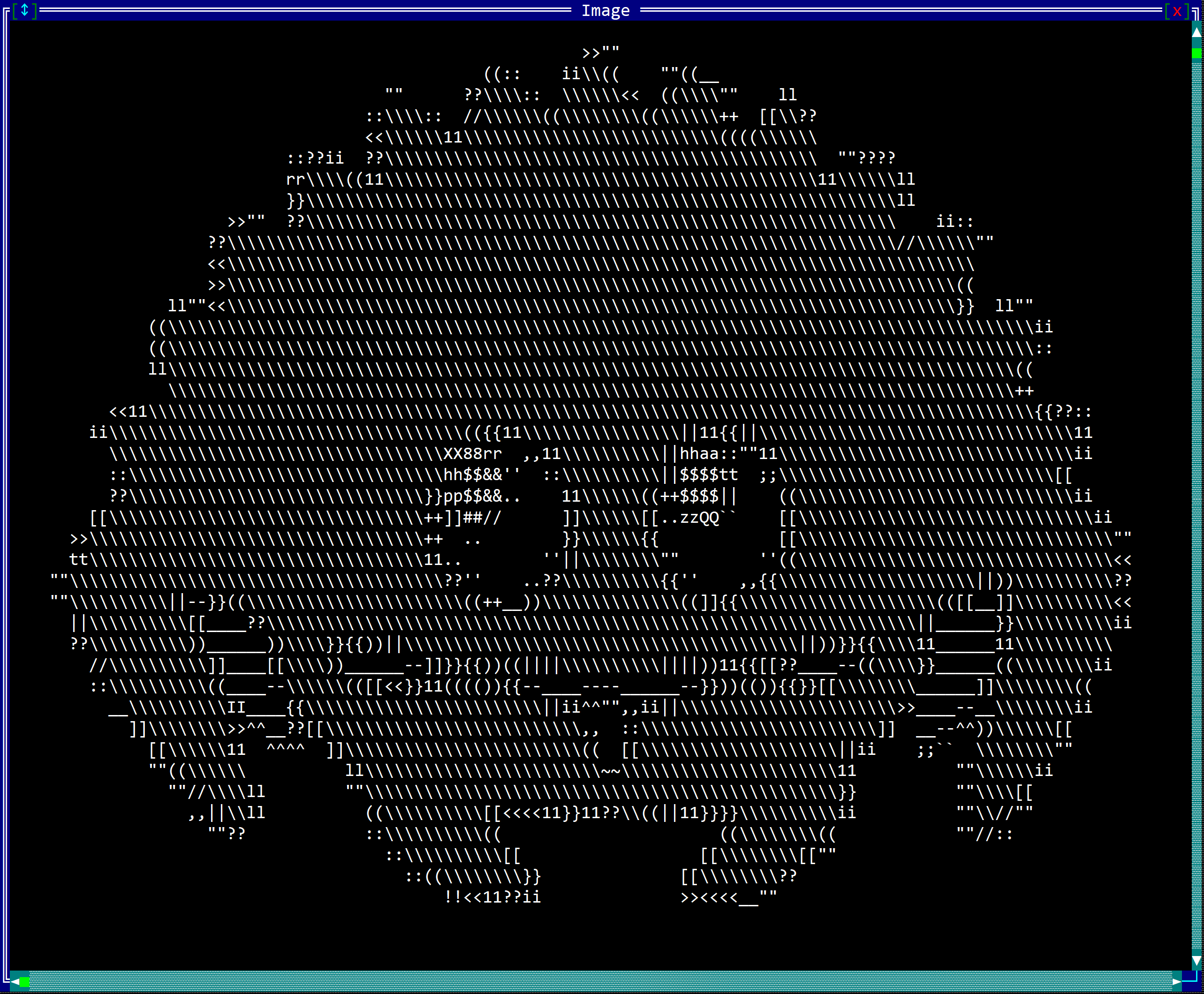 |
Bit Tiles
BitTiles are compact, memory-efficient structures designed for storing and rendering monochrome (black and white) images in AppCUI. Unlike full-color images, a BitTile represents each pixel using a single bit - either set (1) or unset (0) - making them perfect for icons, simple graphics, and patterns where memory usage is a concern.
To create a BitTile, the following methods can be used:
BitTile::new(width, height)creates a BitTile with custom storage size. All pixels will be initially unset (false).BitTile::from_str(...)creates a BitTile from a string representation using the pipe (|) format.- Predefined types like
BitTileU16::from_u16(width, height, bits)for working with specific integer representations. The following predefined types are available:BitTileU16BitTileU32BitTileU64BitTileU128
Methods
Once a BitTile is created, you can use the following methods to manipulate it:
| Method | Purpose |
|---|---|
get(x, y) | Returns Some(bool) if the pixel at coordinates (x,y) is set, or None if coordinates are out of bounds |
set(x, y, value) | Sets the pixel at coordinates (x,y) to the specified boolean value. If the coordinates are outside the bounds of the BitTile, the operation is silently ignored. |
width() | Returns the width of the BitTile in pixels (as u8) |
height() | Returns the height of the BitTile in pixels (as u8) |
size() | Returns the size (width and height) of the BitTile as a Size struct |
clear(value) | Fills the entire BitTile with the specified boolean value (true for all set, false for all unset) |
to_string_format() | Returns a string representation of the BitTile using | to delimit rows and . to represent unset pixels and X to represent set pixels |
BitTile Types
AppCUI provides several predefined BitTile types for common use cases:
| Type | Alias Type | Storage | Max Pixels | Purpose |
|---|---|---|---|---|
BitTileU16 | BitTile<2> | 2 bytes | 16 | Small icons and simple patterns |
BitTileU32 | BitTile<4> | 4 bytes | 32 | Medium-sized graphics |
BitTileU64 | BitTile<8> | 8 bytes | 64 | Larger icons and detailed patterns |
BitTileU128 | BitTile<16> | 16 bytes | 128 | Complex graphics with fine detail |
Working with Predefined Types
Predefined types offer additional methods for working with integer representations:
// Create a 4x4 BitTileU16 from a u16 value
let tile = BitTileU16::from_u16(4, 4, 0b1001_0110_1001_0110).unwrap();

// Get the integer representation
let bits: u16 = tile.to_u16();

// Reset the tile with new bit pattern
tile.reset(0b1111_0000_1111_0000);
Usage
A typical workflow for creating and using BitTiles:
- Create a new
BitTileobject - Optionally, clear the entire tile with a default value
- Use
.set(...)method to draw your pattern, or create from a string representation
The following example creates a simple 8x8 checkerboard pattern:
let mut tile = BitTileU64::new(8, 8).unwrap();
for y in 0..8 {
    for x in 0..8 {
        let is_set = (x + y) % 2 == 0;
        tile.set(x, y, is_set);
    }
}
Building from a String
The most convenient way to create BitTiles is from a string representation. The format follows these rules:
- Each line is enclosed between pipe characters (
|) - Characters outside the pipes are ignored (typically used for spacing and alignment)
- Each line must have the same width (number of characters between
|characters) - Only two types of characters are recognized:
- Unset pixels:
.(point) - Set pixels: Any other character
- Unset pixels:
For example, a 5x5 BitTile can be represented as:
let string_representation = r#"
      |.....|
      |.XXX.|
      |.X.X.|
      |.XXX.|
      |.....|
"#;
let tile = BitTileU32::from_str(string_representation).unwrap();
Creating a Heart Icon
Here's how to create a heart-shaped icon using the string format:
let heart = r#"
    |...rr....rr...|
    |..rrrr..rrrr..|
    |.rrrrrrrrrrrr.|
    |.rrrrrrrrrrrr.|
    |..rrrrrrrrrr..|
    |   rrrrrrrr   |
    |....rrrrrr....|
    |.....rrrr.....|
    |......rr......|
"#;
let heart_tile = BitTileU128::from_str(heart).unwrap();
Note that any character except space ( ) and point (.) represents a set pixel - in this example, r characters create the heart shape.
Rendering BitTiles
AppCUI provides three different methods for rendering BitTiles to the screen through the Surface object draw_tile(...) method that is defined as follows:
impl Surface {
    pub fn draw_tile<const STORAGE_BYTES: usize>(
        &mut self,
        x: i32,
        y: i32,
        tile: &BitTile<STORAGE_BYTES>,
        set_bit_color: Color,
        unset_bit_color: Color,
        render_method: BitTileRenderMethod
    ) { ... }
}
Render Methods
The BitTileRenderMethod enum provides three rendering approaches:
SmallBlocks
Uses half-block characters to render two vertical pixels per character. This is the most compact method:
- Each character represents 2 vertical pixels
- Uses
▀(upper half),▄(lower half),█(full block), or space - Efficient for detailed patterns in limited space
LargeBlocks
Renders each pixel as two characters wide, providing maximum visibility:
- Each pixel becomes a 2x1 character block
- Best for small tiles that need to be clearly visible
- Uses twice the horizontal space
Braille
Uses Unicode Braille characters for ultra-compact rendering:
- Each character represents an 2x4 pixel area (8 pixels total)
- Most space-efficient method
- Uses Unicode range U+2800-U+28FF for Braille patterns
- Excellent for detailed graphics in minimal space
Remarks: The Braille rendering method is the most space-efficient method, but depending on the font used the characters might aligned differently on the vertical vs horizontal axis.
Example Usage
use appcui::prelude::*;

// Create a simple cross pattern
let cross = r#"
    |..X..|
    |..X..|
    |XXXXX|
    |..X..|
    |..X..|
"#;

let tile = BitTileU32::from_str(cross).unwrap();

// Render using different methods
surface.draw_tile(10, 5, &tile, Color::Red, Color::Black, BitTileRenderMethod::SmallBlocks);
surface.draw_tile(20, 5, &tile, Color::Green, Color::Black, BitTileRenderMethod::LargeBlocks);
surface.draw_tile(30, 5, &tile, Color::Blue, Color::Black, BitTileRenderMethod::Braille);
Error Handling
When creating BitTiles from strings, several errors can occur:
| Error | Cause |
|---|---|
MultipleWidths | Lines have different numbers of characters between | characters (for example |...| |....| has one line with 3 pixels and another line with 4 pixels) |
ZeroHeight | No valid lines found in the string (for example an empty string or a string without | characters) |
ZeroWidth | Lines contain no characters between | characters (for example ||) |
ImageTooLarge | Width or height the maximum allowed by the storage of the BitTile (for example a BitTileU16 can only have a width and height of up to 16 pixels) |
ImageDoesNotFitInAllocatedSpace | Total pixels exceed the BitTile's storage capacity (for example a BitTileU16 can only have a width and height of up to 16 pixels so a string representation of a 5x4 image will cause this error) |
MissingCorrespondingMarker | Unmatched | character in the string (for example |... is missing the corresponding | at the end) |
Glyphs
Glyphs are F2D character grids designed for drawing text and character-based graphics in AppCUI. Unlike BitTiles which store binary data, or Images which store full color information, Glyphs store individual characters that can be rendered with specific foreground and background colors. They are perfect for text layouts, ASCII art, character-based UI elements, and any graphics that can be represented using Unicode characters.
To create a Glyph, the following methods can be used:
Glyph::new(width, height)creates an empty Glyph with the specified dimensions. All characters will be initially transparent (null character).Glyph::with_str(width, height, text)creates a Glyph with the specified dimensions and initializes it with the provided text from the top-left corner.
Methods
Once a Glyph is created, you can use the following methods to manipulate it:
| Method | Purpose |
|---|---|
char(x, y) | Returns Some(char) if there is a character at coordinates (x,y), or None if coordinates are out of bounds |
set_char(x, y, ch) | Sets the character at coordinates (x,y) to the specified char. If the coordinates are outside the bounds of the Glyph, the operation is silently ignored. |
clear_char(x, y) | Clears the character at the specified coordinates by setting it to the transparent character |
size() | Returns the size (width and height) of the Glyph as a Size struct |
clear() | Clears the entire Glyph by setting all characters to the transparent character |
fill(ch) | Fills the entire Glyph with the specified character |
resize(width, height) | Resizes the Glyph to the specified dimensions and clears it with the transparent character |
resize_with(width, height, ch) | Resizes the Glyph to the specified dimensions and fills it with the specified character |
write_str(x, y, text) | Writes the specified text to the Glyph starting from the given coordinates. Supports multi-line text with \n characters |
Size Limitations
Glyphs have built-in size constraints for memory management:
- Maximum size:
1024x1024characters - Size clamping: If you specify dimensions larger than 1024x1024, they will be automatically clamped
- Zero dimensions: If width or height is 0, an empty Glyph with zero size is created
- Dynamic memory: Uses
Vec<char>for storage, allowing flexible sizing up to the maximum limit
Usage
A typical workflow for creating and using Glyphs:
- Create a new
Glyphobject with desired dimensions - Optionally, fill or clear the Glyph with a default character
- Use
.set_char(...)or.write_str(...)methods to add content - Render the Glyph to a Surface using appropriate character attributes
Basic Example
The following example creates a simple 10x3 Glyph with a greeting:
use appcui::prelude::*;

let mut glyph = image::Glyph::new(10, 3);
glyph.write_str(0, 0, "Hello");
glyph.write_str(0, 1, "World!");
glyph.set_char(9, 2, '!');
Creating ASCII Art
Here's how to create a simple ASCII art pattern:
use appcui::prelude::*;

let mut glyph = image::Glyph::new(7, 5);
glyph.write_str(0, 0, "  ___  ");
glyph.write_str(0, 1, " /   \\ ");
glyph.write_str(0, 2, "|  o  |");
glyph.write_str(0, 3, " \\___/ ");
glyph.write_str(0, 4, "   |   ");
Multi-line Text
The write_str method supports multi-line text using newline characters:
use appcui::prelude::*;

let text = "Line 1\nLine 2\nLine 3";
let glyph = image::Glyph::with_str(20, 10, text);
Transparent Characters
Glyphs use a special transparent character (null character \0) to represent empty spaces:
- Transparent character:
\0(null character) - Purpose: Allows parts of the Glyph to be "see-through" when rendered
- Default state: All characters in a new Glyph are initially transparent
- Clearing: Use
clear()orclear_char()to set characters back to transparent
Rendering Glyphs
AppCUI provides a dedicated method for rendering Glyphs to the screen through the Surface object draw_glyph(...) method:
impl Surface {
    pub fn draw_glyph(
        &mut self,
        x: i32,
        y: i32,
        glyph: &Glyph,
        attr: CharAttribute
    ) { ... }
}
CharAttribute
The CharAttribute parameter controls how the Glyph is rendered:
- Foreground color: The color of the characters
- Background color: The background color behind the characters
- Character flags: Additional styling like bold, underline, etc.
Example Usage
use appcui::prelude::*;

// Create a simple text glyph
let glyph = image::Glyph::with_str(15, 3, "Hello, AppCUI!\nThis is a test\nof multi-line!");

// Define rendering attributes
let attr = CharAttribute::with_color(Color::Yellow, Color::Blue);

// Render to surface
surface.draw_glyph(10, 5, &glyph, attr);
Advanced Rendering Example
use appcui::prelude::*;

// Create a border pattern
let mut border_glyph = image::Glyph::new(5, 5);
border_glyph.write_str(0, 0, "┌───┐");
border_glyph.write_str(0, 1, "│   │");
border_glyph.write_str(0, 2, "│ X │");
border_glyph.write_str(0, 3, "│   │");
border_glyph.write_str(0, 4, "└───┘");

// Render with different attributes
let border_attr = CharAttribute::with_color(Color::White, Color::Black);
surface.draw_glyph(0, 0, &border_glyph, border_attr);
Input
AppCUI allows input from:
- Keyboard
- Mouse
The input is received via the OnKeyPressed and OnMouseEvent traits, and they are usually used when designing a Custom Control.
Mouse
Mouse events are received through the trait OnMouseEvent defined as follows:
pub trait OnMouseEvent {
    fn on_mouse_event(&mut self, event: &MouseEvent) -> EventProcessStatus {
        EventProcessStatus::Ignored
    }
}
where MouseEvent is defined as follows:
#[derive(Copy, Clone, Debug, PartialEq)]
pub enum MouseEvent {
    Enter,
    Leave,
    Over(Point),
    Pressed(MouseEventData),
    Released(MouseEventData),
    DoubleClick(MouseEventData),
    Drag(MouseEventData),
    Wheel(MouseWheelDirection)
}
where MouseEventData is defined as follows:
#[derive(Copy, Clone, Debug, PartialEq)]
pub struct MouseEventData {
    pub x: i32,
    pub y: i32,
    pub button: MouseButton,
    pub modifier: KeyModifier
}
and MouseButton is an enum with the following values:
Left- indicates that the left mouse button was pressedRight- indicates that the right mouse button was pressedCenter- indicates that the center mouse button was pressedNone- indicates that no button was pressed
MouseWheelDirection is an enum with the following values:
Up- indicates that the mouse wheel was rotated upDown- indicates that the mouse wheel was rotated downLeft- indicates that the mouse wheel was rotated leftRight- indicates that the mouse wheel was rotated rightNone- indicates that the mouse wheel was not rotated
These events reflect the following actions:
MouseEvent::Enter- the mouse cursor entered the controlMouseEvent::Leave- the mouse cursor left the controlMouseEvent::Over(Point)- the mouse cursor was moved over the control and it is now at the specified pointMouseEvent::Pressed(MouseEventData)- a mouse button was pressed over the controlMouseEvent::Released(MouseEventData)- a mouse button was released. If a mouse button was pressed over the control and the control can receive input, then all of the following mouse events will be sent to the control (even if the mouse cursor is outside the control) until the mouse button is released.MouseEvent::DoubleClick(MouseEventData)- a mouse button was double clicked over the controlMouseEvent::Drag(MouseEventData)- a mouse button was pressed over the control and the mouse cursor was moved while keeping the button pressedMouseEvent::Wheel(MouseWheelDirection)- the mouse wheel was rotated
Usage
The events are generated by the system and are sent to the control that has the focus. The control can choose to ignore the event or to process it. The OnMouseEvent trait is usually used when designing a Custom Control.
A typical implementation of the OnMouseEvent trait looks like this:
impl OnMouseEvent for <MyControl> {
    fn on_mouse_event(&mut self, event: &MouseEvent) -> EventProcessStatus {
        // handle the event
        match event {
            MouseEvent::Enter => {
                // the mouse cursor entered the control
            },
            MouseEvent::Leave => {
                // the mouse cursor left the control
            },
            MouseEvent::Over(point) => {
                // the mouse cursor is over the control
            },
            MouseEvent::Pressed(data) => {
                // a mouse button was pressed over the control
            },
            MouseEvent::Released(data) => {
                // a mouse button was released over the control
            },
            MouseEvent::DoubleClick(data) => {
                // a mouse button was double clicked over the control
            },
            MouseEvent::Drag(data) => {
                // a mouse button was pressed over the control and the mouse cursor was moved while keeping the button pressed
            },
            MouseEvent::Wheel(direction) => {
                // the mouse wheel was rotated
            }
        }
    }
}
Key modifiers
The MouseEventData structure contains a modifier field that indicates the key modifiers that were pressed when the mouse event occurred. This can be used to perform different actions based on the key modifiers (e.g., pressing Ctrl while clicking the mouse button can have a different effect than just clicking the mouse button).
impl OnMouseEvent for <MyControl> {
    fn on_mouse_event(&mut self, event: &MouseEvent) -> EventProcessStatus {
        match event {
            MouseEvent::Drag(data) => {
                if data.modifier.contains(KeyModifier::Ctrl) {
                    // the mouse button was pressed while the Ctrl key was also pressed
                } else {
                    // the mouse button was pressed without the Ctrl key being pressed
                }
            },
            _ => {
                EventProcessStatus::Ignored
            }
        }
    }
}
Keyboard
Keyboard events are received through the trait OnKeyPressed defined as follows:
pub trait OnKeyPressed {
    fn on_key_pressed(&mut self, key: Key, character: char) -> EventProcessStatus {
        // do something depending on the key pressed
    }
}
This method has two parameters:
- the
keyparameter (that provides information about the code of the key that was pressed and its modifiers) - the
character(when this is the case). This is usually when you want to insert text into a control (for example, in a TextField).
Key
A key in AppCUI is defined as follows:
#[derive(Copy, Clone, PartialEq, Debug)]
pub struct Key {
    pub code: KeyCode,
    pub modifier: KeyModifier,
}
where:
codeis an enum that indicates a code for the key that was pressed and it includes:- F-commands (
F1toF12) - Letters (
AtoZ) - with upper case - Numbers (
0to9) - Arrows (
Up,Down,Left,Right) - Navigation keys (
PageUp,PageDown,Home,End) - Deletion and Insertions (
Delete,Backspace,Insert) - White-spaces (
Space,Tab) - Other (
Enter,Escape)
- F-commands (
modifiercan be one of the following (including combinations of them):- Shift
- Ctrl
- Alt
To create a key, use:
Key::new(code, modifier)- for example:let k = Key::new(KeyCode::F1,KeyModifier::Alt | KeyModifier::Ctrl); let k2 = Key::new(KeyCode::Enter, KeyModifier::None);- using
Fromimplementation:let k = Key::from(KeyCode::F1); // this is equivalent to Key::new(KeyCode::F1, KeyModifier::None); key!macro - this can be used to create a key:let k1 = key!("F2"); let k2 = key!("Enter"); let k3 = key!("Alt+F4"); let k4 = key!("Ctrl+Alt+F"); let k5 = key!("Ctrl+Shift+Alt+Tab");
Usage
The usual usage is via OnKeyPressed::on_key_pressed(...) method as follows:
impl OnKeyPressed for <MyControl> {
    fn on_key_pressed(&mut self, key: Key, character: char) -> EventProcessStatus {
        // check the key
        match key.value() {
            // check various key combinations
        }
        // check the character
        match character {
            // do something with the character
        }

        EventProcessStatus::Ignored
    }
}
The following example checks the arrow keys for movement and ignores the rest of the keys:
impl OnKeyPressed for <MyControl> {
    fn on_key_pressed(&mut self, key: Key, character: char) -> EventProcessStatus {
        match key.value() {
            key!("Left") => {
                /* move left */
                return EventProcessStatus::Processed;
            }
            key!("Right") => {
                /* move right */
                return EventProcessStatus::Processed;
            }
            key!("Ctrl+Left") => {
                /* Move to beginning */
                return EventProcessStatus::Processed;
            }
            key!("Ctrl+Right") => {
                /* Move to end */
                return EventProcessStatus::Processed;
            }
            _ => {
                return EventProcessStatus::Ignored;
            }
        }
    }
}
Clipboard
Access to the clipboard can be done via a special non-instantiable class called Clipboard. This class provides the basic functionality to work with the clipboard, as follows:
| Method | Purpose |
|---|---|
Clipboard::clear() | Clears the content of the clipboard |
Clipboard::set_text(...) | Sets a new text to the clipboard |
Clipboard::has_text() | Returns true if the clipboard contains a text or false otherwise |
Clipboard::text() | Returns an option with a String that contains the text that is stored in the clipboard |
Access to the clipboard depends on the type of backend you are using (e.g. the WindowsConsole backend relies on low-level APIs such as OpenClipboard, GetClipboardData, EmptyClipboard, SetClipboardData, and CloseClipboard). As such, you will only be able to use this class after the application has been initialized (e.g. after a call to App::new()). Calling static methods from this class before that moment will have no effect.
Example
A typical example of how to use the clipboard looks like the following:
use appcui::prelude::*;

fn main() -> Result<(), appcui::system::Error> {
    // first initialize the application
    let mut a = App::new().build()?;
    // now use the clipboard
    if let Some(text) = Clipboard::text() {
        // do something with the text from the clipboard
    }
    // now set a new text into the clipboard:
    Clipboard::set_text("Hello world");
    Ok(())
}
Remarks: Keep in mind that calling Clipboard::text() will always create a String object containing the content of the clipboard. If you just want to check whether something exists in the clipboard (for example, to enable or disable some menu items), use the Clipboard::has_text() method instead.
Limitations
Depending on the type of terminal, the clipboard comes with some limitations (for example, with the WindowsConsole backend, the clipboard cannot store Unicode characters that are not in WTF-16 format—within the range 0..0xFFFF).
Backends
AppCUI supports various backends (but each one comes with advantages and drawbacks). A backend is the layer that takes the information (characters) from AppCUI's virtual screen and displays it in the terminal.
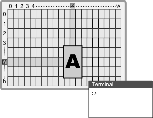
Each backend supported by AppCUI has the following properties:
- Output rendering - each character from the AppCUI surface is displayed on the screen
- Input reading - the backend is capable of identifying keyboard and mouse events and converting them to internal AppCUI events
- Clipboard support - the backend interacts with the OS and provides functionality for Copy / Cut / Paste using OS APIs
The following backends are supported:
- Windows Console
- Windows VT (Virtual Terminal)
- NCurses
- Termios
- Web Terminal
- CrossTerm
Remarks: These types are available via appcui::backend::Type and can be used to initialize an application.
#![allow(unused)]
fn main() {
let mut a = App::with_backend(appcui::backend::/*type*/).build()?;
}
where the appcui::backend::Type enum is defined as follows:
#![allow(unused)]
fn main() {
pub enum Type {
    #[cfg(target_os = "windows")]
    WindowsConsole,
    #[cfg(target_os = "windows")]
    WindowsVT,
    #[cfg(target_family = "unix")]
    Termios,
    #[cfg(target_os = "linux")]
    NcursesTerminal,
    #[cfg(target_arch = "wasm32")]
    WebTerminal,
    CrossTerm
}
}
OS Support
| OS | Windows Console | Windows VT | NCurses | Termios | Web Terminal | CrossTerm |
|---|---|---|---|---|---|---|
| Windows | Yes | Yes | - | - | - | Yes |
| Linux | - | - | Yes | Yes | - | Yes |
| macOS | - | - | Yes | Yes | - | Yes |
| Web | - | - | - | - | Yes | - |
Display
Each backend comes with different support related to what can be displayed on the screen.
- 16 colors - support for 16 colors for foreground and background
- True colors - support for true colors (24-bit) for foreground and background
- UTF-8 - support for UTF-8 encoding
- Ascii - support for ASCII encoding
- WTF-16 - support for WTF-16 encoding (a subset of UTF-8) - only for Windows
- Cursor - support for cursor
- Cursor Blinking - support for cursor blinking
| Display | Windows Console | Windows VT | NCurses | Termios | Web Terminal | CrossTerm |
|---|---|---|---|---|---|---|
| 16 colors | Yes | Yes | Yes | Yes | Yes | Yes |
| True colors | - | Yes | - | Yes | Yes | Yes |
| ASCII | Yes | Yes | Yes | Yes | Yes | Yes |
| WTF-16 | Yes | Yes | Yes | Yes | Yes | Yes |
| UTF-8 | - | Yes | - | Yes | Yes | Yes |
| Cursor | Yes | Yes | Yes | - | Yes | Yes |
| Cursor Blinking | Yes | Yes | - | - | - | Yes |
Remarks:
- True colors support requires the feature
TRUE_COLORSto be enabled (keep in mind that by doing this you also increase the size of your Color and Character structures - if you don't need this or your terminal does not support true colors, you will only allocate additional space that will not be used). - Cursor blinking is not supported by all terminals (AppCUI can show or hide the cursor, but it is the terminal's job to make it blink).
In terms of the output method, each backend uses a different approach:
| Backend | Output method |
|---|---|
| Windows Console | Direct output via Windows API |
| Windows VT | ANSI sequences |
| NCurses | Direct output via NCurses API. NCurses must be installed on the system. |
| Termios | ANSI sequences |
| Web Terminal | HTML elements and browser APIs |
| CrossTerm | ANSI sequences (directly via the crossterm crate API) |
Character Attributes
Besides background and foreground colors, the following character attributes are supported:
| Display | Windows Console | Windows VT | NCurses | Termios | Web Terminal | CrossTerm |
|---|---|---|---|---|---|---|
| Bold | - | Yes | Yes | Yes | - | Yes |
| Underline | Yes | Yes | Yes | Yes | Yes | Yes |
| Italic | - | Yes | - | Yes | - | Yes |
| Curly Underline | - | Yes | - | Yes | - | Yes |
| Double Underline | - | Yes | - | Yes | - | Yes |
| Dotted Underline | - | Yes | - | Yes | - | Yes |
| Strike Through | - | Yes | - | Yes | - | Yes |
Input
Capturing the input implies the following capabilities from any backend:
- identifying keyboard events
- identifying keyboard combinations such as
Alt+Key orCtrl+Key orAlt+Ctrl+Key - Identifying that the state of the
Shift,CtrlandAltkeys has changed (pressed or released) - Identifying mouse events
- Identifying mouse combinations such as
Alt+Mouse orCtrl+Mouse orAlt+Ctrl+Mouse - Identifying mouse drag / move events
- Identifying mouse wheel events
Keyboard
| Keys | Windows Console | Windows VT | NCurses | Termios | Web Terminal | CrossTerm |
|---|---|---|---|---|---|---|
| Alt+Key | Yes | Yes | Yes | - | Yes | Yes |
| Shift+Key | Yes | Yes | Yes | - | Yes | Yes |
| Ctrl+Key | Yes | Yes | Yes | - | Yes | Yes |
| Alt+Shift+Key | Yes | Yes | - | - | - | - |
| Ctrl+Shift+Key | Yes | Yes | - | - | - | - |
| Ctrl+Alt+Key | Yes | Yes | - | - | - | - |
| Ctrl+Alt+Shift+Key | Yes | Yes | - | - | - | - |
| Alt pressed | Yes | Yes | - | - | - | - |
| Shift pressed | Yes | Yes | - | - | - | - |
| Ctrl pressed | Yes | Yes | - | - | - | - |
Mouse
| Mouse events | Windows Console | Windows VT | NCurses | Termios | Web Terminal | CrossTerm |
|---|---|---|---|---|---|---|
| Click | Yes | Yes | Yes | Yes | Yes | Yes |
| Move & Drag | Yes | Yes | Yes | Yes | Yes | Yes |
| Wheel | Yes | Yes | Yes | - | Yes | Yes |
Remarks: Input support is highly dependent on the terminal and the OS. AppCUI uses the following approach to intercept input:
| Backend | Approach |
|---|---|
| Windows Console | Read the input directly from the console via Windows API |
| Windows VT | Read the input directly from the console via Windows API |
| NCurses | Read the input directly from the console via NCurses API. NCurses must be installed on the system. |
| Termios | Read the input directly from the console via Termios API |
| Web Terminal | Read the input directly from the browser |
| CrossTerm | Read the input via the crossterm crate API |
System events
System events are events that are not related to the keyboard or mouse, but are related to the system and indicate that the console has been changed in some way.
| Events | Windows Console | Windows VT | NCurses | Termios | Web Terminal | CrossTerm |
|---|---|---|---|---|---|---|
| Console Resize | Yes | Yes | Yes | - | Yes | Yes |
| Console Closed | Yes | Yes | - | - | Yes | - |
Other capabilities
| Capabilities | Windows Console | Windows VT | NCurses | Termios | Web Terminal | CrossTerm |
|---|---|---|---|---|---|---|
| Set dimension | Yes | Yes | - | - | Yes | - |
| Set title | Yes | Yes | - | - | Yes | - |
| Restore screen | Yes | Yes | - | - | N/A | - |
N/A(not applicable) means that there is no original screen prior to the app execution so there is nothing to restore.
Clipboard
AppCUI provides clipboard support for copying and pasting text. The clipboard functionality is available on the following backends:
| Backend | Clipboard Support | API Used |
|---|---|---|
| Windows Console | Yes | Windows API |
| Windows VT | Yes | Windows API |
| NCurses | Yes | via copypasta crate |
| Termios | - | - |
| Web Terminal | Yes | Browser API |
| CrossTerm | Yes | via copypasta crate (Linux/macOS) or Windows API (Windows) |
Defaults
By default, when initializing an App object via App::new(), the following backend will be used:
| OS | Default backend | Other available backends |
|---|---|---|
| Windows | Windows Console | Windows VT, CrossTerm |
| Linux | NCurses | CrossTerm |
| macOS | Termios | NCurses, CrossTerm |
Windows Console
This backend relies on the following Windows APIs for various console-related tasks:
| API | Task(s) |
|---|---|
GetStdHandle(...) | To gain access to stdin and stdout |
GetConsoleScreenBufferInfo(...) | To get information about console size and position |
GetConsoleMode(...) | To get information about the current mode of the console |
WriteConsoleOutputW(...) | To write a buffer of characters directly into the console |
ReadConsoleInputW(...) | To read input events (keys, mouse, resizing, console closing) |
SetConsoleTitleW(...) | To set the title (caption) of the console |
SetConsoleScreenBufferSize(...) | To resize the console to a specific width and height |
SetConsoleCursorInfo(...) | To move the caret (cursor) into a specific position of the console |
For clipboard based operations, it relies on the following APIs:
- OpenClipboard
- EmptyClipboard
- CloseClipboard
- SetClipboardData
- GetClipboardData
- IsClipboardFormatAvailable
Remarks: For this type of backend to work, there is no need for a 3rd party crate (everything is done via FFI and direct API calls).
Limitations
Windows uses WTF-16 (which does not encode the full range of Unicode characters). While Unicode surrogates are supported, depending on the version of Windows, some characters (usually with a code higher than 0xFFFF) might not be displayed accurately or may cause the line they appear on to shift left.
Windows VT (Virtual Terminal)
This backend is based on both Windows API and VT100 escape sequences.
For clipboard based operations, it relies on the following APIs:
- OpenClipboard
- EmptyClipboard
- CloseClipboard
- SetClipboardData
- GetClipboardData
- IsClipboardFormatAvailable
Input (mouse / keyboard / console resize) is handled by the following APIs:
| API | Task(s) |
|---|---|
GetStdHandle(...) | To gain access to stdin and stdout |
GetConsoleScreenBufferInfo(...) | To get information about console size and position |
GetConsoleMode(...) | To get information about the current mode of the console |
ReadConsoleInputW(...) | To read input events (keys, mouse, resizing, console closing) |
SetConsoleTitleW(...) | To set the title (caption) of the console |
SetConsoleScreenBufferSize(...) | To resize the console to a specific width and height |
The output is done via VT100 escape sequences (please refer to Wikipedia for more information). This backend supports true colors (24 bits per pixel) and wide characters (2 bytes per character) but it depends on the Windows version to support them.
Limitations:
Because of the way VT100 escape sequences work, the backend is much slower than a regular Windows Console backend (that renders the output directly into the console). If speed is a priority, it is recommended to use the Windows Console backend instead.
Keep in mind that the speed limitation can be mitigated by using a 3rd-party terminal that uses the GPU to render the output, such as:
Usage
Windows VT is not the default backend on Windows. To use it, you need to specify the WindowsVT backend type when creating the application:
use appcui::prelude::*;

fn main() -> Result<(), appcui::system::Error> {
    let app = App::with_backend(appcui::backend::Type::WindowsVT).build()?;
    // build your application here
    Ok(())
}
Furthermore, if you also want to use true colors, you will need to enable the TRUE_COLORS feature when building the application:
[dependencies]
appcui = { version = "*", features = ["TRUE_COLORS"] }
Ncurses Terminal
Installing ncurses Library
To use the ncurses terminal library in your Rust project, you need to install the ncurses library on your system. Here's how you can install it on different platforms:
Ubuntu/Debian
sudo apt-get install libncurses5-dev libncursesw5-dev
macOS
brew install ncurses
Limitations of ncurses
While ncurses is a powerful terminal library, it does have some limitations to be aware of:
- ncurses is primarily designed for ASCII characters and may not handle wide characters properly.
- Wide characters, such as Unicode characters, may not be displayed correctly or may cause unexpected behavior.
- Some terminal emulators may not fully support all ncurses features, leading to inconsistent behavior across different terminals.
It's important to consider these limitations when using ncurses in your Rust project, especially if you need to work with wide characters or require consistent behavior across different terminals.
AppCUI uses ncursesw for wide character support in order to render multiple Unicode characters.
Termios
Summary
Termios is a low-level library for terminal manipulation on UNIX systems. It is utilized in AppCUI to handle terminal input and output on macOS.
Implementation Details
When a TermiosTerminal instance is initialized, the terminal is configured to operate in raw mode. This mode allows the application to capture individual key press events directly, bypassing line buffering and other default terminal behaviors. To facilitate advanced input handling, a specific byte sequence is sent to stdout to enable mouse events, allowing AppCUI to handle mouse interactions.
To adapt to dynamic terminal conditions, a signal handler is set up to monitor window resize events (SIGWINCH). This ensures that the terminal layout is updated appropriately when the terminal window's dimensions change.
At the lowest level, the implementation involves reading one or more bytes directly from stdin. This is performed using a blocking read operation on a separate thread to avoid interfering with the application's main execution flow. These bytes are then interpreted into a SystemEvent, which is dispatched to the runtime manager for further processing.
Limitations
- Screen flickering: Screen updates may cause flickering because the screen content is not flushed all at once. We have not yet found a solution for this issue.
- Key Combination Limitations: Certain key combinations on macOS cannot be uniquely identified due to limitations in the terminal's input byte encoding. For example:
Enter,Command + Enter,Option + Enter, andControl + Enterall produce the same byte sequenceControl + HandControl + Backspaceproduce conflicting byte sequences
TODO
The following features are missing from the Termios Terminal implementation:
- Text Styling: Support for
CharFlags(bold, italic, underlined characters) - Key Mapping: Some keys and key combinations are either unmapped or incorrectly mapped
- Cursor Visibility: Hiding the cursor is not supported
Web Terminal
Summary
The Web Terminal allows AppCUI applications to run in a web browser using WebAssembly, WebGL for rendering, and JavaScript for event handling.
Prerequisites
Before you begin, make sure you have:
- Rust Toolchain:
[!IMPORTANT] Use the nightly toolchain, as this project requires unstable features.
- wasm-bindgen:
Add the following dependency in your
Cargo.toml:wasm-bindgen = { version = "0.2" } - wasm-pack: Install wasm-pack for building your WebAssembly package.
- A Web Server:
Use the provided
server.pybelow or any static server to serve your files.[!WARNING] If using threads, make sure to serve all your files in browser with these headers:
Cross-Origin-Opener-Policy: "same-origin"
Cross-Origin-Embedder-Policy: "require-corp"
Setup
1. Configure Rust for WebAssembly
Create or update your .cargo/config.toml to include the following target configuration:
[target.wasm32-unknown-unknown]
rustflags = [
    "-C", "target-feature=+atomics,+bulk-memory,+mutable-globals"
]

[unstable]
build-std = ["panic_abort", "std"]
This configuration enables atomic operations, bulk memory, and mutable globals on the wasm32-unknown-unknown target, and ensures that the build uses the required unstable std features.
2. Create a Library Package
Ensure your Rust project is set up as a library. In your library entry point, add the wasm-bindgen start macro to export your start function:
#![allow(unused)]
fn main() {
use wasm_bindgen::prelude::wasm_bindgen;

#[wasm_bindgen(start)]
pub fn start() {
    // your code
}
}
Make sure that your library depends on the appcui crate and that you use its features for rendering and input handling.
Building the Package
Use wasm-pack to compile the project for the web target:
wasm-pack build --target web
Ensure that your Cargo project has the target wasm32-unknown-unknown installed. You can do so with:
rustup target add wasm32-unknown-unknown
Example HTML File
Below is an example index.html that sets up the canvases and loads the compiled WebAssembly package.
Index.html Example
<!DOCTYPE html>
<html>
<head>
  <meta charset="utf-8">
  <title>Web Terminal Test</title>
  <style>
    html, body {
      margin: 0;
      padding: 0;
      overflow: hidden;
    }
    #canvas, #textCanvas {
      position: absolute;
      top: 0;
      left: 0;
      width: 100%;
      height: 100%;
      display: block;
      background: transparent;
    }
    #textCanvas {
      pointer-events: none;
    }
    .config {
      display: none;
    }
  </style>
</head>
<body>
  <canvas id="canvas"></canvas>
  <canvas id="textCanvas"></canvas>

  <div class="config">
    <span id="terminal-cols">211</span>
    <span id="terminal-rows">56</span>
    <span id="terminal-font">Consolas Mono, monospace</span>
    <span id="terminal-font-size">20</span>
  </div>

  <script type="module">
    console.log("SharedArrayBuffer available:", typeof SharedArrayBuffer !== "undefined");
    import init, * as wasm from "./pkg/your_application.js"; // Replace 'your_application' with your package name

    init({
      module: new URL("./pkg/your_application.wasm", import.meta.url), // Replace 'your_application'
      memory: new WebAssembly.Memory({ initial: 200, maximum: 16384, shared: true })
    }).then(async () => {
      console.log("WASM module initialized");
      // Example: Initialize a thread pool if your application uses threads
      // await wasm.initThreadPool(navigator.hardwareConcurrency);

      if (wasm.start) { // Ensure your exported start function is called
        wasm.start();
        console.log("WASM start function called");
      }
    });
  </script>
</body>
</html>
This file:
- Creates two canvases: one for WebGL background rendering (
canvas) and one for text rendering (textCanvas). - Includes a hidden configuration section for terminal settings (cols, rows, font, font size). These values are read by the
WebTerminalinappcui. - Imports the WebAssembly package and initializes it. Make sure to replace
your_applicationwith the actual name of your wasm package.
Running the Server
A simple Python server for hosting the application:
Python Server Example
import http.server
import socketserver
import os

class CustomHandler(http.server.SimpleHTTPRequestHandler):
    def send_head(self):
        path = self.translate_path(self.path)
        if os.path.isfile(path):
            f = open(path, 'rb')
            fs = os.fstat(f.fileno())
            self.send_response(200)
            if path.endswith('.js'):
                mime_type = "application/javascript"
            elif path.endswith('.wasm'):
                mime_type = "application/wasm"
            else:
                mime_type = "text/html"
            self.send_header("Content-Type", mime_type)
            self.send_header("Content-Length", str(fs.st_size))
            self.send_header("Cross-Origin-Opener-Policy", "same-origin")
            self.send_header("Cross-Origin-Embedder-Policy", "require-corp")
            self.end_headers()
            return f
        return super().send_head()

    def do_GET(self):
        f = self.send_head()
        if f:
            try:
                self.wfile.write(f.read())
            finally:
                f.close()

PORT = 4000
with socketserver.TCPServer(("", PORT), CustomHandler) as httpd:
    print(f"Serving on port {PORT}")
    httpd.serve_forever()
To run the example Python server (assuming you are in the directory containing server.py and your index.html and pkg folder):
python server.py
Then navigate to http://localhost:4000/index.html (or the appropriate address and port for your server) in your browser.
Implementation Details
The WebTerminal uses two HTML canvas elements:
- One canvas (
canvas) is used for WebGL rendering of cell backgrounds. This allows for efficient rendering of colored backgrounds. - A second canvas (
textCanvas) is overlaid on top for rendering text characters. - Event handling (keyboard, mouse) is done via JavaScript event listeners attached to the document, which then forward events to the Rust/WASM module.
- Configuration for terminal dimensions, font, etc., is typically read from hidden HTML elements on the page.
Limitations
- Performance can vary depending on the browser and the complexity of the UI.
- Threading support relies on
SharedArrayBuffer, which requires specific HTTP headers (Cross-Origin-Opener-Policy: "same-origin"andCross-Origin-Embedder-Policy: "require-corp") to be set by the web server. - Clipboard integration uses the browser's asynchronous clipboard API.
CrossTerm
This backend relies on the crossterm crate to provide a terminal abstraction layer. It supports various terminal features such as mouse input, keyboard input, and screen manipulation.
For clipboard operations, it uses the copypasta crate's built-in clipboard functionality for UNIX-like systems, and the Windows API on Windows.
Limitations
Some flickering issues may be seen when using this backend (in particular for old terminals). This is due to the way crossterm handles terminal output and input. If you experience flickering, consider using a different backend or adjusting your terminal settings.
Usage
This backend is not enabled by default. To enable it, you need to compile your application with the feature CROSSTERM enabled in your Cargo.toml file:
[dependencies]
appcui = { version = "*", features = ["CROSSTERM"] }
Then, you can create your application using the App::with_backend method, specifying the Type::CrossTerm backend:
use appcui::prelude::*;

fn main() -> Result<(), appcui::system::Error> {
    let app = App::with_backend(appcui::backend::Type::CrossTerm).build()?;
    // build your application here
    Ok(())
}
Controls
All controls from AppCUI follow a tree-like organization: a control has a parent control and may have multiple child controls.
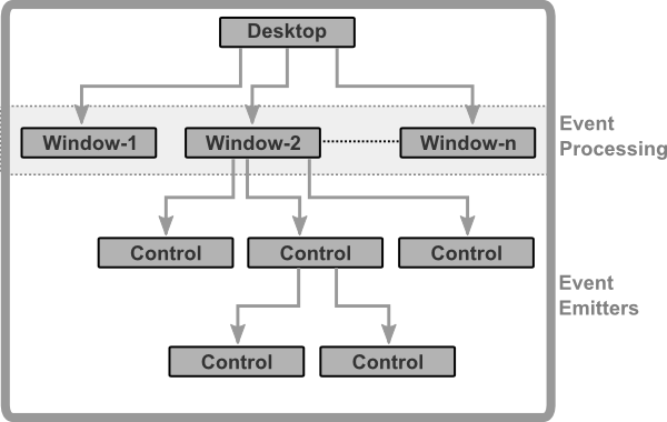
Remarks:
- There is only one Desktop control. AppCUI provides a default one, but a custom desktop can be created as well.
- A Desktop control can have one or more windows.
- All events emitted by any control are processed at window level.
- A control may contain other child controls.
Every control has a set of common characteristics:
Layout(how it is positioned relative to its parent). The only exception in this case is the Desktop control, which always takes the entire terminal space. More details are in the Layout section.Visibility(a control can be visible or not). The only exception is the Desktop control that will always be visible. A hidden control does not receive any input events and it is not drawn.Enabled(a control can be enabled or not). The only exceptions are the Desktop and Window controls, which are always enabled. If a control is not enabled, it will not receive any input events (key presses or mouse events), but it will still be drawn.HotKey(a combination of keys usually in the following form:Alt+<Letter|Number> that will automatically move the focus to the current control and execute a default action for it—for example, for a checkbox, pressing that combination will check or uncheck the checkbox).
Besides this, a set of commonly available methods exists for all controls. These methods allow changing or accessing some attributes like visibility, layout, hotkeys, etc. More details can be found in the Common methods for all Controls section.
Layout
AppCUI supports the following layout modes:
-
Absolute - The control is positioned using an explicit top-left coordinate (x, y) and a fixed size (width, height). (Example:
x = 10, y = 5, width = 20, height = 3) -
Pivot - The control is positioned relative to a reference point (x, y) which acts as a pivot. The pivot determines how the control’s rectangle is placed around that point (e.g., TopLeft, Center, BottomRight). (Example:
pivot = Center means (x, y) is the center of the control) -
Dock - The control is attached to one of its parent’s edges (Left, Right, Top, Bottom) or fills the remaining space (Fill). The control stretches along the opposite axis to fully occupy the available space. (Example:
Dock::Top → control fills width and stays at the top of the parent) -
Aligned - The control is aligned relative to its parent’s bounding box, using one of nine alignment positions: TopLeft, TopCenter, TopRight, CenterLeft, Center, CenterRight, BottomLeft, BottomCenter, BottomRight. (Example:
Align::BottomRight → control is placed at the bottom-right corner of the parent with its own size) -
Anchored - The control is attached to one or more of the parent’s margins (left, right, top, bottom). Anchors determine how the control resizes when the parent changes size:
- If both left and right anchors are set → control’s width is adjusted dynamically.
- If both top and bottom anchors are set → control’s height is adjusted dynamically.
Creating a layout
You can create a layout using the following 3 methods:
1. Using the Layout class
This is the simplest and fastest way to create a layout, useful for scenarios where you need a basic configuration:
// An absolute layout with:
// - x = 10
// - y = 20
// - width = 30
// - height = 40
let l = Layout::absolute(10, 20, 30, 40);
2. Using the LayoutBuilder class
LayoutBuilder gives you full access to the layout system, including support for percentages and combining various layout parameters:
// A pivot layout with:
// - x = 10
// - y position at 50% of the parent's height
// - width = 12 characters
// - height = 25% of the parent's height
// - pivot set to Center (the control is centered around the (x, y) point)
let l = LayoutBuilder::new()
    .x(10)
    .y(0.5)          // 50% of parent height
    .width(12)       // absolute width
    .height(0.25)    // 25% of parent height
    .pivot(Pivot::Center)
    .build();
3. Using the layout! procedural macro
The layout! macro provides the same capabilities as LayoutBuilder in a more concise and readable way:
let l = layout!("x:10, y:50%, w:12, h:25%, p:center");
The Layout Structure
The Layout struct is the primary type used to define how controls are positioned and sized within their parent containers in AppCUI. It serves as a wrapper around layout format information and provides the main interface for specifying control layouts.
The Layout struct provides several methods that can be used to quickly create a layout (for the most common use cases).
-
absolute(...) - The control is positioned using explicit coordinates (
x,y) for the top-left corner and fixed dimensions (width,height).#![allow(unused)] fn main() { use appcui::prelude::*; // Creates a control positioned at (8, 5) with a size of 33x6 characters. let layout = Layout::absolute(8, 5, 33, 6); } -
pivot(...) - The control is positioned relative to a reference point (
x,y) and a [Pivot] value, which determines which part of the control attaches to that point (e.g., top-left, center, bottom-right).#![allow(unused)] fn main() { use appcui::prelude::*; // Creates a control centered around the point (10, 10) // with a size of 6x6 characters. The control will start from // the point (7,7), where 7 = 10 - 6/2, and will expand until // the point (13,13), where 13 = 10 + 6/2. let layout = Layout::pivot(10, 10, 6, 6, Pivot::Center); } -
fill()
The control automatically resizes to completely fill its parent container.#![allow(unused)] fn main() { use appcui::prelude::*; // Creates a layout that occupies the entire parent container. let layout = Layout::fill(); } -
aligned(...)
The control is aligned relative to the parent using an [Alignment] value (e.g., top-left, center, bottom-right). Its size remains fixed.#![allow(unused)] fn main() { use appcui::prelude::*; // Creates a control aligned to the bottom-right corner of // the parent with a fixed size of 20x5 characters. let layout = Layout::aligned(Alignment::BottomRight, 20, 5); }
Remarks:
- while the Layout can work with percentage values, the methods from the Layout struct only support absolute values. If percentages are needed use LayoutBuilder instead.
- not all possible layouts can be created with the methods from the Layout struct. For example, using various anchors or different dock method are not possible. In this case, use LayoutBuilder or the layout! proc-macro instead.
The LayoutBuilder object
The LayoutBuilder is a powerful builder pattern implementation that provides a fluent API for creating complex layout configurations in AppCUI. It allows you to define how controls are positioned and sized within their parent containers using various layout strategies.
Methods
The following methods are available for the LayoutBuilder object:
| Method | Type | Description |
|---|---|---|
x(value) | numerical or float | Sets horizontal position (absolute or percentage) |
y(value) | numerical or float | Sets vertical position (absolute or percentage) |
width(value) | numerical or float | Sets control width (absolute or percentage) |
height(value) | numerical or float | Sets control height (absolute or percentage) |
alignment(align) | Alignment | Sets alignment within parent |
pivot(pivot) | Pivot | Sets pivot point for reference-based positioning |
dock(dock) | Dock | Sets docking behavior |
left_anchor(distance) | numerical or float | Distance from parent's left edge |
right_anchor(distance) | numerical or float | Distance from parent's right edge |
top_anchor(distance) | numerical or float | Distance from parent's top edge |
bottom_anchor(distance) | numerical or float | Distance from parent's bottom edge |
Layout Modes
The LayoutBuilder supports several distinct layout modes, each optimized for different use cases:
1. Absolute Layout
Position controls at fixed (top-left) coordinates with explicit dimensions (width and height). The following parameters are required: x, y. If width and height are not provided they are considered to be 100% of the parent control.
#![allow(unused)]
fn main() {
use appcui::prelude::*;

let layout = LayoutBuilder::new()
    .x(10)
    .y(5)
    .width(20)
    .height(5)
    .build();
}
2. Pivot Layout
Position controls relative to a reference point, with a pivot point that determines how the control is positioned relative to a given reference point (x, y).
Unlike absolute positioning (which always treats (x, y) as the top-left corner), a pivot allows (x, y) to represent any logical point of the control (e.g., center, bottom-right).
The following parameters are required: x, y. If width and height are not provided they are considered to be 100% of the parent control. The pivot parameter is optional (if not provided it is considered to be TopLeft)
For example:
Pivot::TopLeft→(x, y)will be the top-left corner of the control.Pivot::TopCenter→(x, y)will align with the middle of the top edge.Pivot::Center→(x, y)will be the center of the control.Pivot::BottomRight→(x, y)will be the bottom-right corner.
The possible pivot values are defined by the Pivot enum:
Pivot::TopLeft– Align the top-left corner.Pivot::TopCenter– Align the top edge centered horizontally.Pivot::TopRight– Align the top-right corner.Pivot::CenterLeft– Align the left edge centered vertically.Pivot::Center– Align the center of the control.Pivot::CenterRight– Align the right edge centered vertically.Pivot::BottomLeft– Align the bottom-left corner.Pivot::BottomCenter– Align the bottom edge centered horizontally.Pivot::BottomRight– Align the bottom-right corner.
#![allow(unused)]
fn main() {
use appcui::prelude::*;

// Center of control at position (50, 20)
let layout = LayoutBuilder::new()
    .x(50)
    .y(20)
    .width(20)
    .height(10)
    .pivot(Pivot::Center)
    .build();
}
3. Alignment Layout
Position controls at predefined locations within the parent container (such as top-left, center, or bottom-right) while keeping its size fixed.
The possible alignment values are defined by the Alignment enum:
Alignment::TopLeft– Control is positioned at the top-left corner of the parent.Alignment::TopCenter– Control is horizontally centered at the top edge.Alignment::TopRight– Control is positioned at the top-right corner.Alignment::CenterLeft– Control is vertically centered on the left edge.Alignment::Center– Control is centered both horizontally and vertically.Alignment::CenterRight– Control is vertically centered on the right edge.Alignment::BottomLeft– Control is positioned at the bottom-left corner.Alignment::BottomCenter- Control is horizontally centered at the bottom edge.Alignment::BottomRight– Control is positioned at the bottom-right corner.
#![allow(unused)]
fn main() {
use appcui::prelude::*;

// Control aligned to top-left corner
let layout = LayoutBuilder::new()
    .alignment(Alignment::TopLeft)
    .width(20)
    .height(5)
    .build();

// Control centered in parent
let layout = LayoutBuilder::new()
    .alignment(Alignment::Center)
    .width(30)
    .height(10)
    .build();
}
4. Dock Layout
Attach controls to edges of the parent container with automatic stretching. The control is resized automatically when the parent is resized.
The possible docking options are defined by the Dock enum:
Dock::Left– Control is attached to the left edge of the parent and stretches vertically.Dock::Right– Control is attached to the right edge of the parent and stretches vertically.Dock::Top– Control is attached to the top edge of the parent and stretches horizontally.Dock::Bottom– Control is attached to the bottom edge of the parent and stretches horizontally.Dock::Fill– Control fills the entire remaining space of the parent.
#![allow(unused)]
fn main() {
use appcui::prelude::*;

// Dock to left side, stretch vertically
let layout = LayoutBuilder::new()
    .dock(Dock::Left)
    .width(20)  // width respected, height stretches
    .build();

// Fill entire parent area
let layout = LayoutBuilder::new()
    .dock(Dock::Fill)
    .build();
}
5. Anchor Layout
Create responsive layouts that automatically adjust when the parent resizes based on the following anchors:
left_anchor(distance)– Distance from the parent's left edge (absolute or percentage).right_anchor(distance)– Distance from the parent's right edge (absolute or percentage).top_anchor(distance)– Distance from the parent's top edge (absolute or percentage).bottom_anchor(distance)– Distance from the parent's bottom edge (absolute or percentage).
#![allow(unused)]
fn main() {
use appcui::prelude::*;

// Anchored to all edges - control stretches with parent
let layout = LayoutBuilder::new()
    .left_anchor(10)
    .right_anchor(10)
    .top_anchor(5)
    .bottom_anchor(5)
    .build();

// Mixed anchoring - fixed width, flexible height
let layout = LayoutBuilder::new()
    .left_anchor(5)
    .top_anchor(2)
    .bottom_anchor(2)
    .width(30)
    .build();
}
Value Types
The LayoutBuilder accepts flexible value types for positions and dimensions:
Absolute Values
Use integer types for fixed positions/sizes in character cells:
#![allow(unused)]
fn main() {
let layout = LayoutBuilder::new()
    .x(10)        // 10 characters from left
    .width(20)    // 20 characters wide
}
Percentage Values
Use float values (0.0-1.0) for responsive sizing:
#![allow(unused)]
fn main() {
let layout = LayoutBuilder::new()
    .x(0.5)       // 50% of parent width from left
    .width(0.8)   // 80% of parent width
}
Negative Values
Anchors support negative values for positioning outside parent bounds:
#![allow(unused)]
fn main() {
let layout = LayoutBuilder::new()
    .left_anchor(-5)  // 5 characters to the left of parent
}
Advanced Examples
Responsive Side Panel
#![allow(unused)]
fn main() {
use appcui::prelude::*;

let sidebar = LayoutBuilder::new()
    .dock(Dock::Left)
    .width(0.25)  // 25% of parent width
    .build();
}
Centered Dialog with Fixed Size
#![allow(unused)]
fn main() {
use appcui::prelude::*;

let dialog = LayoutBuilder::new()
    .alignment(Alignment::Center)
    .width(50)
    .height(20)
    .build();
}
Status Bar with Margin
#![allow(unused)]
fn main() {
use appcui::prelude::*;

let status_bar = LayoutBuilder::new()
    .left_anchor(1)
    .right_anchor(1)
    .bottom_anchor(1)
    .height(1)
    .build();
}
Complex Multi-Anchor Layout
#![allow(unused)]
fn main() {
use appcui::prelude::*;

let content_area = LayoutBuilder::new()
    .left_anchor(2)       // Fixed left margin
    .right_anchor(0.1)    // 10% right margin
    .top_anchor(5)        // Fixed top margin
    .bottom_anchor(3)     // Fixed bottom margin
    .build();
}
Validation and Error Handling
The build() method performs validation and will panic if conflicting layout options are detected:
- Using
dock()withalignment()orpivot() - Using
alignment()with anchors - Conflicting size specifications
The try_build() method is similar to build(), but it returns a Result instead of a Layout.
If the layout is invalid, an error is returned explaining the issue. This method is useful
when you want to build a layout dynamically and want to check for errors.
#![allow(unused)]
fn main() {
use appcui::prelude::*;

// invalid layout - Dock and Alignment can not be used together
if let Ok(layout) = LayoutBuilder::new()
    .dock(Dock::Fill)
    .alignment(Alignment::Center)
    .try_build()
{
    // valid layout
} else {
    // invalid layout
}
}
The layout! proc-macro
The layout! proc-macro is used to create a layout from a string. The string describes a layout rule that base on the following format:
"parameter:value , parameter:value , ... parameter:value"
or
"parameter=value , parameter=value , ... parameter=value"
Where parameter refects the following LayoutBuilder method and can be one of the following:
| Parameter | Alias (short) | LayoutBuilder method | Value type | Description |
|---|---|---|---|---|
| x | .x(...) | numerical or percentage | "X" coordinate | |
| y | .y(...) | numerical or percentage | "Y" coordinate | |
| left | l | .left_anchor(...) | numerical or percentage | left anchor for the control (the space between parent left margin and control) |
| right | r | .right_anchor(...) | numerical or percentage | right anchor for the control (the space between parent right margin and control) |
| top | t | .top_anchor(...) | numerical or percentage | top anchor for the control (the space between parent top margin and control) |
| bottom | b | .bottom_anchor(...) | numerical or percentage | bottom anchor for the control (the space between parent bottom margin and control) |
| width | w | .width(...) | numerical or percentage | the width of the control |
| height | h | .height(...) | numerical or percentage | the height of the control |
| dock | d | .dock(...) | docking value | the way the entire control is docked on its parent |
| align | a | .alignment(...) | alignment value | the way the entire control is aligned against the margins of its parent |
| pivot | p | .pivot(...) | pivoting direction | the way the entire control is aligned against the point represented by (x,y) - the pivot |
Remarks
- Key aliases can be use to provide a shorter format for a layout. In other words, the following two formats are identical:
width:30,height:30andw:30,h:30 - A numerical value is represented by an integer (positive and negative) number between -30000 and 30000. Example:
x:100--> X will be 100. Using a value outside accepted interval ([-30000..30000]) will reject the layout. - A percentage value is represented by a floating value (positive and negative) succeded by the character
%between -300% and 300%. Example:x:12.75%--> X will be converted to a numerical value that is equal to the width of its parent multiplied by0.1275. Using a value outside accepted interval ([-300%..300%]) will reject the layout. Percentage values can be use to ensure that if a parent size is changed, its children change their size with it. - All layout parameters are case insensitive (meaning that 'left=10' and 'LEFT=10' have the same meaning)
Dock values
Dock values can be one of the following:
| Value | Alias | Enum variant | Description |
|---|---|---|---|
| left | l | Dock::Left | The control is docked at the left edge of its parent. The width parameter is required. |
| right | r | Dock::Right | The control is docked at the right edge of its parent. The width parameter is required. |
| top | t | Dock::Top | The control is docked at the top edge of its parent. The height parameter is required. |
| bottom | b | Dock::Bottom | The control is docked at the bottom edge of its parent. The height parameter is required. |
| fill | f | Dock::Fill | The control fills the entire space of its parent. |
Remarks:
- Dock value aliases can be use to provide a shorter format for a layout. In other words:
dock:leftis the same withdock:lord:l
Examples
-
Dock the control at the left edge of its parent and set its width to 10:
layout!("dock:left, width:10")or
layout!("d:l, w:10")or (via
LayoutBuildermethod)LayoutBuilder::new().dock(Dock::Left).width(10).build() -
Dock the control at the bottom edge of its parent and set its height to 20:
layout!("dock:bottom, height:20")or
layout!("d:b, h:20")or (via
LayoutBuildermethod)LayoutBuilder::new().dock(Dock::Bottom).height(20).build() -
Fill the entire space of its parent:
layout!("dock:fill")or
layout!("d:f")or (via
LayoutBuildermethod)LayoutBuilder::new().dock(Dock::Fill).build()or (via
Layoutstructure)Layout::fill()
Align values
|
|
|

Remarks:
- Align value aliases can be use to provide a shorter format for a layout. In other words:
dock:topleftis the same withalign:tloralign:ltora:tl
Pivot values
Pivot values have the same name as the align values, but they refer to the direction of width and height from a specific point (denoted by "X" and "Y" parameters). Pivot parameter is used to compute top-left and bottom-right corner of a control that is described using a (X,Y) point and a size (width, height). The following table ilustrate how this values are computed:
| Value | Alias | Top-Left corner | Bottom-Right corner |
|---|---|---|---|
| top-left | lefttop, tl, lt | (x,y) | (x+width,y+height) |
| top-center | top, t | (x-width/2,y) | (x+width/2,y+height) |
| top-right | righttop, tr, rt | (x-width,y) | (x,y+height) |
| center-right | right, r | (x-width,y-height/2) | (x,y+height/2) |
| bottom-right | rightbottom, br, rb | (x-width,y-height) | (x,y) |
| bottom-center | bottom, b | (x-width/2,y-height) | (x+width/2,y) |
| bottom-left | leftbottom, lb, bl | (x,y-height) | (x+width,y) |
| center-left | left, l | (x,y-height/2) | (x+width,y+height/2) |
| center | center, c | (x-width/2,y-height/2) | (x+width/2,y+height/2) |
Remarks:
- Align value aliases can be use to provide a shorter format for a layout. In other words:
align:centeris the same withalign:cora:c
Absolute position
This layout mode positions a control using absolute coordinates relative to its parent container.
Required parameters
xandymust be provided and represent the top-left corner of the control.
Optional parameters
widthandheightcan be provided to set the control's size. If not provided, they default to 1 character (unless a minimum width or height is enforced by the control).
To create a control using this mode, you can use the following syntax:
Layout::absolute(...)- requires all four parameters (does not support percentages).LayoutBuilder- and you will need to use thex(...),y(...)and optionallwidth(...)andheight(...)methods.layout!macro - and you will need to provide thex,yand optionallywidthandheightparameters.
Remarks:
- using
Layout::absolute(...)does not support percentages for any parameter (if these are needed, consider usingLayoutBuilderorlayout!procmacro) - Negative values for
xandyare allowed and will position the control outside the parent.
Visual Representation
Below is an example where a control is positioned with its top-left corner at coordinates (8, 5) and a size of 18×6 characters.
| Layout Description | Visual representation |
|---|---|
| A control positioned with its top-left corner at coordinates (8, 5) and a size of 18×6 characters |  |
Examples
-
Control positioned at
(8, 5), size30×6// using Layout class Layout::absolute(8, 5, 30, 6) // or using a LayoutBuilder: LayoutBuilder::new().x(8).y(5).width(30).height(6).build() // or using macro (with full-name parameters): layout!("x:8,y:5,width:30,height:6") // or using macro (with aliases): layout!("x:8,y:5,w:30,h:6") -
Control at
(4, 3), width =50%of parent, height =10// using a LayoutBuilder: LayoutBuilder::new().x(4).y(3).width(0.5).height(10).build() // or using macro (with full-name parameters): layout!("x:4,y:3,width:50%,height:10") // or using macro (with aliases) layout!("x:4,y:3,w:50%,h:10") -
Control positioned at
(25%, 50%)with height =8and the default width.// using a LayoutBuilder: LayoutBuilder::new().x(0.25).y(0.5).height(8).build() // or using macro (with full-name parameters): layout!("x:25%,y:50%,height:8") // or using macro (with aliases) layout!("x:25%,y:50%,h:8")
Positioning using a pivot
This mode positions a control relative to a reference point (x, y) and a specified pivot, which determines which part of the control aligns with that point. Unlike absolute layout, where (x, y) always represents the top-left corner, pivot layout allows more flexible positioning (e.g., centering, bottom-right alignment).
Required Parameters
xandydefine the reference point relative to the parent.pivotspecifies which part of the control aligns with(x, y). For example:Pivot::TopLeft→ (x, y) is the top-left corner.Pivot::Center→ (x, y) is the center of the control.Pivot::BottomRight→ (x, y) is the bottom-right corner.
Optional Parameters
widthandheightcan be provided to set the control's size. If not provided, they default to 1 character (unless a minimum width or height is enforced by the control).
To create a control using this mode, you can use the following syntax:
Layout::pivot(...)– explicit method (absolute values only).LayoutBuilder– using.x(),.y(),.width(),.height(), and.pivot()(supports percentages).layout!macro – usingx,y,porpivot, and optionallyw/widthand/orh/height(supports percentages).
Remarks
- using
Layout::pivot(...)does not support percentages for any parameter (if these are needed, consider usingLayoutBuilderorlayout!procmacro) - Negative values for
xandyare allowed and will position the control outside the parent.
Visual Representation
Here are some examples of how the layout will look like for different types of pivot positioning.
| Layout Description | Visual representation |
|---|---|
A control with TopLeft pivot positioned at (8, 5) with width = 33% of parent width and height = 6 characters |  |
A control with BottomRight pivot positioned at (30, 20) with width = 33% of parent width and height = 6 characters |  |
A control with Center pivot positioned at 50%, 50% of parent with width = 25 characters and height = 8 characters |  |
Examples
-
Center the control at
(50, 10), size =20×6// using Layout class Layout::pivot(50, 10, 20, 6, Pivot::Center) // or using LayoutBuilder LayoutBuilder::new().x(50) .y(10) .width(20) .height(6) .pivot(Pivot::Center) .build() // or using macro (with full-name parameters): layout!("x:50,y:10,width:20,height:6,pivot:center") // or using macro (with full-name parameters): layout!("x:50,y:10,w:20,h:6,p:c") -
Align bottom-right corner of the control at
(100, 50)with size25×8// using Layout class Layout::pivot(100, 50, 25, 8, Pivot::BottomRight) // or using LayoutBuilder LayoutBuilder::new().x(100) .y(50) .width(25) .height(8) .pivot(Pivot::BottomRight) .build() // or using macro (with full-name parameters): layout!("x:100,y:50,width:25,height:8,pivot:bottomright") // or using macro (with full-name parameters): layout!("x:100,y:50,w:25,h:6,p:br") -
Center at
25%width and50%height of parent with the width of20and default height// or using LayoutBuilder LayoutBuilder::new().x(0.25) .y(0.50) .width(20) .pivot(Pivot::Center) .build() // or using macro (with full-name parameters): layout!("x:25%,y:50%,width:20,pivot:center") // or using macro (with full-name parameters): layout!("x:25%,y:50%,w:20,p:c")
Dock Layout
This mode positions a control by docking it to one side of its parent container or making it fill the entire parent area. Docking is useful for creating resizable layouts that automatically adjust when the parent is resized.
Required parameters
dockmust be provided and specifies how the control is docked. Possible values from the Dock enum:Dock::Left– Dock to the left edge and stretch vertically.Dock::Right– Dock to the right edge and stretch vertically.Dock::Top– Dock to the top edge and stretch horizontally.Dock::Bottom– Dock to the bottom edge and stretch horizontally.Dock::Fill– Fill the entire parent container.
Optional parameters
- For
Dock::LeftandDock::Right, you can providewidthto set the control's width. If not provided it will be defaulted to1 character width(unless a minimum width is enforced by the control). The height will stretch automatically. - For
Dock::TopandDock::Bottom, you can provideheightto set the control's height. If not provided it will be defaulted to1 character height(unless a minimum height is enforced by the control). The width will stretch automatically.
To create a control using this mode, you can use the following syntax:
Layout::fill()- a short format for using theDock::Fillmode.LayoutBuilder- using.dock(Dock::...)and optionally.width()or.height().layout!macro - usingdockordparameter with valuesleft,right,top,bottom, orfill.
Remarks:
- For
Dock::Fill, usingwidthandheightare will invalidate the layout. - For
Dock::LeftandDock::Right, usingwidthparameter will invalidate the layout. - For
Dock::TopandDock::Bottom, usingheightparameter will invalidate the layout.
Visual Representation
Here are some examples of how the layout will look like for different types of docking.
| Layout Description | Visual representation |
|---|---|
A control that fills the entire parent container using Dock::Fill |  |
| A control docked to the left edge with 50% width, stretching vertically to fill the parent height |  |
| A control docked to the bottom edge with 10 characters height, stretching horizontally to fill the parent width |  |
Examples
-
Dock control to the left with fixed width
// using LayoutBuilder: LayoutBuilder::new().dock(Dock::Left).width(20).build() // or using macro: layout!("dock:left,width:20") // or using macro with aliases: layout!("d:l,w:20") -
Dock control to the bottom with height = 3
// using LayoutBuilder: LayoutBuilder::new().dock(Dock::Bottom).height(3).build() // or using macro: layout!("d:bottom,h:3") // or using macro with aliases: layout!("d:b,h:3") -
Fill the entire parent
// using Layout class:
Layout::fill()
// using LayoutBuilder:
LayoutBuilder::new().dock(Dock::Fill).build()
// or using macro:
layout!("dock:fill")
// or using macro with aliases:
layout!("d:f")
Aligned Layout
This mode positions a control relative to its parent container using predefined alignment positions, such as Top-Left, Center, or Bottom-Right. Unlike docking, alignment does not stretch the control; the control keeps its specified width and height.
Key Difference Between Dock and Alignment
- Dock stretches the control to fill space along one axis or completely (e.g.,
Dock::Leftstretches vertically). - Alignment keeps the control’s size fixed and positions it relative to the parent.
Required Parameters
alignmentmust be provided and specifies the position inside the parent. Possible values from theAlignmentenum:Alignment::TopLeft– Top-left corner.Alignment::TopCenter– Top edge, centered horizontally.Alignment::TopRight– Top-right corner.Alignment::CenterLeft– Left edge, centered vertically.Alignment::Center– Center of the parent.Alignment::CenterRight– Right edge, centered vertically.Alignment::BottomLeft– Bottom-left corner.Alignment::BottomCenter– Bottom edge, centered horizontally.Alignment::BottomRight– Bottom-right corner.
Optional Parameters
width– Control width (absolute or percentage of parent width).height– Control height (absolute or percentage of parent height).- If
widthorheightare not provided, they default to 1 character or the control's minimum size.
To create a control with an aligned layout you can use:
Layout::aligned(...)- and provide an alignament, a width and a height (in characters)LayoutBuilder– using.alignment(...), and optionally.width()and/or.height().layout!macro – usingalignoraparameter with values such astopleft/tl,bottom-right/br,center/c.
Remarks
- using
Layout::aligned(...)does not support percentages for any parameter (if these are needed, consider usingLayoutBuilderorlayout!procmacro)
Visual Representation
Here are some examples of how the layout will look like for different types of alignment.
| Layout Description | Visual representation |
|---|---|
A control with width = 20 characters, height = 50% of parent height, aligned in the center of the parent |  |
A control with width = 50% of parent width, height = 80% of parent height, aligned at the bottom left corner of the parent |  |
A control with width = 15 characters, height = 50% of parent height, aligned at the center-right edge of the parent |  |
Examples
-
Align a control of size
20x4at the center of its parent top edge// using Layout Layout::aligned(Alignment::TopCenter, 20, 4) // using LayoutBuilder LayoutBuilder::new().alignment(Alignment::TopCenter).width(20).height(4).build() // or using macro: layout!("alignment:top-center, width:20, height:4") // or using short aliases: layout!("a:tc,w:20,h:4") -
Align a control of size
15x3to the bottom-right corner of its parent// using Layout Layout::aligned(Alignment::BottomRight, 15, 3) // using LayoutBuilder LayoutBuilder::new().alignment(Alignment::BottomRight).width(15).height(3).build() // or using macro layout!("align:bottom-right, width:15, height:3") // or using short aliases layout!("a:br,w:15,h:3") -
Align a control of size
30x10to the center of the parent// using Layout Layout::aligned(Alignment::Center, 30, 10) // using LayoutBuilder LayoutBuilder::new().alignment(Alignment::Center).width(30).height(10).build() // or using macro layout!("align:center, width:30, height:10") // or using short aliases layout!("a:c,w:30,h:10")
Anchors
Anchors (left, right, top and bottom) represent the distance between the object and its parent margins. When one of the anchors is present, the dock key can not be used. Depending on the combination of anchors used, other keys may be unusable.
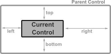
Corner anchors
Corner anchors are cases when the following combinations of anchors are used together (left and top), (left and bottom), (right and top) and (right and bottom).
When these combinations are used, x and y keys cannot be used. Using them will reject the layout.
If width or height are not specified, they will be defaulted to 1 character (unless there is a minimum width or minimum height specified for those controls - in which case that limit will be applied).
The combination of anchors also decides how (top,left) and (right,bottom) corners of a control are computed, as follows:
| Combination | Top-Left corner | Bottom-Right corner |
|---|---|---|
top and left | (left, top) | (left+width, top+height) |
top and right | (parentWidth-right-width, top) | (parentWidth-right, top+height) |
bottom and left | (left, parentHeight-bottom-height) | (left+width, parentHeight-bottom) |
bottom and right | (parentWidth-right-width, parentHeight-bottom-height) | (parentWidth-right, parentHeight-bottom) |
where:
parentWidthis the width of the parent controlparentHeightis the height of the parent control
Visual Representation
| Layout Description | Visual representation |
|---|---|
A control anchored to top and right margins with top = 10, right = 20, width = 50 characters and height = 20 characters | 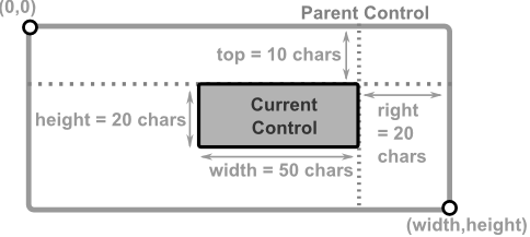 |
A control anchored to bottom and right margins with bottom = 10, right = 20, width = 33% of parent width and height = 10 characters | 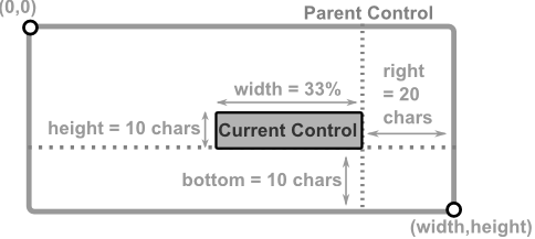 |
A control anchored to bottom and left margins with bottom = 10% of parent height, left = 50% of parent width, width = 25% of parent width and height = 10 characters | 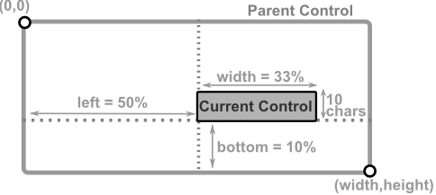 |
Examples
-
Anchor control to top and right with fixed dimensions
// using LayoutBuilder LayoutBuilder::new().top(10) .right(20) .width(50) .height(20) .build() // or using macro: layout!("top:10,right:20,width:50,height:20") // or using macro with aliases: layout!("t:10,r:20,w:50,h:20") -
Anchor control to bottom and right with percentage width
// using LayoutBuilder
LayoutBuilder::new().bottom(10)
                    .right(20)
                    .width(0.33)
                    .height(10)
                    .build()
// or using macro:
layout!("bottom:10,right:20,width:33%,height:10")
// or using macro with aliases:
layout!("b:10,r:20,w:33%,h:10")
Using Left-Right anchors
When left and right anchors are used together, there are several restrictions.
widthcan not be specified, as it will be deduced as the difference between parent's width and the sum of left and right anchors.xparameter cannot be specified, as it will be deduced from thepivotposition. For exameple:- if
pivotis set toTopLeft,BottomLeftorCenterLeft, thexcoordinate will be equal to theleftanchor value. - if
pivotis set toTopRight,BottomRightorCenterRight, thexcoordinate will be equal to the difference between parent's width and therightanchor value. - if
pivotis set toCenter,TopCenterorBottomCenterthexcoordinate will be equal to the midle of the space between theleftandrightanchors.
- if
heightparameter should be specified (if not specified it will be defaulted to1 character(unless a minimum height is specified for those controls - in which case that limit will be applied)yparameter must be specified, and it will be considered reference point for thepivotposition. For example:- if
pivotis set toTopLeft,TopCenter, orTopRight, theycoordinate will be equal to thetopanchor value. - if
pivotis set toBottomLeft,BottomCenter, orBottomRight, theycoordinate will be equal to the difference between parent's height and the sum betweenbottomanchor value and the control's height. - if
pivotis set toCenter,CenterLeftorCenterRightthe control will be centered on the Y-axes around theyparameter value.
- if
Visual Representation
| Layout Description | Visual representation |
|---|---|
A control with left and right anchors, positioned at y = 80% of parent height with height = 20 characters and bottom pivot | 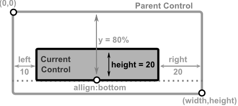 |
A control with left and right anchors, positioned at y = 50% of parent height with height = 100% of parent height and center pivot | 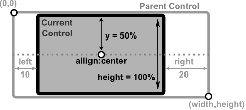 |
A control with left and right anchors, positioned at y = 0 with height = 50% of parent height and top pivot | 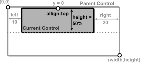 |
A control with left and right anchors, positioned at y = 80 of the parent height, with height = 50% of parent height, a fixed width that cannot be stretched (50 characters) and bottom-right pivot |  |
Examples
-
Left-Right anchors with bottom pivot positioning
// using LayoutBuilder LayoutBuilder::new().left(10) .right(20) .height(20) .y(0.8) .pivot(Pivot::Bottom) .build() // or using macro: layout!("left:10,right:20,height:20,y:80%,pivot:bottom") // or using macro with aliases: layout!("l:10,r:20,h:20,y:80%,p:b") -
Left-Right anchors with center pivot and full height
// using LayoutBuilder
LayoutBuilder::new().left(10)
                    .right(20)
                    .height(1.0)
                    .y(0.5)
                    .pivot(Pivot::Center)
                    .build()
// or using macro:
layout!("left:10,right:20,height:100%,y:50%,pivot:center")
// or using macro with aliases:
layout!("l:10,r:20,h:100%,y:50%,p:c")
Using Top-Bottom anchors
When top and bottom anchors are used together, there are several restrictions.
heightcan not be specified, as it will be deduced as the difference between parent's height and the sum of top and bottom anchors.yparameter cannot be specified, as it will be deduced from thepivotposition. For example:- if
pivotis set toTopLeft,TopCenter, orTopRight, theycoordinate will be equal to thetopanchor value. - if
pivotis set toBottomLeft,BottomCenter, orBottomRight, theycoordinate will be equal to the difference between parent's height and the sum of thebottomanchor value with the controls height. - if
pivotis set toCenter,CenterLeftorCenterRightthe control will be centered on the Y-axes around the midle of the space between the top and bottom anchors.
- if
widthparameter should be specified (if not specified it will be defaulted to1 character(unless a minimum width is specified for those controls - in which case that limit will be applied)xparameter must be specified, and it will be considered reference point for thepivotposition. For example:- if
pivotis set toTopLeft,CenterLeft, orBottomLeft, thexcoordinate will be equal to theleftanchor value. - if
pivotis set toTopRight,CenterRight, orBottomRight, thexcoordinate will be equal to the difference between parent's width and the sum of therightanchor value with the controls width. - if
pivotis set toCenter,TopCenterorBottomCenterthe control will be centered on the X-axes around the midle of the space between the left and right anchors.
- if
Visual Representation
| Layout Description | Visual representation |
|---|---|
A control with top and bottom anchors, positioned at x = 80% of parent width with width = 90 characters and right pivot | 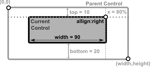 |
A control with top and bottom anchors, positioned at x = 50% of parent width with width = 100% of parent width and center pivot | 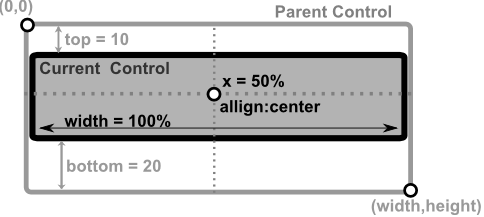 |
A control with top and bottom anchors, positioned at x = 0 with width = 50% of parent width and left pivot | 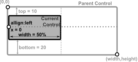 |
A control with top and bottom anchors, positioned at x = 70% of parent width with width = 50% of parent width, a fix height of 20 characters and a bottom-right pivot |  |
Examples
-
Top-Bottom anchors with right pivot positioning
// using LayoutBuilder LayoutBuilder::new().top(10) .bottom(20) .width(90) .x(0.8) .pivot(Pivot::Right) .build() // or using macro: layout!("top:10,bottom:20,width:90,x:80%,pivot:right") // or using macro with aliases: layout!("t:10,b:20,w:90,x:80%,p:r") -
Top-Bottom anchors with center pivot and full width
// using LayoutBuilder
LayoutBuilder::new().top(10)
                    .bottom(20)
                    .width(1.0)
                    .x(0.5)
                    .pivot(Pivot::Center)
                    .build()
// or using macro:
layout!("top:10,bottom:20,width:100%,x:50%,pivot:center")
// or using macro with aliases:
layout!("t:10,b:20,w:100%,x:50%,p:c")
3-margin anchors
When using 3 of the 4 anchors, the following keys cannot be used: x, y, align and dock. Using them will reject the layout.
The following table reflects these dependencies:
| Combination | Result |
|---|---|
left and top and rightor left and bottom and right | height optional (see remarks)width = parentWidth - (left+right) |
top and left and bottomor top and right and bottom | width optional (see remarks)height = parentHeight - (top+bottom) |
Remarks
- if
heightorwidthare not present and cannot be computed as a difference between two margins, they are defaulted to value 1. If limits are present (min Width or min Height) those limits are applied. This is usually useful for controls that have a fixed width or height (e.g. a button, a combobox).
The position of the control is also computed based on the combination of the 3 anchors selected, as shown in the next table:
| Combination | Top-Left corner | Bottom-Right corner |
|---|---|---|
left and top and right | (left, top) | (parentWidth-right, top+height) |
left and bottom and right | (left, parentHeight-bottom-height) | (parentWidth-right, parentHeight-bottom) |
top and left and bottom | (left, top) | (left+width, parentHeight-bottom) |
top and right and bottom | (parentWidth-right-width, top) | (parentWidth-right, parentHeight-bottom) |
where:
parentWidthis the width of the parent controlparentHeightis the height of the parent control
Visual Representation
| Layout Description | Visual representation |
|---|---|
A control anchored to left, top, and right margins with left = 10, top = 8, right = 20, and height = 33% of parent height | 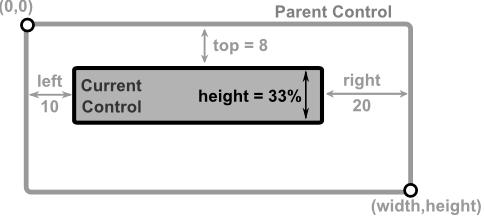 |
A control anchored to left, bottom, and right margins with left = 20, bottom = 5, right = 10, and height = 33% of parent height | 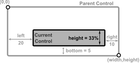 |
A control anchored to top, left, and bottom margins with top = 8, left = 10, bottom = 15, and width = 80% of parent width | 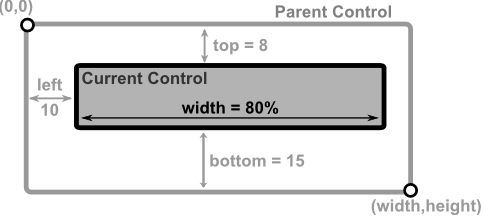 |
A control anchored to top, right, and bottom margins with top = 8, right = 30, bottom = 20% of parent height, and width = 50% of parent width | 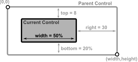 |
Examples
-
Three-margin anchors with left, top, and right
// using LayoutBuilder LayoutBuilder::new().left(10) .top(8) .right(20) .height(0.33) .build() // or using macro: layout!("left:10,top:8,right:20,height:33%") // or using macro with aliases: layout!("l:10,t:8,r:20,h:33%") -
Three-margin anchors with top, left, and bottom
// using LayoutBuilder
LayoutBuilder::new().top(8)
                    .left(10)
                    .bottom(15)
                    .width(0.8)
                    .build()
// or using macro:
layout!("top:8,left:10,bottom:15,width:80%")
// or using macro with aliases:
layout!("t:8,l:10,b:15,w:80%")
4-margin anchors
When all of the 4 anchors are used, the rest of the keys (x, y, width, height, align, pivot and dock) cannot be used. Using them will reject the layout.
Example
| Layout Description | Visual representation |
|---|---|
A control anchored to all four margins with left = 20, top = 7, right = 10, and bottom = 10 | 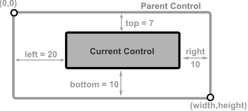 |
Examples
- Four-margin anchors with all sides constrained
// using LayoutBuilder
LayoutBuilder::new().left(20)
                    .top(7)
                    .right(10)
                    .bottom(10)
                    .build()
// or using macro:
layout!("left:20,top:7,right:10,bottom:10")
// or using macro with aliases:
layout!("l:20,t:7,r:10,b:10")
Instantiate a control using macros
All controls can be built via their constructors, but also via specialized macros meant to ease setting up a control. The general format is as follows: controller!("<parameter_list>"), where controller! is a specialized macro (for example button!) and parameter_list is a JSON-like/Python-like format made up of:
- positional parameters — for example, in this case
"10,20,30"has three positional parameters:10,20, and30. - named parameters — parameters described using a name and a value. The usual format is
name:value, butname=valueis also supported.
All parameters are separated from one another using , or ;. The overall format of a parameter list is:
PositionalParam-1, ... PositionalParam-n, NamedParam-1, ... NamedParam-m
Both positional parameters and named parameters are optional. Their order is not arbitrary: positional parameters (if used) must always appear before named parameters.
Values
The values used as parameters can be:
- regular words (e.g.
align:center) - numerical values (e.g.
x=10ory=-2) - percentages (e.g.
width:10%orheight=25%) - strings — a string can be wrapped in double quotes or single quotes and can contain newlines (e.g.
"..."or'...'). If both single quotes and double quotes must appear inside a string, three consecutive double or single quotes can be used (e.g."""..."""or'''...'''). - lists of values — written using
[and]. The general format is[value-1, value-2, ... value-n]; for example[10,20,30]is a list with three values: 10, 20, and 30. - nested parameter lists — written using
{and}. For example,point={x:10,y:20}means parameterpointis defined as two parameters:xwith value10andywith value20. - flags — a meta-interpretation of the parameters described above. Flags can be a regular word or string, or a list of values. If using a word, you can separate flags with
|or+. Additionally, when using strings, spaces,,, and;can also be used as separators. When using a list of values, each value is a separate flag. For example, the following declarations are equivalent:flags=[flag1,flag2]flags=flag1+flag2flags=flag1|flag2flags="flags1,flags2"flags="flags1;flags2"flags="flags1 flags2"
Common parameters
All controls have a set of common parameters that are required for layout or to change some of their states (such as visibility or if a control is enabled - can receive input).
| Parameter names | Type | Purpose |
|---|---|---|
x, y, width, height, left, right, top, bottom and their aliases | Numerical or percentage | Used for control layout |
align, dock, and their aliases | Alignment value (left, topleft, top, center, ...) | Used for control layout |
enabled or enable | bool (true or false) | Used to set the enabled state of a control |
visible | bool (true or false) | Used to set the visibility of a control |
Common methods for all Controls
All controls (including Window and Desktop) have a set of common methods obtained via the Deref trait over a common base object.
Status related methods
| Method | Purpose |
|---|---|
set_visible(...) | Shows or hides a control (has no effect on a Desktop) |
is_visible() | Returns true if the current control is visible, or false otherwise |
set_enable(...) | Changes the enable/disable status of a control (has no effect on a Window or a Desktop control) |
is_enabled() | Returns true if the current control is enabled, or false otherwise |
has_focus() | Returns true if the current control has focus, or false otherwise |
can_receive_input() | Returns true if the current control could receive mouse or keyboard events if focused or false otherwise |
is_mouse_over() | Returns true if the mouse cursor is over the current control |
Layout related methods
| Method | Purpose |
|---|---|
size() | Returns the size (widthxheight) for the current control |
client_size() | Returns the client size (the size minus the margins) for the current control |
set_size(...) | Sets the new size for a control (to a specified size given by parameters width and height). Keep in mind that this method will change the existing layout to a layout based on the top-left corner (given by the control's x and y coordinates) and the newly provided size. Any dock or alignment properties will be removed.This method has no effect on a Desktop control. |
position() | Returns the relative position (x,y) of the current control to its parent. |
set_position(...) | Sets the new position for a control (to specified coordinates given by parameters x and y). Keep in mind that this method will change the existing layout to a layout based on the top-left corner (given by coordinates x and y) and the control's current width and height. Any dock or alignment properties will be removed.This method has no effect on a Desktop control. |
set_components_toolbar_margins(...) | Sets the left and top components margins - for scrollbars, filters, etc |
update_layout(...) | Updates the layout of a control |
Hotkey related methods
| Method | Purpose |
|---|---|
hotkey() | Returns the hotkey associated with a control, or Key::None otherwise |
set_hotkey() | Sets the hotkey for a control. To clear the hotkey call this function like this: .set_hotkey(Key::None) |
Update methods
| Method | Purpose |
|---|---|
request_focus() | Request the framework to assign the focus to the current control |
request_update() | Request the framework to update itself. This action will update the command bar, menus, and the positions of the controls. |
Menu related methods
| Method | Purpose |
|---|---|
register_menu(...) | Registers a menu in the AppCUI framework and returns a handle for it |
show_menu(...) | Show a popup menu that was registered by the current control |
menuitem(...) | Returns an immutable reference to a menu item based on two handles: one for the menu, and one for the menu item |
menuitem_mut(...) | Returns a mutable reference to a menu item based on two handles: one for the menu, and one for the menu item |
Theme related methods
| Method | Purpose |
|---|---|
theme() | Returns a reference to the theme object that is being used by the application. This is the same reference an object receives when the OnPaint method is called. |
Application Bar related methods
| Method | Purpose |
|---|---|
appbar() | Returns a reference to the application bar object that is being used by the application. This method will panic if the application bar is not enabled (via the app_bar() method when building the application) |
Event loop
AppCUI is an event-driven framework, meaning that each control can emit events to reflect various actions or changes that occur. For example, whenever you push a button, an event will be raised. All events are processed at window level by implementing various traits. To build a window that supports event handling, you must use a special procedural macro called Window, defined in the following way:
#[Window(events=..., )]
struct MyWindow {
    // specific fields
}
where the attribute events has the following form:
events=EventTrait-1 + EventTrait-2 + EventTrait-3 + ... EventTrait-n
and an event trait can be one of the following:
- ButtonEvents
- CheckBoxEvents
- RadioBoxEvents
- WindowEvents
- MenuEvents
- CommandBarEvents
- ToolBarEvents
- ColorPickerEvents
- ThreeStateBoxEvents
- PasswordEvents
- KeySelectorEvents
- TextFieldEvents
These traits can be implemented to receive notifications about various actions that child controls are performing.
When creating a window that supports the event loop in this manner, you will need to instantiate it. A common approach is the following:
#[Window(events=..., )]
struct MyWindow {
    // specific fields
}
impl MyWindow {
    fn new(/* extra parameters */) -> Self {
        let mut obj = MyWindow {
            base: Window::new(title, layout, flags),
            // initialize other fields from MyWindow here
        };
        // other initialization (such as creating children)
        return obj;
    }
}
The initialization base: Window::new(title, layout, flags), is mandatory. As for the title, layout, and flags, you can provide them as parameters in the new method, or you can infer or hardcode them in another way. Read more about how a window can be created on the Window page.
Once you create such a window, you can add it to your application using the add_window(...) method.
fn main() -> Result<(), appcui::system::Error> {
    let mut app = App::new().build()?;
    app.add_window(MyWindow::new(/* parameters */));
    app.run();
    Ok(())
}
A simple example
Let's start with a simple example that creates a window with a fixed size of 40x20 characters and two internal i32 values.
use appcui::prelude::*;

#[Window()]
struct MyWindow {
    value1: i32,
    value2: i32
}
impl MyWindow {
    fn new(title: &str) -> Self {
        MyWindow {
            base: Window::new(title, layout!("a:c,w:40,h:20"), window::Flags::None),
            value1: 0,
            value2: 1,
        }
    }
}
fn main() -> Result<(), appcui::system::Error> {
    let mut app = App::new().build()?;
    app.add_window(MyWindow::new("Some title"));
    app.run();
    Ok(())
}
Intercepting events from a child control
Usually, a window that processes events maintains handles to various controls and enables event processing in the #[Window(...)] declaration.
use appcui::prelude::*;

#[Window(events = /*Events specific to a control */)]
struct MyWindow {
    value1: i32,
    control: Handle</*control type*/>
}
impl MyWindow {
    fn new(/* parameters */) -> Self {
        let mut mywin = MyWindow {
            base: Window::new(/*...*/),
            control: Handle::None,
        };
        // now we create the control
        mywin.control =  mywin.add(/* Code that creates a control */);

        return mywin;
    }
}
impl /*Control event*/ for MyWindow {
    // add logic for event
}
fn main() -> Result<(), appcui::system::Error> {
    let mut app = App::new().build()?;
    app.add_window(MyWindow::new(/* parameters */));
    app.run();
    Ok(())
}
For every control described in Stock Controls, an example of how that control can be used with the event loop and the type of events it emits is presented.
Window
A window is the core component of an application. It is the object where all events from child controls are processed.
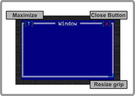
To create a Window use:
Window::newmethod (with 3 parameters: a title, a layout and initialization flags)Window::with_typemethod (with 4 parameters: a title, a layout , initialization flags and a type)- macro
window!.
let w = Window::new("Title", layout!("x:10,y:5,w:15,h:9"),window::Flags::None);
let w2 = window!("Title,a:c,w:10,h:10");
let w3 = window!("title='Some Title',a:c,w:30,h:10,flags=[Sizeable])");
let w4 = window!("title='WithTag',a:c,w:30,h:10,tag:MyTag)");
let w5 = window!("Title,a:c,w:10,h:10,key:Alt+F10");
let w6 = window!("Title,a:c,w:10,h:10,key:auto");
Keep in mind that window will NOT handle any events from its children.
A window supports all common parameters (as they are described in Instantiate via Macros section). Besides them, the following named parameters are also accepted:
| Parameter name | Type | Positional parameter | Purpose |
|---|---|---|---|
title or text or caption | String | Yes (first positional parameter) | The title (text) of the window |
flags | String or List | No | Window initialization flags |
type | String | No | Window type (visual) |
bg or back or background | String | No | The background of the window. |
tag | String | No | The tag of the window |
hotkey or hot-key or key | Key | No | The hotkey associated with a window. You can also use the auto value to ask the framework to find the first available key (from Alt+1 to Alt+9) |
To create a window that will handle events from its children, use #[Window(...)] method:
#[Window(events=..., )]
struct MyWindow {
    // specific fields
}
A window supports the following initialization flags:
window::Flags::None- regular window (with a close button)window::Flags::SizeableorSizeable(for window! macro) - a window that has the resize grip and the maximize buttonwindow::Flags::NoCloseButtonorNoCloseButton(for window! macro) - a window without a close buttonwindow::Flags::FixedPositionorFixedPosition(for window! macro) - a window that can not be moved
the following types:
window::Type::ClassicorClassic(for window! macro) - a regular window with a classic look (double border)window::Type::RoundedorRounded(for window! macro) - a window with rounded cornerswindow::Type::PanelorPanel(for window! macro) - a window with a top bar and no borders
the following backgrounds:
window::Type::NormalorNormal(for window! macro) - a regular window (using the default background color)window::Type::ErrororError(for window! macro) - a window with a red background to indicate an error messagewindow::Type::NotificationorNotification(for window! macro) - a window with a different background designed for notification messageswindow::Type::WarningorWarning(for window! macro) - a window with a different background designed for Warning messages
Methods
Besides the Common methods for all Controls, a window also has the following additional methods:
| Method | Purpose |
|---|---|
add(...) | Adds a new control as a child of the current window |
control(...) | Returns an immutable reference to a control based on its handle |
control_mut(...) | Returns a mutable reference to a control based on its handle |
request_focus_for_control(...) | Requests the focus for a specific control, given a specific handle |
toolbar() | Returns a mutable reference to the current window's toolbar |
set_title(...) | Sets the window title. Example: win.set_title("Title") — this sets the title of the window to Title. |
title() | Returns the title of the current window |
set_tag(...) | Sets the window tag. Example: win.set_tag("ABC") — this sets the tag of the window to ABC. |
tag() | Returns the tag of the current window |
clear_tag() | Clears the current tag. It is equivalent to set_tag(""). |
set_auto_hotkey() | Automatically selects a free hotkey (in the format Alt+{number} where {number} is between 1 and 9). |
enter_resize_mode() | Enters resize mode programmatically. |
close | Closes the current window. |
Key association
In terms of key association, a Window has two modes:
- Normal mode (for whem a window is has focus)
- Resize/Move mode (in this mode you can use arrows and various combinations to move the window)
For normal mode
| Key | Purpose |
|---|---|
Ctrl+Alt+M or Ctrl+Alt+R | Switch the window to resize/move mode |
Escape | Trigers a call cu on_cancel(...) method. By default this will close the window. Howeverm you can change the behavior and return ActionRequest::Deny from the on_cancel callback |
Up or Alt+Up or Ctrl+Up | Moves to the closes control on upper side the curent one. |
Down or Alt+Down or Ctrl+Down | Moves to the closest control on the bottom side of the curent one |
Left or Alt+Left or Ctrl+Left | Moves to the closest control on the left side of the curent one |
Right or Alt+Right or Ctrl+Right | Moves to the closest control on the right side of the curent one |
OBS: Keep in mind that if any of these keys (in particular Left, Right, Up and Down) are capture by one of the children of a window, they will not pe process by the window.
For resize/move mode
| Key | Purpose |
|---|---|
Escape or Enter or Tab or Space | Switch back to the normal mode |
Left, Up, Right, Down | Arrow keys can be used to move the window |
C | Centers the current window to the Desktop |
M or R | Maximizes or Restores the size of the current Windows |
Alt+{Left, Up, Right, Down} | Moves the window towards one of the margins of the Desktop. For example Alt+Up will move current window to the top margin of the client space of the Desktop |
Ctrl+{Left, Up, Right, Down} | Increases or decreases the Width or Height of the current Window |
Events
Window related events can be intercepted via WindowEvents trait. You will need to add WindowEvents in the list of events like in the following example:
#![allow(unused)]
fn main() {
#[Window(events=WindowEvents)]
struct MyWindow { ... }
impl WindowEvents for MyWindow { ... }
}
WindowEvents is defined in the following way:
#![allow(unused)]
fn main() {
pub trait WindowEvents {
    fn on_close(&mut self) -> EventProcessStatus {
        EventProcessStatus::Ignored
    }
    fn on_layout_changed(&mut self, old_layout: Rect, new_layout: Rect) {}
    fn on_activate(&mut self) {}
    fn on_deactivate(&mut self) {}
    fn on_accept(&mut self) {}
    fn on_cancel(&mut self) -> ActionRequest {
        ActionRequest::Allow
    }
}
}
These methods are called under the following scenarious:
| Method | Called when |
|---|---|
on_layout_changed(...) | Called whenever the size or position of a window changes. |
on_activate(...) | Called whenever a window or a modal window receives the focus |
on_deactivate(...) | Called whenever a window or a modal window loses the focus |
on_accept(...) | Called only for modal windows when you hit the Enter key |
on_cancel(...) | For a modal window this method is called when you press Escape. You can use this method to disable closing via Escape key and for an exit with a value (via method exit_with(...)For a regular window (non-modal) this method can be called when you pressed Esc key or when you pressed the close button from a window. |
Window Tags
For every window, a tag can be set for a window (a tag is a string associated with a Window that reflects its purpose). To set a tag use .set_tag("<name") method.
For example, the following code:
fn main() -> Result<(), appcui::system::Error> {
    let mut app = App::new().build()?;
    let mut win = window!("Title,a:c,w:40,h:9");
    win.set_tag("TAG");
    app.add_window(win);
    app.run();
    Ok(())
}
should generate a window that looks like the following:
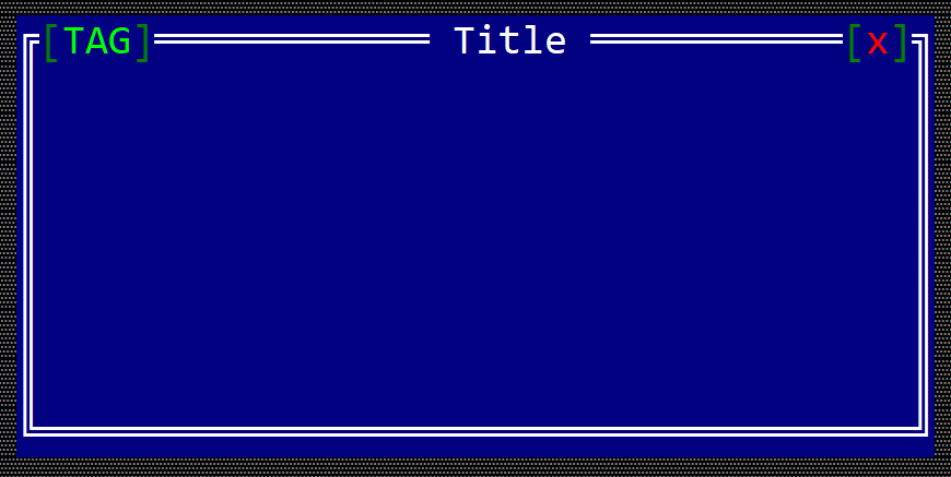
Window Hot Key
You can also associate a hot key to a window. A hot key allows you to quickly switch between windows. In the next example, we set up Alt+7 as a hot key for a windows.
fn main() -> Result<(), appcui::system::Error> {
    let mut app = App::new().build()?;
    let mut win = window!("Title,a:c,w:40,h:9");
    win.set_hotkey(key!("Alt+7"));
    app.add_window(win);
    app.run();
    Ok(())
}
should generate a window that looks like the following:
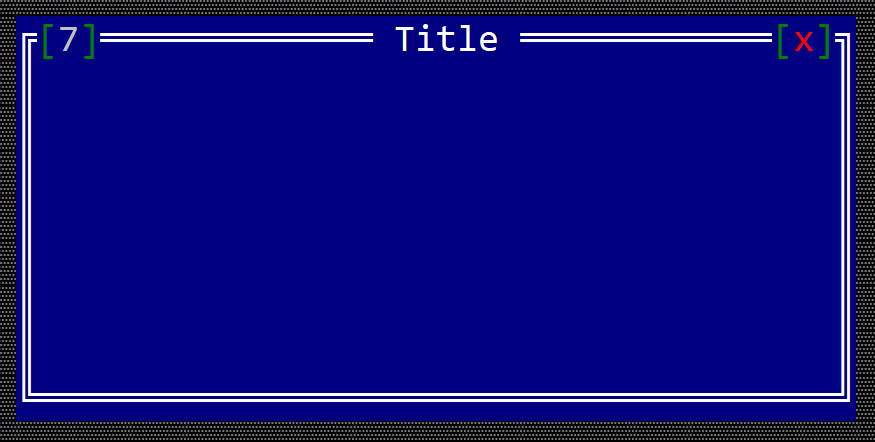
Toolbar
A toolbar is a generic concept of an area over the margins of a window (top or bottom margins) where several controls (or toolbar items) reside. A toolbar items are simplier controls that convey their events directly to the window via a spcial trait: ToolBarEvents.
All toolbar items are organized in groups. A group is similar to a flow (all toolbar items are aligned one after another, depending on the direction of the flow). It is important to notice that a toolbar item does not have a layout of itself (its position is decided by the group). The following direction are supported by a toolbar group (via enum toolbar::GroupPosition):
pub enum GroupPosition {
    TopLeft,
    BottomLeft,
    TopRight,
    BottomRight,
}
Constructing a toolbar item
To add a toolbar item into a window, you need to perform the following steps:
- create a group
- create a toolbar item
- add the previously created toolbar item to the group created on step 1.
Typically, a toolbar initialization mechanims is done when creating a window, in a similar manner as with the next snippet:
#[Window(...)]
struct MyWin {
    // data members
}
impl MyWin {
    fn new() -> Self {
        let mut me = Self {
            base: window!("..."),
        };
        let a_group = me.toolbar().create_group(toolbar::GroupPosition::<Value>);
        let item_handle = me.toolbar().add(a_group, toolbar::<Type>::new("..."));
        // other initializations
        me
    }
}
To create a toolbar item, there are two options:
- use
toolbar::<Item>::new(...)method - use
toolbaritem!macro
Curenly AppCUI supports the following toolbar item types:
Common methods
All toolbar items have a set of common methods that can be used to modify their behavior:
| Method | Purpose |
|---|---|
set_toooltip(...) | Set the tooltip for the current item. Using this method with an empty string clears the tooltip |
get_tooltip() | Returns the current tooltip associated with an toolbar item |
set_visible() | Changes the visibility settings for a selected toolbar item |
is_visible() | Returns true if the current toolbar item is visible, or false otherwise |
Button toolbar item
A toolbar button is a item that can be positioned on the top or bottom part of a windows (like in the following image).
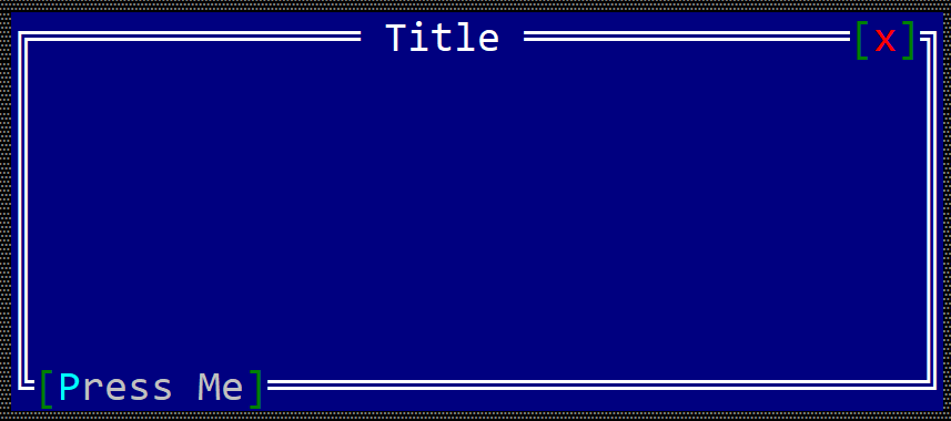
To create a button within a toolbar use the toolbar::Button::new(...) method:
#![allow(unused)]
fn main() {
let toolbar_button = toolbar::Button::new("content");
}
or the toolbaritem! macro:
#![allow(unused)]
fn main() {
let toolbar_button_1 = toolbaritem!("content,type=button");
let toolbal_button_2 = toolbaritem!("content='Start',type:button");
let toolbal_button_3 = toolbaritem!("content='&Stop',type:button,tooltip:'a tooltip'");
let toolbal_button_4 = toolbaritem!("content='hidden button',type:button,visible:false");
}
Using the character & as part of the button caption will associate the next character (if it is a letter or number) as a hot-key for the button. For example, the following caption St&art will set Alt+A as a hot-key for the button.
The following parameters are supported for a toolbar button:
| Parameter name | Type | Positional parameter | Purpose |
|---|---|---|---|
text or caption | String | Yes (first positional parameter) | The caption (text) written on the button |
type | String | No | For a button use: type:Button |
tooltip | String | No | The tooltip associated with the button |
visible | Bool | No | true if the toolbar item is visible (this is also the default setting) or false otherwise |
Besides the default methods that every toolbar item has (as described here), the following methods are available for a toolbar label:
| Method | Purpose |
|---|---|
set_caption(...) | Set the new caption for a button. The width (in characters) of the button is the considered to be the number of characters in its content |
caption() | Returns the current caption of a button. |
Events
To intercept button clicks, implement ToolBarEvents for the current window, as presented in the following example:
#![allow(unused)]
fn main() {
#[Window(events=ToolBarEvents)]
struct MyWin { /* data members */ }

impl ToolBarEvents for MyWin {
    fn on_button_clicked(&mut self, handle: Handle<toolbar::Button>) -> EventProcessStatus {
        // process click events from a toolbar button
    }
}
}
Example
The following example creates two buttons on the bottom right part of a window toolbar that can be used to increase the value of a number.
#[Window(events = ToolBarEvents)]
struct MyWin {
    increase_button: Handle<toolbar::Button>,
    decrease_button: Handle<toolbar::Button>,
    text: Handle<Label>,
    number: u32,
}

impl MyWin {
    fn new() -> Self {
        let mut win = MyWin {
            base: window!("'My Win',a:c,w:40,h:6"),
            increase_button: Handle::None,
            decrease_button: Handle::None,
            text: Handle::None,
            number: 10,
        };
        // create a group
        let g = win.toolbar().create_group(toolbar::GroupPosition::BottomRight);
        // add buttons
        win.increase_button = win.toolbar().add(g, toolbar::Button::new("+"));
        win.decrease_button = win.toolbar().add(g, toolbar::Button::new("-"));
        // add a label
        win.text = win.add(label!("10,a:c,w:2,h:1"));
        win
    }
}
impl ToolBarEvents for MyWin {
    fn on_button_clicked(&mut self, handle: Handle<toolbar::Button>) -> EventProcessStatus {
        match () {
            _ if handle == self.increase_button => self.number += 1,
            _ if handle == self.decrease_button => self.number -= 1,
            _ => {}
        }
        let h = self.text;
        let n = self.number;
        if let Some(label) = self.control_mut(h) {
            label.set_caption(format!("{}", n).as_str());
        }
        EventProcessStatus::Processed
    }
}

fn main() -> Result<(), appcui::system::Error> {
    let mut a = App::new().build()?;
    a.add_window(MyWin::new());
    a.run();
    Ok(())
}
CheckBox toolbar item
A toolbar checkbox is a item that can be positioned on the top or bottom part of a windows (like in the following image) that can have two states (checked or un-checked).
To create a checkbox within a toolbar use the toolbar::CheckBox::new(...) method:
#![allow(unused)]
fn main() {
let toolbar_checkbox = toolbar::CheckBox::new("content", true);
}
or the toolbaritem! macro:
#![allow(unused)]
fn main() {
let toolbar_checkbox_1 = toolbaritem!("content,type=checkbox");
let toolbal_checkbox_2 = toolbaritem!("content='Start',type:checkbox,checked: true");
let toolbal_checkbox_3 = toolbaritem!("content='&Stop',type:checkbox,tooltip:'a tooltip'");
let toolbal_checkbox_4 = toolbaritem!("content='hidden checkbox',type:checkbox,visible:false");
}
Using the character & as part of the button caption will associate the next character (if it is a letter or number) as a hot-key for the checkbox. For example, the following caption &Option one will set Alt+O as a hot-key for the checkbox.
The following parameters are supported for a toolbar checkbox:
| Parameter name | Type | Positional parameter | Purpose |
|---|---|---|---|
text or caption | String | Yes (first positional parameter) | The caption (text) written on the checkbox |
type | String | No | For a checkbox use: type:Checkbox |
tooltip | String | No | The tooltip associated with the button |
visible | Bool | No | true if the toolbar item is visible (this is also the default setting) or false otherwise |
check or checked | Bool | No | true if the checkbox is checked or false otherwise |
Besides the default methods that every toolbar item has (as described here), the following methods are available for a toolbar label:
| Method | Purpose |
|---|---|
set_caption(...) | Sets the new caption for a checkbox. The width (in characters) of the checkbox is the considered to be the number of characters in its content |
caption() | Returns the current caption of a checkbox. |
set_checked() | Sets the new checked stated of the checkbox. |
is_checked() | true if the toolbar checkbox is checked or false otherwise |
Events
To intercept a change in a checkbox checked state, you need to implement ToolBarEvents for the current window, as presented in the following example:
#![allow(unused)]
fn main() {
#[Window(events=ToolBarEvents)]
struct MyWin { /* data members */ }

impl ToolBarEvens for MyWin {
    fn on_checkbox_clicked(&mut self, handle: Handle<toolbar::CheckBox>, checked: bool) -> EventProcessStatus {
        // do an action based on the new state of the checkbox
        // parameter `checked` is true if the toolbar checkbox is checked or false otherwise
    }
}
}
Example
The following example creates a window with two checkboxes toolbar items and a label. Clicking on each one of the checkboxes will show a message on the label that states the check state of that checkbox.
#[Window(events = ToolBarEvents)]
struct MyWin {
    cb1: Handle<toolbar::CheckBox>,
    cb2: Handle<toolbar::CheckBox>,
    text: Handle<Label>,
}

impl MyWin {
    fn new() -> Self {
        let mut win = MyWin {
            base: window!("'My Win',a:c,w:40,h:6"),
            cb1: Handle::None,
            cb2: Handle::None,
            text: Handle::None,
        };
        // create a group
        let g = win.toolbar().create_group(toolbar::GroupPosition::BottomRight);
        // add checkboxes
        win.cb1 = win.toolbar().add(g, toolbar::CheckBox::new("Opt-1",false));
        win.cb2 = win.toolbar().add(g, toolbar::CheckBox::new("Opt-2",false));
        // add a label
        win.text = win.add(label!("'',a:c,w:20,h:1"));
        win
    }
}
impl ToolBarEvents for MyWin {
    fn on_checkbox_clicked(&mut self, handle: Handle<toolbar::CheckBox>, checked: bool) -> EventProcessStatus {
        let txt = match () {
            _ if handle == self.cb1 => format!("Opt-1 is {}",checked),
            _ if handle == self.cb2 => format!("Opt-2 is {}",checked),
            _ => String::new(),
        };
        let h = self.text;
        if let Some(label) = self.control_mut(h) {
            label.set_caption(&txt);
        }
        EventProcessStatus::Processed
    }
}

fn main() -> Result<(), appcui::system::Error> {
    let mut a = App::new().build()?;
    a.add_window(MyWin::new());
    a.run();
    Ok(())
}
Label toolbar item
A toolbar label is a text that can be written on the top or bottom part of a windows (like in the following image).
To create a label toolbar use the toolbar::Label::new(...) method:
#![allow(unused)]
fn main() {
let toolbar_label = toolbar::Label::new("content");
}
or the toolbaritem! macro:
#![allow(unused)]
fn main() {
let toolbar_label_1 = toolbaritem!("content,type=label");
let toolbal_label_2 = toolbaritem!("content='label text',type:label");
let toolbal_label_3 = toolbaritem!("content='label text',type:label,tooltip:'a tooltip'");
let toolbal_label_4 = toolbaritem!("content='hidden label',type:label,visible:false");
}
The following parameters are supported for a toolbar label:
| Parameter name | Type | Positional parameter | Purpose |
|---|---|---|---|
text or caption | String | Yes (first positional parameter) | The caption (text) written on the label |
type | String | No | For a label use: type:Label |
tooltip | String | No | The tooltip associated with the label |
visible | Bool | No | true if the toolbar item is visible (this is also the default setting) or false otherwise |
Besides the default methods that every toolbar item has (as described here), the following methods are available for a toolbar label:
| Method | Purpose |
|---|---|
set_caption(...) | Set the new caption for a label. The size of the label is the considered the number of characters in its content |
caption() | Returns the current caption of a label. |
Example
The following example shows 3 lables that show a number written in base 10, 16 and 2.
- the first two labels (for base 10 and base 16 are part of one group located on the bottom left part of the window);
- the last label is part of a separate group located on the top-right side of the window.
- at the left of the window, there is a button that if clicked increases the number and updates the values in each label;
- at the right of the window, 3 checkboxes can change the visibility state for the labels
#[Window(events = ButtonEvents+CheckBoxEvents)]
struct MyWin {
    increase_button: Handle<Button>,
    dec: Handle<toolbar::Label>,
    hex: Handle<toolbar::Label>,
    bin: Handle<toolbar::Label>,
    show_dec: Handle<CheckBox>,
    show_hex: Handle<CheckBox>,
    show_bin: Handle<CheckBox>,
    number: u32,
}

impl MyWin {
    fn new() -> Self {
        let mut win = MyWin {
            base: window!("'My Win',a:c,w:40,h:6"),
            increase_button: Handle::None,
            dec: Handle::None,
            hex: Handle::None,
            bin: Handle::None,
            show_dec: Handle::None,
            show_hex: Handle::None,
            show_bin: Handle::None,
            number: 24,
        };
        // add the increase button
        win.increase_button = win.add(button!("Increase,w:15,d:l"));
        // add checkboxes
        win.show_dec = win.add(checkbox!("'Show decimal',x:20,y:1,w:16,checked:true"));
        win.show_hex = win.add(checkbox!("'Show hex',x:20,y:2,w:16,checked:true"));
        win.show_bin = win.add(checkbox!("'Show binary',x:20,y:3,w:16,checked:true"));
        // add toolbar labels
        let first_group = win.toolbar().create_group(toolbar::GroupPosition::BottomLeft);
        let second_group = win.toolbar().create_group(toolbar::GroupPosition::TopRight);
        win.dec = win.toolbar().add(first_group, toolbar::Label::new(""));
        win.hex = win.toolbar().add(first_group, toolbar::Label::new(""));
        win.bin = win.toolbar().add(second_group, toolbar::Label::new(""));
        win.update_toolbar_labels();
        win
    }
    fn update_toolbar_label(&mut self, handle: Handle<toolbar::Label>, text: String) {
        if let Some(label) = self.toolbar().get_mut(handle) {
            label.set_content(text.as_str());
        }
    }
    fn update_visibility_status_for_label(&mut self, handle: Handle<toolbar::Label>, visible: bool) {
        if let Some(label) = self.toolbar().get_mut(handle) {
            label.set_visible(visible);
        }
    }
    fn update_toolbar_labels(&mut self) {
        self.update_toolbar_label(self.dec, format!("Dec:{}", self.number));
        self.update_toolbar_label(self.hex, format!("Hex:{:X}", self.number));
        self.update_toolbar_label(self.bin, format!("Bin:{:b}", self.number));
    }
}

impl ButtonEvents for MyWin {
    fn on_pressed(&mut self, _handle: Handle<Button>) -> EventProcessStatus {
        self.number += 1;
        self.update_toolbar_labels();
        return EventProcessStatus::Processed;
    }
}
impl CheckBoxEvents for MyWin {
    fn on_status_changed(&mut self, handle: Handle<CheckBox>, checked: bool) -> EventProcessStatus {
        match () {
            _ if handle == self.show_bin => self.update_visibility_status_for_label(self.bin, checked),
            _ if handle == self.show_hex => self.update_visibility_status_for_label(self.hex, checked),
            _ if handle == self.show_dec => self.update_visibility_status_for_label(self.dec, checked),
            _ => {}
        }
        EventProcessStatus::Processed
    }
}

fn main() -> Result<(), appcui::system::Error> {
    let mut a = App::new().build()?;
    a.add_window(MyWin::new());
    a.run();
    Ok(())
}
Upon execution you should see something that looks like the following image:
SingleChoice toolbar item
A toolbar singlechoice item is a item that can be positioned on the top or bottom part of a windows (like in the following image) that can have two states (selected or un-selected).
Within a group, only one singlechoice item can be selected.
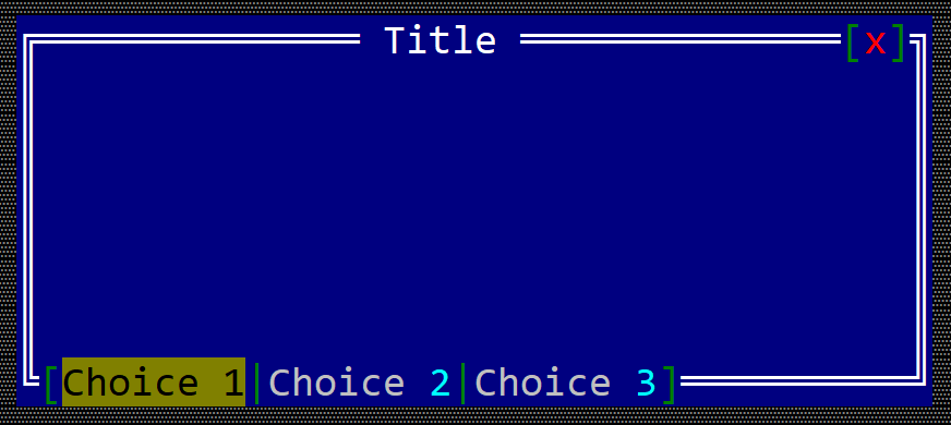
To create a checkbox within a toolbar use the toolbar::SingleChoice::new(...) method:
#![allow(unused)]
fn main() {
let toolbar_singlechoice = toolbar::SingleChoice::new("SingleChoice");
}
or the toolbaritem! macro:
#![allow(unused)]
fn main() {
let toolbar_sc_1 = toolbaritem!("content,type=singlechoice");
let toolbal_sc_2 = toolbaritem!("content='Choice One',type:singlechoice");
let toolbal_sc_3 = toolbaritem!("content='&Second choice',type:singlechoice,tooltip:'a tooltip'");
let toolbal_sc_4 = toolbaritem!("content='hidden choice',type:singlechoice,visible:false");
}
Using the character & as part of the button caption will associate the next character (if it is a letter or number) as a hot-key for the singlechoice item. For example, the following caption First &choice will set Alt+C as a hot-key for the singlechoice item.
The following parameters are supported for a toolbar singlechoice:
| Parameter name | Type | Positional parameter | Purpose |
|---|---|---|---|
text or caption | String | Yes (first positional parameter) | The caption (text) written on the single choice |
type | String | No | For a singlechoince use: type:SingleChoince |
tooltip | String | No | The tooltip associated with the singlechoice |
visible | Bool | No | true if the toolbar item is visible (this is also the default setting) or false otherwise |
Besides the default methods that every toolbar item has (as described here), the following methods are available for a toolbar label:
| Method | Purpose |
|---|---|
set_caption(...) | Sets the new caption for a singlechoince. The width (in characters) of the singlechoince is the considered to be the number of characters in its content |
caption() | Returns the current caption of a singlechoice item. |
select() | Sets the current single choice as the selected single choince for the current group. |
is_selected() | true if the toolbar single choice is selected or false otherwise |
OBS: Keep in mind that using select() method only works if the single choice has already been added to a toolbar. Using this methid without adding the item to a toolbar will result in a panic.
Events
To intercept if the current choice has change, you need to implement ToolBarEvents for the current window, as presented in the following example:
#![allow(unused)]
fn main() {
#[Window(events=ToolBarEvents)]
struct MyWin { /* data members */ }

impl ToolBarEvens for MyWin {
    fn on_choice_selected(&mut self, _handle: Handle<toolbar::SingleChoice>) -> EventProcessStatus {
        // do an action based on the new selection
    }
}
}
Example
The following example creates a window with two single choice toolbar items and a label. Clicking on each one of the singlechoice items will show a message on the label that states the selected singlechoice.
#[Window(events = ToolBarEvents)]
struct MyWin {
    opt1: Handle<toolbar::SingleChoice>,
    opt2: Handle<toolbar::SingleChoice>,
    text: Handle<Label>,
}

impl MyWin {
    fn new() -> Self {
        let mut win = MyWin {
            base: window!("'My Win',a:c,w:40,h:6"),
            opt1: Handle::None,
            opt2: Handle::None,
            text: Handle::None,
        };
        // create a group
        let g = win.toolbar().create_group(toolbar::GroupPosition::BottomLeft);
        // add buttons
        win.opt1 = win.toolbar().add(g, toolbar::SingleChoice::new("First Choice"));
        win.opt2 = win.toolbar().add(g, toolbar::SingleChoice::new("Second Choice"));
        // add a label
        win.text = win.add(label!("'',a:c,w:22,h:1"));
        win
    }
}
impl ToolBarEvents for MyWin {
    fn on_choice_selected(&mut self, handle: Handle<toolbar::SingleChoice>) -> EventProcessStatus {
        let txt = match () {
            _ if handle == self.opt1 => "First choice selected",
            _ if handle == self.opt2 => "Second choice selected",
            _ => "",
        };
        let h = self.text;
        if let Some(label) = self.control_mut(h) {
            label.set_caption(txt);
        }
        EventProcessStatus::Processed
    }
}

fn main() -> Result<(), appcui::system::Error> {
    let mut a = App::new().build()?;
    a.add_window(MyWin::new());
    a.run();
    Ok(())
}
Modal Window
A modal window is a window that captures the entire focus for the duration of its existance. In other word, when a modal window is started, it will be on top of everything else and the entire input (mouse and keyboard will be treated by it).
When a modal window is opened the rest of the windows or other modal windows will be disabled:
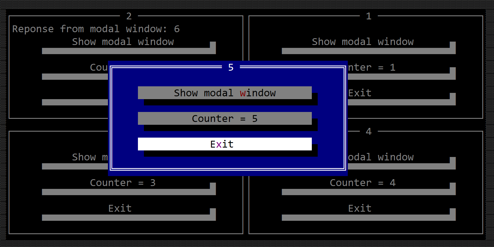
A modal window is in fact just like a regular window (you can add other controls, you can resize and move it) and you can intercept events just like in a regular window case. However, since a modal window can not lose the focus, it has another property (response) that implies that it will provide a response once its execution ends. The response can be any kind of type (including a void type).
To create a modal window that will handle events from its children, use #[ModalWindow(...)] method:
#[ModalWindow(events=..., response=...)]
struct MyModalWindow {
    // specific fields
}
Besides the normal methods that a regular Window has, the following extra methods are available:
| Method | Purpose |
|---|---|
exit() or close() | Exits the current modal window without returning anything. This translates into returning None from the call of method show(...) |
exit_with(...) | Exits and returns a value of the same type as the parameter reponse from the #[ModalWindo(...)] definition. This translates into returning Some(value) from the call of method show(...) |
show() | Shows the modal window and capture the entire input. The execution flow is blocked until method show returns. |
Besides the keys that a regular (non-modal) window supports, the following keys have a different purpose:
| Key | Purpose |
|---|---|
Escape | Trigers a call to on_cancel(...) method. By default this will close the modal window and will return None to the caller. The behavior can be changed by returning ActionRequest::Deny from the on_cancel callback |
Enter | Calls the on_accept(...) method. This will not close the window unless you call exit() or exit_with(...) from within the callback |
To disable this behavior, you can add WindowEvents to the list of events and then return ActionRequest::Deny when implementing on_cancel.
#![allow(unused)]
fn main() {
#[ModalWindow(events=WindowEvents, response=...)]
struct MyModalWindow {
    // specific fields
}
impl WindowEvents for MyWindow {
    fn on_cancel(&mut self) -> ActionRequest {
        ActionRequest::Deny
    }
}

}
Execution flow
Normally, a modal window looks like the following template:
#![allow(unused)]
fn main() {
// ResponseType is a type of data that you want to return
// it could be anything like: u32, String, something user-defined
#[ModalWindow(events=..., response=ResponseType)]
struct MyWindow {
    // specific fields
}
impl MyWindow {
    fn new(...) -> MyWindow { /* constructor */ }
    // other methods
}
// SomeEvent in this context could be any event supported by a Window
// such as: ButtonEvents, ToolBarEvents, ...
impl SomeEvent for MyWindow {
    fn event_methods(&mut self...) {
        // some operations / checks
        self.exit_with(ResponseType::new(...)); // ResponseType::new(...) something that creates a new object of type ResponseType
    }
}
}
Once all of this is in place, you can start the modal window in the following way:
#![allow(unused)]
fn main() {
let r: ResponseType = MyWindow::new(...).show();
}
Example
The following example creates a window with a button that starts a modal window that doubles a value received from the first window.
#[ModalWindow(events=ButtonEvents,response=i32)]
struct MyModalWin {
    value: i32,
}
impl MyModalWin {
    fn new(value: i32) -> Self {
        let mut w = MyModalWin {
            base: ModalWindow::new("Calc", layout!("a:c,w:40,h:12"), window::Flags::None),
            value: value * 2,
        };
        w.add(Label::new(format!("{} x 2 = {}", value, value * 2).as_str(), layout!("a:c,w:16,h:1")));
        w.add(button!("Close,d:b,w:15"));
        w
    }
}
impl ButtonEvents for MyModalWin {
    fn on_pressed(&mut self, _handle: Handle<Button>) -> EventProcessStatus {
        self.exit_with(self.value);
        EventProcessStatus::Processed
    }
}

#[Window(events = ButtonEvents)]
struct MyWin {
    text: Handle<Label>,
    value: i32,
}

impl MyWin {
    fn new() -> Self {
        let mut win = MyWin {
            base: window!("'My Win',a:c,w:40,h:16"),
            text: Handle::None,
            value: 1,
        };
        win.text = win.add(label!("'Value=10',a:c,w:24,h:1"));
        win.add(button!("Double,d:b,w:15"));
        win
    }
}
impl ButtonEvents for MyWin {
    fn on_pressed(&mut self, _handle: Handle<Button>) -> EventProcessStatus {
        // first run the modal window
        if let Some(response) = MyModalWin::new(self.value).show() {
            // set the new value
            self.value = response;
            let h = self.text;
            if let Some(label) = self.control_mut(h) {
                label.set_caption(format!("Value={}", response).as_str());
            }
        }
        EventProcessStatus::Processed
    }
}

fn main() -> Result<(), appcui::system::Error> {
    let mut a = App::new().build()?;
    a.add_window(MyWin::new());
    a.run();
    Ok(())
}
Single Window Apps
A single window app is an AppCUI application where you only have one window that ocupies the entire desktop. Usually, when you create a AppCUI app, you can add multiple windows to a desktop object. In this mode you can only add one window, and terminating that window will close the app.
To do this you need to use the .single_window() method from the App builder as follows:
let mut app = App::new().single_window().build()?;
// add one and only one window
app.add_window(...);
// run the application
app.run()
Remarks
- in a
Single Windowmode you can not set a custom desktop as there is only one window and it covers the entire visible size of a desktop. Using a.desktop(...)method with a.single_window()method will result in a panic:// the following code wil panic App::new().single_window().desktop(...).build()? - Since in a
Single Windowmode there is only one window , you can not use the.add_window(...)method twice. Using it wll result in a panic.let mut a = App::new().single_window()..build()?; a.add_window(...); // the following line will panic as there is alreay a window added a.add_window(...); // panic a.run(); - Since in a
Single Windowmode the window ocupies the entire visible size of a desktop, you can not resize or move it. As such, window flag attributes likeSizeableare not allowed. If used, the code will panic. The layout (regardless on how you set it up) will be changed to make sure that the window ocupies the entire visible desktop space.let mut a = App::new().single_window()..build()?; // the following line will panic as Sizeable flag is not allow on windows in Single Window mode a.add_window(window!("Test,a:c,flags: Sizeable")); a.run(); - In a
Single Windowmode, the event loop will be associated with the single window. As such, not adding a window will result in a panic.let mut a = App::new().single_window()..build()?; // the following line will panic no window was added a.run();
Stock controls
AppCUI comes with a set of out-of-the-box controls that can be used:
| Control | Class | Macro | Image |
|---|---|---|---|
| Accordion | ui::Accordion | accordion! |  |
| BufferView | ui::BufferView | bufferview! |  |
| Button | ui::Button | button! |  |
| Canvas | ui::Canvas | canvas! | 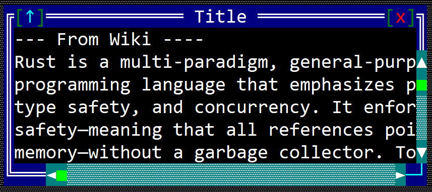 |
| CheckBox | ui::CheckBox | checkbox! |  |
| ColorPicker | ui::ColorPicker | colorpicker! |  |
| CharPicker | ui::CharPicker | charpicker! |  |
| ComboBox | ui::ComboBox | combobox! |  |
| DatePicker | ui::DatePicker | datepicker! |  |
| DropDownList | ui::DropDownList<T> | dropdownlist! |  |
| GraphView | ui::GraphView<T> | graphview! |  |
| HLine | ui::HLine | hline! |  |
| HSplitter | ui::HSplitter | hsplitter! |  |
| ImageViewer | ui::ImageViewer | imageviewer! |  |
| KeySelector | ui::KeySelector | keyselector! | 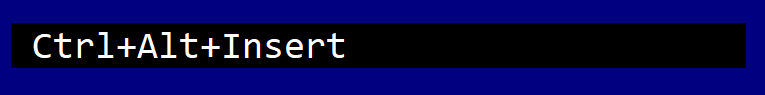 |
| Label | ui::Label | label! |  |
| ListBox | ui::ListBox | listbox! | 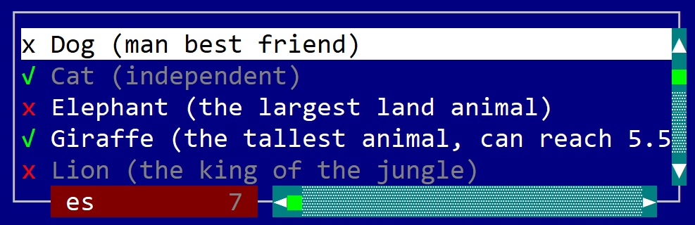 |
| ListView | ui::ListView<T> | listview! |  |
| Markdown | ui::Markdown | markdown! | 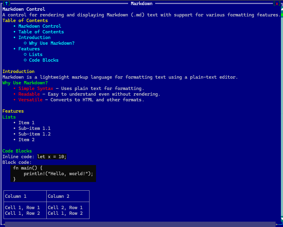 |
| NumericSelector | ui::NumericSelector<T> | numericselector! |  |
| Panel | ui::Panel | panel! |  |
| Password | ui::Password | password! |  |
| PathFinder | ui::PathFinder | pathfinder! |  |
| ProgressBar | ui::ProgressBar | progressbar! |  |
| RadioBox | ui::RadioBox | radiobox! |  |
| RichTextField | ui::RichTextField | richtextfield! |  |
| Selector | ui::Selector<T> | selector! |  |
| Tab | ui::Tab | tab! |  |
| TextArea | ui::TextArea | textarea! |  |
| TextField | ui::TextField | textfield! |  |
| ThreeStateBox | ui::ThreeStateBox | threestatebox! |  |
| TimePicker | ui::TimePicker | timepicker! |  |
| ToggleButton | ui::ToggleButton | togglebutton! |  |
| TreeView | ui::TreeView<T> | treeview! |  |
| VLine | ui::VLine | vline! |  |
| VSplitter | ui::VSplitter | vsplitter! |  |
Accordion
An accordion control is a graphical user interface element that consists of a vertically stacked list of panels. Only one panel can be "expanded" to reveal its associated content.
To create an accordion use Accordion::new methods:
let a1 = Accordion::new(layout!("a:c,w:15,h:10"),accordion::Flags::None);
or the macro accordion!
let a2 = accordion!("a:c,w:15,h:10,panels:[First,Second,Third]");
let a3 = accordion!("a:c,w:15,h:10,panels:[A,B,C],flags:TransparentBackground");
The caption of each accordion may contain the special character & that indicates that the next character is a hot-key. For example, constructing an accordion panel with the following caption &Start will set up the text of the accordion to Start and will set up character S as the hot key to activate that accordion panel.
An accordion supports all common parameters (as they are described in Instantiate via Macros section). Besides them, the following named parameters are also accepted:
| Parameter name | Type | Positional parameter | Purpose |
|---|---|---|---|
flags | List | No | Accordion initialization flags (available list include: TransparentBackground) |
panels | List | No | A list of accordion panels |
An accordion supports the following initialization flags:
accordion::Flags::TransparentBackgroundorTransparentBackground(for macro initialization) - this will not draw the background of the accordion
Some examples that uses these paramateres:
let t1 = accordion!("panels:[Tab1,Tab2,Accordion&3],d:f");
let t2 = accordion!("panels:[A,B,C],flags:TransparentBackground,d:f");
Events
To intercept events from an accordion, the following trait has to be implemented to the Window that processes the event loop:
pub trait AccordionEvents {
    fn on_panel_changed(&mut self, handle: Handle<Accordion>,
                                   new_panel_index: u32,
                                   old_panel_index: u32) -> EventProcessStatus
    {
        // This method is called when the current panel of the accordion is changed.
        // The `handle` parameter is the handle of the accordion control.
        EventProcessStatus::Ignored
    }
}
Methods
Besides the Common methods for all Controls, an accordion also has the following additional methods:
| Method | Purpose |
|---|---|
add_panel(...) | Adds a new accordion panel |
add(...) | Add a new control into the accordion (the index of the accordion where the control has to be added must be provided) |
current_panel() | Provides the index of the current accordion panel |
set_current_panel(...) | Sets the current accordion panel (this method will also change the focus to the accordion cotrol) |
panel_caption(...) | Returns the caption (name) of an accordion panel based on its index |
set_panel_caption(...) | Sets the caption (name) of an accordion panel |
Key association
The following keys are processed by an Accordion control if it has focus:
| Key | Purpose |
|---|---|
Ctrl+Tab | Select the next accordion. If the current accordion is the last one, the first one will be selected. |
Ctrl+Shift+Tab | Select the previous accordion. If the current accordion is the first one, the last one will be selected |
Additionally, Alt+letter or number will automatically select the accordion with that particular hotkey combination.
Example
The following code creates an accordion with 3 panels and adds two buttons on each accordion panel.
use appcui::prelude::*;


fn main() -> Result<(), appcui::system::Error> {
    let mut app = App::new().build()?;
    let mut w = window!("Test,d:f");
    let mut t = accordion!("l:1,t:1,r:1,b:3,panels:['Panel &1','Panel &2','Panel &3']");
    t.add(0, button!("T1-1-A,r:1,b:0,w:10,type:flat"));
    t.add(0, button!("T1-1-B,a:c,w:10,type:flat"));
    t.add(1, button!("T1-2-A,r:1,b:0,w:14,type:flat"));
    t.add(1, button!("T1-2-B,a:c,w:14,type:flat"));
    t.add(2, button!("T1-3-A,r:1,b:0,w:20,type:flat"));
    t.add(2, button!("T1-3-B,d:l,w:20,type:flat"));
    w.add(t);

    w.add(button!("OK,r:0,b:0,w:10, type: flat"));
    w.add(button!("Cancel,r:12,b:0,w:10, type: flat"));

    a.add_window(w);
    a.run();
    Ok(())
}
BufferView
A BufferView is a templated (generics based) control that displays and edits a byte buffer in a hex-editor style layout. It can show raw data in multiple representations (hexadecimal, octal, binary, integers, floats, or characters), optional address and interval-name columns, and optional character-decoding panels.
It can be created using BufferView::new(...), BufferView::with_buffer(...), or the bufferview! macro.
let bv1: BufferView<Vec<u8>> = BufferView::new(layout!("..."), bufferview::Flags::None);
let bv2: BufferView<Vec<u8>> = BufferView::with_buffer(vec![1, 2, 3], layout!("..."), bufferview::Flags::ScrollBars);
let bv3 = bufferview!("Vec<u8>, d:f, flags: ScrollBars+ShowAddress+SearchBar, columns: 8, format: Hex, offset: Hex");
let bv4 = bufferview!("Vec<u8>, d:f, flags: ShowAddress+ShowIntervalNames, format: Hex(Word), endian: Little");
where type T is the type of the backing store and must implement the BufferAccess trait. Vec<u8> is provided out of the box.
The bufferview! macro creates the control with a default-constructed backing buffer (T::default()). Load data at runtime with set_buffer or retrieve it with take_buffer.
A bufferview supports all common parameters (as they are described in Instantiate via Macros section). Besides them, the following named parameters are also accepted:
| Parameter name | Type | Positional parameter | Purpose |
|---|---|---|---|
class or type | String | Yes, first positional parameter | The BufferAccess type used as the backing store (for example Vec<u8> or a custom type). |
flags | String | No | BufferView initialization flags. |
lsm or left-scroll-margin | Numeric | No | The left margin of the bottom scroll bar in characters. If not provided the default value is 0. This should be a positive number and it only has an effect if the ScrollBars or SearchBar flags were specified. |
tsm or top-scroll-margin | Numeric | No | The top margin of the right scroll bar in characters. If not provided the default value is 0. This should be a positive number and it only has an effect if the ScrollBars flag was used to create the control. |
offset-format or offset or address-format | String | No | Address column format (Hex or Dec). |
endian | String | No | Byte order for multi-byte numeric values (Little or Big). |
format or data-format or representation | String | No | Data panel format (see Data representation formats). |
columns or columns-count | String | No | Number of data columns per row (Auto, Fixed(N), or an integer from 1 to 255). |
codepage or cp | String | No | Character panel code page (Default, ASCII, CP437, WINDOWS_1252, or a custom name). |
address-width or aw | Numeric | No | Address column width in characters (minimum 1, maximum 24). |
address-name or address | String | No | Address column title (default: Address). |
interval-name-width or inw | Numeric | No | Interval-name column width in characters (minimum 1, maximum 64). |
interval-name-title or interval-title | String | No | Interval-name column title (default: Name). |
intervals | Expression | No | Initial interval definitions passed to set_intervals (for example &[Interval::new(0, 16, CharAttribute::default(), "Header")]). |
selection-start and selection-end | Numeric | No | Initial byte selection range. Both parameters must be provided together. |
A bufferview supports the following initialization flags:
bufferview::Flags::ScrollBarsorScrollBars(for macro initialization) - enables scroll bars for navigating through the buffer. The scroll bars are visible only when the control has focus.bufferview::Flags::SearchBarorSearchBar(for macro initialization) - enables a search bar for finding byte patterns. The search bar is visible only when the control has focus.bufferview::Flags::HideHeaderorHideHeader(for macro initialization) - hides the column header row.bufferview::Flags::ShowAddressorShowAddress(for macro initialization) - shows the address column on the left.bufferview::Flags::ShowIntervalNamesorShowIntervalNames(for macro initialization) - shows the interval-name column.bufferview::Flags::NoPanelDimmingorNoPanelDimming(for macro initialization) - disables dimming of the inactive panel (data or character panel).bufferview::Flags::ShowAsciiStringsorShowAsciiStrings(for macro initialization) - shows the ASCII string panel below the data area.bufferview::Flags::ShowUtf16AsciiStringsorShowUtf16AsciiStrings(for macro initialization) - highlights UTF-16LE ASCII strings in the character panel.bufferview::Flags::DecodeUTF8CharactersorDecodeUTF8Characters(for macro initialization) - decodes UTF-8 sequences in the character panel.bufferview::Flags::ReadOnlyorReadOnly(for macro initialization) - disables in-place editing.bufferview::Flags::TabSwitchesActivePanelorTabSwitchesActivePanel(for macro initialization) - makes theTabkey switch between the data panel and the character panel (instead of leaving the control).
Data representation formats
The main data panel can display buffer contents in several formats. The active format is set via the format macro parameter or with set_data_representation_format.
| Format | Enum value | Description |
|---|---|---|
| Hex (byte) | DataRepresentationFormat::Hex(HexFormat::Byte) or Hex | One byte per column, shown as NN. |
| Hex (word) | DataRepresentationFormat::Hex(HexFormat::Word) or Hex(Word) | Two bytes per column, shown as NNNN. |
| Hex (dword) | DataRepresentationFormat::Hex(HexFormat::DWord) or Hex(DWord) | Four bytes per column. |
| Hex (qword) | DataRepresentationFormat::Hex(HexFormat::QWord) or Hex(QWord) | Eight bytes per column. |
| Octal | DataRepresentationFormat::Oct or Oct | One byte per column in octal. |
| Binary | DataRepresentationFormat::Bin or Bin | One byte per column in binary. |
| Character | DataRepresentationFormat::Char or Char | One byte per column as a raw character. |
| Unsigned integer | DataRepresentationFormat::UInt(UIntFormat::U8) or UInt, UInt(U16), UInt(U32), UInt(U64) | Multi-byte unsigned integers. |
| Signed integer | DataRepresentationFormat::Int(IntFormat::I8) or Int, Int(I16), Int(I32), Int(I64) | Multi-byte signed integers. |
| Float | DataRepresentationFormat::Float(FloatFormat::Scientific32) or Float, Float(Scientific64), Float(E4M3), Float(E5M2) | Floating-point values. |
When a multi-byte format is active, the byte order is controlled by set_endian (Endian::Little or Endian::Big). The address column format is controlled separately via set_offset_format (OffsetFormat::Hex or OffsetFormat::Dec).
The number of columns per row can be fixed or computed automatically to fill the available width:
ColumnsCount::Fixed(N)or macrocolumns: N/columns: Fixed(N)- exactlyNcolumns per row.ColumnsCount::Autoor macrocolumns: Auto- as many columns as fit in the current control width.
BufferAccess
To connect a BufferView to your data, the backing type must implement the bufferview::BufferAccess trait:
pub trait BufferAccess : Default {
    fn count(&self) -> u64;
    fn get(&mut self, pos: u64) -> Option<u8>;
    fn can_write(&self) -> bool;
    fn set(&mut self, pos: u64, value: u8) -> bool;
    fn can_resize(&self) -> bool;
    fn resize(&mut self, new_size: u64, fill_byte: u8) -> bool;
}
countreturns the number of bytes in the buffer.getreads a byte atpos, or returnsNoneif the position is not readable (for example a sparse or memory-mapped region).can_write/setcontrol whether individual bytes can be modified in place.can_resize/resizecontrol whether the buffer length can be changed.
Vec<u8> already implements BufferAccess. For custom sources (files, memory-mapped regions, read-only views, and so on), implement the trait on your own type. The examples/hexview sample shows a MyBuffer wrapper that exposes most bytes but marks a 100-byte region as unreadable.
Editing through the UI is allowed only when the backing buffer reports can_write() == true and the ReadOnly flag is not set.
Events
To intercept events from a bufferview, the following trait has to be implemented on the Window that processes the event loop. Use BufferViewEvents<T> in the #[Window(events = ...)] attribute, where T is the same BufferAccess type as the control:
pub trait BufferViewEvents<T: BufferAccess + 'static> {
    // called when the current byte position changes
    fn on_current_pos_changed(&mut self, handle: Handle<BufferView<T>>) -> EventProcessStatus {
        EventProcessStatus::Ignored
    }

    // called when the selected byte range changes
    fn on_selection_changed(&mut self, handle: Handle<BufferView<T>>) -> EventProcessStatus {
        EventProcessStatus::Ignored
    }
}
Methods
Besides the Common methods for all Controls a bufferview also has the following additional methods:
Buffer management
| Method | Purpose |
|---|---|
set_buffer(...) | Replaces the backing buffer. Resets cursor position, scroll offset, selection, intervals, and search state, then repaints. Display settings are preserved. |
take_buffer() | Moves the backing buffer out of the control (the control is left with T::default()). Returns the removed buffer. |
Display settings
| Method | Purpose |
|---|---|
set_data_representation_format(...) / format() | Sets or returns the active data panel format. |
set_columns_count(...) | Sets the number of data columns per row (ColumnsCount::Fixed or ColumnsCount::Auto). |
set_offset_format(...) / offset_format() | Sets or returns how byte offsets are shown in the address column. |
set_endian(...) / endian() | Sets or returns the byte order for multi-byte values. |
set_codepage(...) / codepage() | Sets or returns the code page used in the character panel. |
set_address_visible(...) / is_address_visible() | Shows or hides the address column. |
set_address_width(...) | Sets the address column width in characters (clamped to 1..=24). |
set_address_name(...) | Sets the header title of the address column. |
set_interval_names_visible(...) / is_interval_names_visible() | Shows or hides the interval-name column. |
set_interval_name_width(...) | Sets the interval-name column width in characters (clamped to 1..=64). |
set_interval_name_title(...) | Sets the header title of the interval-name column. |
set_ascii_strings_visible(...) / is_ascii_strings_visible() | Shows or hides the ASCII string panel. |
set_utf16_ascii_strings_visible(...) / is_utf16_ascii_strings_visible() | Enables or disables UTF-16LE ASCII string highlighting. |
set_decode_utf8(...) | Enables or disables UTF-8 decoding in the character panel. |
Intervals
| Method | Purpose |
|---|---|
set_intervals(...) | Replaces the set of labeled intervals shown in the interval-name column. |
interval_name_at(...) | Returns the name of the innermost interval covering a byte position, or None. |
Cursor and selection
| Method | Purpose |
|---|---|
current_pos() | Returns the current byte cursor position. |
set_current_pos(...) | Moves the cursor to a byte position and scrolls the view if needed. |
selection() | Returns the current selection as a half-open range [start, end), or None. |
has_selection() | Returns whether a non-empty byte range is selected. |
set_selection(...) | Sets the selection to [start, end). Returns false if the range is invalid. |
clear_selection() | Clears the selection without moving the cursor. |
bytes_count() | Returns the number of bytes in the backing buffer. |
Buffer editing
These methods operate on the backing buffer when writes and resizing are allowed:
| Method | Purpose |
|---|---|
read_bytes(...) | Reads bytes starting at pos into a slice. Returns the number of bytes read. |
read_bytes_into_vec(...) | Appends up to count bytes read from pos to a Vec<u8>. |
overwrite_bytes(...) | Overwrites bytes at pos without changing the buffer length. |
insert_bytes(...) | Inserts bytes at pos, growing the buffer if resizing is supported. |
delete_bytes(...) | Deletes count bytes starting at pos. |
resize_buffer(...) | Changes the buffer length, filling new bytes with fill_byte. |
fill_buffer(...) | Fills a byte range with a single value. |
Key association
The following keys are processed by a BufferView control if it has focus:
| Key | Purpose |
|---|---|
Left, Right | Moves the cursor by one data unit (one byte in the character panel, or one formatted value in the data panel). |
Up, Down | Moves the cursor up or down by one row. |
Shift+{Left, Right, Up, Down} | Extends or shrinks the byte selection while moving the cursor. |
Home, End | Moves the cursor to the first or last byte in the buffer. |
Shift+{Home, End} | Extends the selection to the start or end of the buffer. |
PageUp, PageDown | Moves the cursor up or down by one page. |
Shift+{PageUp, PageDown} | Extends the selection while paging. |
Ctrl+{Left, Right, Up, Down} | Scrolls the view horizontally or vertically without moving the cursor. |
Ctrl+Tab | Switches between the data panel and the character panel. |
Tab | Switches panels when the TabSwitchesActivePanel flag is set; otherwise ignored. |
Ctrl+Alt+{Left, Right} | Enters column-resize mode for the address or interval-name separator (when the corresponding column is visible). |
| Printable characters | When editing is enabled, starts or continues in-place editing at the cursor. Backspace removes the last typed character. Enter, Tab, or Right commits the edit. |
While in column-resize mode (address or interval-name separator selected), the following keys are processed:
Left,Right- decreases or increases the width of the selected columnTab,Ctrl+Left,Ctrl+Right,Ctrl+Alt+Left,Ctrl+Alt+Right- switches to the other resizable column separator- Any other key - exits column-resize mode
Additionally, typing any character will open the search bar (if the SearchBar flag is present) and search for the next match. While the search bar is active:
Backspace- removes the last character from the search textEscape- clears the search text and closes the search barEnter- finds the next match- Movement keys - close the search bar but keep the search text
Mouse interaction
- Left click on a byte moves the cursor to that position. Dragging extends the selection.
- Mouse wheel scrolls the view vertically; horizontal wheel scrolls horizontally when the data panel is wider than the visible area.
- Left click on a column header (
DataorChar) activates that panel. - Drag on a column separator resizes the address or interval-name column.
Search expressions
When the SearchBar flag is set, the search text is parsed into a byte pattern. If no prefix is given, the text is treated as plain bytes. Supported prefixes:
| Prefix | Example | Meaning |
|---|---|---|
(none) or text: | hello or text:"hello" | Raw text bytes |
hex: | hex:48 65 6C 6C 6F | Hexadecimal bytes |
u8: | u8:0,255,128 | List of u8 values |
i8: | i8:0,-1,127 | List of i8 values |
u16: / i16: / u32: / i32: / u64: / i64: | u16:1000,2000 | Lists of fixed-width integers (little-endian) |
f32: / f64: | f32:1.5,2.0 | Lists of floating-point values (little-endian) |
utf16: | utf16:Hello | UTF-16LE encoded text |
Each search updates the selection to the matched byte range and moves the cursor to the match.
Intervals
Intervals label byte ranges in the interval-name column. Overlapping intervals are supported; the innermost interval name is shown for each byte.
An interval is created with bufferview::Interval::new(start, size, attr, name):
start- the first byte offset of the intervalsize- the number of bytes coveredattr- theCharAttributeused to render the namename- the text shown in the interval-name column
bv.set_intervals(&[
    bufferview::Interval::new(0, 16, CharAttribute::with_fore_color(Color::Red), "Header"),
    bufferview::Interval::new(16, 32, CharAttribute::with_fore_color(Color::Green), "Payload"),
]);
Example
The following example creates a window with a hex view over a Vec<u8> buffer. Moving the cursor updates the window title. Two labeled intervals highlight the greeting and the payload regions.
use appcui::prelude::*;

#[Window(events = BufferViewEvents<Vec<u8>>)]
struct HexWindow {
    buffer_view: Handle<BufferView<Vec<u8>>>,
}

impl HexWindow {
    fn new() -> Self {
        let mut w = Self {
            base: window!("Hex View,d:f,flags:Sizeable"),
            buffer_view: Handle::None,
        };
        let mut bv = bufferview!(
            "Vec<u8>,
            d:f,
            flags: ScrollBars+ShowAddress+ShowIntervalNames+SearchBar,
            columns: 8,
            format: Hex,
            offset: Hex"
        );
        bv.set_buffer(b"Hello, AppCUI!".to_vec());
        bv.set_intervals(&[
            bufferview::Interval::new(0, 7, CharAttribute::with_fore_color(Color::Cyan), "Greeting"),
            bufferview::Interval::new(7, 6, CharAttribute::with_fore_color(Color::Yellow), "Payload"),
        ]);
        w.buffer_view = w.add(bv);
        w.update_title();
        w
    }

    fn update_title(&mut self) {
        let h = self.buffer_view;
        if let Some(bv) = self.control(h) {
            self.set_title(&format!("Hex View - position {}", bv.current_pos()));
        }
    }
}

impl BufferViewEvents<Vec<u8>> for HexWindow {
    fn on_current_pos_changed(&mut self, handle: Handle<BufferView<Vec<u8>>>) -> EventProcessStatus {
        if handle == self.buffer_view {
            self.update_title();
        }
        EventProcessStatus::Processed
    }
}

fn main() -> Result<(), appcui::system::Error> {
    let mut app = App::new().build()?;
    app.add_window(HexWindow::new());
    app.run();
    Ok(())
}
For a full-featured hex editor with format switching, code-page selection, and buffer editing commands, see the examples/hexview sample in the repository.
Button
Represents a clickable button control:
To create a button use Button::new method (with 2 parameters: a caption, a layout) or method Button::with_type with 3 parameters (a caption, a layout and the button type).
let b1 = Button::new("&Start", layout!("x:10,y:5,w:15"));
let b2 = Button::with_type("&Start", layout!("x:10,y:5,w:15"),button::Type::Flat);
or the macro button!
let b1 = button!("caption=&Start,x:10,y:5,w:15");
let b2 = button!("&Start,x:10,y:5,w:15");
The caption of a button may contain the special character & that indicates that the next character is a hot-key. For example, constructing a button with the following caption &Start will set up the text of the button to Start and will set up character S as the hot key for that button (pressing Alt+S will be equivalent to pressing that button).
A button supports all common parameters (as they are described in Instantiate via Macros section). Besides them, the following named parameters are also accepted:
| Parameter name | Type | Positional parameter | Purpose |
|---|---|---|---|
name or text or caption | String | Yes (first positional parameter) | The caption (text) written on a button |
type | String | No | Button type |
A button supports the following initialization types:
button::Type::Flatorflat(for macro initialization) - this will hide the shadow of the button making it flat.
Some examples that uses these paramateres:
let disabled_button = button!("caption=&Disabled,x:10,y:5,w:15,enable=false");
let hidden_button = button!("text='&Hidden',x=9,y:1,align:center,w:9,visible=false");
let flat_button = button!("&flat,x:1,y:1,w:10,type:flat");
Events
To intercept events from a button, the following trait has to be implemented to the Window that processes the event loop:
pub trait ButtonEvents {
    fn on_pressed(&mut self, button: Handle<Button>) -> EventProcessStatus {...}
}
Methods
Besides the Common methods for all Controls a button also has the following additional methods:
| Method | Purpose |
|---|---|
set_caption(...) | Set the new caption for a button. If the string provided contains the special character &, this method also sets the hotkey associated with a control. If the string provided does not contain the & character, this method will clear the current hotkey (if any).Example: button.set_caption("&Start") - this will set the caption of the button cu Start and the hotket to Alt+S |
caption() | Returns the current caption of a button |
Key association
The following keys are processed by a Button control if it has focus:
| Key | Purpose |
|---|---|
Space | Clicks / pushes the button and emits ButtonEvents::on_pressed(...) event. It has the same action clicking the button with the mouse. |
Enter | Clicks / pushes the button and emits ButtonEvents::on_pressed(...) event. It has the same action clicking the button with the mouse. |
Additionally, Alt+letter or number will have the same action (even if the Button does not have a focus) if that letter or number was set as a hot-key for a button via its caption. For example, creating a value with the following caption: "My b&utton" (notice the & character before letter u) will enable Alt+U to be a hot-key associated with this button. Pressing this combination while the button is enabled and part of the current focused window, will change the focus to that button and will emit the ButtonEvents::on_pressed(...) event.
Example
The following code creates a window with two buttons (Add and Reset). When Add button is pressed a number is incremented and set as the text of the Add button. When Reset button is being pressed, the counter is reset to 0.
use appcui::prelude::*;

#[Window(events = ButtonEvents)]
struct MyWin {
    add: Handle<Button>,
    reset: Handle<Button>,
    counter: i32,
}

impl MyWin {
    fn new() -> Self {
        let mut win = MyWin {
            base: Window::new("My Win", layout!("a:c,w:40,h:6"), window::Flags::None),
            add: Handle::None,
            reset: Handle::None,
            counter: 0,
        };
        win.add = win.add(Button::new("Add (0)", layout!("x:25%,y:2,w:13,d:f")));
        win.reset = win.add(Button::new("&Reset", layout!("x:75%,y:2,w:13,d:f")));
        win
    }
    fn update_add_button_caption(&mut self) {
        let h = self.add;
        let new_text = format!("Add ({})",self.counter);
        if let Some(button) = self.control_mut(h) {
            button.set_caption(new_text.as_str());
        }
    }
}

impl ButtonEvents for MyWin {
    fn on_pressed(&mut self, button_handle: Handle<Button>) -> EventProcessStatus {
        if button_handle == self.add {
            // 'Add' button was pressed - lets increment the counter
            self.counter += 1;
            self.update_add_button_caption();
            return EventProcessStatus::Processed;
        }
        if button_handle == self.reset {
            // 'Reset` button was pressed - counter will become 0
            self.counter = 0;
            self.update_add_button_caption();
            return EventProcessStatus::Processed;
        }
        // unknown handle - we'll ignore this event
        EventProcessStatus::Ignored
    }
}

fn main() -> Result<(), appcui::system::Error> {
    let mut app = App::new().build()?;
    app.add_window(MyWin::new());
    app.run();
    Ok(())
}
Canvas
Represents a surface that can be drawn inside a viewport:
To create a canvas use Canvas::new method (with 3 parameters: a size, a layout and initialization flags).
let b = Canvas::new(Size::new(30,10), layout!("x:10,y:5,w:15"),canvas::Flags::None);
or the macro canvas!
let b1 = canvas!("30x10,x:10,y:5,w:15");
let b2 = canvas!("'30,10',x:10,y:5,w:15");
A canvas supports all common parameters (as they are described in Instantiate via Macros section). Besides them, the following named parameters are also accepted:
| Parameter name | Type | Positional parameter | Purpose |
|---|---|---|---|
size or sz or surface | Size | Yes (first positional parameter) | The size of the surface within the canvas |
flags | String | No | canvas initialization flags |
back or backgroud | char! format | No | A character as describes in Macro Builds - the same as with the char! macro format |
lsm or left-scroll-margin | Numeric | No | The left margin of the bottom scroll bar in characters. If not provided the default value is 0. This should be a positive number and it only has an effect if the flag Scrollbars was set up. |
tsm or top-scroll-margin | Numeric | No | The top margin of the right scroll bar in characters. If not provided the default value is 0. This should be a positive number and it only has an effect if the flag Scrollbars was set up. |
A canvas supports the following initialization flags:
canvas::Flags::ScrollBarsorScrollBars(for macro initialization) - this enable a set of scrollbars that can be used to change the view of the inner surface, but only when the control has focus, as described in Components section.
Some examples that uses these paramateres:
- A canvas with a backgroud that consists in the character
Xin withAquaandDarkBluecolors.let c = canvas!("size:10x5,x:10,y:5,w:15,back={X,fore:aqua,back:darkblue}"); - A canvas with scrollbars with different margins
let c = canvas!("sz:'10 x 5',x:10,y:5,w:15,flags:Scrollbars,lsm:5,tsm:1");
Events
A canvas emits no events.
Methods
Besides the Common methods for all Controls a canvas also has the following additional methods:
| Method | Purpose |
|---|---|
drawing_surface_mut(...) | Returns the inner surface that can be dranw into the canvas |
resize_surface(...) | Resizes the inner surface of the canvas |
set_backgound(...) | Sets the character used for background |
clear_background() | Remove the background character making the background transparent. |
Key association
The following keys are processed by a canvas control if it has focus:
| Key | Purpose |
|---|---|
Left,Right,Up,Down | Move the viewport to a specified direction by one character. |
Shift+Left | Moves the horizontal viewport coordinate to 0 |
Shift+Up | Moves the vertical viewport coordinate to 0 |
Shift+Right | Moves the horizontal viewport coordinate so that the right side of the inner surface is displayed |
Shift+Down | Moves the vertical viewport coordinate so that the bottom side of the inner surface is displayed |
Ctrl+{Left,Right,Up,Down} | Move the viewport to a specified direction by a number of characters that is equal to the width for Left/Right or height for Up/Down. |
PageUp, PageDown | has the same effect as Ctrl+{Up or Down} |
Home | Moves the viewport to the coordinates (0,0) |
End | Moves the viewport so that the bottom-right part of the inner surface is visible |
Example
The following code uses a canvas to create a viewer over the Rust language definition from wikipedia:
use appcui::prelude::*;

static text: &str = r"--- From Wiki ----
Rust is a multi-paradigm, general-purpose
programming language that emphasizes performance,
type safety, and concurrency. It enforces memory
safety—meaning that all references point to valid
memory—without a garbage collector. To
simultaneously enforce memory safety and prevent
data races, its 'borrow checker' tracks the object
lifetime of all references in a program during
compilation. Rust was influenced by ideas from
functional programming, including immutability,
higher-order functions, and algebraic data types.
It is popular for systems programming.

From: https://en.wikipedia.org/wiki/Rust_(programming_language)
";
fn main() -> Result<(), appcui::system::Error> {
    let mut a = App::new().size(Size::new(60,20)).build()?;
    let mut w = window!("Title,a:c,w:40,h:8,flags:Sizeable");
    let mut c = canvas!("'60x15',d:f,flags=ScrollBars,lsm:3,tsm:1");
    let s = c.drawing_surface_mut();
    s.write_string(0, 0, text, CharAttribute::with_color(Color::White, Color::Black), true);
    w.add(c);
    a.add_window(w);
    a.run();
    Ok(())
}
CheckBox
Represents a control with two states (checked and unchecked):
To create a checkbox use CheckBox::new method (with 3 parameters: a caption, a layout and checked status (true or false)) or method CheckBox::with_type (with one additional parameter - the type of the checkbox).
let b1 = CheckBox::new("A checkbox",
                       layout!("x:10,y:5,w:15"),
                       true);
let b2 = CheckBox::with_type("Another checkbox",
                             layout!("x:10,y:5,w:15"),
                             false,
                             checkbox::Type::YesNo);
or the macro checkbox!
let c1 = checkbox!("caption='Some option',x:10,y:5,w:15,h:1");
let c2 = checkbox!("'Another &option',x:10,y:5,w:15,h:1,checked:true");
let c3 = checkbox!("'&Multi-line option\nthis a hot-key',x:10,y:5,w:15,h:3,checked:false");
let c4 = checkbox!("'&YesNo checkbox',x:10,y:5,w:15,h:3,checked:false,type: YesNo");
The caption of a checkbox may contain the special character & that indicates that the next character is a hot-key. For example, constructing a checkbox with the following caption &Option number 1 will set up the text of the checkbox to Option number 1 and will set up character O as the hot key for that checkbox (pressing Alt+O will be equivalent to changing the status for that checkbox from checked to unchecked or vice-versa).
A checkbox can contain a multi-line text but you will have to set the height parameter large enough to a larger value (bigger than 1).
A checkbox supports all common parameters (as they are described in Instantiate via Macros section). Besides them, the following named parameters are also accepted:
| Parameter name | Type | Positional parameter | Purpose |
|---|---|---|---|
text or caption | String | Yes (first positional parameter) | The caption (text) written on a checkbox |
checked or check | Bool | No | Checkbox checked status: true for false |
type | String | No | The type of the checkbox (see below) |
Some examples that uses these paramateres:
let disabled_checkbox = checkbox!("caption=&Disabled,x:10,y:5,w:15,enable=false");
let hidden_checkbox = checkbox!("text='&Hidden',x=9,y:1,align:center,w:9,visible=false");
let multi_line_checkbox = checkbox!("'&Multi line\nLine2\nLine3',x:1,y:1,w:10,h:3");
The type of a checkbox is described by the checkbox::Type enum:
#![allow(unused)]
fn main() {
#[derive(Copy,Clone,PartialEq,Eq)]
pub enum Type {
    Standard, // Default value
    Ascii,
    CheckBox,
    CheckMark,
    FilledBox,
    YesNo,
    PlusMinus,
}
}
The type of the checkbox describes how the checkbox state (checked or unchecked) will be represented on the screen.
| Type | Check State | Uncheck State |
|---|---|---|
| Standard | [✓] Checked | [ ] Unchecked |
| Ascii | [X] Checked | [ ] Unchecked |
| CheckBox | ☑ Checked | ☐ Unchecked |
| CheckMark | ✔ Checked | ✖ Unchecked |
| FilledBox | ▣ Checked | ▢ Unchecked |
| YesNo | [Y] Checked | [N] Unchecked |
| PlusMinus | ➕ Checked | ➖ Unchecked |
Events
To intercept events from a checkbox, the following trait has to be implemented to the Window that processes the event loop:
pub trait CheckBoxEvents {
    fn on_status_changed(&mut self, handle: Handle<CheckBox>, checked: bool) -> EventProcessStatus {...}
}
Methods
Besides the Common methods for all Controls a checkbox also has the following additional methods:
| Method | Purpose |
|---|---|
set_caption(...) | Set the new caption for a checkbox. If the string provided contains the special character &, this method also sets the hotkey associated with a control. If the string provided does not contain the & character, this method will clear the current hotkey (if any).Example: checkbox.set_caption("&Option") - this will set the caption of the checkbox cu Option and the hotkey to Alt+O |
caption() | Returns the current caption of a checbox |
is_checked() | true if the checkbox is checked, false otherwise |
set_checked(...) | Sets the new checked status for the checkbox |
Key association
The following keys are processed by a Checkbox control if it has focus:
| Key | Purpose |
|---|---|
Space or Enter | Changes the checked state (checked to un-checked and vice-versa). It also emits CheckBoxEvents::on_status_changed(...) event with the checked parameter the current chcked status of the checkbox. It has the same action clicking the checkbox with the mouse. |
Additionally, Alt+letter or number will have the same action (even if the checkbox does not have a focus) if that letter or number was set as a hot-key for a checkbox via its caption.
Example
The following code creates a window with a checkbox and a label. Whenever the checkbox status is being change, the label will print the new status (checked or not-checked).
#[Window(events = CheckBoxEvents)]
struct MyWin {
    c: Handle<CheckBox>,
    l: Handle<Label>,
}

impl MyWin {
    fn new() -> Self {
        let mut win = MyWin {
            base: window!("'My Win',a:c,w:40,h:6"),
            c: Handle::None,
            l: Handle::None,
        };
        win.c = win.add(checkbox!("'My option',l:1,r:1,b:1"));
        win.l = win.add(label!("'<no status>',l:1,r:1,t:1"));
        win
    }
}

impl CheckBoxEvents for MyWin {
    fn on_status_changed(&mut self, _handle: Handle<CheckBox>, checked: bool) -> EventProcessStatus {
        let handle = self.l;
        let l = self.control_mut(handle).unwrap();
        if checked {
            l.set_caption("Status: Checked");
        } else {
            l.set_caption("Status: Not-checked");
        }
        EventProcessStatus::Processed
    }
}

fn main() -> Result<(), appcui::system::Error> {
    let mut app = App::new().build()?;
    app.add_window(MyWin::new());
    app.run();
    Ok(())
}
ColorPicker
Represents a control from which you can choose a color:
To create a color picker use ColorPicker::new method (with 2 parameters: a color and a layout).
let c = ColorPicker::new(Color::Green, layout!("x:10,y:5,w:15"));
or the macro colorpicker!
let c1 = colorpicker!("color=Red,x:10,y:5,w:15");
let c2 = colorpicker!("Darkgreen,x:10,y:5,w:15");
let c3 = colorpicker!("Yellow,x:10,y:5,w:15,visible:false");
A ColorPicker control supports all common parameters (as they are described in Instantiate via Macros section). Besides them, the following named parameters are also accepted:
| Parameter name | Type | Positional parameter | Purpose |
|---|---|---|---|
color | String | Yes (first positional parameter) | The color of the ColorPicker control (should be one of the following values: Black, DarkBlue, DarkGreen, Teal, DarkRed, Magenta, Olive, Silver, Gray, Blue, Green, Aqua, Red, Pink, Yellow, White or Transparent) |
Events
To intercept events from a ColorPicker control, the following trait has to be implemented to the Window that processes the event loop:
pub trait ColorPickerEvents {
    fn on_color_changed(&mut self, handle: Handle<ColorPicker>, color: Color) -> EventProcessStatus {...}
}
Methods
Besides the Common methods for all Controls a ColorPicker control also has the following additional methods:
| Method | Purpose |
|---|---|
set_color(...) | Manually sets the color of the ColorPicker control. It receives an object of type Color. |
color() | Returns the current color selected in the ColorPicker control |
Key association
The following keys are processed by a ColorPicker control if it has focus:
| Key | Purpose |
|---|---|
Space or Enter | Expands or packs (collapses) the ColorPicker control. |
Up, Down, Left, Right | Changes the current selected color from the ColorPicker. Using this keys will trigger a call to ColorPickerEvents::on_color_changed(...) |
Escape | Only when the ColorPicker is expanded, it collapses the control. If the ColorPicker is already colapsed, this key will not be captured (meaning that one of the ColorPicker ancestors will be responsable with treating this key) |
Example
The following example creates a Window with a ColorPicker and a label. Every time the color from the ColorPicker is being changed, the label caption will be modified with the name of the new color.
#[Window(events = ColorPickerEvents)]
struct MyWin {
    c: Handle<ColorPicker>,
    l: Handle<Label>,
}

impl MyWin {
    fn new() -> Self {
        let mut win = MyWin {
            base: Window::new("Test", layout!("a:c,w:40,h:10"), window::Flags::None),
            c: Handle::None,
            l: Handle::None,
        };
        win.l = win.add(label!("'',x:1,y:1,w:30,h:1"));
        win.c = win.add(colorpicker!("Black,x:1,y:3,w:30"));
        win
    }
}

impl ColorPickerEvents for MyWin {
    fn on_color_changed(&mut self, _handle: Handle<ColorPicker>, color: Color) -> EventProcessStatus {
        let h = self.l;
        if let Some(label) = self.control_mut(h) {
            label.set_caption(color.get_name());
            return EventProcessStatus::Processed;
        }
        return EventProcessStatus::Ignored;
    }
}

fn main() -> Result<(), appcui::system::Error> {
    let mut app = App::new().build()?;
    app.add_window(MyWin::new());
    app.run();
    Ok(())
}
CharPicker
A CharPicker is an expandable control that allows you to select a character from various Unicode character sets:
It can be created using CharPicker::new(...), CharPicker::with_set(...) or the charpicker! macro.
let c1 = CharPicker::new(None, layout!("x:1,y:1,w:30"));
let c2 = CharPicker::with_set(Some('A'), layout!("x:1,y:1,w:30"), charpicker::Set::with_interval("ASCII", 0x20, 0x7E).unwrap());
let c3 = charpicker!("char=A,x:1,y:1,w:30,sets=[Ascii]");
let c4 = charpicker!("code=65,x:1,y:1,w:30,sets=[Ascii,Arrows]");
A CharPicker supports all common parameters (as they are described in Instantiate via Macros section). Besides them, the following named parameters are also accepted:
| Parameter name | Type | Positional parameter | Purpose |
|---|---|---|---|
char or ch | String | Yes (first positional parameter) | The initial character to select in the CharPicker |
code | Numeric | No | The Unicode code point of the initial character to select |
sets | List | No | A list of character sets to populate the CharPicker with (e.g., [Ascii, Arrows, Emoticons]) |
The following sets are available:
| Name | Description | Example |
|---|---|---|
Animals | Animal emoji and symbols | 🐀, 🐼, 🦀 |
Arabic | Arabic script characters | ا, ب, ت |
Arrows | Various arrow symbols | ↑, →, ↔ |
Ascii | ASCII characters (0x20-0x7E) | A, B, C, !, @, # |
Blocks | Block drawing characters (0x2580-0x259F) | ▀, ▄, █ |
BoxDrawing | Box drawing characters (0x2500-0x257F) | ╔, ╗, ╚ |
Braille | Braille patterns (0x2800-0x28FF) | ⠁, ⠃, ⠉ |
Chinese | Chinese (CJK) characters (0x4E00-0x9FFF) | 中, 文, 字 |
Currency | Currency symbols (0x20A0-0x20CF) | €, £, ₹ |
Cyrillic | Cyrillic script characters | А, Б, В |
Emoticons | Emoticons and emoji (0x1F600-0x1F64F) | 😀, 😁, 😂 |
Games | Gaming symbols (cards, dice, chess) | ♔, ♟, ⚀ |
Greek | Greek script characters | Α, Β, Γ |
Latin | Extended Latin characters | À, Á, Â |
Math | Mathematical symbols | ∀, ∂, ∃ |
Numbers | Number-related symbols | ⅔, ⅕, ① |
Pictographs | Miscellaneous symbols and pictographs | ☀, ☁, 🌀 |
Punctuation | Various punctuation marks | –, —, … |
Shapes | Geometric shapes | ■, □, ▲ |
Subscripts | Subscript characters (0x2080-0x209C) | ₀, ₁, ₂ |
Superscripts | Superscript characters | ⁰, ¹, ² |
Transport | Transportation symbols (0x1F680-0x1F6FF) | 🚀, 🚁, 🚂 |
Unicode | Full Unicode range (0x0020-0x10FFFF) | All available Unicode characters |
Remark: The sets parameter can also be set to [*] to select all available sets.
let cp = charpicker!("x:1,y:1,w:30,sets:[*]");
Events
To intercept events from a CharPicker control, the following trait has to be implemented in the Window that processes the event loop:
pub trait CharPickerEvents {
    fn on_char_changed(&mut self, handle: Handle<CharPicker>, code: Option<char>) -> EventProcessStatus {
        EventProcessStatus::Ignored
    }
}
The code parameter contains Some(char) when a character is selected, or None when no character is selected.
Methods
Besides the Common methods for all Controls a CharPicker also has the following additional methods:
| Method | Purpose |
|---|---|
add_set(...) | Adds a new character set to the CharPicker |
clear_sets() | Removes all character sets from the CharPicker and unselects the current character |
select_char(...) | Selects a specific character in the CharPicker (the character must exist in one of the sets) |
unselect_char() | Unselects the current character (sets selection to None) |
char() | Returns the current character selected in the CharPicker (if any) |
Key association
The following keys are processed by a CharPicker control if it has focus:
| Key | Purpose |
|---|---|
Space or Enter | Expands or collapses the CharPicker control. |
Up, Down, Left, Right | Navigates through the available characters in the current character set. |
Home | Move the selection to the first character in the current set |
End | Move the selection to the last character in the current set |
PageUp, PageDown | Navigates through the characters page by page when the control is expanded |
Ctrl+Up, Alt+Up | Scrolls the view up when expanded (without changing selection) |
Ctrl+Down, Alt+Down | Scrolls the view down when expanded (without changing selection) |
Ctrl+Left, Alt+Left | Switches to the previous character set |
Ctrl+Right, Alt+Right | Switches to the next character set |
Ctrl+C, Ctrl+Insert | Copies the current selected character to the clipboard |
Ctrl+V, Shift+Insert | Pastes the first character from the clipboard and selects it in the CharPicker (if that character exists in one of the sets) |
Escape | Collapses the control. If the CharPicker is already collapsed, this key will not be captured |
Besides these keys, typing any printable character will automatically search for and select that character in the current character sets.
When the CharPicker is expanded, you can also use the mouse to:
- Click on characters to select them
- Click the left/right arrow buttons to switch between character sets
- Click the
[None]button to unselect the current character - Use the mouse wheel to scroll through characters or switch between sets
Sets
A CharPicker can be populated with multiple character sets. The sets are displayed in the control in a tabbed interface.
By default (using the CharPicker::new(...) constructor), the CharPicker is populated with the entire Unicode character set. However, you can add your own sets using the add_set(...) method.
To create a set of characters, you can use the charpicker::Set struct. The following methods are available:
with_interval(...)- Creates a set of characters from a Unicode interval (e.g.,0x20-0x7E)from_unicode_symbols(...)- Creates a set of characters from a Unicode symbols (e.g.,Ascii,Arrows,Animals, ... )new(...)- Creates a set of characters from a list of characters (this allows one to create a custom set of characters - e.g. just numbers, or just vowels, etc)
Example
The following example creates a Window with a CharPicker that allows selecting from ASCII and Arrow character sets. When a character is selected, the window title is updated to show the character and its Unicode code point.
use appcui::prelude::*;

#[Window(events = CharPickerEvents)]
struct MyWin {
    picker: Handle<CharPicker>,
}

impl MyWin {
    fn new() -> Self {
        let mut w = Self {
            base: window!("x:1,y:1,w:40,h:8,caption:'Character Picker Demo'"),
            picker: Handle::None,
        };
        w.add(label!("'Select a character:',x:1,y:1,w:30"));

        // Create CharPicker with ASCII and Arrows character sets
        let mut cp = CharPicker::new(None, layout!("x:1,y:2,w:30"));
        cp.clear_sets(); // Remove the default Unicode set
        cp.add_set(charpicker::Set::from_unicode_symbols("ASCII", charpicker::UnicodeSymbols::Ascii));
        cp.add_set(charpicker::Set::from_unicode_symbols("Arrows", charpicker::UnicodeSymbols::Arrows));

        // Or use the macro for the same result:
        // let cp = charpicker!("x:1,y:2,w:30,sets:[Ascii,Arrows]");

        w.picker = w.add(cp);
        w
    }
}

impl CharPickerEvents for MyWin {
    fn on_char_changed(&mut self, _handle: Handle<CharPicker>, code: Option<char>) -> EventProcessStatus {
        let title = if let Some(ch) = code {
            format!("Selected: '{}' (U+{:04X})", ch, ch as u32)
        } else {
            String::from("No character selected")
        };
        self.set_title(&title);
        EventProcessStatus::Processed
    }
}

fn main() -> Result<(), appcui::system::Error> {
    let mut a = App::new().build()?;
    a.add_window(MyWin::new());
    a.run();
    Ok(())
}
ComboBox
A combobox is a drop down list control that allows you to select a variant from a list os strings.
It can be created using ComboBox::new(...) or the combobox! macro.
let c1 = ComboBox::new(layout!("..."),combobox::Flags::None);
let c2 = ComboBox::new(layout!("..."),combobox::Flags::ShowDescription);
let c3 = combobox!("x:1,y:1,w:20,items=['Red','Greem','Blue']");
let c3 = combobox!("x:1,y:1,w:20,items=['Red','Greem','Blue'],index:2");
A combobox supports all common parameters (as they are described in Instantiate via Macros section). Besides them, the following named parameters are also accepted:
| Parameter name | Type | Positional parameter | Purpose |
|---|---|---|---|
flags | String | No | ComboBox initialization flags |
items | List | No | A list of string items to populate the combobox with. |
index or selected_index | Numeric | No | The index of the selected item (it should be a value between 0 and the number of items minus 1) |
A combobox supports the following initialization flags:
combobox::Flags::ShowDescriptionorShowDescription(for macro initialization) — this allows a combobox to show the description of each item (if it exists) when expanded.
Events
To intercept events from a combobox, the following trait has to be implemented to the Window that processes the event loop:
pub trait ComboBoxEvents {
    fn on_selection_changed(&mut self, handle: Handle<ComboBox>) -> EventProcessStatus {
        EventProcessStatus::Ignored
    }
}
Methods
Besides the Common methods for all Controls a combobox also has the following additional methods:
| Method | Purpose |
|---|---|
value() | Returns the selected value of the ComboBox. If the current value is None a panic will occur |
try_value() | Returns an Option<&str> containint the current selected of the ComboBox. |
index() | Returns the selected index from the ComboBox list |
set_index(...) | Selects a new element from the ComboBox based on its index |
add(...) | Adss a new string to the list of items in the ComboBox |
add_item(...) | Adds a new item (value and descrition) to the list of items in the ComboBox |
clear() | Clears the list of items available in the ComboBox |
selected_item(...) | Provides immutable (read-only) access to the selected item from the ComboBox |
selected_item_mut(...) | Provides mutable access to the selected item from the ComboBox |
has_selection() | True if an item is selected, False otherwise |
count() | Returns the number of items available in the combo box |
Remarks: Methods selected_item and selected_item_mut return an Option over the type combobox::Item that is defined as follows:
pub struct Item { ...}

impl Item {
    pub fn new(value: &str, description: &str) -> Self {...}
    pub fn from_string(value: String, description: String) -> Self {...}
    pub fn set_value(&mut self, value: &str) {...}
    pub fn value(&self) -> &str {...}
    pub fn set_description(&mut self, description: &str) {...}
    pub fn description(&self) -> &str {...}
}
Key association
The following keys are processed by a ComboBox control if it has focus:
| Key | Purpose |
|---|---|
Space or Enter | Expands or packs (collapses) the ComboBox control. |
Up, Down, Left, Right | Changes the current selected color from the ComboBox. |
PageUp, PageDown | Navigates through the list of variants page by page. If the control is not expanded, their behavior is similar to the keys Up and Down |
Home | Move the selection to the first variant |
End | Move the selection to the last variant or to None if AllowNoneVariant flag was set upon initialization |
Besides this using any one of the following keys: A to Z and/or 0 to 9 will move the selection to the fist variant that starts with that letter (case is ignored). The search starts from the next variant after the current one. This means that if you have multiple variants that starts with letter G, pressing G multiple times will efectively switch between all of the variants that starts with letter G.
When the combobox is expanded the following additional keys can be used:
| Key | Purpose |
|---|---|
Ctrl+Up | Scroll the view to top. If the new view can not show the current selection, move the selection to the previous value so that it would be visible |
Ctrl+Down | Scroll the view to bottom. If the new view can not show the current selection, move the selection to the next value so that it would be visible |
Escape | Collapses the control. If the ComboBox is already colapsed, this key will not be captured (meaning that one of the ComboBox ancestors will be responsable with treating this key) |
Example
The following example creates a Window with a ComboBox that was populated with various animals and their speed. Selecting one animal from the list changes the title of the window to the name of that animal.
use appcui::prelude::*;

#[Window(events = ComboBoxEvents)]
struct MyWin {}
impl MyWin {
    fn new() -> Self {
        let mut w = Self {
            base: window!("x:1,y:1,w:34,h:6,caption:Win"),
        };
        w.add(label!("'Select animal',x:1,y:1,w:30"));
        let mut c = ComboBox::new(layout!("x:1,y:2,w:30"), combobox::Flags::ShowDescription);
        // data from https://en.wikipedia.org/wiki/Fastest_animals
        c.add_item(combobox::Item::new("Cheetah","(120 km/h)"));
        c.add_item(combobox::Item::new("Swordfish","(97 km/h)"));
        c.add_item(combobox::Item::new("Iguana","(35 km/h)"));
        c.add_item(combobox::Item::new("Gazelle","(81 km/h)"));
        c.add_item(combobox::Item::new("Lion","(80 km/h)"));
        c.add_item(combobox::Item::new("Dog","(60 km/h)"));
        c.add_item(combobox::Item::new("Zebra","(56 km/h)"));
        w.add(c);
        w
    }
}
impl ComboBoxEvents for MyWin {
    fn on_selection_changed(&mut self, handle: Handle<ComboBox>) -> EventProcessStatus {
        let title = if let Some(cb) = self.control_mut(handle) {
            if let Some(item) = cb.selected_item() {
                item.value().to_string()
            } else {
                String::from("[None]")
            }
        } else {
            String::from("?")
        };
        self.set_title(&title);
        EventProcessStatus::Processed
    }
}


fn main() -> Result<(), appcui::system::Error> {
    let mut a = App::new().build()?;
    a.add_window(MyWin::new());
    a.run();
    Ok(())
}
DatePicker
Represents a control from which you can choose a date:
To create a date picker, use the DatePicker::new method (with two parameters: a date and a layout), or create one with the DatePicker::with_date method (with two parameters: a NaiveDate object and a layout).
let d = DatePicker::new("2024-06-13", layout!("a:c,w:19"));
let d = DatePicker::with_date(NaiveDate::from_ymd_opt(2000, 10, 1).unwrap(), layout!("a:c,w:19"));
or the macro datepicker!
let d1 = datepicker!("2024-06-13,x:1,y:1,w:19");
let d2 = datepicker!("date:2024-06-13,x:1,y:1,w:19");
A DatePicker control supports all common parameters (as they are described in Instantiate via Macros section). Besides them, the following named parameters are also accepted:
| Parameter name | Type | Positional parameter | Purpose |
|---|---|---|---|
date | String | Yes (first positional parameter) | The initial date of the DatePicker in YYYY-MM-DD format or any other format supported by NaiveDate in chrono crate |
Events
To intercept events from a DatePicker control, the following trait has to be implemented to the Window that processes the event loop:
pub trait DatePickerEvents {
    fn on_date_changed(&mut self, _handle: Handle<DatePicker>, date: chrono::prelude::NaiveDate) -> EventProcessStatus {...}
}
Methods
Besides the Common methods for all Controls a DatePicker control also has the following additional methods:
| Method | Purpose |
|---|---|
set_date(...) | Manually sets the date of the DatePicker control. It receives an object of type NaiveDate. |
set_date_str(...) | Manually sets the date of the DatePicker control. It receives an string slice. |
date() | Returns the current date selected in the DatePicker control |
Key association
The following keys are processed by a DatePicker control if it has focus:
On unexpanded calendar:
| Key | Purpose |
|---|---|
Space or Enter | Extends(unpacks) the DatePicker control. |
Up, Down | Changes the date's day with 1 day. |
Shift+Up, Shift+Down | Changes the date's month by 1. |
Ctrl+Up, Ctrl+Down | Changes the date's year by 1. |
Ctrl+Shift+Up, Ctrl+Shift+Down | Changes the date's year by 10. |
On expanded calendar:
| Key | Purpose |
|---|---|
Enter | Packs (collapses) the DatePicker control, saving the date and triggering a call to DatePickerEvents::on_date_changed(...). |
Escape | It collapses the control without saving the new date. If the DatePicker is already colapsed, this key will not be captured (meaning that one of the DatePicker ancestors will be responsable with treating this key) |
Up, Down, Left, Right | Changes the date's day with 1 (left, right) or 7(up, down) days. |
Shift+Left, Shift+Right | Changes the date's month by 1. |
Ctrl+Left, Ctrl+Right | Changes the date's year by 1. |
Ctrl+Shift+Left, Ctrl+Shift+Right | Changes the date's year by 10. |
On both calendar types:
| Key | Purpose |
|---|---|
Letter (ex. D) | Changes the date's month to the next month starting with that letter. |
Shift+Letter (ex. D) | Changes the date's month to the previous month starting with that letter. (Working for letters for which there are multiple months starting with it (ex. A)) |
Example
The following example creates a Window with a DatePicker. The window implements the DatePickerEvents to intercept DatePicker events.
use appcui::prelude::*; use appcui::prelude::*; #[Window(events=DatePickerEvents)] struct MyWin { dp: Handle<DatePicker>, } impl MyWin{ fn new() -> Self{ let mut win = MyWin{ base: window!("Dates,a:c,w:25,h:6"), dp: Handle::None, }; win.dp = win.add(datepicker!("2024-06-13,x:1,y:1,w:19")); win } } impl DatePickerEvents for MyWin{ fn on_date_changed(&mut self, _handle: Handle<DatePicker>, date: chrono::prelude::NaiveDate) -> EventProcessStatus { self.set_title(&format!("Date: {}", date)); EventProcessStatus::Processed } } fn main(){ let mut a = App::new().build().unwrap(); a.add_window(MyWin::new()); a.run(); }
DropDownList
A drop down list is a templetize (generics based) control that allows you to select a variant of a list of variants of type T.
It can be create using DropDownList::new(...) , DropDownList::with_symbol(...) or the dropdownlist! macro. Using DropDownList::new(...) and DropDownList::with_symbol(...) can be done in two ways:
-
by specifying the type for a variable:
let s: DropDownList<T> = DropDownList::new(...); -
by using turbo-fish notation (usually when you don't want to create a separate variable for the control):
let s = DropDownList::<T>::with_symbol(...);
Remarks: It is important to notice that the T type must implement a special trait DropDownListType that is defined as follows:
pub trait DropDownListType {
fn name(&self) -> &str;
fn description(&self) -> &str {
""
}
fn symbol(&self) -> &str {
""
}
}
where:
name()is a method that provides a string representation (name) for a specific variantdescription()is a method that provides a detailed description for a specific variantsymbol()is a method that returns a suggested symbol for a specific variant
Examples
Assuming we have the following struct: MyData thet implements the required traits as follows:
struct MyData { ... }
impl DropDownListType for MyData { ... }
then we can create a dropdown list object based on this type as follows:
let d1: DropDownList<MyData> = DropDownList::new(layout!("..."),dropdownlist::Flags::None);
let d2: DropDownList<MyData> = DropDownList::with_symbol(1,layout!("..."),dropdownlist::Flags::AllowNoneSelection);
let d3 = dropdownlist!("class:MyData,x:1,y:1,w:20");
let d4 = dropdownlist!("class:MyData,x:1,y:1,w:20, flags: AllowNoneSelection, symbolsize:1");
let d5 = dropdownlist!("MyData,x:1,y:1,w:20");
A dropdown list supports all common parameters (as they are described in Instantiate via Macros section). Besides them, the following named parameters are also accepted:
| Parameter name | Type | Positional parameter | Purpose |
|---|---|---|---|
class or type | String | Yes (first positional parameter) | The name of the generic type parameter used when creating the dropdown list |
flags | String | No | DropDownList initialization flags |
symbolsize | Numeric | No | The size (width) of the symbol in characters. It can be one of the following 0 (symbol will not be displayed), 1, 2 or 3 |
none | String | No | The display name for the None variant that will be displayed in the dropdown list. If not specified, the None variant will not be used |
A dropdown list supports the following initialization flags:
dropdownlist::Flags::AllowNoneSelectionorAllowNoneSelection(for macro initialization) - this will allow a dropdown list to hold aNonevalue (meaning that the user can select no variant)dropdownlist::Flags::ShowDescriptionorShowDescription(for macro initialization) - this will show the description of the selected variant in the dropdown list
Events
To intercept events from a dropdown list, the following trait has to be implemented to the Window that processes the event loop:
pub trait DropDownListEvents<T> {
fn on_selection_changed(&mut self, handle: Handle<DropDownList<T>>) -> EventProcessStatus {...}
}
Methods
Besides the Common methods for all Controls a dropdown list also has the following additional methods:
| Method | Purpose |
|---|---|
index() | Returns the selected index from the DropDownList list |
set_index(...) | Selects a new element from the DropDownList based on its index |
add(...) | Adss a new string to the list of items in the DropDownList |
clear() | Clears the list of items available in the DropDownList |
selected_item(...) | Provides immutable (read-only) access to the selected item from the DropDownList |
selected_item_mut(...) | Provides mutable access to the selected item from the DropDownList |
item(...) | Returns a immutable reference to the item at the specified index. If the index is invalid, the code will return None |
item_mut(...) | Returns a mutable reference to the item at the specified index. If the index is invalid, the code will return None |
has_selection() | True if an item is selected, False otherwise |
count() | Returns the number of items available in the combo box |
set_none_string(...) | Sets the display name for the None variant that will be displayed in the dropdown list |
Key association
The following keys are processed by a DropDownList control if it has focus:
| Key | Purpose |
|---|---|
Space or Enter | Expands or packs (collapses) the DropDownList control. |
Up, Down, Left, Right | Changes the current selected color from the DropDownList. |
PageUp, PageDown | Navigates through the list of variants page by page. If the control is not expanded, their behavior is similar to the keys Up and Down |
Home | Move the selection to the first variant |
End | Move the selection to the last variant or to None if AllowNoneSelection flag was set upon initialization |
Besides this using any one of the following keys: A to Z and/or 0 to 9 will move the selection to the fist variant that starts with that letter (case is ignored). The search starts from the next variant after the current one. This means that if you have multiple variants that starts with letter G, pressing G multiple times will efectively switch between all of the variants that starts with letter G.
When the dropdown list is expanded the following additional keys can be used:
| Key | Purpose |
|---|---|
Ctrl+Up | Scroll the view to top. If the new view can not show the current selection, move the selection to the previous value so that it would be visible |
Ctrl+Down | Scroll the view to bottom. If the new view can not show the current selection, move the selection to the next value so that it would be visible |
Escape | Collapses the control. If the DropDownList is already colapsed, this key will not be captured (meaning that one of the DropDownList ancestors will be responsable with treating this key) |
Example
The following example creates a Window with a DropDownList from where we can select a symbol: ♥ or ♠.
use appcui::prelude::*;
struct MyObject {
name: String,
description: String,
symbol: String,
}
impl MyObject {
fn new(name: &str, description: &str, symbol: &str) -> MyObject {
MyObject {
name: name.to_string(),
description: description.to_string(),
symbol: symbol.to_string(),
}
}
}
impl DropDownListType for MyObject {
fn name(&self) -> &str {
&self.name
}
fn description(&self) -> &str {
&self.description
}
fn symbol(&self) -> &str {
&self.symbol
}
}
fn main() -> Result<(), appcui::system::Error> {
let mut a = App::new().build()?;
let mut w = window!("x:1,y:1,w:60,h:20,title:Win");
let mut db = DropDownList::<MyObject>::with_symbol(1, layout!("x:1,y:1,w:56"), dropdownlist::Flags::ShowDescription);
db.add(MyObject::new("Heart", "(symbol of love)", "♥"));
db.add(MyObject::new("Spade", "(used in a deck of cards)", "♠"));
w.add(db);
a.add_window(w);
a.run();
Ok(())
}
GraphView
Represents a graph visualization control that can display nodes and edges with various layout algorithms and interactive features. It also supports optional multi-selection (checkbox column and bulk shortcuts), mouse-driven creation of nodes (Ctrl+click on empty space) and edges (right-drag between nodes) via GraphViewEvents, and tooltips from GraphNode::write_description on hover.
To create a GraphView use GraphView::new method (with 2 parameters: a layout and initialization flags).
let gv = GraphView::new(layout!("x:10,y:5,w:40,h:20"), graphview::Flags::ScrollBars | graphview::Flags::SearchBar);
or the macro graphview!
let gv1 = graphview!("x:10,y:5,w:40,h:20,flags:[ScrollBars,SearchBar]");
let gv2 = graphview!("d:f,arrange:GridPacked,routing:Orthogonal");
let gv3 = graphview!("d:f,flags:[ScrollBars,SearchBar,MultiSelect]");
A GraphView supports all common parameters (as they are described in Instantiate via Macros section). Besides them, the following named parameters are also accepted:
| Parameter name | Type | Positional parameter | Purpose |
|---|---|---|---|
flags | List | No | GraphView initialization flags |
background or back | Dict | No | Background character for the GraphView |
left-scroll-margin or lsm | Integer | No | Left margin for scrollbars/search components |
top-scroll-margin or tsm | Integer | No | Top margin for scrollbars/search components |
line-type or edge-line-type or elt | String | No | Line type for drawing edges |
routing or edge-routing | String | No | Edge routing algorithm |
arrange or arrange-nodes | String | No | Node arrangement algorithm |
arrow-heads or arrows | Bool | No | Enable/disable arrow heads on directed edges |
highlight-incoming-edges or hie | Bool | No | Highlight incoming edges of current node |
highlight-outgoing-edges or hoe | Bool | No | Highlight outgoing edges of current node |
A GraphView supports the following initialization flags:
graphview::Flags::ScrollBarsorScrollBars(for macro initialization) - enables scrollbars for navigating large graphs.graphview::Flags::SearchBarorSearchBar(for macro initialization) - enables a search bar for finding nodes.graphview::Flags::MultiSelectorMultiSelect(for macro initialization) - enables multi-selection UI: a checkbox gutter on each node (☑/☐), keyboard shortcuts to toggle or bulk-select nodes, and mouse gestures for Ctrl+click toggling and moving multiple selected nodes together. When this flag is off, behavior matches single-selection graphs as before.
A GraphView supports the following edge line types:
LineType::SingleorSingle- single line edgesLineType::DoubleorDouble- double line edgesLineType::SingleThickorSingleThick- thick single line edgesLineType::BorderorBorder- border style edgesLineType::AsciiorAscii- ASCII character edgesLineType::AsciiRoundorAsciiRound- ASCII rounded edgesLineType::SingleRoundorSingleRound- single rounded edgesLineType::BrailleorBraille- braille character edges
A GraphView supports the following edge routing algorithms:
graphview::EdgeRouting::DirectorDirect- draw edges as direct lines between nodesgraphview::EdgeRouting::OrthogonalorOrthogonal- draw edges as orthogonal lines (straight lines with right-angled corners) between attachment points on node rectangles. This usually produces a clearer layout than direct lines, especially on larger graphs.
A GraphView supports the following node arrangement algorithms:
graphview::ArrangeMethod::NoneorNone- no automatic arrangement (use custom positions)graphview::ArrangeMethod::GridorGrid- arrange nodes in a grid with spacinggraphview::ArrangeMethod::GridPackedorGridPacked- arrange nodes in a compact gridgraphview::ArrangeMethod::CircularorCircular- arrange nodes in a circlegraphview::ArrangeMethod::HierarchicalorHierarchical- arrange nodes hierarchically with spacinggraphview::ArrangeMethod::HierarchicalPackedorHierarchicalPacked- arrange nodes hierarchically, compactlygraphview::ArrangeMethod::ForceDirectedorForceDirected- use force-directed layout algorithm
Some examples that use these parameters:
let search_enabled = graphview!("x:0,y:0,w:50,h:30,flags:[SearchBar]");
let styled_graph = graphview!("d:f,line-type:Double,routing:Orthogonal,arrange:Circular,arrows:true");
let highlighted = graphview!("d:f,hie:true,hoe:true,back:{.,gray,black}");
Events
To intercept events from a GraphView, implement GraphViewEvents<T> on the window that runs the event loop. Every method has a default implementation that returns EventProcessStatus::Ignored, so you only override what you need.
pub trait GraphViewEvents<T> {
fn on_current_node_changed(&mut self, handle: Handle<GraphView<T>>) -> EventProcessStatus;
fn on_node_action(&mut self, handle: Handle<GraphView<T>>, node_index: usize) -> EventProcessStatus;
// Ctrl+click on empty canvas — graph coordinates (see Mouse interaction).
fn on_request_new_node(&mut self, handle: Handle<GraphView<T>>, point: Point) -> EventProcessStatus;
// Right-drag finished on another node — zero-based indices as u32.
fn on_request_new_edge(&mut self, handle: Handle<GraphView<T>>, from: u32, to: u32) -> EventProcessStatus;
// MultiSelect only — selection set changed (user or modify_graph / set_selected).
fn on_selection_changed(&mut self, handle: Handle<GraphView<T>>) -> EventProcessStatus;
}
Handle on_request_new_node / on_request_new_edge by calling GraphView::modify_graph to append nodes or edges, or ignore them if your graph is read-only.
Methods
Besides the Common methods for all Controls a GraphView also has the following additional methods:
| Method | Purpose |
|---|---|
set_graph(...) | Sets the graph data to be displayed. Takes a Graph<T> object containing nodes and edges. |
graph() | Returns a reference to the current graph data. |
set_background(...) | Sets the background character for the GraphView. |
clear_background() | Clears the background character, making it transparent. |
set_edge_routing(...) | Sets the edge routing algorithm (Direct or Orthogonal). |
set_edge_line_type(...) | Sets the line type used for drawing edges. |
enable_edge_highlighting(...) | Enables or disables highlighting of incoming and outgoing edges for the current node. Takes two boolean parameters: incoming and outgoing. |
enable_arrow_heads(...) | Enables or disables arrow heads on directed edges. |
arrange_nodes(...) | Applies a layout algorithm to arrange the nodes in the graph. Takes an ArrangeMethod parameter. |
modify_graph(...) | Runs a closure with an EditableGraph so you can add or remove nodes and edges, change the current selection, and edit node or edge properties; the control repaints and refreshes geometry when the closure reports changes. |
selected_count() | Returns how many nodes have selected == true (meaningful when MultiSelect is enabled). |
Building a Graph<T>
| Associated function | Purpose |
|---|---|
Graph::new(nodes, edges) | Takes owned Vec<Node<T>> and Vec<Edge>. Drops edges whose endpoints are not valid node indices, then rebuilds each node’s edges_in / edges_out lists. |
Graph::with_slices(nodes, edges, directed) | Clones each T into a default-styled node via NodeBuilder, then builds edges from (from, to) pairs with the same directed value on every edge. Requires T: Clone. |
Graph::with_slices_and_border(...) | Same as with_slices, but every node is created with the given LineType border. |
Graph::default() yields an empty graph (no nodes, no edges) with default internal buffers.
Reading a graph (graph())
The reference from graph() is &Graph<T>: read-only access to nodes, edges, and the current selection.
| Method | Purpose |
|---|---|
current_node() | Some(&Node<T>) for the focused node, or None when there are no nodes. |
node(index) | Some(&Node<T>) at the zero-based index, or None if out of range. |
nodes_count() | Number of nodes. |
In-place editing (modify_graph)
Call graph_view.modify_graph(|g| { ... }) so the closure receives an EditableGraph. The closure can call:
| Method | Purpose |
|---|---|
node(index) | Some(EditableNode) to read or change bounds, position, size, label alignment, text attribute, or border for that node. |
nodes_count(), add_node, delete_node | Inspect size, append a built Node<T>, or remove a node (incident edges removed; remaining edge endpoints renumbered). |
edge(index) | Some(EditableEdge) to read or change per-edge line type and character attribute. |
edges_count(), add_edge, delete_edge | Edge list maintenance; add_edge returns false if endpoints are invalid. |
set_current_node, current_node | Update or read the selection index tracked for this edit (applied to the inner Graph when the closure finishes). |
After the closure returns, the control updates edge connectivity, may resize the backing surface, and repaints if anything changed. If MultiSelect is enabled and the closure changes any node’s multi-selection state (set_selected), on_selection_changed may be dispatched after the closure returns.
graph_view.modify_graph(|g| {
if let Some(mut n) = g.node(0) {
n.set_value("Updated");
}
});
Node and EditableNode
On a read-only Node<T> from graph().node(i) or graph().current_node():
| Method | Purpose |
|---|---|
value() | Reference to the user payload T (your GraphNode type). |
is_selected() | Whether the node is in the multi-selection set. Meaningful when the GraphView was created with Flags::MultiSelect; otherwise this flag is not used by the control. |
Inside modify_graph, EditableNode also exposes layout and style APIs, for example bounds / set_bounds, position / set_position, size / set_size, value / value_mut / set_value, text alignment and attribute get/set/clear, border get/set/clear, and set_selected / is_selected for the multi-selection checkbox state. Most setters flip an internal “changed” flag so the graph view knows to repaint; value_mut does not set that flag by itself.
EditableEdge
Inside modify_graph, EditableEdge exposes from_node_id, to_node_id, and directed (read-only), plus attribute / set_attribute and line_type / set_line_type for styling overrides.
Key association
The following keys are processed by a GraphView control if it has focus:
| Key | Purpose |
|---|---|
Arrow Keys | Navigate between nodes in the specified direction (finds the closest node in that direction). |
Ctrl+Arrow Keys | Without MultiSelect: move the current node by one cell. With MultiSelect: move every selected node by one cell in that direction; if that moves nothing, falls back to nudging the current node (same as non–multi-select). |
Space | When MultiSelect is enabled: toggle whether the current node is in the selection set (same effect as a short Ctrl+click on that node). Ignored if multi-select UI is off or the graph is empty. |
Ctrl+A | When MultiSelect is enabled: if every visible (non–search-filtered) node is selected, clear selection on those nodes; otherwise select all visible nodes. Moves the current node to the first visible node. Ignored if multi-select UI is off or the graph is empty. |
Enter | Triggers a node action event (on_node_action) for the current node. |
Ctrl+Tab | Move to the next node in the graph (by index). |
Ctrl+Shift+Tab | Move to the previous node in the graph (by index). |
Alt+Arrow Keys | Scroll the view in the specified direction (when scrollbars are enabled). |
Page Up/Page Down | Scroll the view up or down by one page. |
Home | Scroll to the top-left of the graph. |
End | Scroll to the bottom-right of the graph. |
Escape | Clear search text (if search bar is active), or exit search mode. |
Enter (in search) | Go to next matching node. |
Ctrl+Enter (in search) | Go to previous matching node. |
Mouse interaction
The GraphView supports various mouse interactions:
- Click (left) on a node: Sets that node as current. With
MultiSelect, a normal click also clears other selected nodes and selects only this one, then begins a drag if you keep the button down (see below). - Ctrl+click (left) on a node (
MultiSelectonly): If you release without moving more than a few pixels, toggles that node’s inclusion in the selection set and raiseson_selection_changedwhen the set changes. If you drag past the threshold, behaves like dragging the selection (see Drag nodes). - Double-click (left) on a node: Triggers
on_node_actionfor that node. - Drag nodes: Press on a node and drag to move it. With
MultiSelect, all selected nodes move together when you drag from a selected node; dragging from an unselected node moves only that node (and selects it on press, unless Ctrl+click mode applies). - Click / drag empty graph area (left): Dragging pans the view (same as before). Releasing after a click with no movement clears the multi-selection set (
MultiSelectonly). Ctrl+click on empty space raiseson_request_new_nodewith the graph-spacePointunder the cursor so you can create a node at that position. - Right button — new edge: Press right on a node and drag; a preview line follows the pointer. Release right on a different node to raise
on_request_new_edge(from, to)with zero-based indices asu32. Releasing elsewhere cancels. Moving the mouse out of the control or losing focus clears the preview. - Mouse wheel: Scrolls the view (including horizontal where supported).
- Hover: Updates hover highlighting; if
GraphNode::write_descriptionreturns non-empty text, it is shown as a tooltip over the node rectangle.
Graph item
A GraphView can display a graph data structure. The graph data structure is a collection of nodes and edges. Each node can contain a data object of type T that must implement the GraphNode trait.
pub trait GraphNode {
fn write_label(&self, f: &mut dyn std::fmt::Write, size: Size) -> std::fmt::Result;
fn write_description(&self, f: &mut dyn std::fmt::Write) -> std::fmt::Result {
Ok(())
}
fn prefered_size(&self) -> Size;
}
where:
write_labelis used to write the label of the node to the formatter (this method is required and must be implemented by the data object)write_descriptionis used to write the description of the node. The default implementation writes nothing; if you override it, the text can be shown as a tooltip when the user hovers over the node.prefered_sizeis used to get the preferred size of the node. This method is being used when a graph is provided without an explicit size for a node.
Remarks: By default, the GraphNode trait is implemented for the following types:
&strStringu8,u16,u32,u64,usizei8,i16,i32,i64,isize
Creating a graph
A graph can be created in several ways:
- Using the
Graph::newmethod (a vector of nodes and a vector of edges; invalid edges are removed as described above)let graph = Graph::new(nodes, edges); - Using the
Graph::with_slicesmethod (and providing slices of nodes and edges)let graph = Graph::with_slices(nodes, edges, directed); - Using the
Graph::with_slices_and_bordermethod (and providing slices of nodes and edges, and a border type)let graph = Graph::with_slices_and_border(nodes, edges, border, directed);
To create a node (that will further be used in the graph) you can use the NodeBuilder struct.
let node = NodeBuilder::new(node_data).build();
with the following builder methods:
size- the size of the node (if not provided, the preferred size as it is returned by theGraphNodeimplementation will be used)position- the position of the node (if not provided, the node will be placed at the top-left corner of the graph)border- the border type for the node (if not provided, no border will be drawn)text_alignment- the text alignment for the node (if not provided, the text will be centered)text_attribute- the text attribute for the node (if not provided, the text will be displayed in the default attribute extracted from the terminal theme)
Similarly, to create an edge (that will further be used in the graph) you can use the EdgeBuilder struct.
let edge = EdgeBuilder::new(from, to).build();
with the following builder methods:
directed- if the edge is directed (with an arrow) or not (if not provided, the edge will be undirected)attribute- the attribute for the edge (if not provided, the edge will be displayed in the default attribute extracted from the terminal theme)line_type- the line type for the edge (if not provided, the default line type will be used)
When building an edge, the from and to parameters are the indices of the nodes in the graph. For example, in a graph with 5 nodes, the edge from node 2 to node 4 will be created with EdgeBuilder::new(2, 4).build() (indices are zero-based).
Some examples on how to create a graph:
- A simple graph with 5 nodes and 4 edges (using slices):
let graph = Graph::with_slices( &["A", "B", "C", "D", "E"], // nodes (of type &str) &[(0, 1), (0, 2), (1, 3), (2, 4)], // edges between nodes true // directed edges ); - A graph with a border around each node:
let graph = Graph::with_slices_and_border( &["A", "B", "C", "D", "E"], // nodes (of type &str) &[(0, 1), (0, 2), (1, 3), (2, 4)], // edges between nodes LineType::Double, // border type true // directed edges ); - A more complex graph where each node is created manually:
let nodes = vec![ NodeBuilder::new("A").size(Size::new(10, 1)).build(), NodeBuilder::new("B").build(), NodeBuilder::new("C").text_alignment(TextAlignment::Left).build(), NodeBuilder::new("D").text_alignment(TextAlignment::Right).build(), NodeBuilder::new("E").border(LineType::Ascii).build(), ]; let edges = vec![ EdgeBuilder::new(0, 1).build(), EdgeBuilder::new(0, 2).build(), EdgeBuilder::new(1, 3).build(), EdgeBuilder::new(2, 4).build(), ]; let graph = Graph::new(nodes, edges);
Example
The following code creates a window with a GraphView displaying a simple hierarchy. When nodes are selected or activated, the window title updates to show the current action. The other GraphViewEvents methods (on_request_new_node, on_request_new_edge, on_selection_changed) are left at their default implementations here.
For a full editor sample (app bar, modify_graph, MultiSelect, and handlers for new node/edge and selection), see the examples/graph_editor example in the AppCUI-rs repository.
use appcui::prelude::*;
type NodeValue = &'static str;
#[Window(events = GraphViewEvents<NodeValue>)]
struct MyWin {
graph_view: Handle<GraphView<NodeValue>>,
}
impl MyWin {
fn new() -> Self {
let mut win = MyWin {
base: Window::new("Graph Demo", layout!("d:f"), window::Flags::None),
graph_view: Handle::None,
};
// Create a simple graph
let nodes = &["Root", "Child 1", "Child 2", "Grandchild"];
let edges = &[(0, 1), (0, 2), (1, 3)];
let graph = graphview::Graph::with_slices(nodes, edges, true);
// Create and configure the GraphView
let mut gv = graphview!("d:f,arrange:Grid,routing:Orthogonal,arrows:true,flags:[ScrollBars,SearchBar],hie:true");
gv.set_graph(graph);
win.graph_view = win.add(gv);
win
}
}
impl GraphViewEvents<NodeValue> for MyWin {
fn on_current_node_changed(&mut self, handle: Handle<GraphView<&'static str>>) -> EventProcessStatus {
if let Some(gv) = self.control(handle) {
if let Some(node) = gv.graph().current_node() {
let title = format!("Graph Demo - Selected: {}", node.value());
self.set_title(&title);
}
}
EventProcessStatus::Processed
}
fn on_node_action(&mut self, handle: Handle<GraphView<&'static str>>, node_index: usize) -> EventProcessStatus {
if let Some(gv) = self.control(handle) {
if let Some(node) = gv.graph().node(node_index) {
let title = format!("Graph Demo - Action on: {}", node.value());
self.set_title(&title);
}
}
EventProcessStatus::Processed
}
}
fn main() -> Result<(), appcui::system::Error> {
let mut app = App::new().build()?;
app.add_window(MyWin::new());
app.run();
Ok(())
}
Label
Represents a label (a text):
To create a label use Label::new method (with 2 parameters: a caption and a layout).
let b = Label::new("My label", layout!("x:10,y:5,w:15"));
or the macro label!
let l1 = label!("caption='a caption for the label',x:10,y:5,w:15");
let l2 = label!("MyLabel,x:10,y:5,w:15");
The caption of a label may contain the special character & that indicates that the next character is a hot-key. However, as a label can not receive any input, the hotkey is meant to be for display only.
A label supports all common parameters (as they are described in Instantiate via Macros section). Besides them, the following named parameters are also accepted:
| Parameter name | Type | Positional parameter | Purpose |
|---|---|---|---|
name or text or caption | String | Yes (first positional parameter) | The caption (text) written on the label |
Events
A label emits no events.
Methods
Besides the Common methods for all Controls a label also has the following additional methods:
| Method | Purpose |
|---|---|
set_caption(...) | Set the new caption for a label. If the string provided contains the special character &, this method will highlight the next character just like a hotkey does. Example: label.set_caption("&Start") - this will set the caption of the label to Start and highlight the first letter (S) |
caption() | Returns the current caption of a label |
Key association
A label does not receive any input and as such it has no key associated with it.
Example
The following code creates a window with a label that contains the text Hello world !.
use appcui::prelude::*;
fn main() -> Result<(), appcui::system::Error> {
let mut app = App::new().build()?;
let mut w = Window::new("Title", layout!("a:c,w:40,h:9"), window::Flags::None);
w.add(Label::new("Hello world !", layout!("a:c,w:14,h:1")));
app.add_window(w);
app.run();
Ok(())
}
ListBox
A listbox is a control that displays a list of items.
It can be created using ListBox::new(...) and ListBox::with_capacity(...) methods or with the listbox! macro.
let l1 = ListBox::new(layout!("..."),listbox::Flags::None);
let l2 = ListBox::with_capacity(10,layout!("..."),listbox::Flags::ScrollBars);
let l3 = listbox!("x:1,y:1,w:20,h:10,items=['Red','Greem','Blue']");
let l4 = listbox!("x:1,y:1,w:20,h:10,items=['Red','Greem','Blue'],index:2");
let l5 = listbox!("x:1,y:1,w:20,h:10,items=['Red','Greem','Blue'],index:2, flags: ScrollBars+SearchBar");
A listbox supports all common parameters (as they are described in Instantiate via Macros section). Besides them, the following named parameters are also accepted:
| Parameter name | Type | Positional parameter | Purpose |
|---|---|---|---|
flags | String | No | Listbox initialization flags |
items | List | No | A list of string items to populate the listbox with. |
index or selected_index | Numeric | No | The index of the selected item (it should be a value between 0 and number if items - 1) |
lsm or left-scroll-margin | Numeric | No | The left margin of the bottom scroll bar in characters. If not provided the default value is 0. This should be a positive number and it only has an effect if the flag ScrollBars or SearchBar flags were specified. |
tsm or top-scroll-margin | Numeric | No | The top margin of the right scroll bar in characters. If not provided the default value is 0. This should be a positive number and it only has an effect if the flag ScrollBars flags was used to create the control. |
em or empty-message | String | No | A message that will be displayed when the listbox is empty. This message will be centered in the listbox. |
A listbox supports the following initialization flags:
listbox::Flags::ScrollBarsorScrollBars(for macro initialization) - this enables a set of scrollbars that can be used to navigate through the list of items. The scrollbars are visible only when the control has focuslistbox::Flags::SearchBarorSearchBar(for macro initialization) - this enables a search bar that can be used to filter the list of items. The search bar is visible only when the control has focuslistbox::Flags::CheckBoxesorCheckBoxes(for macro initialization) - this enable a set of checkboxes that can be used to select multiple items from the list.listbox::Flags::AutoScrollorAutoScroll(for macro initialization) - this will automatically scroll the listbox to the last item whenever a new item is being added. This flag is usefull for scenarios where the listbox is used as a log/event viewer.listbox::Flags::HighlightSelectedItemWhenInactiveorHighlightSelectedItemWhenInactive(for macro initialization) - this will highlight the selected item even when the listbox does not have focus. This flag is usefull when the listbox is used as a navigation menu.
Events
To intercept events from a listbox, the following trait has to be implemented to the Window that processes the event loop:
pub trait ListBoxEvents {
fn on_current_item_changed(&mut self, handle: Handle<ListBox>, index: usize) -> EventProcessStatus {
EventProcessStatus::Ignored
}
fn on_item_checked(&mut self, handle: Handle<ListBox>, index: usize, checked: bool) -> EventProcessStatus {
EventProcessStatus::Ignored
}
}
Methods
Besides the Common methods for all Controls a listbox also has the following additional methods:
| Method | Purpose |
|---|---|
add(...) | Adds a new string to the list of items in the ListBox |
add_item(...) | Adds a new item (text and check status) to the list of items in the ListBox |
clear() | Clears the list of items available in the ListBox |
index() | Returns the selected index from the ListBox list |
item(...) | Returns the item from a specified index from the ListBox. If the index is invalid, None will be returned |
set_index(...) | Selects a new element from the ListBox based on its index |
count() | Returns the number of items from the ListBox |
count_checked() | Returns the number of checked items from the ListBox. This method will always return 0 if the flags CheckBoxes was NOT set when creating a ListBox |
set_empty_message(...) | Sets the message that will be displayed when the ListBox is empty |
sort() | Sorts the items from the ListBox alphabetically. The sorting is done based on the text of the items. |
sort_by(...) | Sorts the items from the ListBox based on a custom comparison function. The function should have the following signature: fn(&Item, &Item) -> Ordering |
An item from the ListBox is represented by the following structure:
pub struct Item { ...}
impl Item {
pub fn new(text: &str, checked: bool) -> Self {...}
pub fn text(&self) -> &str {...}
pub fn is_checked(&self) -> bool {...}
}
Key association
The following keys are processed by a ListBox control if it has focus:
| Key | Purpose |
|---|---|
Up, Down | Changes the current selected item from the ListBox. |
Left, Right | Scrolls the view to the left or to the right. |
Space or Enter | Checks or unchecks the current selected item from the ListBox. If the CheckBoxes flag was not set, this key will have no effect. |
Home | Move the selection to the first item |
End | Move the selection to the last item |
PageUp, PageDown | Navigates through the list of items page by page. |
Ctrl+Alt+Left | Scrolls the view to the left-most position |
Ctrl+Alt+Right | Scrolls the view to the right-most position |
Ctrl+Alt+Up | Scrolls the view to the top with one position |
Ctrl+Alt+Down | Scrolls the view to the bottom with one position |
When pressing an ascii key, the ListBox will start a search in the list of items. All items that are matched (ignoring case) will be highlighted while the rest of them will be dimmed. While in search mode, the following keys can be used to navigate through the list of items:
| Key | Purpose |
|---|---|
Enter | Go to the next item that matches the search criteria. If the search criteria is not met, the search will start from the beginning. |
Escape | Exit the search mode. |
Backspace | Remove the last character from the search criteria |
Any other key used while in search mode (such as arrow keys, page up, page down, etc) will exit the search mode and will be processed as a normal key press.
Example
The following example creates a Window with a ListBox that was populated with various animals.
use appcui::prelude::*;
fn main() -> Result<(), appcui::system::Error> {
let mut a = App::new().build()?;
let mut w = window!("Animals,a:c,w:50,h:11,flags: Sizeable");
let mut p = panel!("l:1,t:1,b:1,r:1");
let mut l = listbox!("d:f,flags: ScrollBars+CheckBoxes+SearchBar, lsm:2");
l.add_item(listbox::Item::new("Dog (man best friend)", false));
l.add_item(listbox::Item::new("Cat (independent)", true));
l.add_item(listbox::Item::new("Elephant (the largest land animal)", false));
l.add_item(listbox::Item::new("Giraffe (the tallest animal, can reach 5.5m)", true));
l.add_item(listbox::Item::new("Lion (the king of the jungle)", false));
l.add_item(listbox::Item::new("Tiger (the largest cat species)", false));
l.add_item(listbox::Item::new("Zebra (black and white stripes)", false));
l.add_item(listbox::Item::new("Donkey (related to horses)", false));
l.add_item(listbox::Item::new("Cow (provides milk)", false));
p.add(l);
w.add(p);
a.add_window(w);
a.run();
Ok(())
}
ListView
A ListView is a templetize (generics based) control that allows you to view a list of objects.
It can be created using ListView::new(...) and ListView::with_capacity(...) methods or with the listview! macro.
let l1: ListView<T> = ListView::new(layout!("..."),listview::Flags::None);
let l2: ListView<T> = ListView::with_capacity(10,layout!("..."),listview::Flags::ScrollBars);
let l3 = listview!("class: T, flags: Scrollbar, d:c, w:100%, h:100%");
let l4 = listview!("type: T, flags: Scrollbar, d:c, view:Columns(3)");
let l5 = listview!("T, d:c, view:Details, columns:[{Name,10,left},{Age,5,right},{City,20,center}]");
where type T is the type of the elements that are shown in the list view and has to implement ListItem trait.
A listview supports all common parameters (as they are described in Instantiate via Macros section). Besides them, the following named parameters are also accepted:
| Parameter name | Type | Positional parameter | Purpose |
|---|---|---|---|
class or type | String | Yes, first positional parameter | The type of items that are being displayed in the ListView control. |
flags | String | No | ListView initialization flags |
lsm or left-scroll-margin | Numeric | No | The left margin of the bottom scroll bar in characters. If not provided the default value is 0. This should be a positive number and it only has an effect if the flag ScrollBars or SearchBar flags were specified. |
tsm or top-scroll-margin | Numeric | No | The top margin of the right scroll bar in characters. If not provided the default value is 0. This should be a positive number and it only has an effect if the flag ScrollBars flags was used to create the control. |
view or viewmode or vm | String | No | The view mode of the ListView control (Details or Columns). |
columns | List | No | The list of columns for the the ListView control. |
The field columns is a list of columns that are displayed in the ListView control. Each column is a tuple with three elements: the name of the column, the width of the column in characters, and the alignment of the column (left, right, or center). The column field accespts the following parameters:
| Parameter name | Type | Positional parameter | Purpose |
|---|---|---|---|
caption or name or text | String | Yes, first positional parameter | The name of the column. If a character in the name is precedeed by the & character, that column will have a hot key associated that will allow clicking on a column via Ctrl+ |
width or w | Numeric | Yes, second positional parameter | The width of the column in characters. |
align or alignment or a | String | Yes, third positional parameter | The alignment of the column (left or l, right or r, and center or c). |
To create a column with the name Test, that hast Ctrl+E assigned as a hot key, with a width of 10 characters, and aligned to the right, you can use the following formats:
{caption: "T&est", width: 10, align: right}{name: "T&est", w: 10, a: right}{T&est, 10, right}{T&est,10,r}
Similary, to create a listview with 3 columns (Name, Age, and City) with the widths of 10, 5, and 20 characters, respectively, and aligned to the left, right, and center, you can use the following format:
let l = listview!("T, d:c, view:Details, columns:[{Name,10,left},{Age,5,right},{City,20,center}]");
A listview supports the following initialization flags:
listview::Flags::ScrollBarsorScrollBars(for macro initialization) - this enables a set of scrollbars that can be used to navigate through the list of items. The scrollbars are visible only when the control has focuslistview::Flags::SearchBarorSearchBar(for macro initialization) - this enables a search bar that can be used to filter the list of items. The search bar is visible only when the control has focuslistview::Flags::CheckBoxesorCheckBoxes(for macro initialization) - this enable a set of checkboxes that can be used to select multiple items from the list.listview::Flags::ShowGroupsorShowGroups(for macro initialization) - this enables the grouping of items in the list view.listview::Flags::SmallIconsorSmallIcons(for macro initialization) - this enables the small icons (one character) view mode for the list view.listview::Flags::LargeIconsorLargeIcons(for macro initialization) - this enables the large icons (two characters or unicode surrogates) view mode for the list view.listview::Flags::CustomFilterorCustomFilter(for macro initialization) - this enables the custom filter that can be used to filter the list of items. The custom filter should be provided by the user in the ListItem implementation.listview::Flags::NoSelectionorNoSelection(for macro initialization) - this disables the selection of items from the list view. This flag is useful when the list view is used only for displaying information and the selection is not needed (such as a Save or Open file dialog). Using this flag together with theCheckBoxesflag will result in a panic.
Events
To intercept events from a listview, the following trait has to be implemented to the Window that processes the event loop:
pub trait ListViewEvents<T: ListItem + 'static> {
// called when the current item is changed
fn on_current_item_changed(&mut self, handle: Handle<ListView<T>>) -> EventProcessStatus {
EventProcessStatus::Ignored
}
// called when a group (if groups are enabled) is collapsed
fn on_group_collapsed(&mut self, handle: Handle<ListView<T>>, group: listview::Group) -> EventProcessStatus {
EventProcessStatus::Ignored
}
// called when a group (if groups are enabled) is expanded
fn on_group_expanded(&mut self, handle: Handle<ListView<T>>, group: listview::Group) -> EventProcessStatus {
EventProcessStatus::Ignored
}
// called when the selection is changed
fn on_selection_changed(&mut self, handle: Handle<ListView<T>>) -> EventProcessStatus {
EventProcessStatus::Ignored
}
// called when you double click on an item (or press Enter)
fn on_item_action(&mut self, handle: Handle<ListView<T>>, item_index: usize) -> EventProcessStatus {
EventProcessStatus::Ignored
}
}
Methods
Besides the Common methods for all Controls a list view also has the following additional methods:
Adding items and groups
| Method | Purpose |
|---|---|
add_group(...) | Creates a new group with a specified name and return a group identifier. You can further used the group identified to add an item to a group. |
add(...) | Adds a new item to the ListView control. |
add_item(...) | Adds a new item to the ListView control. This methods allows you to specify the color, icon, group and selection state for that item. |
add_items(...) | Adds a vector of items to the ListView control. |
add_to_group(...) | Adds a vector if items to the ListView control and associate all of them to a group |
add_batch(...) | Adds multiple items to the listview. When an item is added to a listview, it is imediatly filtered based on the current search text. If you want to add multiple items (using various methods) and then filter them, you can use the add_batch method. |
clear() | Clears all items from the listview |
Item manipulation
| Method | Purpose |
|---|---|
current_item() | Returns an immutable reference to the current item or None if the listview is empty or the cursor is over a group. |
current_item_mut() | Returns a mutable reference to the current item or None if the listview is empty or the cursor is over a group. |
current_item_index() | Returns the index of the current item or None if the listview is empty or the cursor is over a group. |
item(...) | Returns an immutable reference to an item based on its index or None if the index is out of bounds. |
item_mut(...) | Returns a mutable reference to an item based on its index or None if the index is out of bounds. |
items_count() | Returns the number of items in the listview. |
is_item_selected(...) | Returns true if the item is selected or false otherwise. If the index is invalid, false will be returned. |
selected_items_count() | Returns the number of selected items in the listview. |
select_item(...) | Selects or deselects an item based on its index. |
Group manipulation
| Method | Purpose |
|---|---|
current_group() | Returns the current group or None if the cursor is not on a group or the current item does not have an associated group |
group_name(...) | Returns the name of a group based on its identifier or None if the identifier is invalid |
Column manipulation
| Method | Purpose |
|---|---|
column(...) | Returns the column based on its index or None if the index is out of bounds. |
column_mut() | Returns a mutable reference to the column based on its index or None if the index is out of bounds. |
add_column(...) | Adds a new column to the ListView control. This method is in particular usefull when you need to create a custom listview. |
Miscellaneous
| Method | Purpose |
|---|---|
set_frozen_columns(...) | Sets the number of frozen columns. Frozen columns are columns that are not scrolled when the listview is scrolled horizontally. |
set_view_mode(...) | Sets the view mode of the ListView control. |
sort(...) | Sorts the items in the ListView control based on a column index. |
clear_search() | Clears the content of the search box of the listview. |
Key association
The following keys are processed by a ListView control if it has focus:
| Key | Purpose |
|---|---|
Up, Down | Changes the current item from the ListView. |
Left, Right | Scrolls the view to the left or to the right (when the view is Details or changes the current item if the view is Columns) |
PageUp, PageDown | Navigates through the list of items page by page. |
Home | Moves the current item to the first element in the list |
End | Moves the current item to the last element in the list |
Shift+{Up, Down, Left, Right, PageUp, PageDown, Home, End} | Selects multiple items in the list. If the flag CheckBoxes is prezent, the items will be checked, otherwise will be colored with a different color to indicare that they are selected. |
Insert | If the flag CheckBoxes is present, this will toggle the selection state of the current item. Once the selection is toggled, the cursor will me moved to the next item in the list. |
Space | If the flag CheckBoxes is present, this will toggle the selection state of the current item. If the flag CheckBoxes is not present, and the current item is a group, this will expand or collapse the group. |
Ctrl+A | Selects all items in the list. If the flag CheckBoxes is present, all items will be checked, otherwise will be colored with a different color to indicare that they are selected. |
Ctrl+Alt+{Up, Down} | Moves the scroll up or down |
Enter | if the current item is a group, this will expand or collapse the group. If the current item is an element from the list, this will trigger the ListViewEvents::on_item_action event. |
Ctrl+{A..Z, 0..9} | If a column has a hot key associated (by using the & character in the column name), this will sort all items bsed on that column. If that column is already selected, this will reverse the order of the sort items (ascendent or descendent) |
Ctrl+{Left, Right} | Enter in the column resize mode. |
Additionally, typing any character will trigger the search bar (if the flag SearchBar is present) and will filter the items based on the search text. While the search bar is active, the following keys are processed:
Backspace- removes the last character from the search textEscape- clears the search text and closes the search bar- Movement keys (such as
Up,Down,Left,Right,PageUp,PageDown,Home,End) - will disable the search bar, but will keep the search text
While in the column resize mode, the following keys are processed:
Left,Right- increases or decreases the width of the current columnCtrl+Left,Ctrl+Right- moves the focus to the previous or next columnEscapeor movement keys - exits the column resize mode
Groups
Groups are a way to organize items in a listview. A group is a special item that can contain other items. If the flag ShowGroups is set, the items that are part of a group are displayed below the group item and are indented to the right. The group item can be expanded or collapsed by using the Space key or by double clicking on the group item.
Sorting is done within the group (even if the flag ShowGroups is not set) and the items are sorted based on the current sorting column. The groups are always displayed at the top of the listview and are not sorted.
If the CheckBoxes flag is set, the group item will have a checkbox that can be used to select all items from the group. The selection state of the group item is updated based on the selection state of the items from the group.
To create a group use the add_group method. The method returns a group identifier that can be used to add items to that group.
A group is displayed in the following way:

that contains the following characteristics:
name- the name of the groupexpanded- a button that can be used to expand or collapse the groupselected- a checkbox that can be used to select or deselecte all items from the group.count- the right most number that indicates the number of items from the group that are visible (if the search bar is being used, this number will indicate the number of items in the group that have been filtered out)
Populating a list view
Whenever an element is being added to a listview, the listview will try to assigned to a group and if the search bar contains a filter expression, will try to filter the item based on that expression. After this steps, the listview will also try to sort the items based on the current sorting column. Additionally, there might be cases where you want to add an item with a specific icon, selection status or color. As such, there are several methods that can be used to add items to a listview (each one design for a different scenario).
These operations can be expensive if the listview contains a large number of items.
To avoid this, you can use the add_batch method that allows you to add multiple items to the listview and then filter and sort them.
Let's consder the following structure Student that represents the type of items that are displayed in the listview:
struct Student {
name: String,
age: u8,
grade: u8,
}
To add an item to the listview (assuming the listview is named lv), you can use the following methods:
-
add- adds a new item to the listviewlv.add(Student { name: "John", age: 20, grade: 10 }); lv.add(Student { name: "Alice", age: 21, grade: 9 }); -
add_item- adds a new item to the listview with a specific color, icon, group, and selection statuslv.add_item(listview::Item::new( Student { name: "John", age: 20, grade: 10 }, false, // not selected None, // no color [0 as char,0 as char], // no icon listview::Group::None // no group )); let g = lv.add_group("Group 1"); lv.add_item(listview::Item::new( Student { name: "Alice", age: 22, grade: 9 }, true, // selected Some(CharAttribute::with_fore_color(Color::Red)), // Red ['🐧', 0 as char], // Penguin icon g // link to group g )); -
add_items- adds a vector of items to the listview. You can use this method when you don't use groups and you need to process all items after being added (this will speed up the process for large lists)lv.add_items(vec![ Student { name: "John", age: 20, grade: 10 }, Student { name: "Alice", age: 21, grade: 9 }, Student { name: "Bob", age: 21, grade: 8 }, Student { name: "Mike", age: 21, grade: 7 }, ]); -
add_to_group- adds a vector of items to the listview and associates all of them to a group. You can use this method when you want to add multiple items to a group and you need to process all items after being added (this will speed up the process for large lists)let g = lv.add_group("Group 1"); lv.add_to_group(vec![ Student { name: "John", age: 20, grade: 10 }, Student { name: "Alice", age: 21, grade: 9 }, Student { name: "Bob", age: 21, grade: 8 }, Student { name: "Mike", age: 21, grade: 7 }, ], g); -
add_batch- adds multiple items to the listview. This is the most generic way to add items using the preivous methods to a listview and to filter and sort them after the adding process ends.lv.add_batch(|lv| { lv.add(Student { name: "John", age: 20, grade: 10 }); lv.add_item(listview::Item::new( Student { name: "Ana", age: 21, grade: 10 }, false, // not selected None, // no color [0 as char,0 as char], // no icon listview::Group::None // no group )); });
To add an item to a listview, the item type has to implement the ListItem trait. Based on the implementation of this trait, the listview will:
- display an item based on a specification
- filter the item based on the search text or a specific filtering algorithm
- sort the items based on a column index
- get a list of columns and their specifications (name, width, alignment)
View modes
The listview control has two ways to display the items:
Details- the items are displayed in a table with multiple columns. Each column can have a different width and alignment and contain information about various fields of the item.Columns- the items are displayed in a table with multiple columns. Each column has one item and represents the fist content of the first column in the Details view mode.
You can change the view mode of the listview by using the view parameter in the listview! macro or by using the set_view_mode method programmatically. The default view mode is Details.
| View mode | Enum | Example |
|---|---|---|
| Details | listview::ViewMode::Details |  |
| Columns (three) | listview::ViewMode::Columns(3) |  |
Example
The following example shows how to create a listview with a custom item type and how to add items to it.
The item used in the example is a DownloadItem that has the following fields:
name- the name of the itemage- the age of the itemserver- the server from which the item is downloadedstars- the rating of the itemdownload- the download status of the itemcreated- the creation date of the itemenabled- a flag that indicates if the item is enabled or not
use appcui::prelude::*;
#[derive(ListItem)]
struct DownloadItem {
#[Column(name: "&Name", width: 12, align: Left)]
name: &'static str,
#[Column(name: "&Age", width: 10, align: Center)]
age: u32,
#[Column(name: "&Server")]
server: &'static str,
#[Column(name: "&Stars", width: 10, align: Center, render: Rating, format:Stars)]
stars: u8,
#[Column(name: "Download", width:15)]
download: listview::Status,
#[Column(name: "Created", w: 20, align: Center, render: DateTime, format: Short)]
created: chrono::NaiveDateTime,
#[Column(name: "Enabled", align: Center)]
enabled: bool,
}
fn main() -> Result<(), appcui::system::Error> {
let mut a = App::new().build()?;
let mut w = window!("Download,d:f,flags: Sizeable");
let mut l = listview!("DownloadItem,a:c,view:Details,flags: ScrollBars+CheckBoxes");
l.add(DownloadItem {
name: "music.mp3",
age: 21,
server: "London",
stars: 4,
download: listview::Status::Running(0.5),
created: chrono::NaiveDate::from_ymd_opt(2016, 7, 8).unwrap().and_hms_opt(9, 10, 11).unwrap(),
enabled: true,
});
l.add(DownloadItem {
name: "picture.png",
age: 30,
server: "Bucharest",
stars: 3,
download: listview::Status::Paused(0.25),
created: chrono::NaiveDate::from_ymd_opt(2016, 7, 8).unwrap().and_hms_opt(9, 10, 11).unwrap(),
enabled: false,
});
l.add(DownloadItem {
name: "game.exe",
age: 40,
server: "Bucharest",
stars: 5,
download: listview::Status::Completed,
created: chrono::NaiveDate::from_ymd_opt(2016, 7, 8).unwrap().and_hms_opt(9, 10, 11).unwrap(),
enabled: true,
});
w.add(l);
a.add_window(w);
a.run();
Ok(())
}
HLine
Represents a horizontal line:
To create a horizontal line use HLine::new method (with 3 parameters: a title, a layout and a set of flags). The flags let you choose if the line has text or if it is a double line.
let a = HLine::new("TestLine", layout!("x:1,y:3,w:30"), Flags::None);
let b = HLine::new("TestLine", layout!("x:1,y:3,w:30"), Flags::DoubleLine | Flags::HasTitle);
or the macro hline!
let hl1 = hline!("x:1,y:1,w:10");
let hl2 = hline!("TestLine,x:1,y:3,w:30,flags:DoubleLine+HasTitle");
A horizontal line supports all common parameters (as they are described in Instantiate via Macros section). Besides them, the following named parameters are also accepted:
| Parameter name | Type | Positional parameter | Purpose |
|---|---|---|---|
text or title | String | Yes (first positional parameter) | The title (text) written on the line |
flags | Enum | No | Flags to specify how the horizontal line should be drawn |
Where the flags are defined as follows:
hline::Flags::DoubleLineorDoubleLine(for macro initialization) - this will draw a double line instead of a single one.hline::Flags::HasTitleorHasTitle(for macro initialization) - this will draw a title (a text) centered on the line.
Events
A horizontal line emits no events.
Methods
Besides the Common methods for all Controls a horizontal line also has the following additional methods:
| Method | Purpose |
|---|---|
set_title(...) | Set the new title for a horizontal line. |
title() | Returns the current title of a label |
Key association
A horizontal line does not receive any input and as such it has no key associated with it.
Example
The following code creates a window with a horizontal line that contains the text Hello world !.
use appcui::prelude::*;
fn main() -> Result<(), appcui::system::Error> {
let mut app = App::new().build()?;
let mut w = Window::new("Title", layout!("a:c,w:40,h:9"), window::Flags::None);
w.add(HLine::new("Hello world !", layout!("x:1,y:3,w:30"),
hline::Flags::DoubleLine | hline::Flags::HasTitle));
app.add_window(w);
app.run();
Ok(())
}
Horizontal Splitter
Renders a horizontal splitter that allows the user to resize the two panels it separates.
To create a horizontal splitter use HSplitter::new method or the hsplitter! macro.
#![allow(unused)] fn main() { let vs_1 = HSplitter::new(0.5,layout!("x:1,y:1,w:20,h:10"),hsplitter::ResizeBehavior::PreserveBottomPanelSize); let vs_2 = HSplitter::new(20,layout!("x:1,y:1,w:20,h:10"),hsplitter::ResizeBehavior::PreserveBottomPanelSize); }
or
#![allow(unused)] fn main() { let vs_3 = hsplitter!("x:1,y:1,w:20,h:10,pos:50%"); let vs_4 = hsplitter!("x:1,y:1,w:20,h:10,pos:20,resize:PreserveBottomPanelSize"); }
A horizontal splitter supports all common parameters (as they are described in Instantiate via Macros section). Besides them, the following named parameters are also accepted:
| Parameter name | Type | Positional parameter | Purpose |
|---|---|---|---|
pos | Coordinate | Yes (first positional parameter) | The position of the splitter (can be an absolute value - like 10 or a percentage like 50% ) |
resize or resize-behavior or on-resize or rb | String | No | The resize behavior of the splitter. Can be one of the following: PreserveTopPanelSize, PreserveBottomPanelSize or PreserveAspectRatio |
min-top-height or mintopheight or mth | Dimension | No | The minimum height of the top panel (in characters - e.g. 5) or as a percentage (e.g. 10%) |
min-bottom-height or minbottomheight or mbh | Dimension | No | The minimum height of the bottom panel (in characters - e.g. 5) or as a percentage (e.g. 10%) |
A vertial splitters supports the following resize modes:
hsplitter::ResizeBehavior::PreserveTopPanelSizeorPreserveTopPanelSize(for macro initialization) - this will keep the size of the top panel constant when resizing the splitterhsplitter::ResizeBehavior::PreserveBottomPanelSizeorPreserveBottomPanelSize(for macro initialization) - this will keep the size of the bottom panel constant when resizing the splitterhsplitter::ResizeBehavior::PreserveAspectRatioorPreserveAspectRatio(for macro initialization) - this will keep the aspect ratio of the two panels constant when resizing the splitter
Events
A horizontal splitter emits no events.
Methods
Besides the Common methods for all Controls a horizontal splitter also has the following additional methods:
| Method | Purpose |
|---|---|
add(...) | Adds an element to the top or bottom panel of the splitter. |
set_min_height(...) | Sets the minimum height of the top or bottom panel. |
set_position(...) | Sets the position of the splitter. If an integer value is being used, the position will be considered in characters. If a flotant value (f32 or f64) is being used, the position will be considered as a percentage. |
position() | Returns the current position of the splitter (in characters). |
Key association
The following keys are processed by a HSplitter control if it has focus:
| Key | Purpose |
|---|---|
Ctrl+Up | Moves the splitter one character up |
Ctrl+Down | Moves the splitter one character down |
Ctrl+Shift+Up | Move the splitter to its top most position |
Ctrl+Shift+Down | Move the splitter to its bottom most position |
Example
The following code creates a window with a horizontal splitter that separates two panels. The upper panel contains a panel with the text Top and the bottom panel contains a panel with the text Bottom.
use appcui::prelude::*; fn main() -> Result<(), appcui::system::Error> { let mut a = App::new().build()?; let mut w = window!("'Horizontal Splitter',a:c,w:50,h:11,flags: Sizeable"); let mut hs = hsplitter!("50%,d:f,resize:PreserveBottomPanelSize"); hs.add(hsplitter::Panel::Top,panel!("Top,l:1,r:1,t:1,b:1")); hs.add(hsplitter::Panel::Bottom,panel!("Bottom,l:1,r:1,t:1,b:1")); w.add(hs); a.add_window(w); a.run(); Ok(()) }
Image Viewer
Represents an image that is being rendered under a view-port:
To create an image viewer use ImageViewer::new method (with 4 parameters: an image, a layout, render options, and initialization flags). To understand more on how an image is being rendered or constructed read the Images chapter.
let i = ImageViewer::new(Image::from_str(...).unwrap(),
layout!("x:10,y:5,w:15"),
image::RenderOptionsBuilder::new()
.scale(image::Scale::Scale50)
.character_set(image::CharacterSet::AsciiArt)
.build(),
imageviewer::Flags::None);
Or use the macro imageviewer!:
let i1 = imageviewer!("x:10,y:5,w:15,scale:50%,charset:AsciiArt");
let i2 = imageviewer!("image:'|R..|,|.R.|,|..R|',x:10,y:5,w:15");
An image viewer supports all common parameters (as they are described in Instantiate via Macros section). Besides them, the following named parameters are also accepted:
| Parameter name | Type | Positional parameter | Purpose |
|---|---|---|---|
image | String | No | A string representation of an image as described in Images (Building from a string) chapter |
scale | Percentage | No | The scaling percentage. Acceptable values are: 100%, 50%, 33%, 25%, 20%, 10% and 5% |
charset or char_set | Enum values | No | The character set for rendering. Can be: SmallBlocks, LargeBlocks, DitheredShades, Braille, AsciiArt |
color_schema or colorschema or cs | Enum values | No | The color schema for rendering. Can be: Auto, Color16, TrueColors, GrayScale4, GrayScaleTrueColors, BlackAndWhite |
luminance_threshold or lt | Percentage | No | The luminance threshold percentage (0-100) for black/white conversion |
flags | String | No | Image viewer initialization flags |
back or background | char! format | No | A character as described in Macro Builds - the same as with the char! macro format |
lsm or left-scroll-margin | Numeric | No | The left margin of the bottom scroll bar in characters. If not provided the default value is 0. This should be a positive number and it only has an effect if the flag Scrollbars was set up. |
tsm or top-scroll-margin | Numeric | No | The top margin of the right scroll bar in characters. If not provided the default value is 0. This should be a positive number and it only has an effect if the flag Scrollbars was set up. |
An image viewer supports the following initialization flags:
imageviewer::Flags::ScrollBarsorScrollBars(for macro initialization) - this enables a set of scrollbars that can be used to change the view of the inner surface, but only when the control has focus, as described in Components section.
Some examples that use these parameters:
- An image viewer with a background that consists of the character
XwithAquaandDarkBluecolors.let img = imageviewer!("x:10,y:5,w:15,back={X,fore:aqua,back:darkblue}"); - An image viewer with scrollbars with different margins
let img = imageviewer!("x:10,y:5,w:15,flags:Scrollbars,lsm:5,tsm:1"); - An ASCII art image with scrollbars with different margins and 50% scaling:
let img = imageviewer!("image:'...',x:10,y:5,w:15,flags:Scrollbars,lsm:5,tsm:1,scale:50%,charset:AsciiArt"); - An image viewer with custom color schema and luminance threshold:
let img = imageviewer!("image:'|RGB|,|YWr|',x:10,y:5,w:15,color_schema:BlackAndWhite,luminance_threshold:30%");
Events
An image viewer control emits no events.
Methods
Besides the Common methods for all Controls an image viewer also has the following additional methods:
| Method | Purpose |
|---|---|
set_image(...) | Sets a new image to be displayed in the image viewer |
render_options() | Returns the current render options of the image viewer |
set_render_options(...) | Sets new render options for the image viewer |
set_background(...) | Sets the character used for background |
clear_background() | Remove the background character making the background transparent. |
Key association
The following keys are processed by an image viewer control if it has focus:
| Key | Purpose |
|---|---|
Left,Right,Up,Down | Move the viewport to a specified direction by one character. |
Shift+Left | Moves the horizontal viewport coordinate to 0 |
Shift+Up | Moves the vertical viewport coordinate to 0 |
Shift+Right | Moves the horizontal viewport coordinate so that the right side of the inner surface is displayed |
Shift+Down | Moves the vertical viewport coordinate so that the bottom side of the inner surface is displayed |
Ctrl+{Left,Right,Up,Down} | Move the viewport to a specified direction by a number of characters that is equal to the width for Left/Right or height for Up/Down. |
PageUp, PageDown | has the same effect as Ctrl+{Up or Down} |
Home | Moves the viewport to the coordinates (0,0) |
End | Moves the viewport so that the bottom-right part of the inner surface is visible |
Example
The following code draws a heart with different colors using an ImageViewer:
use appcui::prelude::*;
fn main() -> Result<(), appcui::system::Error> {
let mut a = App::new().build()?;
let mut w = window!("Heart,a:c,w:15,h:7");
let heart = Image::from_str(r#"
|.............|
|...rr...rr...|
|..rrrr.rrrr..|
|.rrrrrrrrrrr.|
|.raaaaaaaaar.|
|..ryyyyyyyr..|
| rwwwwwr |
|....rwwwr....|
|.....rwr.....|
|......r......|
"#).unwrap();
w.add(ImageViewer::new(
heart,
layout!("d:f"),
image::RenderOptionsBuilder::new()
.scale(image::Scale::Scale50)
.character_set(image::CharacterSet::AsciiArt)
.color_schema(image::ColorSchema::Color16)
.build(),
imageviewer::Flags::None,
));
a.add_window(w);
a.run();
Ok(())
}
KeySelector
Represents a control that can be used to select a key (including modifiers such as Alt, Shift, ...)
To create a keyselector use KeySelector::new method (with 3 parameters: a key, a layout and initialization flags).
let k = KeySelector::new(Key::from(KeyCode::F1), layout!("x:10,y:5,w:15"),keyselector::Flags::None);
or the macro keyselector!
let b1 = keyselector!("F1,x:10,y:5,w:15");
let b2 = keyselector!("key:Ctrl+Alt+F1,x:10,y:5,w:15,flags:ReadOnly");
A keyselector supports all common parameters (as they are described in Instantiate via Macros section). Besides them, the following named parameters are also accepted:
| Parameter name | Type | Positional parameter | Purpose |
|---|---|---|---|
key | String | Yes (first positional parameter) | The key (including modifiers such as Alt,Ctrl or Shift) |
flags | String | No | Initialization flags that describe the behavior of the control |
A keyselector supports the following initialization flags:
keyselector::Flags::AcceptEnterorAcceptEnter(for macro initialization) - this will intercept theEnterkey (with or without modifiers) if pressed while the control has focuskeyselector::Flags::AcceptEscapeorAcceptEscape(for macro initialization) - this will intercept theEscapekey (with or without modifiers) if pressed while the control has focus. Enabling this feture must be done carefully, asEscapekey is used by window or desktop to exit and intercepting it might change this behavior.keyselector::Flags::AcceptTaborAcceptTab(for macro initialization) - this will intercept theTabkey (with or without modifiers) if pressed while the control has focus. Be carefull when intercepting this key, as it is being used to switch between controls.keyselector::Flags::ReadOnlyorReadOnly(for macro initialization) - this will set the internal state of the control to a read-only state (meaning that keys are being intercepted, but the selection of the new key will not be possible).
Some examples that uses these paramateres:
let intercept_enter = keyselector!("Enter,x:10,y:5,w:15,flags=AcceptEnter");
let readonly_all_keys = keyselector!("x:1,y:1,w:10,flags:[AcceptEnter,AcceptTab,AcceptEscape,ReadOnly]");
Events
To intercept events from a keyselector, the following trait has to be implemented to the Window that processes the event loop:
pub trait KeySelectorEvents {
fn on_key_changed(&mut self, handle: Handle<KeySelector>, new_key: Key, old_key: Key) -> EventProcessStatus { ... }
}
Methods
Besides the Common methods for all Controls a keyselector also has the following additional methods:
| Method | Purpose |
|---|---|
set_key(...) | Set the new key for a keyselector. You can also use Key::None here to infer no selection |
key() | Returns the current key of a keyselector |
Key association
There are no specific key associations (all keys are intercepted expect for Enter, Escape and Tab that can be intercepted if some flags are set).
Example
The following code creates a window with a keyselector and a button that can be used to reset the keyselector key to None.
use appcui::prelude::*;
#[Window(events = ButtonEvents+KeySelectorEvents)]
struct MyWin {
reset: Handle<Button>,
ks: Handle<KeySelector>,
lb: Handle<Label>,
}
impl MyWin {
fn new() -> Self {
let mut win = MyWin {
base: window!("'Key Selector example',a:c,w:40,h:9"),
reset: Handle::None,
ks: Handle::None,
lb: Handle::None,
};
win.reset = win.add(button!("&Reset,x:50%,y:6,a:c,w:15"));
win.ks = win.add(keyselector!("x:1,y:3,w:36"));
win.lb = win.add(label!("<none>,x:1,y:1,w:35"));
win
}
fn update_info(&mut self) {
let key = self.control(self.ks).map(|obj| obj.key()).unwrap_or(Key::None);
let s = if key == Key::None {
"<none>".to_string()
} else {
format!("New key is: {}{}", key.modifier.name(), key.code.name())
};
let h = self.lb;
if let Some(label) = self.control_mut(h) {
label.set_caption(&s);
}
}
}
impl ButtonEvents for MyWin {
fn on_pressed(&mut self, _: Handle<Button>) -> EventProcessStatus {
// reset button was pressed
let h = self.ks;
if let Some(k) = self.control_mut(h) {
k.set_key(Key::None);
}
self.update_info();
EventProcessStatus::Processed
}
}
impl KeySelectorEvents for MyWin {
fn on_key_changed(&mut self, _handle: Handle<KeySelector>, _new_key: Key, _old_key: Key) -> EventProcessStatus {
self.update_info();
EventProcessStatus::Processed
}
}
fn main() -> Result<(), appcui::system::Error> {
let mut app = App::new().build()?;
app.add_window(MyWin::new());
app.run();
Ok(())
}
Markdown
Represents a control that can properly display .md (Markdown) text.
To create a canvas use Markdown::new method (with 3 parameters: content, layout and initialization flags).
let m = Markdown::new(&content,layout!("d: c"),markdown::Flags::ScrollBars);
or the macro canvas!
let mut m = markdown!(
"'\r\n\
# Markdown Control\r\n\r\n\
## Code Blocks \r\n\r\n\
Inline code: `let x = 10;`\r\n\r\n\
Block code:\r\n\r\n\
```\r\n\
fn main() {\r\n\
println!(\"Hello, world!\");\r\n\
}\r\n\
```\r\n\r\n\
**etc.**\r\n',
d: c,
flags: ScrollBars"
);
A markdown control supports all common parameters (as they are described in Instantiate via Macros section). Besides them, the following named parameters are also accepted:
| Parameter name | Type | Positional parameter | Purpose |
|---|---|---|---|
content or text | String | Yes (first positional parameter) | The content of the markdown control |
flags | Flags | No | Canvas initialization flags |
left-scroll-margin or lsm | Integer | No | Defines the left margin of the bottom scroll bar in characters. If not provided, the default value is 0. Only applies if ScrollBars is set. |
top-scroll-margin or tsm | Integer | No | Defines the top margin of the right scroll bar in characters. If not provided, the default value is 0. Only applies if ScrollBars is set. |
A markdown supports the following initialization flags:
markdown::Flags::ScrollBarsorScrollBars(for macro initialization) - this enable a set of scrollbars that can be used to change the view of the inner surface, but only when the control has focus, as described in Components section.
Some examples that uses these paramateres:
- A markdown control with two headers, inline code, a code block and the text
etc.marcked as bold.let mut m = markdown!( "'\r\n\ # Markdown Control\r\n\r\n\ ## Code Blocks \r\n\r\n\ Inline code: `let x = 10;`\r\n\r\n\ Block code:\r\n\r\n\ ```\r\n\ fn main() {\r\n\ println!(\"Hello, world!\");\r\n\ }\r\n\ ```\r\n\r\n\ **etc.**\r\n', d: c, flags: ScrollBars" ); - A markdown control containging a table and having scrollbars with different margins.
let mut m = markdown!( "'\r\n\ # Markdown Control\r\n\r\n\ | Column 1 | Column 2|\r\n\ | - | --- |\r\n\ | Cell 1, Row 1| Cell 2, Row 1 |\r\n\ | Cell 1, Row 2 | Cell 1, Row 2 |\r\n\ ', d: c, flags: ScrollBars, lsm:10,tsm:1" );
Events
To intercept events from a markdown control, the following trait has to be implemented to the Window that processes the event loop:
pub trait MarkdownEvents {
fn on_external_link(&mut self, markdown: Handle<Markdown>, link: &str) ->
EventProcessStatus {...}
}
Methods
Besides the Common methods for all Controls a canvas also has the following additional methods:
| Method | Purpose |
|---|---|
set_content(...) | Replaces the canvas content with new data. It resets the drawing coordinates (x, y) and re-parses the content. |
Key association
The following keys are processed by a markdown control if it has focus:
| Key | Purpose |
|---|---|
Left,Right,Up,Down | Move the viewport to a specified direction by one character. |
Example
The following code uses a markdown control to create a documentation viewer for the Rust programming language:
use appcui::prelude::*;
fn main() -> Result<(), appcui::system::Error> {
let mut a = App::new().build()?;
let mut w = window!("Markdown,a:c,w:50,h:15,flags:sizeable");
let m = markdown!(
"'''
\r\n\
# Rust Programming Language\r\n\
\r\n\
Rust is a modern systems programming language that emphasizes memory safety, concurrency, and performance.\r\n\
\r\n\
## Table of Contents\r\n\
- [Introduction](#introduction)\r\n\
- [What Makes Rust Unique?](#what-makes-rust-unique)\r\n\
- [Features](#features)\r\n\
- [Ownership and Borrowing](#ownership-and-borrowing)\r\n\
- [Concurrency](#concurrency)\r\n\
\r\n\
## Introduction\r\n\
\r\n\
Rust is a statically typed language designed to eliminate common programming errors at compile time while delivering high performance.\r\n\
\r\n\
### What Makes Rust Unique?\r\n\
\r\n\
- **Memory Safety**: Rust's ownership model prevents null pointer dereferences and data races.\r\n\
- **Concurrency**: Built-in support for safe, concurrent programming.\r\n\
- **Performance**: Delivers speed comparable to C/C++.\r\n\
- **Modern Syntax**: Offers clear, expressive code that is easy to maintain.\r\n\
\r\n\
## Features\r\n\
\r\n\
Rust provides several advanced features that set it apart:\r\n\
\r\n\
### Ownership and Borrowing\r\n\
\r\n\
Rust enforces strict rules for how memory is accessed and managed, ensuring that bugs like use-after-free and data races are caught at compile time.\r\n\
\r\n\
### Concurrency\r\n\
\r\n\
Rust's design promotes safe concurrency, enabling multithreaded programming without the typical pitfalls of shared mutable state.\r\n\
\r\n\
Inline code example: `let x = 10;`\r\n\
\r\n\
Block code example:\r\n\
\r\n\
```\r\n\
fn main() {\r\n\
println!(\"Hello, world!\");\r\n\
}\r\n\
```\r\n\
\r\n\
| Feature | Description |\r\n\
| ----------------- | -------------------------------------------------------------------- |\r\n\
| Memory Safety | Prevents null pointers and data races through ownership rules. |\r\n\
| Concurrency | Enables safe multithreading with minimal runtime overhead. |\r\n\
| Performance | Optimized for high-performance, low-level systems programming. |\r\n\
| Expressive Syntax | Modern syntax that enhances code clarity and maintainability. |\r\n\
''',d: c,flags: ScrollBars,lsm:10,tsm:1"
);
w.add(m);
a.add_window(w);
a.run();
Ok(())
}
NumericSelector
The NumericSelector control is a simple control that allows the user to select a number from a range of numbers. The control is made up of a text field and two buttons, one to increase the number and one to decrease it. The control can be used to select a number from a range of numbers.
It can be create using NumericSelector::new(...), NumericSelector::with_format(...) or the numericselector! macro. Using NumericSelector::new(...) can be done in two ways:
-
by specifying the type for a variable:
let s: NumericSelector<T> = NumericSelector::new(...); -
by using turbo-fish notation (usually when you don't want to create a separate variable for the control):
let s = NumericSelector::<T>::new(...);
Remarks: The type T can be one of the following: i8, i16, i32, i64, i128, u8, u16, u32, u64, u128, usize, isize, f32, f64.
Examples
Assuming we want to create a NumeicSelector for i32 type, we can do it as follows:
let n1: NumericSelector<i32> = NumericSelector::new(layout!("..."),numericselector::Flags::None);
let n2: NumericSelector<i32> = NumericSelector::with_format(1,layout!("..."),numericselector::Flags::None, numericselector::Format::Percentage);
let n3 = numericselector!("class:i32,value:5,min:0,max:10,step:1,x:1,y:1,w:20");
let n4 = numericselector!("u32,5,0,10,step:1,x:1,y:1,w:20,format:Percentage");
let n5 = numericselector!("i32,5,0,10,step:1,x:1,y:1,w:20,flags:ReadOnly,format:Percentage");
A numeric selector supports all common parameters (as they are described in Instantiate via Macros section). Besides them, the following named parameters are also accepted:
| Parameter name | Type | Positional parameter | Purpose |
|---|---|---|---|
class or type | String | Yes (first positional parameter) | The name of the generic type parameter used when creating the numeric selector |
value | String | Yes (second positional parameter) | The initial value of the numeric selector. If it is not within the bounds (min and max parameters) it will be adjusted to the closest limit. |
min | String | Yes (third positional parameter) | The minimum value that the numeric selector can have. If the initial value is less than this, it will be adjusted to this value. |
max | String | Yes (fourth positional parameter) | The maximum value that the numeric selector can have. If the initial value is greater than this, it will be adjusted to this value. |
step | String | Yes (fifth positional parameter) | The step by which the value of the numeric selector will be increased or decreased. |
flags | String | No | Numeric selector initialization flags |
format or nf or numericformat | String | No | The format in which the value of the numeric selector will be displayed. |
A numeric selector supports the following initialization flags:
numericselector::Flags::ReadOnlyorReadOnly(for macro initialization) - this will make the numeric selector read-onlynumericselector::Flags::HideButtonsorHideButtons(for macro initialization) - this will hide the buttons that allow the user to increase or decrease the value
The format parameter can be one of the following:
numericselector::Format::DecimalorDecimal(for macro initialization) - this will display the value as it isnumericselector::Format::PercentageorPercentage(for macro initialization) - this will display the value as a percentagenumericselector::Format::HexorHex(for macro initialization) - this will display the value as a hexadecimal numbernumericselector::Format::DigitGroupingorDigitGrouping(for macro initialization) - this will display the value with digit grouping (for example: 1,000,000)numericselector::Format::SizeorSize(for macro initialization) - this will display the value as a size (for example: 1.5 KB, 1.5 MB, 1.5 GB, 1.5 TB)
Events
To intercept events from a numeric selector, the following trait has to be implemented to the Window that processes the event loop:
pub trait NumericSelectorEvents<T> {
fn on_value_changed(&mut self, handle: Handle<NumericSelector<T>>, value: T) -> EventProcessStatus {...}
}
Methods
Besides the Common methods for all Controls a numeric selector also has the following additional methods:
| Method | Purpose |
|---|---|
set_value(...) | Sets the new value associated with the selector. The value will be adjusted to the min / max parameters. This method will do nothing if the control was created in a read-only mode |
value() | Returns the current value of the control. |
Key association
The following keys are processed by a NumericSelector control if it has focus:
| Key | Purpose |
|---|---|
Enter | Either enters the edit mode, or if already in edit mode validates the new value and sets it up |
Up, Left | Decreases the value using the step parameter. If the new value is less than the min parameter, it will be adjusted to this value |
Down, Right | Increases the value using the step parameter. If the new value is greater than the max parameter, it will be adjusted to this value |
Home | Sets the value to the min parameter |
End | Sets the value to the max parameter |
Backspace | Deletes the last digit from the value |
Escape | Cancels the edit mode and restores the previous value |
Besides this using any one of the following keys: A to F and/or 0 to 9 will move enter the edit mode and will allow the user to enter a new value.
Example
The following example shows how to create a simple application that converts a temperature from Celsius to Fahrenheit and vice versa. The application uses two numeric selectors, one for Celsius and one for Fahrenheit. When the value of one of the numeric selectors is changed, the other numeric selector is updated with the converted value.
use appcui::prelude::*;
#[Window(events = NumericSelectorEvents<f64>)]
struct MyWin {
celsius: Handle<NumericSelector<f64>>,
fahrenheit: Handle<NumericSelector<f64>>,
}
impl MyWin {
fn new() -> Self {
let mut win = MyWin {
base: window!("'Convert',a:c,w:40,h:8"),
celsius: Handle::None,
fahrenheit: Handle::None,
};
win.add(label!("'Celsius:',x:1,y:1,w:12,h:1"));
win.celsius = win.add(numericselector!("f64,0.0,x:14,y:1,w:25,min:-100.0,max:100.0,step:1.0"));
win.add(label!("'Fahrenheit:',x:1,y:3,w:12,h:1"));
win.fahrenheit = win.add(numericselector!("f64,32.0,x:14,y:3,w:25,min:-213.0,max:213.0,step:0.1"));
win
}
fn convert_celsius_to_feherenheit(&mut self) {
let celsius = self.control(self.celsius).unwrap().value();
let fahrenheit = celsius * 9.0 / 5.0 + 32.0;
let h = self.fahrenheit;
self.control_mut(h).unwrap().set_value(fahrenheit);
}
fn convert_fahrenheit_to_celsius(&mut self) {
let fahrenheit = self.control(self.fahrenheit).unwrap().value();
let celsius = (fahrenheit - 32.0) * 5.0 / 9.0;
let h = self.celsius;
self.control_mut(h).unwrap().set_value(celsius);
}
}
impl NumericSelectorEvents<f64> for MyWin {
fn on_value_changed(&mut self, handle: Handle<NumericSelector<f64>>, _value: f64) -> EventProcessStatus {
match () {
_ if handle == self.celsius => {
self.convert_celsius_to_feherenheit();
EventProcessStatus::Processed
}
_ if handle == self.fahrenheit => {
self.convert_fahrenheit_to_celsius();
EventProcessStatus::Processed
}
_ => EventProcessStatus::Ignored,
}
}
}
fn main() -> Result<(), appcui::system::Error> {
let mut a = App::new().build()?;
a.add_window(MyWin::new());
a.run();
Ok(())
}
Panel
Represents a panel (a container that can have multiple children):
To create a panel use Panel::new method (with 2 parameters: a title and a layout) or method Panel::with_type with 3 parameters (a title, a layout and the panel type).
let p1 = Panel::new("My panel", layout!("x:10,y:5,w:15"));
let p2 = Panel::with_type("My panel", layout!("x:10,y:5,w:15"), panel::Type::Border);
or the macro panel!
let p1 = panel!("caption='a panel',x:10,y:5,w:15");
let p2 = panel!("MyPanel,x:10,y:5,w:15,type:Border");
A panel supports all common parameters (as they are described in Instantiate via Macros section). Besides them, the following named parameters are also accepted:
| Parameter name | Type | Positional parameter | Purpose |
|---|---|---|---|
title or text or caption | String | Yes (first positional parameter) | The title of the panel |
type | String | No | Panel type. If not provided, Border type is considered as default |
A pabel supports the following types:
panel::Type::Borderorborder(for macro initialization) - this will create a panel surrounded by a border (with the title left allined).panel::Type::Windoworwindow(for macro initialization) - this will create a panel surrounded by a border (with the title centered allined).panel::Type::Pageorpage(for macro initialization) - this will create a panel without any border or titlepanel::Type::TopBarortopbar(for macro initialization) - this will create a panel with a top bar and centered titledpanel::Type::Raisedorraised(for macro initialization) - this will create 3D panel (with a raised look)panel::Type::Sunkenorsunken(for macro initialization) - this will create 3D panel (with a sunken look)
Events
A panel emits no events.
Methods
Besides the Common methods for all Controls a button also has the following additional methods:
| Method | Purpose |
|---|---|
set_title(...) | Set the new title of the panel |
title() | Returns the current title of the panel |
panel_type() | Returns type of the panel |
add(...) | Adds a new control as a child for the panel. It returns a handle for the new control or Handle::None if the control was not added |
Key association
A panel does not receive any input and as such it has no key associated with it.
Example
The following code creates a panel with the title Options.
use appcui::prelude::*;
fn main() -> Result<(), appcui::system::Error> {
let mut app = App::new().build()?;
let mut w = Window::new("Title", layout!("a:c,w:40,h:10"), window::Flags::None);
w.add(Panel::new("Options", layout!("l:1,t:1,r:1,b:2")));
app.add_window(w);
app.run();
Ok(())
}
Password
Represents a clickable password control:
To create a password use Password::new method (with one parameter - the layout).
let p = Password::new(layout!("x:10,y:5,w:15"));
or use the macro password!
let p1 = password!("pass=1234,x:10,y:5,w:15");
let p2 = password!("password='MyP@ssw0rd',x:10,y:5,w:15");
A password control supports all common parameters (as they are described in Instantiate via Macros section). Besides them, the following named parameters are also accepted:
| Parameter name | Type | Positional parameter | Purpose |
|---|---|---|---|
pass or password | String | No | A password to be used |
Some examples that uses these paramateres:
let disabled_password = password!("x:10,y:5,w:15,enable=false");
let hidden_password = password!("pass='admin',x=9,y:1,align:center,w:9,visible=false");
Events
To intercept events from a password, the following trait has to be implemented to the Window that processes the event loop:
pub trait PasswordEvents {
fn on_accept(&mut self, handle: Handle<Password>) -> EventProcessStatus {
// called when you hit the ENTER key (to accept a passowrd)
}
fn on_cancel(&mut self, handle: Handle<Password>) -> EventProcessStatus {
// called when you hit the ESCAPE key
}
}
Methods
Besides the Common methods for all Controls a password also has the following additional methods:
| Method | Purpose |
|---|---|
set_password(...) | Programmatically sets a new password. Example: password.set_password("1234") |
password() | Returns the current password |
Key association
The following keys are processed by a password control if it has focus:
| Key | Purpose |
|---|---|
Enter | Attempts to accept password by emitting passwordEvents::on_accept(...) event. This is where a password can be validated. |
Escape | Cancel the password validation and emits passwordEvents::on_cancel(...). |
Example
The following code creates a login window where you need to type the password admin to continue.
use appcui::prelude::*;
#[Window(events = ButtonEvents+PasswordEvents)]
struct MyWin {
p: Handle<Password>,
b_ok: Handle<Button>,
b_cancel: Handle<Button>,
}
impl MyWin {
fn new() -> Self {
let mut win = MyWin {
base: window!("'Login',a:c,w:40,h:8"),
p: Handle::None,
b_ok: Handle::None,
b_cancel: Handle::None
};
win.add(label!("'Enter the password:',x:1,y:1,w:36,h:1"));
win.b_ok = win.add(button!("&Ok,x:5,y:4,w:11"));
win.b_cancel = win.add(button!("&Cancel,x:22,y:4,w:11"));
win.p = win.add(password!("x:1,y:2,w:36"));
win
}
fn check_password(&mut self) {
let p = self.p;
if let Some(pass) = self.control(p) {
if pass.password() == "admin" {
dialogs::message("Login", "Correct password. Let's start !");
} else {
if !dialogs::retry("Login", "Invalid password. Try again ?") {
self.close();
}
}
}
}
}
impl ButtonEvents for MyWin {
fn on_pressed(&mut self, handle: Handle<Button>) -> EventProcessStatus {
match () {
_ if handle == self.b_cancel => {
self.close();
EventProcessStatus::Processed
}
_ if handle == self.b_ok => {
self.check_password();
EventProcessStatus::Processed
}
_ => { EventProcessStatus::Ignored }
}
}
}
impl PasswordEvents for MyWin {
fn on_accept(&mut self, _: Handle<Password>) -> EventProcessStatus {
self.check_password();
EventProcessStatus::Processed
}
fn on_cancel(&mut self, _: Handle<Password>) -> EventProcessStatus {
self.close();
EventProcessStatus::Processed
}
}
fn main() -> Result<(), appcui::system::Error> {
let mut app = App::new().build()?;
app.add_window(MyWin::new());
app.run();
Ok(())
}
PathFinder
Represents a control where you can navigate through the file system and select a path:
To create a path finder control use the PathFinder::new method with the 3 parameteres: a starting file path, a layout and initialization flags:
let mut control = PathFinder::new("C:\\Program Files", layout!("x:1 , y:1 , width:40"), pathfinder::Flags::CaseSensitive)
or the macro pathfinder!
let mut control = pathfinder!(" x: 1, y:1, path: 'C:\\Program Files', w:40"));
A pathfinder supports all common parameters (as they are described in Instantiate via Macros section). Besides them, the following named parameters are also accepted:
| Parameter name | Type | Positional parameter | Purpose |
|---|---|---|---|
path | String | Yes (first positional parameter) | The file path used as a starting point when navigating through the file system. |
flags | List | No | PathFinder initialization flags that control if the path finder is case-sensitive, readonly, etc |
A pathfinder supports the following initialization flags:
pathfinder::Type::ReadonlyorReadonly(for macro initialization) - this will allow you to view or copy the text but not to modify itpathfinder::Type::CaseSensitiveorCaseSensitive(for macro initialization) - by default the control is case insensitive, set this if you want it to be case sensitive. Some examples that use these parameters:
let cb = pathfinder!(" x: 1, y:1, path: 'C:\\Program Files', w:40, flags:ReadOnly|CaseSensitive");
let cb = pathfinder!(" x: 1, y:1, path: 'C:\\Program Files', w:40, enabled: false);
Events
To intercept events from a pathfinder, the following trait has to be implemented to the Window that processes the event loop:
pub trait PathFinderEvents {
fn on_path_updated(&mut self, handle: Handle<PathFinder>) -> EventProcessStatus {...}
}
Methods
Besides the Common methods for all Controls a pathfinder also has the following additional methods:
| Method | Purpose |
|---|---|
set_path(...) | Set the path for a pathfinder. |
path() | Returns the current path from a pathfinder. |
Key association
The following keys are processed by a PathFinder control if it has focus:
| Key | Purpose |
|---|---|
Left, Right | Navigate through the text from the pathfinder |
Shift+{Left,Right} | Selects part of the text pathfinder |
Home | Move to the begining of the text |
Shift+Home | Selects the text from the beging of the text until the current position |
End | Moves to the end of the text |
Shift + End | Selects the text from current position until the end of the text |
Delete | Deletes the current character. If a selection exists, it deletes it first |
Backspace | Deletes the previous charactr. If a selection exists, it deletes it first |
Ctrl+A | Selects the entire text |
Ctrl+C or Ctrl+Insert | Copy the current selection to clipboard |
Ctrl+V or Shift+Insert | Paste the text from the clipboard (if any) to current position |
Ctrl+X or Shift+Delete | If a selection is present, it copies it into the clipboard and then delets it (acts like a Cut command) |
Additionally, all printable characters can be used to insert / modify or edit the current text.
Mouse actions
Mouse cursor can be used to select the text. Additionally, a double click over the control will select all the text.
Example
The following code creates multiple path finders with both unicode and regular text.
use appcui::prelude::*;
fn main() -> Result<(), appcui::system::Error> {
let mut app = App::new().build()?;
let mut w = Window::new("Title", layout!("a:c,w:40,h:11"), window::Flags::None);
w.add(pathfinder!("path: 'C:\\Program Files',x:1,y:1,w:36,h:1"));
w.add(pathfinder!("'C:\\Program Files',x:1,y:3,w:36,h:1, flags: ReadOnly"));
w.add(pathfinder!("path:'C:\\Program Files\\Țambal.exe',x:1,y:5,w:36,h:1,enable: false"));
a.add_window(w);
a.run();
Ok(())
}
ProgressBar
Represents a progress bar that can be used to show the progress of a task.
To create a label use ProgressBar::new method (with 2 parameters: a caption and a layout).
let pg1 = ProgressBar::new(1000, layout!("x:10,y:5,w:15"), progressbar::Flags::None);
or the macro progressbar!
let pg1 = progressbar!("total: 1000, x:10,y:5,w:15");
let pg2 = progressbar!("count: 125 ,x:10,y:5,w:15, text: 'Copying ...'");
A progress supports all common parameters (as they are described in Instantiate via Macros section). Besides them, the following named parameters are also accepted:
| Parameter name | Type | Positional parameter | Purpose |
|---|---|---|---|
text or caption | String | No | The caption (text) written on the progress bar |
total or count or c | Integer | No | The total number of steps that the progress bar will show |
progress or value or v | Integer | No | The current value of the progress bar |
pause or paused | Boolean | No | If true, the progress bar will be paused |
flags | Flags | No | Additional flags for the progress bar that can be used to control how the progress bar is being displayed |
A progress bar supports the following initialization types:
progressbar::Type::HidePercentageorHidePercentage(for macro initialization) - this will hide the percentage displayed on the progress bar.
Events
A progress bar emits no events.
Methods
Besides the Common methods for all Controls, a progress bar also has the following additional methods:
| Method | Purpose |
|---|---|
update_text(...) | Updates the text display on the progress bar |
update_progress(...) | Updates the progress of the progress bar. If the progress bar is paused this method also resume its activity. |
processed() | Returns the current progress of the progress bar |
count() | Returns the total number of steps of the progress bar |
pause() | Pauses the progress bar |
resume() | Resumes the progress bar |
is_paused() | Returns true if the progress bar is paused and false otherwise |
reset(...) | Resets the progress bar to its initial state. This method should be use to also set up a new count (total items) value for the progress bar. This method is often used when a progress bar is being reused. |
Key association
A progress bar does not receive any input and as such it has no key associated with it.
Example
The following code creates a window with a progress bar that shows the progress of a task that copies 100 files from one location to another.
use appcui::prelude::*;
fn main() -> Result<(), appcui::system::Error> {
let mut a = App::new().build()?;
let mut w = window!("Test,d:f");
let mut p = ProgressBar::new(100,layout!("x:1,y:1,w:30,h:2"), progressbar::Flags::None);
p.update_text("Copying ...");
w.add(p);
a.add_window(w);
a.run();
Ok(())
}
RadioBox
A RadioBox is a control that allows selecting one option from a group of options. When a radio box is selected, it will notify its parent control to update the selection state of its siblings to unselected.
To create a radiobox use RadioBox::new method (with 3 parameters: a caption, a layout and selected status (true or false)) or method RadioBox::with_type (with one additional parameter - the type of the radiobox).
let b1 = RadioBox::new("A radiobox",
layout!("x:10,y:5,w:15"),
true);
let b2 = RadioBox::with_type("Another radiobox",
layout!("x:10,y:5,w:15"),
false,
radiobox::Type::Circle);
or the macro radiobox!
let r1 = radiobox!("caption='Some option',x:10,y:5,w:15,h:1");
let r2 = radiobox!("'Another &option',x:10,y:5,w:15,h:1,selected:true");
let r3 = radiobox!("'&Multi-line option\nthis a hot-key',x:10,y:5,w:15,h:3,selected:false");
let r4 = radiobox!("'&Circle radiobox',x:10,y:5,w:15,h:3,selected:false,type: Circle");
The caption of a radiobox may contain the special character & that indicates that the next character is a hot-key. For example, constructing a radiobox with the following caption &Option number 1 will set up the text of the radiobox to Option number 1 and will set up character O as the hot key for that radiobox (pressing Alt+O will be equivalent to selecting that radiobox).
A radiobox can contain a multi-line text but you will have to set the height parameter large enough to a larger value (bigger than 1).
A radiobox supports all common parameters (as they are described in Instantiate via Macros section). Besides them, the following named parameters are also accepted:
| Parameter name | Type | Positional parameter | Purpose |
|---|---|---|---|
text or caption | String | Yes (first positional parameter) | The caption (text) written on a radiobox |
selected or select | Bool | No | Radiobox selected status: true for false |
type | String | No | The type of the radiobox (see below) |
Some examples that uses these paramateres:
let disabled_radiobox = radiobox!("caption=&Disabled,x:10,y:5,w:15,enable=false");
let hidden_radiobox = radiobox!("text='&Hidden',x=9,y:1,align:center,w:9,visible=false");
let multi_line_radiobox = radiobox!("'&Multi line\nLine2\nLine3',x:1,y:1,w:10,h:3");
The type of a radiobox is described by the radiobox::Type enum:
#![allow(unused)] fn main() { #[derive(Copy,Clone,PartialEq,Eq)] pub enum Type { Standard, // Default value Circle, Diamond, Ascii, Bullet, Target, } }
The type of the radiobox describes how the radiobox state (selected or unselected) will be represented on the screen.
| Type | Selected State | Unselected State |
|---|---|---|
| Standard | (●) Selected | ( ) Unselected |
| Ascii | (*) Selected | ( ) Unselected |
| Circle | ⚪ Selected | ⚫ Unselected |
| Diamond | ◆ Selected | ◇ Unselected |
| Bullet | ⦿ Selected | ⦾ Unselected |
| Target | 🞉 Selected | 🞅 Unselected |
Events
To intercept events from a radiobox, the following trait has to be implemented to the Window that processes the event loop:
pub trait RadioBoxEvents {
fn on_status_changed(&mut self, handle: Handle<RadioBox>) -> EventProcessStatus {...}
}
Methods
Besides the Common methods for all Controls a radiobox also has the following additional methods:
| Method | Purpose |
|---|---|
set_caption(...) | Set the new caption for a radiobox. If the string provided contains the special character &, this method also sets the hotkey associated with a control. If the string provided does not contain the & character, this method will clear the current hotkey (if any).Example: radiobox.set_caption("&Option") - this will set the caption of the radiobox to Option and the hotkey to Alt+O |
caption() | Returns the current caption of a radiobox |
is_selected() | true if the radiobox is selected, false otherwise |
set_selected() | Sets the radiobox to selected state and notifies its parent control to update the selection state of its siblings to unselected |
Key association
The following keys are processed by a RadioBox control if it has focus:
| Key | Purpose |
|---|---|
Space or Enter | Changes the selected state. It also emits RadioBoxEvents::on_status_changed(...) event. It has the same action clicking the radiobox with the mouse. |
Additionally, Alt+letter or number will have the same action (even if the radiobox does not have a focus) if that letter or number was set as a hot-key for a radiobox via its caption.
Grouping
Implicetelly, all radiboxes withing a control (that have the same parent) are considered as part of one group. This means that when you select one radiobox, all other radioboxes from the same group will be unselected.
To create multiple groups, one need to create panels and add radioboxes as their children, like in the following example:
// group 1
let mut panel_1 = Panel::new(...);
panel_1.add(RadioBox::new(...));
panel_1.add(RadioBox::new(...));
panel_1.add(RadioBox::new(...));
// group 2
let mut panel_2 = Panel::new(...);
panel_2.add(RadioBox::new(...));
panel_2.add(RadioBox::new(...));
panel_2.add(RadioBox::new(...));
Example
The following code creates a window with two groups (panels), each group containing 3 radioboxes. When a radiobox is selected, its content will display on a label.
use appcui::prelude::*;
#[Window(events = RadioBoxEvents)]
struct MyWin {
g1_r1: Handle<RadioBox>,
g1_r2: Handle<RadioBox>,
g1_r3: Handle<RadioBox>,
g2_r1: Handle<RadioBox>,
g2_r2: Handle<RadioBox>,
g2_r3: Handle<RadioBox>,
l: Handle<Label>,
}
impl MyWin {
fn new() -> Self {
let mut win = MyWin {
base: window!("'My Win',a:c,w:60,h:14"),
g1_r1: Handle::None,
g1_r2: Handle::None,
g1_r3: Handle::None,
g2_r1: Handle::None,
g2_r2: Handle::None,
g2_r3: Handle::None,
l: Handle::None,
};
win.l = win.add(label!("'<no status>',l:1,r:1,t:1"));
let mut group_1 = panel!("'Group 1',x:1,y:3,w:26,h:7");
win.g1_r1 = group_1.add(radiobox!("Meters,x:1,y:1,w:20,select:true"));
win.g1_r2 = group_1.add(radiobox!("Centimeters,x:1,y:2,w:20"));
win.g1_r3 = group_1.add(radiobox!("Kilometers,x:1,y:3,w:20"));
let mut group_2 = panel!("'Group 2',x:30,y:3,w:26,h:7");
win.g2_r1 = group_2.add(radiobox!("Red,x:1,y:1,w:20,select:true"));
win.g2_r2 = group_2.add(radiobox!("Green,x:1,y:2,w:20"));
win.g2_r3 = group_2.add(radiobox!("Blue,x:1,y:3,w:20"));
win.add(group_1);
win.add(group_2);
win
}
}
impl RadioBoxEvents for MyWin {
fn on_selected(&mut self, handle: Handle<RadioBox>) -> EventProcessStatus {
let mut s = String::new();
if let Some(r) = self.control(handle) {
s += r.caption();
}
if s.len()>0 {
let h = self.l;
if let Some(l) = self.control_mut(h) {
l.set_caption(&s);
}
}
EventProcessStatus::Ignored
}
}
fn main() -> Result<(), appcui::system::Error> {
let mut a = App::new().build()?;
a.add_window(MyWin::new());
a.run();
Ok(())
}
RichTextField
Represents a text editing control with parser-based, per-character styling.
To create a rich text field, use RichTextField::new (with 3 parameters: text, layout and flags):
let rtx = RichTextField::new("some text", layout!("x:10,y:5,w:20"), richtextfield::Flags::None);
You can also build it with a parser callback via RichTextField::with_parser:
fn my_parser(t: &mut richtextfield::AttributeText, theme: &Theme) {
let n = t.count();
for i in 0..n {
if let Some(c) = t.char(i) {
if c.is_ascii_digit() {
t.set_attr(i, CharAttribute::new(Color::Yellow, Color::Transparent, CharFlags::Bold));
} else {
t.set_attr(i, theme.text.normal);
}
}
}
}
let rtx = RichTextField::with_parser(
"v1 build 42",
layout!("x:1,y:1,w:30,h:1"),
richtextfield::Flags::None,
my_parser,
);
Or via macro:
let rtx1 = richtextfield!("text='some text',x:10,y:5,w:20");
let rtx2 = richtextfield!("'some text',x:10,y:5,w:20,parser:my_parser");
A RichTextField supports all common parameters (see Instantiate via Macros). Besides them, the following named parameters are also accepted:
| Parameter name | Type | Positional parameter | Purpose |
|---|---|---|---|
text or caption | String | Yes (first positional parameter) | Initial text content. If omitted, an empty text is used. |
flags | List | No | Initialization flags controlling read-only mode and Enter processing. |
parser | Function | No | Parser callback (fn(&mut AttributeText, &Theme)) applied after edits. |
A rich text field supports the following initialization flags:
richtextfield::Flags::ReadonlyorReadonly(macro) - allows viewing/selecting/copying but prevents text edits.richtextfield::Flags::ProcessEnterorProcessEnter(macro) - capturesEnterand triggersRichTextFieldEvents::on_validate(...).richtextfield::Flags::DisableAutoSelectOnFocusorDisableAutoSelectOnFocus(macro) - disables auto-select-all when focus is received.
Events
To intercept events from a rich text field, implement:
pub trait RichTextFieldEvents {
fn on_validate(&mut self, handle: Handle<RichTextField>, text: &str) -> EventProcessStatus { ... }
fn on_text_changed(&mut self, handle: Handle<RichTextField>) -> EventProcessStatus { ... }
}
Methods
Besides the Common methods for all Controls, RichTextField has:
| Method | Purpose |
|---|---|
set_text(...) | Replaces the full text and recomputes parser styling. |
undo() | Undo last action. |
redo() | Redo last action. |
text() | Returns current text. |
is_readonly() | Returns true when the control is in read-only mode. |
set_parser(...) | Installs/replaces parser callback and reapplies styling immediately. |
reset_parser() | Removes parser callback and resets character styles to defaults. |
Key association
The following keys are processed when a RichTextField has focus:
| Key | Purpose |
|---|---|
Left, Right, Up, Down | Move cursor through text |
Shift+{Left,Right,Up,Down} | Extend/reduce selection |
Ctrl+Left | Move to beginning of previous word |
Shift+Ctrl+Left | Select from current position to beginning of previous word |
Ctrl+Right | Move to beginning of next word |
Shift+Ctrl+Right | Select from current position to beginning of next word |
Home / End | Move to start / end of text |
Shift + Home / Shift + End | Select from cursor to start / end |
Delete / Backspace | Delete current / previous character (or current selection) |
Ctrl+A | Select all text |
Ctrl+U | Convert selection (or current word) to lowercase |
Ctrl+Shift+U | Convert selection (or current word) to uppercase |
Ctrl+C or Ctrl+Insert | Copy selection |
Ctrl+V or Shift+Insert | Paste clipboard text |
Ctrl+X or Shift+Delete | Cut selection |
Ctrl+Z | Undo last action |
Ctrl+Shift+Z | Redo last action |
Enter | Triggers on_validate(...) only when ProcessEnter is set |
Additionally, printable characters can be inserted directly into the text.
Mouse actions
Mouse cursor can be used for caret positioning and selection. Double click selects the clicked word.
Example
The following example applies markdown-like styling with a parser callback:
use appcui::prelude::*;
fn markdown_like_colors(t: &mut richtextfield::AttributeText, _theme: &Theme) {
let n = t.count();
let mut ticks = false;
let mut bold = false;
let mut italic = false;
let mut i = 0;
while i < n {
let c = t.char(i).unwrap_or('\0');
if i + 1 < n && c == '*' && t.char(i + 1).unwrap_or('\0') == '*' {
bold = !bold;
i += 2;
continue;
}
if c == '`' {
ticks = !ticks;
i += 1;
continue;
}
if c == '*' {
italic = !italic;
i += 1;
continue;
}
if ticks {
t.set_attr(i, CharAttribute::new(Color::Aqua, Color::Transparent, CharFlags::None));
} else if bold {
t.set_attr(i, CharAttribute::new(Color::Yellow, Color::Transparent, CharFlags::Bold));
} else if italic {
t.set_attr(i, CharAttribute::new(Color::Green, Color::Transparent, CharFlags::Italic));
}
i += 1;
}
}
fn main() -> Result<(), appcui::system::Error> {
let mut app = App::new().build()?;
let mut w = window!("'RichTextField example',a:c,w:80,h:12");
w.add(label!("'Use **, * and ` to toggle styles',l:1,t:1,r:1,h:1"));
w.add(richtextfield!(
"'A `code` and **bold** plus *italic* demo',l:1,t:3,r:1,h:2,parser:markdown_like_colors"
));
app.add_window(w);
app.run();
Ok(())
}
Selector
A selector is a templetize (generics based) control that allows you to select a variant of an enum.
It can be create using Selector::new(...) or the selector! macro. Using Selector::new(...) can be done in two ways:
-
by specifying the type for a variable:
let s: Selector<T> = Selector::new(...); -
by using turbo-fish notation (usually when you don't want to create a separate variable for the control):
let s = Selector::<T>::new(...);
Remarks: It is important to notice that the T type must implement a special trait EnumSelector as well as Copy, Clone, Eq and PartialEq.
Examples
Assuming we have the following enum: Animal thet implements the required traits as follows:
#[derive(Copy,Clone,PartialEq,Eq)]
enum Animal { Cat,Mouse,Dog }
impl EnumSelector for Animal { ... }
then we can create a selector object based on this type as follows:
let s1: Selector<Animal> = Selector::new(Some(Animal::Dog),layout!("..."),selector::Flags::None);
let s2: Selector<Animal> = Selector::new(None,layout!("..."),selector::Flags::AllowNoneVariant);
let s3 = selector!("Animal,value:Dog,x:1,y:1,w:20");
let s4 = selector!("enum: Animal,x:1,y:1,w:20, flags: AllowNoneVariant");
A selector supports all common parameters (as they are described in Instantiate via Macros section). Besides them, the following named parameters are also accepted:
| Parameter name | Type | Positional parameter | Purpose |
|---|---|---|---|
enum or type | String | Yes (first positional parameter) | The name of the generic type parameter used when creating the selector |
flags | String | No | Selector initialization flags |
value | String | No | The initial value of the selector (should be one of the variants of the enum). If not specified, None is assume (and you MUST also set the AllowNoneVariant flag on initalization). If you don't a panic will occur ! |
A selector supports the following initialization flags:
selector::Flags::AllowNoneVariantorAllowNoneVariant(for macro initialization) — this allows a selector to hold aNonevalue as well. If it is not specified, the value from a selector will always be one of the variants of the generic type.
Events
To intercept events from a selector, the following trait has to be implemented to the Window that processes the event loop:
pub trait SelectorEvents<T> {
fn on_selection_changed(&mut self, handle: Handle<Selector<T>>, value: Option<T>) -> EventProcessStatus {...}
}
Methods
Besides the Common methods for all Controls a selector also has the following additional methods:
| Method | Purpose |
|---|---|
set_value(...) | Sets the new value associated with the selector. The value will be of type T (the type parameter of the selector control). |
clear_value() | Sets the new value of the control to None. If the flag AllowNoneVariant was not set when the control was create, a panic will occur |
value() | Returns the current value of the control. If the current value is None a panic will occur |
try_value() | Returns an Option<T> containint the current value of the control. |
Remarks: If the flag AllowNoneVariant was set, it is recommended to use try_value() method. If not, you can safely use the value() method.
Key association
The following keys are processed by a Selector control if it has focus:
| Key | Purpose |
|---|---|
Space or Enter | Expands or packs (collapses) the Selector control. |
Up, Down, Left, Right | Changes the current selected color from the Selector. |
PageUp, PageDown | Navigates through the list of variants page by page. If the control is not expanded, their behavior is similar to the keys Up and Down |
Home | Move the selection to the first variant |
End | Move the selection to the last variant or to None if AllowNoneVariant flag was set upon initialization |
Besides this using any one of the following keys: A to Z and/or 0 to 9 will move the selection to the fist variant that starts with that letter (case is ignored). The search starts from the next variant after the current one. This means that if you have multiple variants that starts with letter G, pressing G multiple times will efectively switch between all of the variants that starts with letter G.
When the selector is expanded the following additional keys can be used:
| Key | Purpose |
|---|---|
Ctrl+Up | Scroll the view to top. If the new view can not show the current selection, move the selection to the previous value so that it would be visible |
Ctrl+Down | Scroll the view to bottom. If the new view can not show the current selection, move the selection to the next value so that it would be visible |
Escape | Collapses the control. If the Selector is already colapsed, this key will not be captured (meaning that one of the Selector ancestors will be responsable with treating this key) |
Example
The following example creates a Window with a Selector that can chose between 4 animals: a cat, a dog, a horse and a mouse. When an animal is being selected the title of the window changes to reflect this.
use appcui::prelude::*;
#[derive(Copy, Clone, Eq, PartialEq)]
enum Animals {
Cat,
Dog,
Horse,
Mouse,
}
impl EnumSelector for Animals {
const COUNT: u32 = 4;
fn from_index(index: u32) -> Option<Self>
where
Self: Sized,
{
match index {
0 => Some(Animals::Cat),
1 => Some(Animals::Dog),
2 => Some(Animals::Horse),
3 => Some(Animals::Mouse),
_ => None,
}
}
fn name(&self) -> &'static str {
match self {
Animals::Cat => "Cat",
Animals::Dog => "Dog",
Animals::Horse => "Horse",
Animals::Mouse => "Mouse",
}
}
fn description(&self) -> &'static str {
match self {
Animals::Cat => "A cat is a ...",
Animals::Dog => "A dog is a ...",
Animals::Horse => "A horse is a ...",
Animals::Mouse => "A mouse is a ...",
}
}
}
#[Window(events = SelectorEvents<Animals>)]
struct MyWin {}
impl MyWin {
fn new() -> Self {
let mut w = Self {
base: window!("x:1,y:1,w:30,h:8,caption:Win"),
};
w.add(selector!("Animals,value:Cat,x:1,y:1,w:26"));
w
}
}
impl SelectorEvents<Animals> for MyWin {
fn on_selection_changed(&mut self, _handle: Handle<Selector<Animals>>,
value: Option<Animals>) -> EventProcessStatus
{
self.set_title(value.unwrap().name());
EventProcessStatus::Processed
}
}
fn main() -> Result<(), appcui::system::Error> {
let mut a = App::new().build()?;
a.add_window(MyWin::new());
a.run();
Ok(())
}
Tab
Represents a tabulator (tab control) where you can select the visible page:
To create a tab use Tab::new , Tab::with_type methods:
let t1 = Tab::new(layout!("a:c,w:15,h:10"),tab::Flags::None);
let t2 = Tab::with_type(layout!("a:c,w:15,h:10"),tab::Flags::None, tab::Type::OnLeft);
or the macro tab!
let t3 = tab!("a:c,w:15,h:10,tabs:[First,Second,Third],type:OnBottom");
let t4 = tab!("a:c,w:15,h:10,tabs:[A,B,C],flags:TabsBar");
The caption of each tab may contain the special character & that indicates that the next character is a hot-key. For example, constructing a tab with the following caption &Start will set up the text of the tab to Start and will set up character S as the hot key to activate that tab.
A tab supports all common parameters (as they are described in Instantiate via Macros section). Besides them, the following named parameters are also accepted:
| Parameter name | Type | Positional parameter | Purpose |
|---|---|---|---|
type | String | No | Tab type (one of OnLeft, OnBottom, OnTop, HiddenTabs) |
flags | List | No | Tab initialization flags |
tabs | List | No | A list of tab pages |
tabwidth or tab-width or tw | Numeric | No | The size of one tab. Should be between 3 and 32 |
A tab supports the following initialization types:
tab::Type::OnToporOnTop(for macro initialization) - this will position all tabs on top (this is also the default mode if this parameter is not specified)tab::Type::OnBottomorOnBottom(for macro initialization) - this will position all tabs on the bottom the the controltab::Type::OnLeftorOnLeft(for macro initialization) - this will position all tabs on the left side of the controltab::Type::HiddenTabsorHiddentTabs(for macro initialization) - this will hide all tabs. You can use this mode if you plan to change the tabs manually (via.set_current_tab(...)) method
and the following flags:
tab::Flags::TransparentBackgroundorTransparentBackground(for macro initialization) - this will not draw the background of the tabtab::Flags::TabsBarorTabsBar(for macro initialization) - this will position all tabs over a bar
Some examples that uses these paramateres:
let t1 = tab!("type:OnBottom,tabs:[Tab1,Tab2,Tab&3],tw:10,flags:TabsBar,d:f");
let t2 = tab!("type:OnLeft,tabs:[A,B,C],flags:TabsBar+TransparentBackground,d:f");
Events
To intercept events from an tab, the following trait has to be implemented to the Window that processes the event loop:
pub trait AccordionEvents {
fn on_tab_changed(&mut self, handle: Handle<Tab>,
new_tab_index: u32,
old_tab_index: u32) -> EventProcessStatus
{
// This method is called when the current tab is changed.
// The `handle` parameter is the handle of the tab control.
EventProcessStatus::Ignored
}
}
Methods
Besides the Common methods for all Controls a tab also has the following additional methods:
| Method | Purpose |
|---|---|
add_tab(...) | Adds a new tab |
add(...) | Add a new control into the tab (the index of the tab where the control has to be added must be provided) |
current_tab() | Provides the index of the current tab |
set_current_tab(...) | Sets the current tab (this method will also change the focus to the tab cotrol) |
tab_width() | Returns the width of a tab |
set_tab_width(...) | Sets the width of a tab (must be a value between 3 and 32) |
tab_caption(...) | Returns the caption (name) or a tab based on its index |
set_tab_caption(...) | Sets the caption (name) of a tab |
Key association
The following keys are processed by a Tab control if it has focus:
| Key | Purpose |
|---|---|
Ctrl+Tab | Select the next tab. If the current tab is the last one, the first one will be selected. |
Ctrl+Shift+Tab | Select the previous tab. If the current tab is the first one, the last one will be selected |
Additionally, Alt+letter or number will automatically select the tab with that particular hotkey combination.
Example
The following code creates a tab with 3 tabs pages and adds two buttons on each tab page.
use appcui::prelude::*;
fn main() -> Result<(), appcui::system::Error> {
let mut app = App::new().build()?;
let mut w = window!("Test,d:f");
let mut t = tab!("l:1,t:1,r:1,b:3,tabs:['Tab &1','Tab &2','Tab &3']");
t.add(0, button!("T1-1-A,r:1,b:0,w:10,type:flat"));
t.add(0, button!("T1-1-B,a:c,w:10,type:flat"));
t.add(1, button!("T1-2-A,r:1,b:0,w:14,type:flat"));
t.add(1, button!("T1-2-B,a:c,w:14,type:flat"));
t.add(2, button!("T1-3-A,r:1,b:0,w:20,type:flat"));
t.add(2, button!("T1-3-B,d:l,w:20,type:flat"));
w.add(t);
w.add(button!("OK,r:0,b:0,w:10, type: flat"));
w.add(button!("Cancel,r:12,b:0,w:10, type: flat"));
a.add_window(w);
a.run();
Ok(())
}
TextArea
Represents a control where you can add/modify a text:
To create a textarea use TextArea::new method (with 3 parameters: a caption, a layout and initialization flags).
let tx = TextArea::new("Some text", layout!("x:10,y:5,w:15"), textarea::Flags::None);
or use the macro textarea!()
let textarea1 = textarea!("text='some text to edit',a:c,h:100%");
let textarea2 = textarea!("'some text to print',a:c,h:100%,flags:ReadOnly");
A textarea supports all common parameters (as they are described in Instantiate via Macros section). Besides them, the following named parameters are also accepted:
| Parameter name | Type | Positional parameter | Purpose |
|---|---|---|---|
text | String | Yes (first positional parameter) | The text from a text area. If ommited an empty string will be considered as the caption of the textarea. |
flags | List | No | TextArea initialization flags that control how the TextArea should look and behave(ReadOnly, having line numbers) |
Text Area supports the following initialization flags:
textarea::Flags::ShowLineNumberorShowLineNumber(for macro initialization) - This flag enables the display of line numbers in the text area, typically in a gutter on the left side. It helps users keep track of their position within the text, making navigation and debugging easier. This feature is especially useful for programming and document editing, where line references are important.textarea::Flags::ReadOnlyorReadOnly(for macro initialization) - When this flag is set, the text area becomes non-editable, meaning users can view but not modify the text. This is useful for displaying logs, reference documents, or any content where accidental modifications should be prevented. Although users cannot change the text, they may still be able to select and copy it.textarea::Flags::ScrollBarsorScrollBars(for macro initialization)- This flag enables scrollbars in the text area when the content exceeds the visible space. It ensures smooth navigation by allowing users to scroll horizontally or vertically as needed.textarea::Flags::HighlightCursororHughlightCursor(for macro initialization) - When enabled, this flag highlights the current cursor position within the text. It can be useful for visually tracking the insertion point while typing or editing. The highlight will appear as a different background color.
Methods
Besides the Common methods for all Controls a textfield also has the following additional methods:
| Method | Purpose |
|---|---|
| set_text | Replaces the current content with the specified text. |
| insert_text | Inserts the given text at the specified cursor position. |
| remove_text | Removes a portion of the text between specified positions. |
| text | Returns the full content of the text editor. |
| select_text | Selects a range of text with the given start position and size. |
| clear_selection | Clears any active text selection. |
| has_selection | Returns true if there is an active text selection. |
| selection | Returns the currently selected text, if any. |
| delete_selection | Deletes the currently selected text. |
| is_read_only | Returns true if the text editor is in read-only mode. |
| set_cursor_position | Moves the cursor to the specified position. |
| cursor_position | Returns the current position of the cursor. |
Key association
The following keys are processed by a TextArea control if it has focus:
| Key | Purpose |
|---|---|
| Arrow Keys | Move the cursor left, right, up, or down by one character or line. |
| Shift + Arrows | Extends the text selection in the direction of the arrow key. |
| Ctrl + Right | Moves the cursor to the beginning of the next word. |
| Ctrl + Left | Moves the cursor to the beginning of the previous word. |
| Ctrl + Shift + Right | Extends the selection to the beginning of the next word. |
| Ctrl + Shift + Left | Extends the selection to the beginning of the previous word. |
| Ctrl + A | Selects the entire text and moves the cursor to the end. |
| Ctrl + C | Copies the selected text to the clipboard. |
| Ctrl + V | Pastes the clipboard content at the cursor position. |
| Backspace | Deletes the character before the cursor. |
| Delete | Deletes the character after the cursor. |
| Ctrl + Backspace | Deletes the entire previous word. |
| Ctrl + Delete | Deletes the entire next word. |
| Enter | Inserts a new line at the cursor position. |
| Page Up | Moves the view up by one page, scrolling the text accordingly. |
| Page Down | Moves the view down by one page, scrolling the text accordingly. |
Additionally, all printable characters can be used to insert / modify or edit the current text.
Mouse actions
Mouse cursor can be used to select the text.
Example
The following code creates multiple text areas with both unicode and regular text.
use appcui::prelude::*;
fn main() -> Result<(), appcui::system::Error> {
let mut app = App::new().build()?;
let mut w = Window::new("Title", layout!("a:c,w:40,h:11"), window::Flags::None);
w.add(TextArea::new("I ❤️ Rust Language", layout!("a:c,h:100%"), textarea::Flags::None));
w.add(TextArea::new("Read only text", layout!("a:c,h:100%"), textarea::Flags::ReadOnly));
w.add(TextArea::new("Line Numbers tab functional", layout!("a:c,h:100%"), textarea::Flags::ShowLineNumber | textarea::Flags::ReadOnly));
w.add(TextArea::new("I also have scrollbars ❤️", layout!("a:c,h:100%"), textarea::Flags::ScrollBars));
a.add_window(w);
a.run();
Ok(())
}
TextField
Represents a control where you can add/modify a text:
To create a textfield use TextField::new method (with 3 parameters: a caption, a layout and initialization flags).
let tx = TextField::new("some text", layout!("x:10,y:5,w:15"),textfield::Flags::None);
or the macro textfield!
let tx1 = textfield!("text='some text',x:10,y:5,w:15");
let tx2 = textfield!("some_text,x:10,y:5,w:15");
A textfield supports all common parameters (as they are described in Instantiate via Macros section). Besides them, the following named parameters are also accepted:
| Parameter name | Type | Positional parameter | Purpose |
|---|---|---|---|
text or caption | String | Yes (first positional parameter) | The caption (text) from a text field. If ommited an empty string will be considered as the caption of the textfield. |
flags | List | No | TextField initialization flags that control how Enter is process, if the textfield is readonly, etc |
A textfield supports the following initialization flags:
textfield::Type::ReadonlyorReadonly(for macro initialization) - this will allow you to view or copy the text but not to modify ittextfield::Type::ProcessEnterorProcessEnter(for macro initialization) - by default theEnterkey is not processed by this control. However, if this flag is being used,Enterkey is being captured and when pressed theTextFieldEvents::on_validate(...)method is being called.textfield::Type::DisableAutoSelectOnFocusorDisableAutoSelectOnFocus(for macro initialization) - by default, a textfield will automatically select its content when it receives the focus. This behavior can be disabled by adding this flag to the initialization flags.
Some examples that uses these paramateres:
let no_auto_focus = textfield!("caption='no auto focus',x:10,y:5,w:15,flags:DisableAutoSelectOnFocus");
let read_only = textfield!("text='a read only text',x=9,y:1,align:center,w:9,flags: ReadOnly");
let expty_text = textfield!("x:1,y:1,w:10");
Events
To intercept events from a textfield, the following trait has to be implemented to the Window that processes the event loop:
pub trait TextFieldEvents {
fn on_validate(&mut self, handle: Handle<TextField>, text: &str) -> EventProcessStatus {...}
}
Methods
Besides the Common methods for all Controls a textfield also has the following additional methods:
| Method | Purpose |
|---|---|
set_text(...) | Set the new text for a textfield. |
undo() | Undo last text editing action. |
redo() | Redo the most recently undone text editing action. |
text() | Returns the current text from a textfield |
is_readonly() | Returns true if the current textfield is in a readonly state (was created with the readonlu flag) or false otherwise |
Key association
The following keys are processed by a TextField control if it has focus:
| Key | Purpose |
|---|---|
Left, Right, Up, Down | Navigate through the text from the textfield |
Shift+{Left,Right,Up,Down} | Selects part of the text textfield |
Ctrl+Left | Moves to the begining of the previous word |
Shift+Ctrl+Left | Selects the text from the begining of the previous word until the current position |
Ctrl+Right | Moves to the begining of the next word |
Shift+Ctrl+Right | Selects the text from current postion until the start of the next word |
Home | Move to the begining of the text |
Shift+Home | Selects the text from the beging of the text until the current position |
End | Moves to the end of the text |
Shift + End | Selects the text from current position until the end of the text |
Delete | Deletes the current character. If a selection exists, it deletes it first |
Backspace | Deletes the previous charactr. If a selection exists, it deletes it first |
Ctrl+A | Selects the entire text |
Ctrl+U | Converts the current selection to lower case. If no selection is present the curent word will be selected and then converted to lowercase |
Ctrl+Shift+U | Converts the current selection to upper case. If no selection is present the curent word will be selected and then converted to uppercase |
Ctrl+C or Ctrl+Insert | Copy the current selection to clipboard |
Ctrl+V or Shift+Insert | Paste the text from the clipboard (if any) to current position |
Ctrl+X or Shift+Delete | If a selection is present, it copies it into the clipboard and then delets it (acts like a Cut command) |
Ctrl+Z | Undo last action |
Ctrl+Y or Ctrl+Shift+Z | Redo last undone action |
Enter | Only if the flag textfield::Type::ProcessEnter is present will trigger a call to TextFieldEvents::on_validate(...) |
Additionally, al printable characters can be used to insert / modify or edit the current text.
Undo history is optimized for normal typing: continuous typing runs are grouped, so one Ctrl+Z typically reverts the last typed run instead of just one character.
Mouse actions
Mouse cursor can be used to select the text. Additionally, a double click over a word will select it.
Example
The following code creates multiple text fields with both unicode and regular text.
use appcui::prelude::*;
fn main() -> Result<(), appcui::system::Error> {
let mut app = App::new().build()?;
let mut w = Window::new("Title", layout!("a:c,w:40,h:11"), window::Flags::None);
w.add(textfield!("text:'I ❤️ Rust Language',x:1,y:1,w:36,h:1"));
w.add(textfield!("'Read only text',x:1,y:3,w:36,h:1, flags: Readonly"));
w.add(textfield!("Inactive,x:1,y:5,w:36,h:1,enable: false"));
w.add(textfield!("'No auto selection',x:1,y:7,w:36,h:1, flags: DisableAutoSelectOnFocus"));
a.add_window(w);
a.run();
Ok(())
}
ThreeStateBox
Represents a control with three states (checked, unchecked or unknown):
To create a threestatebox use ThreeStateBox::new method (with 3 parameters: a caption, a layout and a state (checked, unchecked or unknown)).
let b = ThreeStateBox::new("A ThreeStateBox", layout!("x:10,y:5,w:15"),threestatebox::State::Checked);
or the macro threestatebox!
let c1 = threestatebox!("caption='Some option',x:10,y:5,w:15,h:1");
let c2 = threestatebox!("'Another &option',x:10,y:5,w:15,h:1,state:checked");
let c3 = threestatebox!("'&Multi-line option\nthis a hot-key',x:10,y:5,w:15,h:3,state:unknown");
let c4 = threestatebox!("'&Unchecked threestatebox',x:10,y:5,w:15,h:3,state:unchecked");
The caption of a threestatebox may contain the special character & that indicates that the next character is a hot-key. For example, constructing a threestatebox with the following caption &Option number 1 will set up the text of the button to Option number 1 and will set up character O as the hot key for that threestatebox (pressing Alt+O will be equivalent to changing the status for that threestatebox from checked to unchecked to unkown).
A threestatebox can contain a multi-line text but you will have to set the height parameter large enough to a larger value (bigger than 1).
A threestatebox supports all common parameters (as they are described in Instantiate via Macros section). Besides them, the following named parameters are also accepted:
| Parameter name | Type | Positional parameter | Purpose |
|---|---|---|---|
text or caption | String | Yes (first positional parameter) | The caption (text) written on a threestatebox |
state | String | No | threestatebox state: checked, unchecked or unknown. If the parameter is not provided, it will be defaulted to unknown state |
type | String | No | threestatebox type: Standard, Ascii, CheckBox, CheckMark, FilledBox, YesNo or PlusMinus. If the parameter is not provided, it will be defaulted to Standard type |
Some examples that uses these paramateres:
let disabled_threestatebox = threestatebox!("caption=&Disabled,x:10,y:5,w:15,enable=false");
let hidden_threestatebox = threestatebox!("text='&Hidden',x=9,y:1,align:center,w:9,visible=false");
let multi_line_threestatebox = threestatebox!("'&Multi line\nLine2\nLine3',x:1,y:1,w:10,h:3");
let custom_type_threestatebox = threestatebox!("'&Custom type',x:1,y:1,w:10,h:1,type=YesNo");
The type of the ThreeStateBox describes how the ThreeStateBox state (checked , unchecked or unknown) will be represented on the screen.
| Type | Checked State | Unchecked State | Unknown State |
|---|---|---|---|
| Standard | [✓] Checked | [ ] Unchecked | [?] Unknown |
| Ascii | [X] Checked | [ ] Unchecked | [?] Unknown |
| CheckBox | ☑ Checked | ☐ Unchecked | ⍰ Unknown |
| CheckMark | ✔ Checked | ✖ Unchecked | ? Unknown |
| FilledBox | ▣ Checked | ▢ Unchecked | ◪ Unknown |
| YesNo | [Y] Checked | [N] Unchecked | [?] Unknown |
| PlusMinus | ➕ Checked | ➖ Unchecked | ± Unknown |
Events
To intercept events from a threestatebox, the following trait has to be implemented to the Window that processes the event loop:
pub trait ThreeStateBoxEvents {
fn on_status_changed(&mut self, handle: Handle<ThreeStateBoxEvents>, state: threestatebox::State) -> EventProcessStatus {...}
}
Methods
Besides the Common methods for all Controls a checkbox also has the following additional methods:
| Method | Purpose |
|---|---|
set_caption(...) | Set the new caption. If the string provided contains the special character &, this method also sets the hotkey associated with a control. If the string provided does not contain the & character, this method will clear the current hotkey (if any).Example: threestatebox.set_caption("&Option") - this will set the caption of the threestatebox with Option and the hotkey to Alt+O |
caption() | Returns the current caption |
state() | Returns the current state of the threestatebox (checked, unchecked or unknown) |
set_state(...) | Sets the new state for the threestatebox (checked, unchecked or unknown) |
Key association
The following keys are processed by the control if it has focus:
| Key | Purpose |
|---|---|
Space or Enter | Cycle throght the states (checked to un-checked and vice-versa). It also emits ThreeStateBoxEvents::on_status_changed(...) event with the state parameter, the current state of the threestatebox. It has the same action clicking the threestatebox with the mouse. |
Additionally, Alt+letter or number will have the same action (even if the threestatebox does not have a focus) if that letter or number was set as a hot-key for a threestatebox via its caption.
Example
The following code creates a window a threestatebox and a label. Whenever the threestatebox status is being changed, the label will print the new status (checked, unchecked or unkown).
#[Window(events = ThreeStateBoxEvents)]
struct MyWin {
c: Handle<ThreeStateBox>,
l: Handle<Label>,
}
impl MyWin {
fn new() -> Self {
let mut win = MyWin {
base: window!("'My Win',a:c,w:40,h:6"),
c: Handle::None,
l: Handle::None,
};
win.c = win.add(threestatebox!("'My option',l:1,r:1,b:1"));
win.l = win.add(label!("'State: Unknown',l:1,r:1,t:1"));
win
}
}
impl ThreeStateBoxEvents for MyWin {
fn on_status_changed(&mut self, _handle: Handle<ThreeStateBox>, state: State) -> EventProcessStatus {
let handle = self.l;
let l = self.control_mut(handle).unwrap();
match state {
State::Checked => l.set_caption("State: Checked"),
State::Unchecked => l.set_caption("State: Unchecked"),
State::Unknown => l.set_caption("State: Unknown"),
}
EventProcessStatus::Processed
}
}
fn main() -> Result<(), appcui::system::Error> {
let mut app = App::new().build()?;
app.add_window(MyWin::new());
app.run();
Ok(())
}
TimePicker
Represents a control from which you can choose or modify a time:
To create a time picker use TimePicker::new method (with 3 parameters: a time string, a layout, and flags), or it can be created with TimePicker::with_time method (with 3 parameters: a NaiveTime object, a layout, and flags).
let t = TimePicker::new("12:34:56", layout!("a:c,w:10"), timepicker::Flags::Seconds);
let t = TimePicker::with_time(NaiveTime::from_hms_opt(12, 34, 56).unwrap(), layout!("a:c,w:10"), timepicker::Flags::Seconds);
or the macro timepicker!
let t1 = timepicker!("'12:34:56',x:1,y:1,w:10");
let t2 = timepicker!("time:'12:34:56',x:1,y:1,w:10,flags:Seconds");
A TimePicker control supports all common parameters (as they are described in Instantiate via Macros section). Besides them, the following named parameters are also accepted:
| Parameter name | Type | Positional parameter | Purpose |
|---|---|---|---|
time | String | Yes (first positional parameter) | The initial time of the TimePicker in HH:MM:SS format or any other format supported by NaiveTime in chrono crate |
flags | Flags | No | Additional flags that control the appearance and behavior of the TimePicker |
Flags
The TimePicker control supports the following flags:
| Flag name | Purpose |
|---|---|
Seconds | Shows seconds in the time picker (format becomes HH:MM:SS) |
AMPM | Shows AM/PM indicator and uses 12-hour format |
Flags can be combined using the | operator (e.g., timepicker::Flags::Seconds | timepicker::Flags::AMPM).
Events
To intercept events from a TimePicker control, the following trait has to be implemented to the Window that processes the event loop:
pub trait TimePickerEvents {
fn on_time_changed(&mut self, handle: Handle<TimePicker>,
time: chrono::prelude::NaiveTime) -> EventProcessStatus
{...}
}
Methods
Besides the Common methods for all Controls a TimePicker control also has the following additional methods:
| Method | Purpose |
|---|---|
set_time(...) | Manually sets the time of the TimePicker control. It receives an object of type NaiveTime. |
time() | Returns the current time selected in the TimePicker control |
Key association
The following keys are processed by a TimePicker control if it has focus:
| Key | Purpose |
|---|---|
Up, Down | Increases/decreases the value of the currently selected component (hour, minute, second, or AM/PM) |
Left, Right | Moves between time components (hour → minute → second → AM/PM → hour) |
0-9 | Enters a digit for the currently selected component. Automatically moves to the next component after entering a complete value |
Backspace | Resets the digit editing position to the first digit of the current component |
Mouse interaction
The TimePicker control supports the following mouse interactions:
| Mouse Action | Purpose |
|---|---|
Click | Selects the time component (hour, minute, second, or AM/PM) at the clicked position |
Hover | Highlights the time component under the mouse cursor |
Mouse Wheel Up/Down | Increases/decreases the value of the currently selected component |
Mouse Wheel Left/Right | Moves between time components |
Example
The following example creates a Window with a TimePicker. The window implements the TimePickerEvents to intercept TimePicker events.
use appcui::prelude::*; #[Window(events=TimePickerEvents)] struct MyWin { tp: Handle<TimePicker>, } impl MyWin { fn new() -> Self { let mut win = MyWin { base: window!("Time,a:c,w:25,h:6"), tp: Handle::None, }; win.tp = win.add(timepicker!("'12:34:56',x:1,y:1,w:10,flags:Seconds")); win } } impl TimePickerEvents for MyWin { fn on_time_changed(&mut self, handle: Handle<TimePicker>, time: chrono::prelude::NaiveTime) -> EventProcessStatus { self.set_title(&format!("Time: {time}")); EventProcessStatus::Processed } } fn main() { let mut a = App::new().build().unwrap(); a.add_window(MyWin::new()); a.run(); }
ToggleButton
A toggle button is a button that can be toggled on (selected) and off (unselected).
A toggle button is created using the ToggleButton::new and ToggleButotn::with_single_selection methods:
let tb1 = ToggleButton::new(
"Aa", // caption
"Enable case sensitive", // tooltip
layout!(...), // layout
false, // initial state (on/off)
togglebutton::Flags::Normal); // type
let tb2 = ToggleButton::with_single_selection(
"Aa", // caption
"Enable case sensitive", // tooltip
layout!(...), // layout
false, // initial state (on/off)
togglebutton::Flags::Normal); // type
or the macro togglebutton!:
let tb1 = togglebutton!("Aa,'Enable case sensitive',x:10,y:5,w:15");
let tb2 = togglebutton!("Aa,'Enable case sensitive',
x:10,y:5,w:15,selected: false, group: true");
A toggle button supports all common parameters (as they are described in Instantiate via Macros section). Besides them, the following named parameters are also accepted:
| Parameter name | Type | Positional parameter | Purpose |
|---|---|---|---|
name or text or caption | String | Yes (first positional parameter) | The caption (text) written on a button |
tooltip or desc or description | String | Yes (second positional parameter) | The tool tip that will be showed if the mouse is hovered over the control. Since the text within this control is usually small (2-3 character - such as a pictogram), this is the way to convey more information on the purpose of the control |
type | String | No | The type of the toggle button |
state or selected or select | bool | No | The initial state of the toggle button (on/off) |
group or single_selection | bool | No | If true the toggle button will be part of a group of toggle buttons. Only one button in the group can be selected at a time. |
A toggle button supports the following types:
button::Type::NormalorNormal(for macro initialization) - this is the default type of a toggle button.button::Type::UnderlinedorUnderlined(for macro initialization) - this will underline the caption of the button is it is selected.
Events
To intercept events from a toggle button, the following trait has to be implemented to the Window that processes the event loop:
pub trait ToggleButtonEvents {
fn on_selection_changed(&mut self, handle: Handle<ToggleButton>, selected: bool) -> EventProcessStatus {
EventProcessStatus::Ignored
}
}
Methods
Besides the Common methods for all Controls a button also has the following additional methods:
| Method | Purpose |
|---|---|
set_caption(...) | Set the new caption for a toggle button. |
caption() | Returns the current caption of a toggle button |
set_selected(...) | Set the state of the toggle button (on or off) |
is_selected() | Returns the current state of the toggle button (selected or not) |
Key association
The following keys are processed by a Button control if it has focus:
| Key | Purpose |
|---|---|
Space | Clicks / pushes the button and emits ToggleButtonEvents::on_selection_changed(...) event. It has the same action clicking the toggle button with the mouse. |
Enter | Clicks / pushes the button and emits ToggleButtonEvents::on_selection_changed(...) event. It has the same action clicking the toggle button with the mouse. |
Grouping
If a toggle button is created with the group parameter set to true or via the api ToggleButton::with_single_selection it will be part of a group of toggle buttons. Only one button in the group can be selected at a time.
To create multiple groups, one need to create panels and add toggle buttons as their children, like in the following example:
// group 1
let mut panel_1 = Panel::new(...);
panel_1.add(ToggleButton::with_single_selection(...));
panel_1.add(ToggleButton::with_single_selection(...));
panel_1.add(ToggleButton::with_single_selection(...));
// group 2
let mut panel_2 = Panel::new(...);
panel_2.add(togglebutton!("....,group:true"));
panel_2.add(togglebutton!("....,group:true"));
panel_2.add(togglebutton!("....,group:true"));
Example
The following code creates a window with three toggle buttons (Case sensitive, Match whole word and RegExp search).
use appcui::prelude::*;
fn main() -> Result<(), appcui::system::Error> {
let mut a = App::new().build()?;
let mut w = window!("Test,a:c,w:60,h:10");
let tg1 = ToggleButton::new(
"Aa",
"Case sensitive",
layout!("x:1,y:1,w:2,h:1"),
true,
togglebutton::Type::Underlined);
let tg2 = ToggleButton::new(
"..",
"Match whole word",
layout!("x:4,y:1,w:2,h:1"),
false,
togglebutton::Type::Underlined,
);
let tg3 = ToggleButton::new(
".*",
"RegExp search",
layout!("x:7,y:1,w:2,h:1"),
true,
togglebutton::Type::Underlined);
w.add(tg1);
w.add(tg2);
w.add(tg3);
a.add_window(w);
a.run();
Ok(())
}
TreeView
A TreeView is a templetize (generics based) control that allows you to view a list of objects as a tree.
It can be created using TreeView::new(...) and TreeView::with_capacity(...) methods or with the treeview! macro.
let l1: TreeView<T> = TreeView::new(layout!("..."),treeview::Flags::None);
let l2: TreeView<T> = TreeView::with_capacity(10,layout!("..."),treeview::Flags::ScrollBars);
let l3 = treeview!("class: T, flags: Scrollbar, d:c, w:100%, h:100%");
let l4 = treeview!("type: T, flags: Scrollbar, d:c, view:Columns(3)");
let l5 = treeview!("T, d:c, columns:[{Name,10,left},{Age,5,right},{City,20,center}]");
where type T is the type of the elements that are shown in the tree view and has to implement ListItem trait.
A treeview supports all common parameters (as they are described in Instantiate via Macros section). Besides them, the following named parameters are also accepted:
| Parameter name | Type | Positional parameter | Purpose |
|---|---|---|---|
class or type | String | Yes, first positional parameter | The type of items that are being displayed in the TreeView control. |
flags | String | No | TreeView initialization flags |
lsm or left-scroll-margin | Numeric | No | The left margin of the bottom scroll bar in characters. If not provided the default value is 0. This should be a positive number and it only has an effect if the flag ScrollBars or SearchBar flags were specified. |
tsm or top-scroll-margin | Numeric | No | The top margin of the right scroll bar in characters. If not provided the default value is 0. This should be a positive number and it only has an effect if the flag ScrollBars flags was used to create the control. |
columns | List | No | The list of columns for the the TreeView control. |
The field columns is a list of columns that are displayed in the TreeView control. Each column is a tuple with three elements: the name of the column, the width of the column in characters, and the alignment of the column (left, right, or center). The column field accespts the following parameters:
| Parameter name | Type | Positional parameter | Purpose |
|---|---|---|---|
caption or name or text | String | Yes, first positional parameter | The name of the column. If a character in the name is precedeed by the & character, that column will have a hot key associated that will allow clicking on a column via Ctrl+ |
width or w | Numeric | Yes, second positional parameter | The width of the column in characters. |
align or alignment or a | String | Yes, third positional parameter | The alignment of the column (left or l, right or r, and center or c). |
To create a column with the name Test, that hast Ctrl+E assigned as a hot key, with a width of 10 characters, and aligned to the right, you can use the following formats:
{caption: "T&est", width: 10, align: right}{name: "T&est", w: 10, a: right}{T&est, 10, right}{T&est,10,r}
Similary, to create a treeview with 3 columns (Name, Age, and City) with the widths of 10, 5, and 20 characters, respectively, and aligned to the left, right, and center, you can use the following format:
let l = treeview!("T, d:c, columns:[{Name,10,left},{Age,5,right},{City,20,center}]");
A treeview supports the following initialization flags:
treeview::Flags::ScrollBarsorScrollBars(for macro initialization) - this enables a set of scrollbars that can be used to navigate through the list of items. The scrollbars are visible only when the control has focustreeview::Flags::SearchBarorSearchBar(for macro initialization) - this enables a search bar that can be used to filter the list of items. The search bar is visible only when the control has focustreeview::Flags::SmallIconsorSmallIcons(for macro initialization) - this enables the small icons (one character) view mode for the tree view.treeview::Flags::LargeIconsorLargeIcons(for macro initialization) - this enables the large icons (two characters or unicode surrogates) view mode for the tree view.treeview::Flags::CustomFilterorCustomFilter(for macro initialization) - this enables the custom filter that can be used to filter the list of items. The custom filter should be provided by the user in the ListItem implementation.treeview::Flags::NoSelectionorNoSelection(for macro initialization) - this disables the selection of items from the tree view. This flag is useful when the tree view is used only for displaying information and the selection is not needed (such as a Save or Open file dialog).treeview::Flags::HideHeaderorHideHeader(for macro initialization) - this hides the header of the tree view. This flag is useful when the tree view is used only for displaying information and the header is not needed.
Events
To intercept events from a treeview, the following trait has to be implemented to the Window that processes the event loop:
pub trait TreeViewEvents<T: ListItem + 'static> {
// called when the current item is changed
fn on_current_item_changed(&mut self,
handle: Handle<TreeView<T>>,
item: Handle<treeview::Item<T>>) -> EventProcessStatus
{
EventProcessStatus::Ignored
}
// called whenever an item was collapes.
// the recursive parameter indicates that all children and their children
// were collapesed as well
fn on_item_collapsed(&mut self,
handle: Handle<TreeView<T>>,
item: Handle<treeview::Item<T>>,
recursive: bool) -> EventProcessStatus
{
EventProcessStatus::Ignored
}
// called whenever an item was expanded.
// the recursive parameter indicates that all children and their children
// were expanded as well
fn on_item_expanded(&mut self,
handle: Handle<TreeView<T>>,
item: Handle<treeview::Item<T>>,
recursive: bool) -> EventProcessStatus
{
EventProcessStatus::Ignored
}
// called when the selection is changed
fn on_selection_changed(&mut self, handle: Handle<TreeView<T>>) -> EventProcessStatus
{
EventProcessStatus::Ignored
}
// called when you double click on an item (or press Enter)
fn on_item_action(&mut self,
handle: Handle<TreeView<T>>,
item: Handle<treeview::Item<T>>) -> EventProcessStatus
{
EventProcessStatus::Ignored
}
}
Methods
Besides the Common methods for all Controls a tree view also has the following additional methods:
Adding items
| Method | Purpose |
|---|---|
add_column(...) | Adds a new column to the TreeView control. This method is in particular usefull when you need to create a custom treeview. |
add(...) | Adds a new item to the root of the TreeView control. |
add_to_parent(...) | Adds a new item as a child for another item that exists in TreeView control. |
add_item(...) | Adds a new item to the root of the TreeView control. This methods allows you to specify the color, icon and selection state for that item. |
add_item_to_parent(...) | Adds a new item as a child for another item that exists in TreeView control. This methods allows you to specify the color, icon and selection state for that item. |
add_batch(...) | Adds multiple items to the treeview. When an item is added to a treeview, it is imediatly filtered based on the current search text. If you want to add multiple items (using various methods) and then filter them, you can use the add_batch method. |
items_count() | Returns the number of items in the treeview. |
Deleting items
| Method | Purpose |
|---|---|
delete_item(...) | Deletes an item from the treeview. If the item has children, they will be deleted as well. |
delete_item_children(...) | Deletes all children of an item from the treeview. |
clear() | Clears all items from the treeview |
Item access
| Method | Purpose |
|---|---|
current_item_handle() | Returns a handle to the current item or None if the treeview is empty |
current_item() | Returns a immutable reference to the current item or None if the treeview is empty |
current_item_mut() | Returns a mutable reference to the current item or None if the treeview is empty |
item(...) | Returns an immutable reference to an item based on its handle or None if the handle is invalid (e.g. item was deleted) |
item_mut(...) | Returns a mutable reference to an item based on its handle or None if the handle is invalid (e.g. item was deleted) |
root_items() | Returns a list of handles to the root items in the treeview. |
root_item_mut(...) | Returns a mutable reference to the root item based on its index or None if the index is invalid |
root_item(...) | Returns an immutable reference to the root item based on its index or None if the index is invalid |
Selection & Folding
| Method | Purpose |
|---|---|
select_item(...) | Selects or deselects an item based on its handle. |
selected_items_count() | Returns the number of selected items in the treeview. |
collapse_item(...) | Collapses an item based on its handle. This methods takes a recursive parameter that if true will also collapse all of the item children |
expand_item(...) | Expands an item based on its handle. This methods takes a recursive parameter that if true will also expand all of the item children |
collapse_all() | Collapses all items in the treeview. |
expand_all() | Expands all items in the treeview. |
Miscellaneous
| Method | Purpose |
|---|---|
set_frozen_columns(...) | Sets the number of frozen columns. Frozen columns are columns that are not scrolled when the treeview is scrolled horizontally. |
sort(...) | Sorts the items in the TreeView control based on a column index. |
clear_search() | Clears the content of the search box of the treeview. |
move_cursor_to(...) | Moves the cursor to a specific item in the treeview. |
Key association
The following keys are processed by a TreeView control if it has focus:
| Key | Purpose |
|---|---|
Up, Down | Changes the current item from the TreeView. |
Left, Right | Scrolls the view to the left or to the right |
PageUp, PageDown | Navigates through the list of items page by page. |
Home | Moves the current item to the first element in the tree view |
End | Moves the current item to the last element in the tree view |
Shift+{Up, Down,PageUp, PageDown, Home, End} | Selects multiple items in the tree view. |
Insert | Toggle the selection state of the current item. Once the selection is toggled, the cursor will me moved to the next item in the tree view. |
Space | Folds or un-foldes an item in the tree view |
Ctrl+Alt+{Up, Down} | Moves the scroll up or down |
Enter | Triggers the TreeViewEvents::on_item_action event for the current item |
Ctrl+{A..Z, 0..9} | If a column has a hot key associated (by using the & character in the column name), this will sort all items bsed on that column. If that column is already selected, this will reverse the order of the sort items (ascendent or descendent) |
Ctrl+{Left, Right} | Enter in the column resize mode. |
Additionally, typing any character will trigger the search bar (if the flag SearchBar is present) and will filter the items based on the search text. While the search bar is active, the following keys are processed:
Backspace- removes the last character from the search textEscape- clears the search text and closes the search barEnter- moves to the next match- Movement keys (such as
Up,Down,Left,Right,PageUp,PageDown,Home,End) - will disable the search bar, but will keep the search text
While in the column resize mode, the following keys are processed:
Left,Right- increases or decreases the width of the current columnCtrl+Left,Ctrl+Right- moves the focus to the previous or next columnEscapeor movement keys - exits the column resize mode
Populating a tree view
To add items to a tree view, you can use the add and add_to_parent methods. The add method adds an item to the root of the tree view, while the add_to_parent method adds an item as a child to another item. Both of them return a handle to the newly added item.
The following example shows how to add items to a tree view:
let mut treeview = TreeView::new(layout!("d:f"),treeview::Flags::ScrollBars);
// add two items to the root of the tree view
let handle_item_1 = treeview.add(...);
let handle_item_2 = treeview.add(...);
// add a child item to the first item
let handle_item_3 = treeview.add_to_parent(...,handle_item_1);
// add a child to the child of the first item
let handle_item_4 = treeview.add_to_parent(...,handle_item_3);
Whenever an element is being added to a TreeView, the TreeView will try to filter and sort the item based on its content. These operations are expensive so if you need to add multiple items to a TreeView, you can use the add_batch method. This method will add all items to the TreeView and will filter and sort the items only once, after all items were added.
To add an item to a tree view, the item type has to implement the ListItem trait. Based on the implementation of this trait, the TreeView will:
- display an item based on a specification
- filter the item based on the search text or a specific filtering algorithm
- sort the items based on a column index
- get a list of columns and their specifications (name, width, alignment)
Example
The following example shows how to create a tree view with a custom item type that implements the ListItem trait:
use appcui::prelude::*;
#[derive(ListItem)]
struct MyItem {
#[Column(name="Text", width=100)]
text: String,
}
impl MyItem {
pub fn new(text: &str) -> Self {
Self {
text: text.to_string(),
}
}
}
fn main() -> Result<(), appcui::system::Error> {
let mut a = App::new().build()?;
let mut w = window!("Tree,d:f");
let mut tv = treeview!("MyItem,a:c,flags: ScrollBars+SearchBar+HideHeader");
let h1 = tv.add(MyItem::new("Root Item 1"));
let h2 = tv.add(MyItem::new("Root Item 2"));
let h1_1 = tv.add_to_parent(MyItem::new("First Child of Root Item 1"), h1);
let h1_2 = tv.add_to_parent(MyItem::new("Second Child of Root Item 1"), h1);
let h1_3 = tv.add_to_parent(MyItem::new("Third Child of Root Item 1"), h1);
let h1_1_1 = tv.add_to_parent(MyItem::new("First Child of First Child of Root Item 1"), h1_1);
let h2_1 = tv.add_to_parent(MyItem::new("First Child of Root Item 1"), h2);
let h2_2 = tv.add_to_parent(MyItem::new("Second Child of Root Item 1"), h2);
w.add(tv);
a.add_window(w);
a.run();
Ok(())
}
VLine
Represents a vertical line:
To create a vertical line use VLine::new method (with 2 parameters: a layout and a set of flags). The flags let you choose if it is a double line.
let a = VLine::new(layout!("x:1,y:1,h:10"), Flags::None);
let b = VLine::new(layout!("x:3,y:1,h:20"), Flags::DoubleLine);
or the macro vline!
let hl1 = vline!("x:1,y:1,h:10");
let hl2 = vline!("x:3,y:1,h:20,flags:DoubleLine");
A vertical line supports all common parameters (as they are described in Instantiate via Macros section). Besides them, the following named parameters are also accepted:
| Parameter name | Type | Positional parameter | Purpose |
|---|---|---|---|
flags | Enum | No | Flags to specify how the line should be drown |
Where the flags are defined as follows:
vline::Flags::DoubleLineorDoubleLine(for macro initialization) - this will draw a double line instead of a single one.
Events
A vertical line emits no events.
Methods
A vertical line has no additional methods.
Key association
A vertical line does not receive any input and as such it has no key associated with it.
Example
The following code creates a window with a vertical line.
use appcui::prelude::*;
fn main() -> Result<(), appcui::system::Error> {
let mut app = App::new().build()?;
let mut w = Window::new("Title", layout!("a:c,w:40,h:20"), window::Flags::None);
w.add(VLine::new(layout!("x:3,y:1,h:15"), vline::Flags::DoubleLine));
app.add_window(w);
app.run();
Ok(())
}
Vertical Splitter
Renders a vertical splitter that allows the user to resize the two panes it separates.
To create a vertical splitter use VSplitter::new method or the vsplitter! macro.
#![allow(unused)] fn main() { let vs_1 = VSplitter::new(0.5,layout!("x:1,y:1,w:20,h:10"),vsplitter::ResizeBehavior::PreserveRightPanelSize); let vs_2 = VSplitter::new(20,layout!("x:1,y:1,w:20,h:10"),vsplitter::ResizeBehavior::PreserveRightPanelSize); }
or
#![allow(unused)] fn main() { let vs_3 = vsplitter!("x:1,y:1,w:20,h:10,pos:50%"); let vs_4 = vsplitter!("x:1,y:1,w:20,h:10,pos:20,resize:PreserveRightPanelSize"); }
A vertical splitter supports all common parameters (as they are described in Instantiate via Macros section). Besides them, the following named parameters are also accepted:
| Parameter name | Type | Positional parameter | Purpose |
|---|---|---|---|
pos | Coordinate | Yes (first positional parameter) | The position of the splitter (can be an absolute value - like 10 or a percentage like 50% ) |
resize or resize-behavior or on-resize or rb | String | No | The resize behavior of the splitter. Can be one of the following: PreserveLeftPanelSize, PreserveRightPanelSize or PreserveAspectRatio |
min-left-width or minleftwidth or mlw | Dimension | No | The minimum width of the left panel (in characters - e.g. 5) or as a percentage (e.g. 10%) |
min-right-width or minrightwidth or mrw | Dimension | No | The minimum width of the right panel (in characters - e.g. 5) or as a percentage (e.g. 10%) |
A vertial splitters supports the following resize modes:
vsplitter::ResizeBehavior::PreserveLeftPanelSizeorPreserveLeftPanelSize(for macro initialization) - this will keep the size of the left panel constant when resizing the splittervsplitter::ResizeBehavior::PreserveRightPanelSizeorPreserveRightPanelSize(for macro initialization) - this will keep the size of the right panel constant when resizing the splittervsplitter::ResizeBehavior::PreserveAspectRatioorPreserveAspectRatio(for macro initialization) - this will keep the aspect ratio of the two panels constant when resizing the splitter
Events
A vertical splitter emits no events.
Methods
Besides the Common methods for all Controls a vertical splitter also has the following additional methods:
| Method | Purpose |
|---|---|
add(...) | Adds an element to the left or right panel of the splitter. |
set_min_width(...) | Sets the minimum width of the left or right panel. |
set_position(...) | Sets the position of the splitter. If an integer value is being used, the position will be considered in characters. If a flotant value (f32 or f64) is being used, the position will be considered as a percentage. |
position() | Returns the current position of the splitter (in characters). |
Key association
The following keys are processed by a VSplitter control if it has focus:
| Key | Purpose |
|---|---|
Ctrl+Left | Moves the splitter one character to the left |
Ctrl+Right | Moves the splitter one character to the right |
Ctrl+Shift+Left | Move the splitter to its left most position |
Ctrl+Shift+Right | Move the splitter to its right most position |
Example
The following code creates a window with a vertical splitter that separates two panels. The left panel contains a panel with the text Left and the right panel contains a panel with the text Right.
use appcui::prelude::*; fn main() -> Result<(), appcui::system::Error> { let mut a = App::new().build()?; let mut w = window!("'Vertical Splitter',a:c,w:50,h:10,flags: Sizeable"); let mut vs = vsplitter!("50%,d:f,resize:PreserveRightPanelSize"); vs.add(vsplitter::Panel::Left,panel!("Left,l:1,r:1,t:1,b:1")); vs.add(vsplitter::Panel::Right,panel!("Right,l:1,r:1,t:1,b:1")); w.add(vs); a.add_window(w); a.run(); Ok(()) }
Custom controls
While the existing stock controls should suffice for most apps, there is sometimes a need to create a custom control. This can be done using a special attribute macro, #[CustomControl(...)], as follows:
#[CustomControl(...)]
struct MyCustomControl {
// additional fields
}
A custom control accepts the following attributes (via the #[CustomControl(...)] macro):
eventswith two possible values or combinations: MenuEvents and/or CommandBarEvents:#[CustomControl(events = MenuEvent+CommandBarEvent)] struct MyCustomControl { // additional fields }overwriteto allow one to overwrite certain traits (for painting or resizing):#[CustomControl(overwrite = OnPaint+OnResize)] struct MyCustomControl { // additional fields }emitto describe a list of events that the current control can emit towards the event loop:#[CustomControl(emit = Player1Wins+Player2Wins+GameOver)] struct MyCustomControl { // additional fields }commands(as described in the Commands section)
A simple example
The following example creates a simple custom control with the X character written in Yellow over Red background and a White double border.
use appcui::prelude::*;
#[CustomControl(overwrite = OnPaint)]
struct MyControl {}
impl MyControl {
fn new(layout: Layout) -> Self {
Self { base: ControlBase::new(layout, true) }
}
}
impl OnPaint for MyControl {
fn on_paint(&self, surface: &mut Surface, _theme: &Theme) {
surface.clear(char!("'X',Yellow,DarkRed"));
let size = self.size();
surface.draw_rect(
Rect::with_point_and_size(Point::ORIGIN, size),
LineType::Double,
CharAttribute::with_fore_color(Color::White),
);
}
}
fn main() -> Result<(), appcui::system::Error> {
let mut a = App::new().build()?;
let mut w = window!("caption:'Custom Control',a:c,w:30,h:10");
w.add(MyControl::new(layout!("l:1,t:1,r:1,b:1")));
a.add_window(w);
a.run();
Ok(())
}
Remarks: Notice that a new data member base has been created by the #[CustomControl] macro. This data member provides all standard methods that every control has (related to visibility, enablement, etc.). This data member must be instantiated in one of the following two ways:
ControlBase::new(layout: Layout, accept_input: bool)
or
ControlBase::with_focus_overlay(layout: Layout)
where:
layoutis the Layout of the controlaccept_inputis either true if we want the new custom control to receive events from the mouse and/or keyboard, or false otherwise (the latter case is usual when a control similar to a label is being created).
The second method (ControlBase::with_focus_overlay) is used when we want to create a custom control that will extend its size one character to the bottom and one character to the right.
Overwriteable traits
The following traits can be overwritten in a custom control:
- OnPaint
- OnResize
- OnFocus
- OnExpand
- OnDefaultAction
- OnKeyPressed
- OnMouseEvent
OnPaint
OnPaint trait methods are called whenever a control is being painted:
pub trait OnPaint {
fn on_paint(&self, surface: &mut Surface, theme: &Theme) {
}
}
The surface object will be clipped to the visible space occupied by the control and the coordinates will be translated to correspond to the top-left corner of the control (this means that surface.write_char(0,0,...) will draw a character to the top-left corner of the control).
OnResize
OnResize trait methods are called whenever the control is being resized:
pub trait OnResize {
fn on_resize(&mut self, old_size: Size, new_size: Size) {
}
}
if old_size parameter has the size of (0x0) then this is the first time this method is being called.
OnFocus
OnFocus trait methods are called whenever the control either receives the focus or it loses it:
pub trait OnFocus {
fn on_focus(&mut self) {}
fn on_lose_focus(&mut self) {}
}
OnExpand
OnExpand methods are called whenever a control is being expanded or packed. An expanded control is a control that increases its size when it has the focus amd packs back to its original size when the control loses its focus. One such example is the ColorPicker.
pub trait OnExpand {
fn on_expand(&mut self, direction: ExpandedDirection) { }
fn on_pack(&mut self) { }
}
OnDefaultAction
OnDefaultAction methods a default action is balled for a control. The default action is different from one control to another (for example in case of a button - the default action is similar to clicking the button, for a checkbox is similar to checking or unchecking the control, etc).
This method is also associated with the control hot key. Assuming we have a hot key associated with a control, pressing that hot key is equivalent to:
- changing the focus of the control (if it does not have the focus)
- calling
OnDefaultAction::on_default_action()for that control.
For example, if a button has a hot key, pressinhg that hot-key is similar to clicking the button.
pub trait OnDefaultAction {
fn on_default_action(&mut self) {
}
}
OnKeyPressed
OnKeyPressed methods are called whenever a key is pressed. The control must have the focus at that point.
pub trait OnKeyPressed {
fn on_key_pressed(&mut self, key: Key, character: char) -> EventProcessStatus {
EventProcessStatus::Ignored
}
}
if OnKeyPressed::on_key_pressed(...) returns EventProcessStatus::Ignored the key is being send to the parent of the current control. If the method returns EventProcessStatus::Processed the cotrol will ne redrawn and the event will not be passed to its parent anymore.
The following custom control uses arrow keys to move a rectangle within the control:
use appcui::prelude::*;
#[CustomControl(overwrite = OnPaint+OnKeyPressed)]
struct MyControl {
p: Point,
}
impl MyControl {
fn new(layout: Layout) -> Self {
Self {
base: ControlBase::new(layout, true),
p: Point::ORIGIN,
}
}
}
impl OnPaint for MyControl {
fn on_paint(&self, surface: &mut Surface, _theme: &Theme) {
surface.clear(char!("' ',black,black"));
surface.draw_rect(
Rect::with_point_and_size(self.p, Size::new(2, 2)),
LineType::Double,
CharAttribute::with_fore_color(Color::White),
);
}
}
impl OnKeyPressed for MyControl {
fn on_key_pressed(&mut self, key: Key, _character: char) -> EventProcessStatus {
match key.value() {
key!("Left") => { self.p.x -= 1; EventProcessStatus::Processed }
key!("Right") => { self.p.x += 1; EventProcessStatus::Processed }
key!("Up") => { self.p.y -= 1; EventProcessStatus::Processed }
key!("Down") => { self.p.y += 1; EventProcessStatus::Processed }
_ => EventProcessStatus::Ignored
}
}
}
fn main() -> Result<(), appcui::system::Error> {
let mut a = App::new().build()?;
let mut w = window!("caption:'Custom Control',a:c,w:30,h:10");
w.add(MyControl::new(layout!("l:1,t:1,r:1,b:1")));
a.add_window(w);
a.run();
Ok(())
}
OnMouseEvent
OnMouseEvent trait methods can be use to react to mouse events such as clicks, drag, wheel movement, etc.
pub trait OnMouseEvent {
fn on_mouse_event(&mut self, event: &MouseEvent) -> EventProcessStatus {
EventProcessStatus::Ignored
}
}
if OnMouseEvent::on_mouse_event(...) returns EventProcessStatus::Processed the control is going to be repainted, otherwise nothing happens.
A tipical implementation for this trait looks like the following one:
impl OnMouseEvent for /* control name */ {
fn on_mouse_event(&mut self, event: &MouseEvent) -> EventProcessStatus {
match event {
MouseEvent::Enter => todo!(),
MouseEvent::Leave => todo!(),
MouseEvent::Over(_) => todo!(),
MouseEvent::Pressed(_) => todo!(),
MouseEvent::Released(_) => todo!(),
MouseEvent::DoubleClick(_) => todo!(),
MouseEvent::Drag(_) => todo!(),
MouseEvent::Wheel(_) => todo!(),
}
}
}
The following example intercepts the mouse movement while the mouse is over the control and prints it.
use std::fmt::Write;
use appcui::prelude::*;
#[CustomControl(overwrite = OnPaint+OnMouseEvent)]
struct MyControl {
text: String
}
impl MyControl {
fn new(layout: Layout) -> Self {
Self {
base: ControlBase::new(layout, true),
text: String::new()
}
}
}
impl OnPaint for MyControl {
fn on_paint(&self, surface: &mut Surface, _theme: &Theme) {
surface.clear(char!("' ',black,black"));
surface.write_string(0, 0, &self.text, CharAttribute::with_fore_color(Color::White), false);
}
}
impl OnMouseEvent for MyControl {
fn on_mouse_event(&mut self, event: &MouseEvent) -> EventProcessStatus {
match event {
MouseEvent::Enter | MouseEvent::Leave => EventProcessStatus::Processed,
MouseEvent::Over(data) => {
self.text.clear();
write!(&mut self.text,"Mouse at: ({}x{})", data.x, data.y).unwrap();
EventProcessStatus::Processed
},
_ => EventProcessStatus::Ignored
}
}
}
fn main() -> Result<(), appcui::system::Error> {
let mut a = App::new().build()?;
let mut w = window!("caption:'Custom Control',a:c,w:30,h:10");
w.add(MyControl::new(layout!("l:1,t:1,r:1,b:1")));
a.add_window(w);
a.run();
Ok(())
}
Emitting custom events
There are scenarios where a custom control needs to emit some events that will be used in the event loop window. For this the following steps need to be performed:
-
Create a list of events in the custom control using
emitattribute. For example:#[CustomControl(emit:Event1+Event2+Event3)] pub struct MyCustomControl { // data members }Make sure that the custom control is defined with appropriate visibility as you will need to use it in another structure (e.g. where you define the event loop via
#[Window(...)]or#[ModalWindow(...)]). -
When you create an event loop via
#[Window(...)]add the following attributecustom_eventsthat has as value a list of all custom controls from where you want to intercept custom events. For example:#[Window(custom_events: CustomControl1Events+CustomControl2Events+...)] struct MyWin { // data members }Remarks: The name of the custom event MUST be in the following format: CustomControlName followed by Events.
-
Implement the custom event trait in the following way:
impl MyCustomControlEvents for MyWin { fn on_event(&mut self, handle: Handle<CustomControl>, event: customcontrl::Events) -> EventProcessStatus { // add your code here } }Remarks: Returning
EventProcessStatus::Processedwill repaint the entire custom control. -
Make sure that you import the custom control in you window file. The
#[CustomControl(...)]creates an internal module with the same name (but with lowercase) as the custom control where an enum (namedEvents) will store all defined custom events. As such, the file where you define the window (event loop) should have the following:use <path to custom control>::MyCustomControl; use <path to custom control>::mycustomcontrol::*;
Example
Let's consider the following example:
- we want to create a custom control for a Chess game. That control will display all pieces, will allow movement and will notify the main window when the game is over.
- we will also need a main window from where we can start the game, make configuration changes, etc.
Let's start by designing the Chess custom control. We will create a separate file (chess.rs) where we will define the control in the following way:
use appcui::prelude::*;
#[CustomControl(overwrite: OnPaint+OnKeyPressed+OnMouseEvent,
emit : DrawGame+Player1Wins+Player2Wins)]
pub struct Chess {
// private data
}
impl OnPaint for Chess { ... }
impl OnMouseEvent for Chess { ... }
impl OnKeyPressed for Chess { ...}
This code will also create an inner module that contains an Events enum with the following variants:
pub mod chess {
#[repr(u32)]
#[derive(Copy, Clone, Eq, PartialEq, Debug)]
pub enum Events {
DrawGame,
Player1Wins,
Player2Wins
}
}
Notice that we define the structure Chess as public. The visibility attribute is copied into the inner module and as such, the module chess is public as well.
Also, a method raise_event(event: chess::Events) was added to the Chess struct.
Now lets see how we can define the event loop component (the window where the custom control will be added):
use appcui::prelude::*;
use <path_to_cheese_file>::Chess;
use <path_to_cheese_file>::chess::*;
#[Window(custom_events: ChessEvents)]
struct MyWin {
// data members
table: Handle<Chess>
}
impl ChessEvents for MyWin {
fn on_event(&mut self, handle: Handle<Chess>,
event: board::Events) -> EventProcessStatus
{
match event {
chess::Events::DrawGame => { /* in case of a draw game */ }
chess::Events::Player1Wins => { /* Player one has won */ }
chess::Events::Player2Wins => { /* Player two has won */ }
}
}
}
}Overlay on Focus support
Sometimes, you may want to have additional space in a control when it has focus (e.g. to draw some extra components that only make sense when the control is focused). Examples of such behavior include:
- scrollbars - when a control has scrollbars, the scrollbars are drawn only when the control has a focus.
- searchbar - when a control has a focus, a search bar is drawn that the control can use to filter/find inner items.
- additional information — controls that operate on a container (e.g. a list) can use the overlay to show additional information about the current item or the current state of the control (e.g. number of items selected, etc.).
Constructor
To create a custom control that has a focus overlay, you need to use the ControlBase::with_focus_overlay method.
use appcui::prelude::*;
#[CustomControl(overwrite = OnPaint)]
struct MyControl {
// additional fields
}
impl MyControl {
fn new(layout: Layout) -> Self {
Self {
base: ControlBase::with_focus_overlay(layout)
// initialization of additional fields
}
}
}
Remember: Using ControlBase::with_focus_overlay implies that the control would receive imput events (e.g. keyboard, mouse).
Behavior
When a control has a focus overlay, the control will extend its size by one character to the right and one character to the bottom when if has focus. This will allow it to be drawn over its parent if needed (e.g. if a control is within a window, it will extend over the window's border).
The control will also receive all mouse events if they are triggered over the overlay area. This means that the control has to handle them or pass them to the parent control (to allow a normal behavior).
OnPaint trait
As previously mentioned, q custom control (if created with ControlBase::with_focus_overlay) will increase its size by one character to the right and one character to the bottom only if it has the focus. This means that the control will have to handle the drawing of the overlay area (if needed) in two cases:
- when the control has the focus and it is being drawn
- when the control does not have the focus and it is being drawn
A tipical implementation of the OnPaint trait for a custom control that has a focus overlay would do the following steps in the on_paint method:
- Check if the control has the focus
- If it has the focus:
- draw (if needed) the overlay area (the area that is one character to the right and one character to the bottom of the control)
- reduce the clip area of the surface to the size of the control (without the overlay area). This can be done by calling
surface.reduce_clip_by(0, 0, 1, 1).
- Draw the normal area of the control
A typical implementation of the OnPaint trait for a custom control that has a focus overlay would look like this:
use appcui::prelude::*;
#[CustomControl(overwrite = OnPaint)]
struct MyControl {
// additional fields
}
impl MyControl {
fn new(layout: Layout) -> Self {
Self {
base: ControlBase::with_focus_overlay(layout)
// initialization of additional fields
}
}
}
impl OnPaint for MyControl {
fn on_paint(&self, surface: &mut Surface, theme: &Theme) {
if self.has_focus() {
// draw the overlay area
surface.reduce_clip_by(0, 0, 1, 1);
// now the surface has the exact same size
// as if it would not have the focus
}
// draw the normal area
}
}
Final remarks
Keep in mind that if focus ovelay is being used you may still want to convay mouse events to the parent control. Lets consider a custom control that fills up the entire window. If the window is sizeable, it means that the bottom-right corner of the window has a grip that allows the user to resize the window. If the custom control is not passing the mouse events to the parent, the user will not be able to resize the window anymore. This means that you need to be carefull where you draw when in the overlay area as well as what events you pass to the parent.
You can however use the ControlBase::set_components_toolbar_margins(...) method to set the left and top margins for the overlay components (this will allow the AppCUI framework to avoid sending mouse events if they originated from the overlay area, but are outside the margins).
For example:
use appcui::prelude::*;
#[CustomControl(overwrite = OnPaint)]
struct MyControl {
// additional fields
}
impl MyControl {
fn new(layout: Layout) -> Self {
let mut me = Self {
base: ControlBase::with_focus_overlay(layout)
// initialization of additional fields
};
me.set_components_toolbar_margins(5,4);
me
}
}
Assuming the control size is 20 x 10 characters. Then, with this setup , when it has the focus, the overlay area will be 21 x 11 characters but the mouse event will be send only in the following cases:
- if the mouse coordinate (relative to the control) is between (0,0) and (20,10) - the normal area
- if the mouse coordinate (relative to the control) is between (5,10) and (21,10) - the bottom side of the overlay area (but only from the 5th character as it was specified in the
me.set_components_toolbar_margins(5,4);command) - if the mouse coordinate (relative to the control) is between (20,4) and (21,11) - the right side of the overlay area (but only from the 4th character as it was specified in the
me.set_components_toolbar_margins(5,4);command)
ScrollBars
Scrollbars are a set of components that are used to navigate through a control that has a large content. They are typically used in controls that handle a large amount of data, such as text editors, image viewers, and other controls that display a lot of information. Scrollbars are usually displayed only when the control has the focus and they are not visible when the control does not have the focus.
AppCUI provides a special structure (called ScrollBars) that can be used to create a set of scrollbars for a control. The ScrollBars structure is created by calling the ScrollBars::new method and it takes two parameters (the width and the height of the content to be displayed).
Scrollbars can only be used with controls that have a focus overlay. This means that the control must be created with the ControlBase::with_focus_overlay method.
Methods
The ScrollBars structure has the following methods:
| Method | Purpose |
|---|---|
paint(...) | Paints the scrollbars on the given surface and theme. |
process_mouse_event(...) | Processes a mouse event if it is triggered over the scrollbars and returns true in this case or false otherwise. It is a useful method to filter our scenarios where a mouse event should be pass to the parent control. |
should_repaint(...) | Returns true if the scrollbars should be repainted. |
horizontal_index() | Returns the current horizontal index of the scrollbars. |
vertical_index() | Returns the current vertical index of the scrollbars. |
offset() | Returns a point that represents from where in the current control with its current clippint the content should be drawn to the surface. This is useful when the control has a large content and it needs to be drawn in a specific area of the surface. |
set_indexes(...) | Sets the horizontal and vertical indexes of the scrollbars. |
resize(...) | Resizes the scrollbars to the given width and height. This method is often called when on_resize(...) trait from a custom control is being called. |
Usage
A typical usage of the ScrollBars structure would look like this:
-
Create a custom control (make sure it is created with
ControlBase::with_focus_overlaymethod) and add a scrollbars field to it:use appcui::prelude::*; #[CustomControl(overwrite = OnPaint+OnResize+OnMouseEvents+OnKeyPressed)] struct MyControl { sb: ScrollBars } impl MyControl { fn new(layout: Layout) -> Self { Self { base: ControlBase::with_focus_overlay(layout) sb: ScrollBars::new(/* content width */, /* contront height */), } } } -
The
on_paintmethod should look like this:impl OnPaint for MyControl { fn on_paint(&self, surface: &mut Surface, theme: &Theme) { if self.base.has_focus() { // draw the scrollbars self.sb.paint(surface, theme, self); // reduce the clip area to the size of the // control (without the overlay area) surface.reduce_clip_by(0, 0, 1, 1); } // draw the content of the control // you can use at this point the `self.sb.offset()` method to // get the offset from where the content should be drawn or // the self.sb.horizontal_index() and self.sb.vertical_index() // methods to get the current indexes and customize the drawing // of the content } } -
The
on_resizemethod should look like this:impl OnResize for MyControl { fn on_resize(&mut self, old_size: Size, new_size: Size) { self.sb.resize(/* content width */, /* content height */, &self.base); } }It is important to call the
resizemethod of the scrollbars in theon_resizemethod of the control. This will ensure that the scrollbars are resized to fit the new size of the control. -
The
on_mouse_eventmethod should look like this:impl OnMouseEvent for MyControl { fn on_mouse_event(&mut self, event: &MouseEvent) -> EventProcessStatus { // if the event can be processed by the scrollbars // then return if self.sb.process_mouse_event(event) { return EventProcessStatus::Processed; } match event { // process the event for the control } } } -
Additionally, you can change the indexes manually (for example via an
OnKeyPressedevent) by using theself.sb.set_indexes(...)method. This is useful when you want to change the indexes of the scrollbars based on a specific event (e.g. a key pressed event).impl OnKeyPressed for Canvas { fn on_key_pressed(&mut self, key: Key, _character: char) -> EventProcessStatus { match key.value() { key!("Up") => { self.sb.set_indexes(self.sb.horizontal_index(), self.sb.vertical_index().saturating_sub(1)); return EventProcessStatus::Processed; } key!("Down") => { self.sb.set_indexes(self.sb.horizontal_index(), self.sb.vertical_index() + 1); return EventProcessStatus::Processed; } key!("Left") => { self.sb.set_indexes(self.sb.horizontal_index().saturating_sub(1), self.sb.vertical_index()); return EventProcessStatus::Processed; } key!("Right") => { self.sb.set_indexes(self.sb.horizontal_index() + 1, self.sb.vertical_index()); return EventProcessStatus::Processed; } // process other keys _ => {} } EventProcessStatus::Ignored } }
Scrollbar size
You can change the scrollbars size by using the ControlBase::set_components_toolbar_margins(left,top) method to specify:
- where on the X-axes (left parameter) the horizontal scrollbars should be drawn (relative to the control)
- where on the Y-axes (top parameter) the vertical scrollbars should be drawn (relative to the control)
Custom containers
While the existing stock containers (panel, tab, accordion, etc.) should suffice for most apps, there are times when you need to create a custom container that can hold and manage other controls.
This can be done using a special macro: #[CustomContainer(...)] as follows:
#[CustomContainer(...)]
struct MyCustomContainer {
// additional fields
}
A custom container accepts the same attributes as custom controls (via #[CustomContainer(...)] macro):
eventswith two possible values or combinations: MenuEvents and/or CommandBarEvents:#[CustomContainer(events = MenuEvent+CommandBarEvent)] struct MyCustomContainer { // additional fields }overwriteto allow one to overwrite certain traits (for painting or resizing):#[CustomContainer(overwrite = OnPaint+OnResize)] struct MyCustomContainer { // additional fields }emitto describe a list of events that the current container can emit towards the event loop:#[CustomContainer(emit = DataChanged+ItemSelected+ContainerResized)] struct MyCustomContainer { // additional fields }commands(as they are described in Commands section)
Difference between Custom Controls and Custom Containers
While both #[CustomControl] and #[CustomContainer] generate very similar code, they serve different conceptual purposes:
- Custom Controls are typically leaf elements in the UI hierarchy - they represent individual interactive or display elements (buttons, labels, input fields, etc.)
- Custom Containers are designed to hold and manage other controls - they act as layout managers or grouping elements that can contain child controls
When creating a custom container, two additional methods are available:
| Method | Description |
|---|---|
add(...) | Adds a child control to the container (much like the methods from a panel or window controls) |
set_margins(...) | Sets the margins of the container. The margins are the space between the container and its child controls. By default they are 0 and are meaningless for a regular control that has no children. |
A simple container example
The following example creates a simple custom container that acts as a bordered panel with a title bar and can hold other controls:
use appcui::prelude::*;
#[CustomContainer(overwrite = OnPaint)]
struct TitledContainer {
title: String,
}
impl TitledContainer {
fn new(layout: Layout, title: &str) -> Self {
let mut me = Self {
base: ContainerBase::new(layout, true),
title: title.to_string(),
};
me.set_margins(1, 1, 1, 1);
me
}
}
impl OnPaint for TitledContainer {
fn on_paint(&self, surface: &mut Surface, _theme: &Theme) {
let size = self.size();
surface.draw_rect(
Rect::with_point_and_size(Point::ORIGIN, size),
LineType::AsciiRound,
charattr!("yellow"));
surface.fill_horizontal_line(2,
0,
size.width as i32 - 3,
~~Character~~::with_attributes(' ', charattr!("black,yellow")));
let format = TextFormatBuilder::new()
.position(size.width as i32/2, 0)
.align(TextAlignment::Center)
.attribute(charattr!("black,yellow"))
.build();
surface.write_text(&self.title, &format);
}
}
fn main() -> Result<(), appcui::system::Error> {
let mut a = App::new().build()?;
let mut w = window!("caption:'Container Example',a:c,w:50,h:20");
// Create the custom container
let mut container = TitledContainer::new(layout!("l:2,t:2,r:2,b:2"), "My Custom Container");
// Add child controls to the container
container.add(label!("'Hello from inside!', x:2, y:2, w:20"));
container.add(button!("'Click Me', x:2, y:4, w:12"));
w.add(container);
a.add_window(w);
a.run();
Ok(())
}
Object Traits
ListItem
The ListItem trait is a trait design to provide controls like ListView or TreeView a way to undestand how a structure should be represented. The trait has to be implemented by the item type that is displayed in the listview. This trait has the following methods that have to be implemented:
pub trait ListItem {
fn columns_count() -> u16 { 0 }
fn column(index: u16) -> Column {
Column::new("", 10, TextAlignment::Left)
}
fn paint(&self, column_index: u32, width: u16, surface: &mut Surface, theme: &Theme, attr: Option<CharAttribute>) {
// paint the item in the surface
}
fn render_method(&self, column_index: u16) -> Option<RenderMethod>;
fn compare(&self, other: &Self, column_index: u16) -> Ordering {
Ordering::Equal
}
fn matches(&self, text: &str) -> bool {
true
}
}
These methods have the following purpose:
columns_count()- the number of columns that are displayed in the listview. If let unspecfied, the default value is 0. Adding new columns to the listview will not be affected by this value (all of the new columns will be added after the last column defined by the item type).column(index)- returns the column definition for the column with the specified index. This method has to be implemented by the item type. The column definition contains the name of the column, the width of the column, and the alignment of the column. This method is called once, when the listview is created, for indexes from 0 tocolumns_count()-1.paint(column_index, width, surface, theme, attr)- paints the item in the surface. This method has to be implemented by the item type. This method is only called if therender_method(...)returns the valueRenderMethod::Custom.render_method(column_index)- returns the render method for the column with the specified index. This method has to be implemented by the item type.compare(other, column_index)- compares the item with another item based on the column index. This method has to be implemented by the item type. This method is used to sort the items in the listview.matches(text)- returns true if the item matches the text. This method needs to be implemented only if the flagCustomFilteris set. This method is used to filter the items in the listview based on the search text and a custom algorithm that interprets the search test and filters based on it.
The RenderMethod enum is defined as follows:
pub enum RenderMethod<'a> {
Text(&'a str),
Ascii(&'a str),
DateTime(NaiveDateTime, DateTimeFormat),
Time(NaiveTime, TimeFormat),
Date(NaiveDate, DateFormat),
Duration(Duration, DurationFormat),
Int64(i64, NumericFormat),
UInt64(u64, NumericFormat),
Bool(bool, BoolFormat),
Size(u64, SizeFormat),
Percentage(f64, PercentageFormat),
Float(f64, FloatFormat),
Status(Status, StatusFormat),
Temperature(f64, TemperatureFormat),
Area(u64, AreaFormat),
Rating(u32, RatingFormat),
Currency(f64, CurrencyFormat),
Distance(u64, DistanceFormat),
Volume(u64, VolumeFormat),
Weight(u64, WeightFormat),
Speed(u64, SpeedFormat),
Custom,
}
with the following meanings:
| RenderMethod | Format variants | Description |
|---|---|---|
| Text | N/A | Renders the text as it is |
| Ascii | N/A | Renders the text as ASCII (this is usefull if you know the text is in Ascii format as some thins can be computed faster) |
| DateTime | FullNormalShort | Renders a date and time value |
| Time | ShortAMPMNormal | Renders a time value |
| Date | FullYearMonthDayDayMonthYear | Renders a date value |
| Duration | AutoSecondsDetails | Renders a duration value. The Auto value will attempt to find the best representation (e.g. 1:20 instead of 80 seconds) |
| Int64 | NormalSeparatorHexHex16Hex32Hex64 | Renders an integer value. Example: - Normal -> 12345- Separator -> 12,345- Hex and derivate will format a number into various hex representations |
| UInt64 | NormalSeparatorHexHex16Hex32Hex64 | Renders an unsigned integer value. The format is simialr to the one from Int64 variant |
| Bool | YesNoTrueFalseXMinus CheckmarkMinus | Renders a boolean value. Example: - YesNo -> Yes- TrueFalse -> True |
| Size | AutoAutoWithDecimalsBytesKiloBytesMegaBytesGigaBytesTeraBytesKiloBytesWithDecimalsMegaBytesWithDecimalsGigaBytesWithDecimalsTeraBytesWithDecimals | Renders a size value. The Auto and AutoWithDecimals variants will attempt to find the best representation (e.g. 1.20 MB instead of 1234567 bytes) |
| Percentage | NormalDecimals | Renders a percentage value. The Normal variant will display the percentage without any decimals, while the Decimals variant will display the percentage with two decimals. For example: PercentageFormat::Normal(0.5) will display 50%, while PercentageFormat::Decimals(0.525) will display 52.50% |
| Float | NormalTwoDigitsThreeDigitsFourDigits | Renders a float value. The Normal variant will display the float without any decimals, while the other ones will add 2,3 or 4 digits to the representation |
| Status | HashtagGraphicalArrowBlock | Renders a a value of type listview::Status with th following potential variants: Running, Queued,Paused, Stopped, Error and Completed. For the variant Running a progress bar is drawn. For the rest of th possible Status valuesa strng is shown |
| Temperature | CelsiusFahrenheitKelvin | Renders a temperature value. For example: TemperatureFormat::Celsius(20.5) will display 20.5°C, while TemperatureFormat::Fahrenheit(20.5) will display 20.5°F |
| Area | SquaredMillimetersSquaredCentimetersSquaredMetersSquaredKilometersHectaresAresSquareFeetSquareInchesSquareYardsSquareMiles | Renders an area value. |
| Rating | NumericalStarsCirclesAsterix | Renders a rating value. The Numerical variant will display the rating as a report (e.g. 3/4) while the other variants will use a star based representation (for example: ★★★☆☆ ) |
| Currency | USDUSDSymbolEUREURSymbolGBPGBPSymbolYENYENSymbolBitcoinBitcoinSymbolRON | Renders a currency value. The USD and EUR variants will display the currency value with the currency short name, while the USDSymbol and EURSymbol variants will display the currency value with the currency symbol. For example: CurrencyFormat::USD(20.5) will display USD 20.5, while CurrencyFormat::USDSymbol(20.5) will display $ 20.5. The symbol or short name are alwats displayed on the left side of the column while the value with 2 digits will be displayed on the right side. |
| Distance | KilometersMetersCentimetersMillimetersInchesFeetYardsMiles | Renders a distance value |
| Volume | CubicMillimetersCubicCentimetersCubicMetersCubicKilometersLitersMillilitersGallonsCubicFeetCubicInchesCubicYardsCubicMiles | Renders a volume value |
| Weight | GramsMilligramsKilogramsPoundsTons | Renders a weight value |
| Speed | KilometersPerHourMetersPerHourKilometersPerSecondMetersPerSecond MilesPerHour MilesPerSecond Knots FeetPerSecond Mach | Renders a speed value |
Example
Lets consider the following structure: Student with the following fields:
struct Student {
name: String,
grade: u8,
stars: u8,
}
In order to use this structure in a ListView, the minimum implementation of the ListItem trait would be:
use appcui::listview::{ListItem, RenderMethod, NumericFormat, RatingFormat};
impl ListItem for Student {
fn render_method(&self, column_index: u16) -> Option<RenderMethod> {
match column_index {
0 => Some(RenderMethod::Text(&self.name)),
1 => Some(RenderMethod::UInt64(self.grade as u64, NumericFormat::Normal)),
2 => Some(RenderMethod::Rating(self.stars as u32, RatingFormat::Stars(5))),
_ => None,
}
}
}
For this implementation to work, the columns would have to be added when the listview is created (e.g. listview!("class:Student, d:c, columns:[{&Name,20,left},{&Grade,5,center},{&Stars,5,center}]")).
However, you can also add them programmatically by using the add_column method or by overriding the column method from the ListItem trait, like in the following example:
impl ListItem for Student {
fn columns_count() -> u16 { 3 }
fn column(index: u16) -> Column {
match index {
0 => Column::new("&Name", 20, TextAlignment::Left),
1 => Column::new("&Grade", 5, TextAlignment::Center),
2 => Column::new("&Stars", 5, TextAlignment::Center),
_ => Column::new("", 10, TextAlignment::Left),
}
}
fn render_method(&self, column_index: u16) -> Option<RenderMethod> {...}
}
Notice that in this case, we have to specify the number of columns that are displayed in the listview by using the columns_count() method.
If you want all of the columns to be sortable, you will have to override the compare method from the ListItem trait. This method has to return an Ordering value that indicates the order of the two items.
impl ListItem for Student {
fn columns_count() -> u16 { 3 }
fn column(index: u16) -> Column {...}
fn render_method(&self, column_index: u16) -> Option<RenderMethod> {...}
fn compare(&self, other: &Self, column_index: u16) -> Ordering {
match column_index {
0 => self.name.cmp(other.name),
1 => self.grade.cmp(&other.grade),
2 => self.stars.cmp(&other.stars),
_ => Ordering::Equal,
}
}
}
Alternatively, you can use the LisItem derive macro to automatically implement the ListItem trait for a structure. The macro has to be combined with the #[Column(...)] attribute that has to be added to each field of the structure that has to be displayed in the listview. The #[Column(...)] attribute has the following parameters:
| Parameter | Type | Required | Default value | Description |
|---|---|---|---|---|
name or text | String | Yes | N/A | The name of the column. This name will be displayed in the header of the column. |
width or w | u16 | No | 10 | The width of the column. |
align or a | Align | No | Left | The alignment of the column (one of Left (or l), Right (or r)) and Center (or c) |
render or r | Render | No | N/A | The render method for the column. If not provided it will be automatically identified based of the field type |
format or f | Format | No | various ... | The format of the render method. If not provided it will be defaulted to different variants based on the renderer type |
index or idx | u16 | No | N/A | The index of the column. This is used to determine the order of the columns. Indexes starts with value 1 or 0 and have o be unique. If not provided, the next free index will be allocated for the column. |
If the render parameter is not provided, the render method will be automatically identified based on the field type. The following field types are supported:
| Field type | Render method | Default variant |
|---|---|---|
&str | Text | |
String | Text | |
i8, i16, i32, i64 | Int64 | Normal |
u8, u16, u32, u64 | UInt64 | Normal |
f32, f64 | Float | Normal |
bool | Bool | CheckmarkMinus |
NaiveDateTime | DateTime | Normal |
NaiveTime | Time | Normal |
NaiveDate | Date | Full |
Duration | Duration | Auto |
Status | Status | Graphical |
This means that the previous Student structure can be rewritten as follows:
#[derive(ListItem)]
struct Student {
#[Column(name: "&Name", width: 20, align: Left)]
name: String,
#[Column(name: "&Grade", width: 5, align: Center)]
grade: u8,
#[Column(name: "&Stars", width: 5, align: Center, render: Rating, format: Stars)]
stars: u8,
}
Custom filtering
The filtering mechanism takes the string from the search bar and tries to see if any of the fields that are displayed contain that string (ignoring the case). While this method will be good enough for most cases, there might be scearious where you want to implement a custom filtering algorithm.
For example, lets consider that we want to filter the student based on the name that starts with the specified text written in the search bar.
In this case, we have to implement the matches method from the ListItem trait:
impl ListItem for Student {
fn matches(&self, text: &str) -> bool {
self.name.starts_with(text)
}
}
We will also need to make sure that the CustomFilter flag is set when creating the listview:
let lv = listview!("class:Student, d:c, flags: CustomFilter");
Custom rendering
If you want to have a custom rendering for the items in the listview, you can use the RenderMethod::Custom variant. This variant will trigger the paint method from the ListItem trait.
It is important to notice that you don't need to implement the paint method for all fields (only for the ones where the response from the render_method method is RenderMethod::Custom).
In the next example, we will atempt to print the grade differently based on the value of the grade. If the grade is greater than 5, we will print the grade in green, otherwise in red.
impl ListItem for Student {
fn render_method(&self, column_index: u16) -> Option<RenderMethod> {
match column_index {
0 => Some(RenderMethod::Text(&self.name)),
1 => Some(RenderMethod::Custom)),
2 => Some(RenderMethod::Rating(self.stars as u32, RatingFormat::Stars(5))),
_ => None,
}
}
fn paint(&self, column_index: u32, width: u16, surface: &mut Surface, theme: &Theme, attr: Option<CharAttribute>) {
if column_index == 1 {
// the grade column
let color = if self.grade > 5 { Color::Green } else { Color::Red };
// if the attr is provided, we will use it, otherwise we
// will use the color variable (Green or Red)
let a = attr.unwrap_or(CharAttribute::with_fore_color(color));
// prepare a string with the grade
// normally this is not indicated as it would allocate memory
// everytime the paint method is called
let t = format!("{}", self.grade);
// print the string in the surface
surface.write_string(0, 0, &t, a, false);
}
}
}
EnumSelector
The EnumSelector trait is a trait design to provide controls like Selector. The trait has to be implemented by the enum types you wish to associate with a selection mechanism.
pub trait EnumSelector {
const COUNT: u32;
fn from_index(index: u32) -> Option<Self> where Self: Sized;
fn name(&self) -> &'static str;
fn description(&self) -> &'static str {
""
}
}
These methods have the following purpose:
-
COUNT
This constant defines the total number of variants in the enum. It is used to assist in selection logic and must be set appropriately. -
from_index(index)This method is responsible for mapping a provided index to a specific variant of the enum. It should returnSome(variant)if the index is valid, andNoneif the index is out of bounds. -
name()
This method returns the name of the enum variant as a static string. It can be used to display the name of the variant in user interfaces or for documentation purposes. -
description()This method provides a description of the enum variant. By default, it returns an empty string, but it can be overridden to provide more detailed information about the variant.Example
Lets consider the following enum: Shape with the following structure:
enum Shape {
Square,
Rectangle,
Triangle,
Circle,
}
In order to use this enum in a EnumSelector, the minimum implementation of the EnumSelector trait would be:
impl EnumSelector for Shape {
const COUNT: u32 = 4;
fn from_index(index: u32) -> Option<Self> where Self: Sized {
match index {
0 => Some(Shape::Square),
1 => Some(Shape::Rectangle),
2 => Some(Shape::Triangle),
3 => Some(Shape::Circle),
_ => None
}
}
fn name(&self) -> &'static str {
match self {
Shape::Square => "Square",
Shape::Rectangle => "Rectangle",
Shape::Triangle => "Triangle",
Shape::Circle => "Circle",
}
}
fn description(&self) -> &'static str {
match self {
Shape::Square => "a red square",
Shape::Rectangle => "a green rectangle",
Shape::Triangle => "a blue triangle",
Shape::Circle => "a white circle",
}
}
}
Alternatively, you can use the EnumSelector derive macro to automatically implement the EnumSelector trait for a enum
This means that the previous Shape enum can be rewritten as follows:
#[derive(EnumSelector, Eq, PartialEq, Copy, Clone)]
enum Shape {
#[VariantInfo(name = "Square", description = "a red square")]
Square,
#[VariantInfo(name = "Rectangle", description = "a green rectangle")]
Rectangle,
#[VariantInfo(name = "Triangle", description = "a blue triangle")]
Triangle,
#[VariantInfo(name = "Circle", description = "a white circle")]
Circle,
}
Make sure that you also add the following derives: Eq, PartialEq, Copy and Clone to the enum. This is required for the EnumSelector derive macro to work properly.
Desktop
The desktop is the root control for all controls in an AppCUI application. There is only one such object, and it is always created during AppCUI framework initialization. Creating another desktop object after this point will result in a panic.
The desktop will always have the same size as the terminal. Resizing the terminal implicitly resizes the desktop as well.
The desktop object is created by default when the AppCUI framework is initialized (via App::new(...)). However, if needed, a custom desktop can be provided.
Custom Desktop
A custom desktop is a user-defined desktop where various methods can be overridden and system events can be processed.
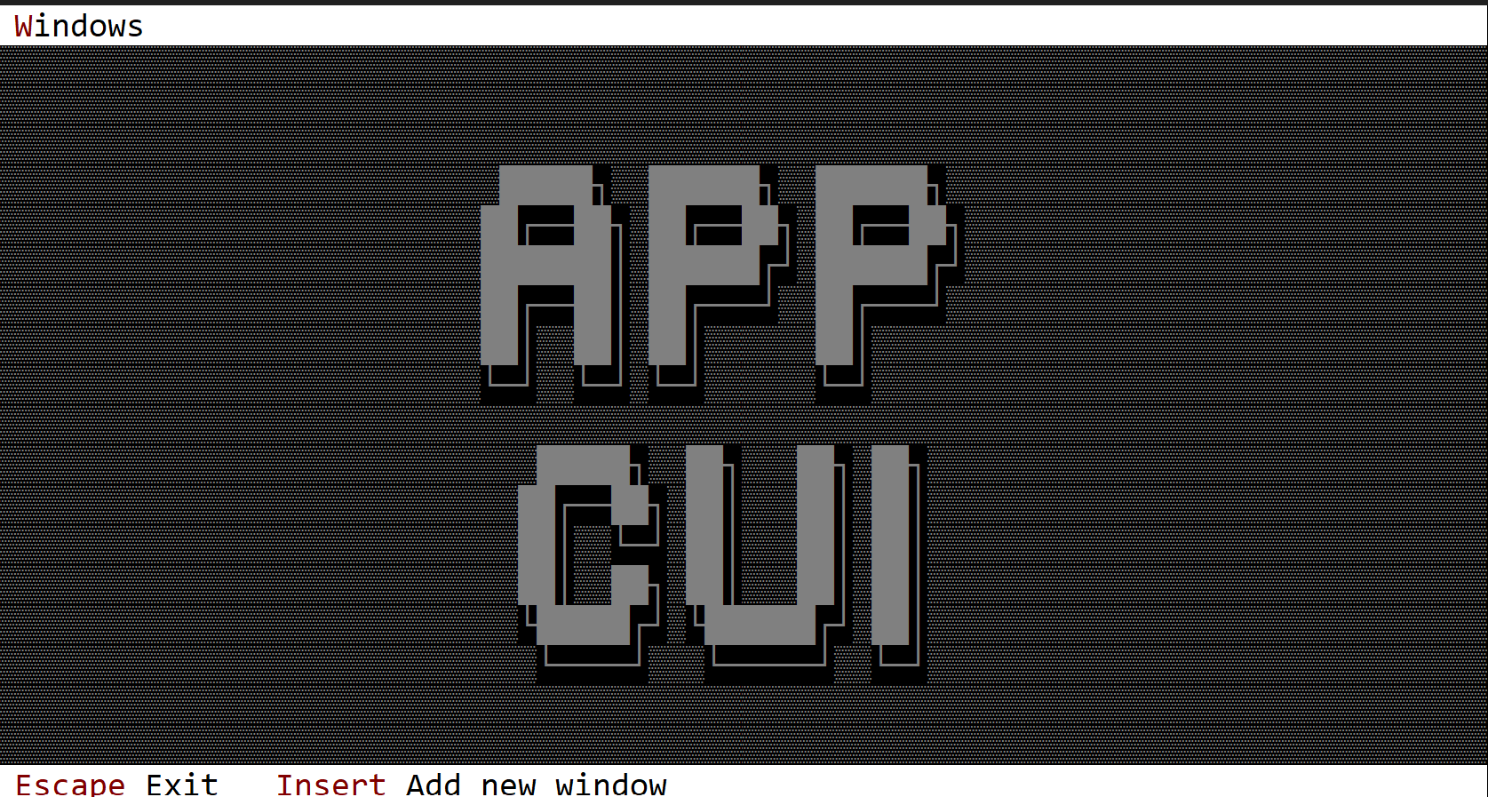
To build a custom desktop that supports event handling, you must use a special procedural macro called Desktop, defined in the following way:
#[Desktop(events=..., overwrite=... )]
struct MyDesktop {
// specific fields
}
where the attribute events has the following form:
events=EventTrait-1 + EventTrait-2 + EventTrait-3 + ... EventTrait-n
and an event trait can be one of the following:
- MenuEvents
- AppBarEvents
- CommandBarEvents
- DesktopEvents
and the overwrite attribute allows you to override the following traits:
- OnPaint
- OnResize
In other words, a custom desktop object can have specific logic for painting and for scenarios where it is resized, and it can process its internal events as well as events from menus and the command bar.
Events
The most important event trait for a desktop is DesktopEvents (that allows you to intercept desktop specific events):
pub trait DesktopEvents {
fn on_start(&mut self) { }
fn on_close(&mut self) -> ActionRequest {...}
fn on_update_window_count(&mut self, count: usize) {...}
}
These methods have the following purpose:
on_startis called once (after the AppCUI framework has started). A desktop object is constructed before the AppCUI framework starts. As such, you cannot instantiate other objects such as menus or windows in its constructor. However, you can do that by overriding theon_startmethod.on_closeis called whenever a desktop is being closed (usually when you press theEscapekey on a desktop). You can use this to perform some additional validations (such as saving all files, closing various handles, etc.).on_update_window_countis called whenever a new window is added or removed from the desktop. You can use this method to rearrange the remaining windows.
Using the custom desktop
To use the custom desktop, use the .desktop(...) method from the App like in the following example:
#[Desktop(events=..., overwrite=...)]
struct MyDesktop {
// additional fields
}
impl MyDesktop {
fn new()->Self {...}
// additional methods
}
// additional implementation for events and overridden traits
fn main() -> Result<(), appcui::system::Error> {
let a = App::new().desktop(MyDesktop::new()).build()?;
// do additional setup with the application
// such as add some windows into it
a.run();
Ok(())
}
It is important to note that it is usually preferable for the entire logic that instantiates a desktop and adds windows, menus, or other settings to run in the on_start method. From that point of view, the code in main becomes quite simple:
fn main() -> Result<(), appcui::system::Error> {
App::new().desktop(MyDesktop::new()).build()?.run();
Ok(())
}
Methods
Besides the Common methods for all Controls, a desktop also has the following additional methods:
| Method | Purpose |
|---|---|
terminal_size() | Returns the size of the current terminal |
desktop_rect() | Returns the actual rectangle for the desktop. If the application bar and command bar are present, the desktop rectangle describes the visible area of the desktop. For example, if the terminal size is 80x20 and we also have a command bar and an application bar, then the desktop rectangle might be [Left:0, Top:1, Right:79, Bottom:18] |
add_window(...) | Adds a new window to the desktop |
arrange_windows(...) | Arranges windows on the desktop. Four methods are provided: Cascade, Vertical, Horizontal, and Grid. |
close() | Closes the desktop and the entire app |
active_window() | Returns a handle to the focused window |
window_mut(...) | Returns a mutable reference to a window with the specified handle. If the handle is not valid, an error is returned. |
window(...) | Returns a reference to a window with the specified handle. If the handle is not valid, an error is returned. |
Key associations
A desktop intercepts the following keys (if they are not processed at window level):
| Key | Purpose |
|---|---|
Tab or Ctrl+Tab | Changes the focus to the next window |
Shift+Tab or Ctrl+Shift+Tab | Changes the focus to the previous window |
Escape | Calls the on_close method and if the result is ActionRequest::Allow closes the desktop and the entire application. |
If hotkeys are present for windows, Alt+{hotkey} is handled by the desktop, and the focus is moved to the window that has that hotkey association.
Example
The following example creates a custom desktop that prints My desktop in the top-left corner of the screen in white on a red background. The desktop has one command (AddWindow) to add new windows via the Insert key.
At the same time, DesktopEvents::on_update_window_count(...) is intercepted, and whenever a new window is added, it rearranges all windows in a grid.
use appcui::prelude::*;
#[Desktop(events: CommandBarEvents+DesktopEvents, overwrite:OnPaint, commands:AddWindow)]
struct MyDesktop {
index: u32,
}
impl MyDesktop {
fn new() -> Self {
Self {
base: Desktop::new(),
index: 1,
}
}
}
impl OnPaint for MyDesktop {
fn on_paint(&self, surface: &mut Surface, theme: &Theme) {
surface.clear(theme.desktop.character);
surface.write_string(1, 1, "My desktop", CharAttribute::with_color(Color::White, Color::Red), false);
}
}
impl DesktopEvents for MyDesktop {
fn on_update_window_count(&mut self, _count: usize) {
self.arrange_windows(desktop::ArrangeWindowsMethod::Grid);
}
}
impl CommandBarEvents for MyDesktop {
fn on_update_commandbar(&self, commandbar: &mut CommandBar) {
commandbar.set(key!("Insert"), "Add new_window", mydesktop::Commands::AddWindow);
}
fn on_event(&mut self, command_id: mydesktop::Commands) {
match command_id {
mydesktop::Commands::AddWindow => {
let name = format!("Win─{}", self.index);
self.index += 1;
self.add_window(Window::new(&name, layout!("a:c,w:20,h:10"), window::Flags::None));
}
}
}
}
fn main() -> Result<(), appcui::system::Error> {
App::new().size(Size::new(80,20))
.desktop(MyDesktop::new())
.command_bar()
.build()?
.run();
Ok(())
}
Commands
All custom controls, windows (including modal windows), and the desktop support a set of commands that are associated with their functionality.
To define such commands, use the commands attribute when defining a window, modal window, desktop, or custom control:
#[Window(commands = <list of commands>)]
The list of commands can be added in two ways:
- use
[command1, command2, ... command-n]format - use
command1+command2+...command-nformat
Example
#[Window(commands = [Save, Load, New])]
and
#[Window(commands = Save+Load+New)]
are identical and create three commands that are supported by the new window (Save, Load, and New).
Enum
Including a command attribute implicitly generates an enum within a module. The module's name is derived from the desktop, window, or custom control for which the commands are created, using its name in lowercase.
For example, the following definition:
#[Window(commands = Save+Load+New)]
struct MyWindow { /* data members */ }
will create the following:
mod mywindow {
#[repr(u32)]
#[derive(Copy, Clone, Eq, PartialEq, Debug)]
pub enum Commands {
Save = 0,
Load = 1,
New = 2,
}
}
Notice that the module name mywindow is the lowercase name of the window MyWindow.
You can further use these commands for menus or the command bar (via mywindow::Commands::Save, mywindow::Commands::Load, and so on).
You can also use them for parameter cmd in the macro definition for menus or menu items. If the macro parameter defines the name of the class via the parameter class (e.g. class = MyWindow) you don't have to write the full qualifier in the macro, you can write the name of the command alone.
For example, the following are equivalent:
cmd="mywin::Commands::Save"
and
cmd="Save", class="MyWin"
Menu
A menu is a list of items (that represents commands, checkboxes and single choice elements) that can be displayed over the existing controls.
To create a menu, use the Menu::new() method or the menu! macro (this can be used to quickly create complex static menus).
let m = Menu::new()
Menus can be displayed in two ways:
- As part of an AppBar using
MenuButtoncomponents (recommended for desktop applications) - As standalone popup menus using the traditional registration method
The menu button's name might include the special character &. This designates the next character as the hot key needed to activate the menu (in the previous example this will be Alt+F).
Registration
There are two ways to register and display menus in AppCUI:
Method 1: AppBar Integration (Recommended)
For desktop applications, menus are typically integrated into the AppBar using MenuButton components:
#[Window(events = MenuEvents+AppBarEvents, commands=[New, Open, Save, Exit])]
struct MyWin {
file_menu: Handle<appbar::MenuButton>,
}
impl MyWin {
fn new() -> Self {
let mut w = MyWin {
base: window!("Example,a:c,w:40,h:10"),
file_menu: Handle::None,
};
// Create a menu and add items to it
let mut file_menu = Menu::new();
file_menu.add(menu::Command::new("&New", key!("Ctrl+N"), mywin::Commands::New));
file_menu.add(menu::Command::new("&Open", key!("Ctrl+O"), mywin::Commands::Open));
file_menu.add(menu::Command::new("&Save", key!("Ctrl+S"), mywin::Commands::Save));
file_menu.add(menu::Separator::new());
file_menu.add(menu::Command::new("E&xit", key!("Alt+F4"), mywin::Commands::Exit));
// Add menu to AppBar as a MenuButton
w.file_menu = w.appbar().add(
appbar::MenuButton::new("&File", file_menu, 0, appbar::Side::Left)
);
w
}
}
Method 2: Traditional Registration
Each menu can also be registered directly into the AppCUI framework using the .register_menu(...) method. This is useful for popup menus or when you need direct menu handles:
#[Window(events = MenuEvents, commands=[<list of commands>])]
struct MyWin {
menu_handle_1: Handle<Menu>,
menu_handle_2: Handle<Menu>,
// other handles
}
impl MyWin {
fn new() -> Self {
let mut w = MyWin {
base: window!(...),
menu_handle_1: Handle::None,
menu_handle_2: Handle::None,
// other handle initialization,
};
// first menu
let m1 = Menu::new();
// add items to menu 'm1'
w.menu_handle_1 = w.register_menu(m1);
// second menu
let m2 = Menu::new();
// add items to menu 'm2'
w.menu_handle_2 = w.register_menu(m2);
w
}
}
Events
Using a menu implies that you will need to implement MenuEvents on the desktop, window, or a custom control to receive the associated action from a menu.
MenuEvents Trait
The MenuEvents trait provides the following methods:
trait MenuEvents {
fn on_menu_open(&self, menu: &mut Menu) {
// called whenever a menu is being opened
// by AppCUI framework
// This method can be used to change
// certain menu related aspects, such as
// - enable/disable menu items
// - add new items
}
fn on_command(&mut self, menu: Handle<Menu>, item: Handle<menu::Command>, command: u32) {
// this is called whenever a Command menu
// item is being clicked
}
fn on_check(&mut self, menu: Handle<Menu>, item: Handle<menu::CheckBox>, command: u32, checked: bool) {
// this is called whenever a CheckBox menu
// item is being clicked
}
fn on_select(&mut self, menu: Handle<Menu>, item: Handle<menu::SingleChoice>, command: u32) {
// this is called whenever a SingleChoice menu
// item is being clicked
}
}
AppBarEvents Trait (for AppBar Integration)
When using menus with AppBar, you'll also need to implement AppBarEvents:
trait AppBarEvents {
fn on_update(&self, appbar: &mut AppBar) {
// Called when the app bar needs to be updated
// Use appbar.show(handle) to display menu buttons
}
}
Complete Example
#[Window(events = MenuEvents+AppBarEvents, commands=[New, Open, Save, Exit])]
struct MyWindow {
file_menu: Handle<appbar::MenuButton>,
}
impl MenuEvents for MyWindow {
fn on_command(&mut self, _menu: Handle<Menu>, _item: Handle<menu::Command>, command: u32) {
match command {
cmd if cmd == mywindow::Commands::New as u32 => { /* Handle New */ },
cmd if cmd == mywindow::Commands::Open as u32 => { /* Handle Open */ },
cmd if cmd == mywindow::Commands::Save as u32 => { /* Handle Save */ },
cmd if cmd == mywindow::Commands::Exit as u32 => { /* Handle Exit */ },
_ => {}
}
}
}
impl AppBarEvents for MyWindow {
fn on_update(&self, appbar: &mut AppBar) {
// Show the file menu in the app bar
appbar.show(self.file_menu);
}
}
Methods
The following methods are available for every Menu object:
| Method | Purpose |
|---|---|
add(...) | Adds a new menu item to the existing menu and returns a Handle for it |
get(...) | Returns an immutable reference to a menu item |
get_mut(...) | Returns a mutable reference to a menu item |
Besides this, the following methods are available on each control and allow menu manipulation.
Menu Items
Each menu is formed from menu items. AppCUI supports the following menu items:
- Command: a command (clicking this item will send a command)
- CheckBox: an item that has two states (
checkedorunchecked). Clicking this item changes the state (fromcheckedtouncheckedand vice versa) and sends a command. - SingleChoice: an item that is part of a group from which only one can be selected at a time. Clicking this item selects it (implicitly unselecting any other selected
SingleChoiceitem in the group) and sends a command. - SubMenu: an item that contains another menu. Clicking this item opens the submenu.
- Separator: an item that has no input and is represented by a horizontal line that separates groups or commands within a menu.
Macro
All menu items can be built via the menuitem! macro. The following attributes can be used:
| Attribute | Command | CheckBox | SingleChoice | Sub-Menu | Separator |
|---|---|---|---|---|---|
caption | Yes | Yes | Yes | Yes | Yes |
shortcut | Yes | Yes | Yes | ||
command | Yes | Yes | Yes | ||
checked | Yes | ||||
selected | Yes | ||||
items | Yes | ||||
enabled | Yes (opt) | Yes (opt) | Yes (opt) | Yes (opt) | |
type | Yes (opt) | Yes (opt) | Yes (opt) | Yes (opt) | Yes (opt) |
class | Yes (opt) | Yes (opt) | Yes (opt) | Yes (opt) | Yes (opt) |
The type attribute is not optional. If not present, the type of the menu item is determined as follows:
- a menu item with only one attribute of type
captionthat consists only of multiple-characters will be considered aSeparator - a menu item that has the attribute
checkedwill be considered aCheckBox - a menu item that has the attribute
selectedwill be considered aSingleChoice - a menu item that has the attribute
itemswill be considered aSubMenu - otherwise, the menu item will be considered of type
Command
Similarly, the class attribute can be used to simplify the command value. Typically, the command attribute must use a format that resembles the following:
"command='<module-name>::Command::<Command-ID>'"
where <module-name> is the lowercase name of the struct that registers the menu.
To simplify the previous form, one can use the following:
"command=<Command-ID>, class=<class-name>"
For example - assuming we have the following window:
#![allow(unused)] fn main() { #[Window(..., commands = Save+Open+New)] struct MyWindow { /* data members */ } }
then we can define a menu item for command Save in one of the following ways:
#![allow(unused)] fn main() { let item = menuitem!("... command='mywindow::Commands::Save'"); }
or
#![allow(unused)] fn main() { let item = menuitem!("... command=Save, class=MyWindow"); }
It is also important to note that the class attribute is inherited (meaning that if you specify it for a menu item that has submenus, the submenu items inherit it, so you do not have to add it to their definitions).
Command (menu item)
A command menu item is an equivalent of a button but for menus.
You can create it using either menu::Command::new(...) method or via the menuitem! macro.
let cmd = menu::Command::new("Content", Key::new(KeyCode::F1,KeyModifier::None), <module>::Command::Content);
or
let cmd = menu::Command::new("Content", key!("F1"), <module>::Command::Content);
or
let cmd = menuitem!("Content,F1,'<module>::Command::Content'");
or
let cmd = menuitem!("Content,F1,cmd:Content,class:<class-name>");
Macro build
The following parameters are accepted by menuitem! when building a command menu item:
| Parameter name | Type | Positional parameter | Purpose |
|---|---|---|---|
text or caption | String | Yes (first positional parameter) | The caption (text) of the command. If the caption contains the special character &, the next character after it acts as a shortcut (meaning that pressing that character while that menu is open is equivalent to clicking that item). |
key or shortcut or shortcutket | String | Yes (second positional parameter) | The shortcut associated with the command. If not specified it will be considered Key::None |
cmd or cmd-id or command or command-id | String | Yes (third positional parameter) | The associated command id for this item |
type | String | No | The type of the item (for a command item, if this field is specified, its value must be command). |
class | String | No | The name of the class where the menu is being implemented |
enable or enabled | Bool | No | Use this to disable or enable a menu item |
Events
To intercept events this item, the following trait and method have to be implemented to the Window that processes the event loop:
trait MenuEvents {
fn on_command(&mut self, menu: Handle<Menu>, item: Handle<menu::Command>, command: <module>::Commands) {
// add logic here
}
}
Methods
The following methods are available for a menu::Command object:
| Method | Purpose |
|---|---|
set_caption(...) | Set the new caption for the item. If the string provided contains the special character &, this method also sets the hotkey associated with an item. If the string provided does not contain the & character, this method will clear the current hotkey (if any). |
caption() | Returns the current caption of an item |
set_enables(...) | Enables or disables current item |
is_enabled() | true if the item is enables, false otherwise |
set_shortcut(...) | Sets a new shortcut for the current item |
shortcut() | Returns the shortcut for the current item |
Example
The following code creates a menu with 3 menu items (of type command). Notice that we had to initialize the application with support for menus.
use appcui::prelude::*;
#[Window(events = MenuEvents+AppBarEvents, commands=Cmd1+Cmd2+Cmd3)]
struct MyWin {
m_commands: Handle<MenuButton>,
}
impl MyWin {
fn new() -> Self {
let mut w = MyWin {
base: window!("Test,a:c,w:40,h:8"),
m_commands: Handle::None,
};
let mut m = Menu::new();
m.add(menu::Command::new("Command-1", Key::None, mywin::Commands::Cmd1));
m.add(menu::Command::new("Command-2", Key::None, mywin::Commands::Cmd2));
m.add(menuitem!("Command-3,F1,cmd:Cmd3,class:MyWin"));
w.m_commands = w.appbar().add(MenuButton::new("Commands", m, 0, Side::Left));
w
}
}
impl AppBarEvents for MyWin {
fn on_update(&self, appbar: &mut AppBar) {
appbar.show(self.m_commands);
}
}
impl MenuEvents for MyWin {
fn on_command(&mut self, menu: Handle<Menu>, item: Handle<menu::Command>, command: mywin::Commands) {
match command {
mywin::Commands::Cmd1 => { /* do something with command 1 */ },
mywin::Commands::Cmd2 => { /* do something with command 2 */ },
mywin::Commands::Cmd3 => { /* do something with command 3 */ },
}
}
}
fn main() -> Result<(), appcui::system::Error> {
let mut a = App::new().app_bar().build()?;
a.add_window(MyWin::new());
a.run();
Ok(())
}
Checkbox (menu item)
A checkbox menu item is an equivalent of a checkbo but for menus.
You can create it using either menu::CheckBox::new(...) method or via the menuitem! macro.
let cbox = menu::CheckBox::new("Option", Key::new(KeyCode::F1,KeyModifier::None), <module>::Command::Content, true);
or
let cbox = menu::CheckBox::new("Option", key!("F1"), <module>::Command::Content, false);
or
let cbox = menuitem!("Option,F1,'<module>::Command::Content',type:Checkbox");
or
let cbox = menuitem!("Option,F1,cmd:Content,class:<class-name>,checked:true");
Macro build
The following parameters are accepted by menuitem! when building a checkbox menu item:
| Parameter name | Type | Positional parameter | Purpose |
|---|---|---|---|
text or caption | String | Yes (first positional parameter) | The caption (text) of the checkbox. If the caption contains the special character &, the next character after it acts as a shortcut (meaning that pressing that character while that menu is open is equivalent to clicking that item). |
key or shortcut or shortcutket | String | Yes (second positional parameter) | The shortcut associated with the checkbox. If not specified it will be considered Key::None |
cmd or cmd-id or command or command-id | String | Yes (third positional parameter) | The associated command id for this item |
check or checked | Bool | No | true if the item is checked, false otherwise |
type | String | No | The type of the item (for a checkbox item, if this field is specified, its value must be checkbox). |
class | String | No | The name of the class where the menu is being implemented |
enable or enabled | Bool | No | Use this to disable or enable a menu item |
Events
To intercept events this item, the following trait and method have to be implemented to the Window that processes the event loop:
trait MenuEvents {
fn on_check(&mut self, menu: Handle<Menu>, item: Handle<menu::CheckBox>, command: <module>::Commands, checked: bool) {
// this is called whenever a CheckBox menu
// item is being cliecked
}
}
Methods
The following methods are available for a menu::CheckBox object:
| Method | Purpose |
|---|---|
set_caption(...) | Set the new caption for the item. If the string provided contains the special character &, this method also sets the hotkey associated with an item. If the string provided does not contain the & character, this method will clear the current hotkey (if any). |
caption() | Returns the current caption of an item |
set_checked(...) | Checkes or uncheckes current ite, |
is_checked() | true if the item is checked, false otherwise |
set_enables(...) | Enables or disables current item |
is_enabled() | true if the item is enables, false otherwise |
set_shortcut(...) | Sets a new shortcut for the current item |
shortcut() | Returns the shortcut for the current item |
Example
The following code creates a menu with 3 menu items (of type checkbox). Notice that we had to initialize the application with support for menus.
use appcui::prelude::*;
#[Window(events = MenuEvents+AppBarEvents, commands=Cmd1+Cmd2+Cmd3)]
struct MyWin {
m_commands: Handle<MenuButton>,
}
impl MyWin {
fn new() -> Self {
let mut w = MyWin {
base: window!("Test,a:c,w:40,h:8"),
m_commands: Handle::None,
};
let mut m = Menu::new();
m.add(menu::CheckBox::new("&Option-1", Key::None, mywin::Commands::Cmd1,true));
m.add(menu::CheckBox::new("Option-2", Key::None, mywin::Commands::Cmd2,false));
m.add(menuitem!("Option-3,F1,cmd:Cmd3,class:MyWin,checked:true"));
w.m_commands = w.appbar().add(MenuButton::new("Commands", m, 0, Side::Left));
w
}
}
impl AppBarEvents for MyWin {
fn on_update(&self, appbar: &mut AppBar) {
appbar.show(self.m_commands);
}
}
impl MenuEvents for MyWin {
fn on_check(&mut self,menu:Handle<Menu>,item:Handle<menu::CheckBox>,command:mywin::Commands,checked:bool) {
match command {
mywin::Commands::Cmd1 => { /* do something with option 1 */ },
mywin::Commands::Cmd2 => { /* do something with option 2 */ },
mywin::Commands::Cmd3 => { /* do something with option 3 */ },
}
}
}
fn main() -> Result<(), appcui::system::Error> {
let mut a = App::new().app_bar().build()?;
a.add_window(MyWin::new());
a.run();
Ok(())
}
Single Choice (menu item)
A checkbox menu item is an equivalent of a checkbo but for menus.
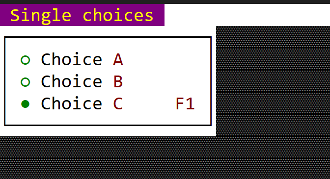
You can create it using either menu::SingleChoice::new(...) method or via the menuitem! macro.
let sc = menu::SingleChoice::new("Choice", Key::new(KeyCode::F1,KeyModifier::None), <module>::Command::Content);
or
let sc = menu::SingleChoice::new("Choice", key!("F1"), <module>::Command::Content);
or
let sc = menuitem!("Choice,F1,'<module>::Command::Content',type:SinghleChoice");
or
let sc = menuitem!("Choice,F1,cmd:Content,class:<class-name>,selected:true");
Macro build
The following parameters are accepted by menuitem! when building a checkbox menu item:
| Parameter name | Type | Positional parameter | Purpose |
|---|---|---|---|
text or caption | String | Yes (first positional parameter) | The caption (text) of the single-choice item. If the caption contains the special character &, the next character after it acts as a shortcut (meaning that pressing that character while that menu is open is equivalent to clicking that item). |
key or shortcut or shortcutket | String | Yes (second positional parameter) | The shortcut associated with the single choice item. If not specified it will be considered Key::None |
cmd or cmd-id or command or command-id | String | Yes (third positional parameter) | The associated command id for this item |
select or selected | Bool | No | true if the choice is the selected one, false otherwise |
type | String | No | The type of the item (for a single-choice item, if this field is specified, its value must be singlechoice). |
class | String | No | The name of the class where the menu is being implemented |
enable or enabled | Bool | No | Use this to disable or enable a menu item |
Events
To intercept events this item, the following trait and method have to be implemented to the Window that processes the event loop:
trait MenuEvents {
fn on_select(&mut self, menu: Handle<Menu>, item: Handle<menu::CheckBox>, command: <module>::Commands) {
// this is whenever a single choice item is selected
}
}
Methods
The following methods are available for a menu::SingleChoice object:
| Method | Purpose |
|---|---|
set_caption(...) | Set the new caption for the item. If the string provided contains the special character &, this method also sets the hotkey associated with an item. If the string provided does not contain the & character, this method will clear the current hotkey (if any). |
caption() | Returns the current caption of an item |
set_checked(...) | Checkes or uncheckes current ite, |
is_selected() | true if the item is checked, false otherwise |
set_selected() | Selects the current item |
is_enabled() | true if the item is enables, false otherwise |
set_shortcut(...) | Sets a new shortcut for the current item |
shortcut() | Returns the shortcut for the current item |
Groups
All single choice items are implicetely gouped based on their index. A consequitive set of single choice items forms a group. Whenever a single choice item is selected, the rest of the items from the group will be unselected.
Let's consider the following example (menu):
Single choice A
Single choice B
Single choice C
---------------
Single choice D
Single choice E
Single choice F
This menu has 7 items (the first three are of type single choice, then we have a separator and then another three single choice items). As such, 2 groups will be create:
- First group - created out of single choice items
A,BandC - Second group - created out of single choice items
D,EandF
Whenever an item from the first group is being selected, the rest of the items will be unselected (ex: if we slect item F, then item D and item E will be unselected by default).
Example
The following code creates a menu with 3 menu items (of type checkbox). Notice that we had to initialize the application with support for menus.
use appcui::prelude::*;
#[Window(events = MenuEvents+AppBarEvents, commands=Cmd1+Cmd2+Cmd3)]
struct MyWin {
m_commands: Handle<MenuButton>,
}
impl MyWin {
fn new() -> Self {
let mut w = MyWin {
base: window!("Test,a:c,w:40,h:8"),
m_commands: Handle::None,
};
let mut m = Menu::new();
m.add(menu::SingleChoice::new("Choice &A", Key::None, mywin::Commands::Cmd1,false));
m.add(menu::SingleChoice::new("Choice &B", Key::None, mywin::Commands::Cmd2,false));
m.add(menuitem!("'Choice &C',F1,cmd:Cmd3,class:MyWin,selected:true"));
w.m_commands = w.appbar().add(MenuButton::new("Single choices", m, 0, Side::Left));
w
}
}
impl AppBarEvents for MyWin {
fn on_update(&self, appbar: &mut AppBar) {
appbar.show(self.m_commands);
}
}
impl MenuEvents for MyWin {
fn on_select(&mut self,menu:Handle<Menu>,item:Handle<menu::SingleChoice>,command:mywin::Commands) {
match command {
mywin::Commands::Cmd1 => { /* do something with option 1 */ },
mywin::Commands::Cmd2 => { /* do something with option 2 */ },
mywin::Commands::Cmd3 => { /* do something with option 3 */ },
}
}
}
fn main() -> Result<(), appcui::system::Error> {
let mut a = App::new().app_bar().build()?;
a.add_window(MyWin::new());
a.run();
Ok(())
}
Separator
A separator item is designed to provide a way to separate groups of menu items.
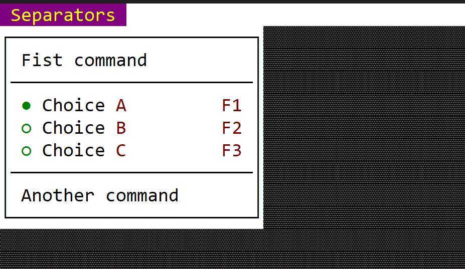
You can create it using either menu::Separator::new() method or via the menuitem! macro.
let sep = menu::Separator::new();
or
let sep = menuitem!("---");
or
let sep = menuitem!("type:separator");
Macro build
The following parameters are accepted by menuitem! when building a separator menu item:
| Parameter name | Type | Positional parameter | Purpose |
|---|---|---|---|
type | String | No | The type of the item (for a separator item, if this field is specified, its value must be separator). |
Events
There are no events associated with a separator.
Methods
There are no events associated with a separator.
Example
The following code creates a menu with multiple items separated between them.
use appcui::prelude::*;
#[Window(events = AppBarEvents, commands=Cmd1+Cmd2+Cmd3)]
struct MyWin {
m_commands: Handle<MenuButton>,
}
impl MyWin {
fn new() -> Self {
let mut w = MyWin {
base: window!("Test,a:c,w:40,h:8"),
m_commands: Handle::None,
};
let mut m = Menu::new();
m.add(menu::Command::new("Fist command", Key::None, mywin::Commands::Cmd1));
m.add(menu::Separator::new());
m.add(menuitem!("'Choice &A',F1,cmd:Cmd3,class:MyWin,selected:true"));
m.add(menuitem!("'Choice &B',F2,cmd:Cmd3,class:MyWin,selected:false"));
m.add(menuitem!("'Choice &C',F3,cmd:Cmd3,class:MyWin,selected:false"));
m.add(menuitem!("---"));
m.add(menu::Command::new("Another command", Key::None, mywin::Commands::Cmd2));
w.m_commands = w.appbar().add(MenuButton::new("Commands", m, 0, Side::Left));
w
}
}
impl AppBarEvents for MyWin {
fn on_update(&self, appbar: &mut AppBar) {
appbar.show(self.m_commands);
}
}
fn main() -> Result<(), appcui::system::Error> {
let mut a = App::new().app_bar().build()?;
a.add_window(MyWin::new());
a.run();
Ok(())
}
Sub Menus
A sub menu item is a container for another menu.
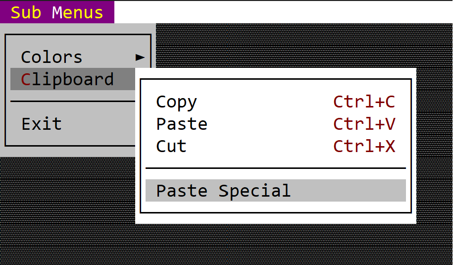
You can create it using either menu::SubMenu::new(...) method or via the menuitem! macro.
let submenu = menu::SubMenu::new("&Content", Menu::new());
or
let submenu = menuitem!("Content,items=[...]");
or
let submenu = menuitem!("Content,class:<class-name>,items=[...]");
Macro build
The following parameters are accepted by menuitem! when building a command menu item:
| Parameter name | Type | Positional parameter | Purpose |
|---|---|---|---|
text or caption | String | Yes (first positional parameter) | The caption (text) of the submenu. If the caption contains the special character &, the next character after it acts as a shortcut (meaning that pressing that character while that menu is open is equivalent to clicking that item). |
type | String | No | The type of the item (for a submenu item, if this field is specified, its value must be submenu). |
class | String | No | The name of the class where the menu is being implemented |
enable or enabled | Bool | No | Use this to disable or enable a menu item |
Remarks: Using the class attribute in a submenu will inherit that attribute for all subitems and submenus. See Build a menu with macros for more details.
Events
There are no command based events associated with a sub-menu. When clicked (or the Enter key is being pressed) the sub-menu will open and on_menu_open will be called (if needed to change the status of some of the sub-menu items):
trait MenuEvents {
fn on_menu_open(&self, menu: &mut Menu) {
// called whenever a menu is being opened
// by AppCUI framework
// This method can be used to change
// certain menu-related aspects, such as
// - enable/disable menu items
// - add new items
}
Methods
The following methods are available for a menu::SubMenu object:
| Method | Purpose |
|---|---|
set_caption(...) | Set the new caption for the item. If the string provided contains the special character &, this method also sets the hotkey associated with an item. If the string provided does not contain the & character, this method will clear the current hotkey (if any). |
caption() | Returns the current caption of an item |
set_enabled(...) | Enables or disables current item |
is_enabled() | true if the item is enabled, false otherwise |
Example
The following code creates a menu with submenus using the AppBar approach (recommended):
use appcui::prelude::*;
#[Window(events = MenuEvents+AppBarEvents,
commands = Red+Green+Blue+Copy+Paste+Cut+PasteSpecial+Exit)]
struct MyWin {
main_menu: Handle<appbar::MenuButton>,
}
impl MyWin {
fn new() -> Self {
let mut w = MyWin {
base: window!("Test,a:c,w:40,h:8"),
main_menu: Handle::None,
};
// Create the main menu
let mut main_menu = Menu::new();
// Create colors submenu
let mut colors_menu = Menu::new();
colors_menu.add(menu::SingleChoice::new("&Red", Key::None, mywin::Commands::Red, true));
colors_menu.add(menu::SingleChoice::new("&Green", Key::None, mywin::Commands::Green, false));
colors_menu.add(menu::SingleChoice::new("&Blue", Key::None, mywin::Commands::Blue, false));
main_menu.add(menu::SubMenu::new("&Colors", colors_menu));
// Create clipboard submenu
let mut clipboard_menu = Menu::new();
clipboard_menu.add(menu::Command::new("&Copy", key!("Ctrl+C"), mywin::Commands::Copy));
clipboard_menu.add(menu::Command::new("&Paste", key!("Ctrl+V"), mywin::Commands::Paste));
clipboard_menu.add(menu::Command::new("Cu&t", key!("Ctrl+X"), mywin::Commands::Cut));
clipboard_menu.add(menu::Separator::new());
clipboard_menu.add(menu::Command::new("Paste &Special", Key::None, mywin::Commands::PasteSpecial));
main_menu.add(menu::SubMenu::new("&Clipboard", clipboard_menu));
main_menu.add(menu::Separator::new());
main_menu.add(menu::Command::new("E&xit", key!("Alt+F4"), mywin::Commands::Exit));
// Add to AppBar
w.main_menu = w.appbar().add(
appbar::MenuButton::new("&Actions", main_menu, 0, appbar::Side::Left)
);
w
}
}
impl MenuEvents for MyWin {
fn on_command(&mut self, menu: Handle<Menu>, item: Handle<menu::Command>, command: mywin::Commands) {
match command {
mywin::Commands::Copy => { /* Copy command was called */ }
mywin::Commands::Paste => { /* Paster command was called */ },
mywin::Commands::Cut => { /* Cut command was called */ },
mywin::Commands::PasteSpecial => { /* PasteSpecial command was called */ },
mywin::Commands::Exit => { /* Exit command was called */ },
_ => {}
}
}
fn on_select(&mut self, menu: Handle<Menu>, item: Handle<menu::SingleChoice>, command: mywin::Commands) {
match command {
mywin::Commands::Red => { /* Red color was selected */ }
mywin::Commands::Green => { /* Green color was selected */ }
mywin::Commands::Blue => { /* Blue color was selected */ }
_ => {}
}
}
}
impl AppBarEvents for MyWin {
fn on_update(&self, appbar: &mut AppBar) {
appbar.show(self.main_menu);
}
}
fn main() -> Result<(), appcui::system::Error> {
let mut a = App::new().app_bar().build()?;
a.add_window(MyWin::new());
a.run();
Ok(())
}
Build a menu with macros
Building a menu is not a complicated task, but it involves multiple operations over the menu items. Let's consider the following menu:
- Items:
Colors-> a sub-menu that contains the following sub-items:Red(a single choice sub-item)Green(a single choice sub-item)Blue(a single choice sub-item)
Clipboard-> another sub-menu that contains the following sub-items:Copy(a command, withCtrl+Cshortcut associated )Cut(a command, withCtrl+Xshortcut associated )Paste( a command withCtrl+Vshortcut associated )- a separator
Paste Special(also a command, with no shortcut associated )
- a separator
Exit(a command with no shortcut associated)
We will also assume that the following commands were added via the commands attribute:
#[Window(..., commands = Red+Green+Blue+Copy+Paste+Cut+PasteSpecial+Exit)]
struct MyWindow { /* data members */ }
Let's see several ways this menu can be created.
Build this menu without any macros
let mut m = Menu::new();
// build the color submenu
let mut m_colors = Menu::new();
m_colors.add(menu::SingleChoice::new("Red",
Key::None,
mywin::Commands::Red,
true));
m_colors.add(menu::SingleChoice::new("Green",
Key::None,
mywin::Commands::Green,
true));
m_colors.add(menu::SingleChoice::new("Blue",
Key::None,
mywin::Commands::Blue,
true));
m.add(menu::SubMenu::new("Colors", m_colors));
// build the clipboard submenu
let mut m_clipboard = Menu::new();
m_clipboard.add(menu::Command::new("Copy",
Key::new(KeyCode::C, KeyModifier::Ctrl),
mywin::Commands::Copy));
m_clipboard.add(menu::Command::new("Cut",
Key::new(KeyCode::X, KeyModifier::Ctrl),
mywin::Commands::Cut));
m_clipboard.add(menu::Command::new("Paste",
Key::new(KeyCode::V, KeyModifier::Ctrl),
mywin::Commands::Paste));
m_clipboard.add(menu::Separator::new());
m_clipboard.add(menu::Command::new("Paste Special",
Key::None,
mywin::Commands::PasteSpecial));
m.add(menu::SubMenu::new("&Clipboard", m_clipboard));
// add the last items
m.add(menu::Separator::new());
m.add(menu::Command::new("Exit",
Key::None,
mywin::Commands::Exit));
Notice that the code is correct but is quite bloated and hard to read.
Build this menu using menuitem! macro
let mut m = Menu::new();
// build the color submenu
let mut m_colors = Menu::new();
m_colors.add(menuitem!("Red,selected:true,cmd:Red,class:MyWin"));
m_colors.add(menuitem!("Green,selected:true,cmd:Green,class:MyWin"));
m_colors.add(menuitem!("Blue,selected:true,cmd:Blue,class:MyWin"));
m.add(menu::SubMenu::new("Colors", m_colors));
// build the clipboard submenu
let mut m_clipboard = Menu::new();
m_clipboard.add(menuitem!("Copy,Ctrl+C,cmd:Copy,class:MyWin"));
m_clipboard.add(menuitem!("Cut,Ctrl+X,cmd:Cut,class:MyWin"));
m_clipboard.add(menuitem!("Paste,Ctrl+V,cmd:Paste,class:MyWin"));
m_clipboard.add(menuitem!("---"));
m_clipboard.add(menuitem!("'Paste Special',None,cmd:PasteSpecial,class:MyWin"));
m.add(menu::SubMenu::new("&Clipboard", m_clipboard));
// add the last items
m.add(menuitem!("---"));
m.add(menuitem!("Exit,cmd:Exit,class:MyWin"));
The code is more readable, but we can make it even smaller.
Building a menu using the menu! macro
In this case we will use the menu! macro to condense the code even more:
let m = menu!("items=[
{ Colors,items=[
{ Red,selected:true,cmd:Red,class:MyWin },
{ Green,selected:true,cmd:Green,class:MyWin },
{ Blue,selected:true,cmd:Blue,class:MyWin }
]},
{ &Clipboard,items=[
{ Copy,Ctrl+C,cmd:Copy,class:MyWin },
{ Cut,Ctrl+X,cmd:Cut,class:MyWin },
{ Paste,Ctrl+V,cmd:Paste,class:MyWin },
{ --- },
{ 'Paste Special',None,cmd:PasteSpecial,class:MyWin }
]},
{ --- },
{ Exit,cmd:Exit,class:MyWin }
]");
Notice that in this case, the description of a menu item is more condensed (and easier to read) and looks like a JSON file.
However, there is still some duplicated data in this form (for example, the attribute class with value MyWin is present for each actionable item). In this case we can use the inherited properties of a menu and specify this attribute only once, reducing the code further by adding the class attribute to the top-level menu description. That yields the most compact way to create a menu quickly.
let m = menu!("class:MyWin,items=[
{ Colors,items=[
{ Red,selected:true,cmd:Red },
{ Green,selected:true,cmd:Green },
{ Blue,selected:true,cmd:Blue }
]},
{ &Clipboard,items=[
{ Copy,Ctrl+C,cmd:Copy },
{ Cut,Ctrl+X,cmd:Cut },
{ Paste,Ctrl+V,cmd:Paste },
{ --- },
{ 'Paste Special',None,cmd:PasteSpecial }
]},
{ --- },
{ Exit,cmd:Exit }
]");
Remarks: Keep in mind that this approach will not let you obtain any menu item handles. If handles are necessary to change attributes (such as enable/disable status), you will not be able to do so. However, if your menu only has commands or checkboxes, and assigning a command is enough for you to react to an event, this is the preferred way to create a menu.
Popup Menu
A popup menu is a menu that is displayed outside of the application bar (for example, a menu that appears when the right mouse button is pressed):
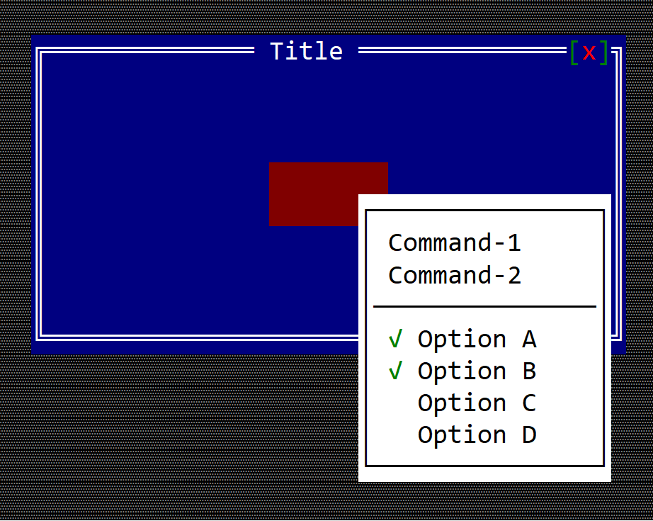
Remarks: There is no need to enable the application bar for a popup menu.
There is no special control for a popup menu. A popup menu is a menu that is displayed in a different way. Usually a popup menu is associated with a window, a custom control, or a custom desktop, and using the show_menu method available on all controls:
fn show_menu(&self, handle: Handle<Menu>, x: i32, y: i32, max_size: Option<Size>) {
...
}
where:
handleis a handle to a menu that was registered via theregister_menu(...)method.xandyare coordinates within the current control where the menu should be displayed. By default, AppCUI will try to position the menu to the bottom-right of the provided coordinates. If the menu does not fit in the available space, it will try another position so that it remains visible on the screen.max_sizeis an Option that controls the maximum size of a menu. By default, a menu will attempt to grow its width and height to show all items while staying visible on the screen. This behavior can be overridden by providing a maximum width and height (the maximum width must be at least 5 characters so that at least 3 items are visible).
Example
The following example creates a custom control that can display a popup menu when the user right-clicks it:
use appcui::prelude::*;
#[CustomControl(events : MenuEvents,
overwrite : OnPaint+OnMouseEvent,
commands : A+B+C)]
struct MyCustomControl {
popup_menu: Handle<Menu>,
}
impl MyCustomControl {
fn new() -> Self {
let mut w = MyCustomControl {
base: ControlBase::new(layout!("a:c,w:8,h:2"), true),
popup_menu: Handle::None,
};
// construct a popup menu
let m = menu!("Popup,class: MyCustomControl, items=[
{Command-1,cmd:A},
{Command-2,cmd:B},
{-},
{'Option A',checked:true, cmd:C},
{'Option B',checked:true, cmd:C},
{'Option C',checked:false, cmd:C},
{'Option D',checked:false, cmd:C},
]");
w.popup_menu = w.register_menu(m);
w
}
}
impl MenuEvents for MyCustomControl {
fn on_command(&mut self, _menu: Handle<Menu>, _item: Handle<menu::Command>, command: mycustomcontrol::Commands) {
match command {
mycustomcontrol::Commands::A => { /* do something */ },
mycustomcontrol::Commands::B => { /* do something */ },
mycustomcontrol::Commands::C => { /* do something */ },
}
}
}
impl OnPaint for MyCustomControl {
fn on_paint(&self, surface: &mut Surface, _theme: &Theme) {
surface.clear(char!("' ',White,DarkRed"));
}
}
impl OnMouseEvent for MyCustomControl {
fn on_mouse_event(&mut self, event: &MouseEvent) -> EventProcessStatus {
// if the event is a mouse click
if let MouseEvent::Pressed(ev) = event {
// if the button is the right one
if ev.button == MouseButton::Right {
// show the popup menu at mouse coordinates
self.show_menu(self.popup_menu, ev.x, ev.y, None);
}
}
EventProcessStatus::Ignored
}
}
fn main() -> Result<(), appcui::system::Error> {
let mut a = App::new().build()?;
let mut w = window!("Title,a:c,w:40,h:10");
w.add(MyCustomControl::new());
a.add_window(w);
a.run();
Ok(())
}
Command Bar
A command bar is a bar (on the bottom part of a desktop and on top of every window) that contains key associations with commands. All associations are checked first - meaning that if you associate the key F1 with a command, when you press F1 you will not receive the key event, but the command associated with it.
The command bar is unique per application. This means that you need to enable it when a new application is created. A typical way to do this is by using the .command_bar() method when building an application, as in the following snippet:
#![allow(unused)] fn main() { let mut app = App::new().command_bar().build()?; }
Once you have enabled the command bar, you will need to implement CommandBarEvents on your window or custom control, and you will also need to add a list of commands when you create your window and/or custom control. A typical template for this flow looks like this:
#![allow(unused)] fn main() { #[Window(events = CommandBarEvents, commands=[Command_1, Command_2 ... Command_n])] struct MyWin { /* data member */ } impl MyWin { /* internal methods */ } impl CommandBarEvents for MyWin { fn on_update_commandbar(&self, commandbar: &mut CommandBar) { // this is where you add associations (key - command) // this can be done via `commandbar.set(...)` method } fn on_event(&mut self, command_id: mywin::Commands) { // this method is called whenever a key from the associated list is being pressed } } }
It is also important to note that on_update_commandbar is called only if the current focus (or one of its children) has focus. This implies that, except when a modal window is opened, this method will always be called for the desktop object.
Whenever the focus changes, the command bar is cleared and the method on_update_commandbar is invoked again for each control from the focused control up to its oldest ancestor (in most cases, the desktop).
You can always request an update to the command bar by calling the .request_update() method that every control has. This method will force AppCUI to call on_update_commandbar again from the focused control up to its oldest ancestor. Keep in mind that this will not necessarily call on_update_commandbar for the control that calls request_update, unless that control has the focus.
All commands that you add via the commands attribute are automatically added to a module (with the same name as your window or control, but lowercased) under the enum Commands.
Example
The following example shows a window that associates three keys: F1, F2 and F3 to some commands:
use appcui::prelude::*; #[Window(events = CommandBarEvents, commands=[Help, Save, Load])] struct MyWin { } impl MyWin { fn new() -> Self { Self { base: window!("Win,x:1,y:1,w:20,h:7"), } } } impl CommandBarEvents for MyWin { fn on_update_commandbar(&self, commandbar: &mut CommandBar) { commandbar.set(key!("F1"), "Help", mywin::Commands::Help); commandbar.set(key!("F2"), "Save", mywin::Commands::Save); commandbar.set(key!("F3"), "Load", mywin::Commands::Load); } fn on_event(&mut self, command_id: mywin::Commands) { match command_id { mywin::Commands::Help => { // show a help }, mywin::Commands::Save => { // save current data }, mywin::Commands::Load => { // load something }, } } } fn main() -> Result<(), appcui::system::Error> { let mut a = App::new().command_bar().build()?; a.add_window(MyWin::new()); a.run(); Ok(()) }
Application Bar
An application bar is a bar (on the top part of a desktop and on top of every window) that contains all menus and other specific controls associated with an application.
The application bar is unique per application. This means that you need to enable it when a new application is created. A typical way to do this is by using the .app_bar() method when building an application, as in the following snippet:
#![allow(unused)] fn main() { let mut app = App::new().app_bar().build()?; }
You cannot directly create an application bar. However, all controls (including windows and desktop) have an appbar() method that returns a mutable reference to the application bar.
Events
To work with the application bar, you will need to implement AppBarEvents on your window or custom control.
pub trait AppBarEvents {
/// Called when an app bar button is being clicked.
fn on_button_click(&mut self, button: Handle<super::Button>);
/// Called when a toggle button's state changes.
fn on_togglebutton_state_changed(&mut self,
togglebutton: Handle<super::ToggleButton>,
selected: bool);
/// Called when a switch button's state changes.
fn on_switchbutton_state_changed(&mut self,
switchbutton: Handle<super::SwitchButton>,
selected: bool);
/// Called when the app bar needs to be updated.
fn on_update(&self, appbar: &mut AppBar) {}
}
The on_update method in particular is called whenever the application bar needs to be updated. At this point, you can decide which items to show in the application bar, via the appbar.show(...) method.
#![allow(unused)] fn main() { #[Window(events = AppBarEvents)] struct MyWin { /* data member */ } impl MyWin { fn new() -> Self { let mut w = Self { /* code to instantiate the structure */ }; // other initialization methods let appbar_item_handle = w.appbar().add(/* appbar item */); // store the handle for later use // add other appbar items w } /* other methods */ } impl AppBarEvents for MyWin { // other event related methods fn on_update(&self, appbar: &mut AppBar) { // this is called whenever the application bar needs to be updated // at this point, you can decide which items to show in the application bar. appbar.show(/* appbar item handle */); } } }
It is also important to note that on_update is called only if the current focus (or one of its children) has focus. This implies that, except when a modal window is opened, this method will always be called for the desktop object.
Whenever the focus changes, the application bar is cleared and the method on_update is invoked again for each control from the focused control up to its oldest ancestor (in most cases, the desktop).
You can always request an update to the application bar by calling the .request_update() method that every control has. This method will force AppCUI to call on_update again from the focused control up to its oldest ancestor. Keep in mind that this will not necessarily call on_update for the control that calls request_update, unless that control has the focus.
Usage
An application bar has the following methods:
| Method | Purpose |
|---|---|
add(...) | Adds a new item to the application bar (including an order and position) and returns a handle for it |
show(...) | Shows an item in the application bar |
get(...) | Returns an immutable reference to an item from the application bar |
get_mut(...) | Returns a mutable reference to an item from the application bar |
Remarks: The show(...) method is typically used to show an item in the application bar. This method should only be called from AppBarEvents::on_update(...) (if overridden). By default, all items are hidden, and whenever the focus changes, the AppCUI framework hides all items, starts from the focused control, walks up to its ancestors, and calls this method to decide which items to show.
Item order and positioning
Each item in the application bar has an order and a position. The order is used to determine the order of the items in the application bar. The position is used to determine the position of the item in the application bar (to the left or to the right).
orderrepresents a value of typeu8between 0 and 255 (the lower the value, the earlier the item will appear in the application bar)positionrepresents a value of typeappbar::Sidethat can be eitherSide::LeftorSide::Right
Algorithm:
When the focus changes, the AppCUI framework does the following:
- Hides all items from the application bar
- Starts from the focus control and moves to its ancestors and calls the
AppBarEvents::on_update(...)method to decide which items to show.- each control should call
appbar.show(...)method with the handle of the item it wants to be shown#![allow(unused)] fn main() { impl AppBarEvents for <Control|Window|Desktop> { fn on_update(&self, appbar: &mut AppBar) { appbar.show(/* handle of the first item to show */); appbar.show(/* handle of the second item to show */); // ... } } }
- each control should call
- Once this process is done (meaning that we reach the desktop control), the items are sorted based on their
orderproperty. This allows a control to position some items before its parent control. - After the sort process is done, items are extracted and their position is configured based on their
positionproperty.- if the
positionproperty isSide::Left, the item is positioned from the left side of the application bar - if the
positionproperty isSide::Right, the item is positioned from the right side of the application bar
- if the
Remark: If there is no space available to position an item without overlapping with other items, the process stops and the rest of the remaining items will not be displayed (even if the user has called the .show(...) method for them). This typically happens if the terminal is too small (in width) to fit all items.
Let's see an example with 3 items ('A', 'B', and 'C') and a terminal width of 10 characters (we will assume that 'A', 'B', and 'C' each have a width of 2 characters):
| Examples | 'A' offset | 'B' offset | 'C' offset | Observations |
|---|---|---|---|---|
A (order 0, position Left)B (order 1, position Left)C (order 2, position Left) | 0 | 2 | 4 | All items are positioned one after another |
A (order 0, position Left)B (order 1, position Left)C (order 0, position Right) | 0 | 2 | 8 (10-2) | First we position A , then C(both have order 0), and finally B(in the space between A and C) |
A (order 0, position Left)B (order 1, position Right)C (order 0, position Right) | 0 | 6 (C-2) | 8 (10-2) | First we position A , then C(both have order 0), and finally B(relative to C) |
A (order 2, position Left)B (order 1, position Left)C (order 0, position Left) | 4 | 2 | 0 | Items are positioned in reverse order |
Items
An application bar item can be one of the following types:
Each item has the following properties:
- position
- caption
- tooltip
- order
- width
- enabled or disabled
MenuButton
A menu button is a button that opens a menu when clicked. Once the menu is opened, moving the mouse over another menu button or using the keyboard to move to another menu button will close the current menu and open the new one automatically.
To create a menu button, use the appbar::MenuButton::new(...) method or the appbar::MenuButton::with_handle(...) method.
let m = appbar::MenuButton::new("&File",
menu!(...),
0, // order
appbar::Side::Left);
or
let menu = menu!(....);
let menu_handle = self.register_menu(menu);
let m = appbar::MenuButton::with_handle("&File",
menu_handle,
0, // order
appbar::Side::Left);
The caption of a menu button may contain the special character & that indicates that the next character is a hot-key. For example, constructing a menu button with the following caption &File will set up the text of the button to File and will set up character F as the hot key for that button (pressing Alt+F will open the menu).
Events
A menu button does not have an associated method in the AppBarEvents trait. However, once opened, any events generated by the menu can be received via the MenuEvents trait.
Methods
The following methods are available for a menu button:
| Method | Purpose |
|---|---|
set_caption(...) | Set the new caption for a menu button. If the string provided contains the special character &, this method also sets the hotkey associated with a control. If the string provided does not contain the & character, this method will clear the current hotkey (if any).Example: menu_button.set_caption("&File") — this sets the caption of the menu button to File and the hotkey to Alt+F. |
caption() | Returns the current caption of a menu button |
set_enabled(...) | Enables or disables the menu button |
is_enabled() | Returns true if the menu button is enabled, false otherwise |
Example
The following example creates 3 menu buttons (File, Edit and Help) and adds them to the app bar.
File and Edit are on the left side of the app bar, while Help is on the right side.
The window implements:
AppBarEvents- to select what menu button will be visible in the app bar when the window has focusMenuEvents- to receive the commands from the menus if opened
use appcui::prelude::*;
#[Window(events = [AppBarEvents, MenuEvents],
commands=[New,Save,SaveAs,Open,Exit,Copy,Cut,Paste,Time,Date,Convert,About,Welcome])]
pub(crate) struct Win {
h_file: Handle<appbar::MenuButton>,
h_edit: Handle<appbar::MenuButton>,
h_help: Handle<appbar::MenuButton>,
}
impl Win {
pub(crate) fn new() -> Self {
let mut w = Win {
base: window!("'Menu Buttons',a:c,w:40,h:8,Flags: Sizeable"),
h_file: Handle::None,
h_edit: Handle::None,
h_help: Handle::None,
};
// File menu
let m = menu!(
"class: Win, items=[
{ &New, cmd: New , key: Ctrl+N },
{ &Save, cmd: Save, key: Ctrl+S },
{ 'Save &as...', cmd: SaveAs },
{ &Open, cmd: Open, key: Ctrl+O },
{ --- },
{ E&xit, cmd: Exit, key: Alt+F4 },
]"
);
w.h_file = w.appbar().add(appbar::MenuButton::new("&File", m, 1, appbar::Side::Left));
// Edit menu
let m = menu!(
"class: Win, items=[
{ &Copy, cmd: Copy , key: Ctrl+C },
{ C&ut, cmd: Cut, key: Ctrl+X },
{ &Paste, cmd: Paste, key: Ctrl+V },
{ --- },
{ 'Sub menu one', items = [
{ &Time, cmd: Time, Key: F1 },
{ &Date, cmd: Date, Key: F2 },
{ &Convert, items = [
{ 'From milliseconds', cmd: Convert, key: Ctrl+1 },
{ 'From seconds', cmd: Convert, key: Ctrl+2 },
]
}
]
}
]"
);
w.h_edit = w.appbar().add(appbar::MenuButton::new("&Edit", m, 1, appbar::Side::Left));
// Help menu
let m = menu!(
"class: Win, items=[
{ &About, cmd: About },
{ Welcome, cmd: Welcome },
]"
);
w.h_help = w.appbar().add(appbar::MenuButton::new("&Help", m, 1, appbar::Side::Right));
w
}
}
impl AppBarEvents for Win {
fn on_update(&self, appbar: &mut AppBar) {
// order will be File, Edit, Help (on the right)
appbar.show(self.h_file);
appbar.show(self.h_edit);
appbar.show(self.h_help);
}
}
impl MenuEvents for Win {
fn on_command(&mut self, _menu:Handle<Menu>, _item:Handle<menu::Command>, command:win::Commands){
match command {
win::Commands::New => { /* Handle New command */ },
win::Commands::Save => { /* Handle Save command */ },
win::Commands::SaveAs => { /* Handle SaveAs command */ },
win::Commands::Open => { /* Handle Open command */ },
win::Commands::Exit => { /* Handle Exit command */ },
win::Commands::Copy => { /* Handle Copy command */ },
win::Commands::Cut => { /* Handle Cut command */ },
win::Commands::Paste => { /* Handle Paste command */ },
win::Commands::Time => { /* Handle Time command */ },
win::Commands::Date => { /* Handle Date command */ },
win::Commands::Convert => { /* Handle Convert command */ },
win::Commands::About => { /* Handle About command */ },
win::Commands::Welcome => { /* Handle Welcome command */ },
}
}
}
fn main() -> Result<(), appcui::system::Error> {
let mut app = App::new().app_bar().build()?;
app.add_window(Win::new());
app.run();
Ok(())
}
Separator
A separator is a line that separates different items in the app bar.
To create a separator, use appbar::Separator::new(...) method. You will also need to specify the order and position of the separator in the app bar (a lower number will be displayed first from either left or right depending on the position parameter).
let separator = appbar::Separator::new(0, appbar::Side::Left);
Remarks: Even if a separator does not require additional processing after it is created, you still need to store that handle in order to show it in the app bar.
Events
There are no events associated with a separator.
Methods
There are no methods associated with a separator.
Example
The following example adds a separator to the app bar to separate the menu buttons File and Edit from the buttons Next and Prev.
use appcui::prelude::*;
#[Window(events = AppBarEvents)]
pub(crate) struct Win {
h_file: Handle<appbar::MenuButton>,
h_edit: Handle<appbar::MenuButton>,
h_sep: Handle<appbar::Separator>,
h_next: Handle<appbar::Button>,
h_prev: Handle<appbar::Button>,
}
impl Win {
pub(crate) fn new() -> Self {
let mut w = Win {
base: window!("'Separators',a:c,w:40,h:8,Flags: Sizeable"),
h_file: Handle::None,
h_edit: Handle::None,
h_sep: Handle::None,
h_next: Handle::None,
h_prev: Handle::None,
};
let m_file = Menu::new();
// add items to menu 'm_file'
w.h_file = w.appbar().add(appbar::MenuButton::new("&File", m_file, 1, appbar::Side::Left));
let m_edit = Menu::new();
// add items to menu 'm_edit'
w.h_edit = w.appbar().add(appbar::MenuButton::new("&Edit", m_edit, 1, appbar::Side::Left));
// add separator
w.h_sep = w.appbar().add(appbar::Separator::new(1, appbar::Side::Left));
// Next and Prev buttons
w.h_next = w.appbar().add(appbar::Button::new(" Next ", 1, appbar::Side::Left));
w.h_prev = w.appbar().add(appbar::Button::new(" Prev ", 1, appbar::Side::Left));
w
}
}
impl AppBarEvents for Win {
fn on_update(&self, appbar: &mut AppBar) {
// the order will be File, Edit, Separator (|), Next, Prev
appbar.show(self.h_file);
appbar.show(self.h_edit);
appbar.show(self.h_sep);
appbar.show(self.h_next);
appbar.show(self.h_prev);
}
}
fn main() -> Result<(), appcui::system::Error> {
let mut app = App::new().app_bar().build()?;
app.add_window(Win::new());
app.run();
Ok(())
}
Label
A label is a text that is displayed in the app bar.
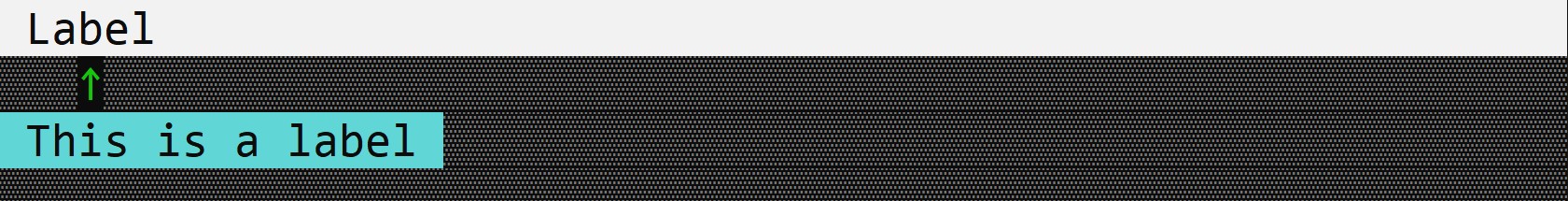
To create a label, use appbar::Label::new(...) method.
let label = appbar::Label::new("Label", 0, appbar::Side::Left);
Events
There are no events associated with a label.
Methods
The following methods are available for a label:
| Method | Purpose |
|---|---|
set_caption(...) | Set the new caption for a label. Currently the caption is limited to 128 characters. |
caption() | Returns the current caption of a label. |
set_tooltip(...) | Set the tooltip for a label. |
tooltip() | Returns the current tooltip of a label. |
Example
The following example creates a label with the caption Label and the tooltip This is a label.
use appcui::prelude::*;
#[Window(events = AppBarEvents)]
pub(crate) struct Win {
h_label: Handle<appbar::Label>,
}
impl Win {
pub(crate) fn new() -> Self {
let mut w = Win {
base: window!("'Label',a:c,w:40,h:8,Flags: Sizeable"),
h_label: Handle::None,
};
let mut label = appbar::Label::new(" Label ", 0, appbar::Side::Left);
label.set_tooltip("This is a label");
w.h_label = w.appbar().add(label);
w
}
}
impl AppBarEvents for Win {
fn on_update(&self, appbar: &mut AppBar) {
appbar.show(self.h_label);
}
}
fn main() -> Result<(), appcui::system::Error> {
let mut app = App::new().app_bar().build()?;
app.add_window(Win::new());
app.run();
Ok(())
}
Button
A button is a clickable item in the application bar.
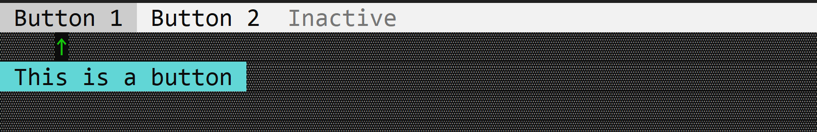
To create a button, use appbar::Button::new(...) method or the appbar::Button::with_tooltip(...) method.
let button = appbar::Button::new("Button", 0, appbar::Side::Left);
or
let button = appbar::Button::with_tooltip("Button", "Tooltip", 0, appbar::Side::Left);
Events
To capture button clicks, implement AppBarEvents on your window or custom control and overwrite the on_button_click method.
impl AppBarEvents for /* Window, Desktop or custom control */ {
fn on_button_click(&mut self, button: Handle<appbar::Button>) {
// Do something when the button is clicked
}
}
Methods
The following methods are available for a button:
| Method | Purpose |
|---|---|
set_caption(...) | Set the new caption for a button. If the string provided contains the special character &, this method also sets the hotkey associated with a control. If the string provided does not contain the & character, this method will clear the current hotkey (if any).Example: button.set_caption("&Start") — this sets the caption of the button to Start and the hotkey to Alt+S. |
caption() | Returns the current caption of a button. |
set_tooltip(...) | Set the tooltip for a button. |
tooltip() | Returns the current tooltip of a button. |
set_enabled(...) | Set the enabled state of a button. |
is_enabled() | Returns the enabled state of a button. |
Example
The following code creates a window with three buttons (Button 1, Button 2 and Inactive). The Button 1 and Button 2 buttons are enabled, while the Inactive button is disabled.
use appcui::prelude::*;
#[Window(events = AppBarEvents)]
pub(crate) struct Win {
h_b1: Handle<appbar::Button>,
h_b2: Handle<appbar::Button>,
h_b3: Handle<appbar::Button>,
}
impl Win {
pub(crate) fn new() -> Self {
let mut w = Win {
base: window!("'Test Button',a:c,w:40,h:8,Flags: Sizeable"),
h_b1: Handle::None,
h_b2: Handle::None,
h_b3: Handle::None,
};
w.h_b1 = w.appbar().add(
appbar::Button::with_tooltip(" Button 1 ",
"This is a button",
0,
appbar::Side::Left));
w.h_b2 = w.appbar().add(
appbar::Button::new(" Button 2 ", 0, appbar::Side::Left));
let mut b3 = appbar::Button::new(" Inactive ", 0, appbar::Side::Left);
b3.set_enabled(false);
w.h_b3 = w.appbar().add(b3);
w
}
}
impl AppBarEvents for Win {
fn on_update(&self, appbar: &mut AppBar) {
appbar.show(self.h_b1);
appbar.show(self.h_b2);
appbar.show(self.h_b3);
}
}
fn main() -> Result<(), appcui::system::Error> {
let mut app = App::new().app_bar().build()?;
app.add_window(Win::new());
app.run();
Ok(())
}
ToggleButton
A toggle button is a button that can be toggled on and off. It is in particular usefull for features that can be enabled or disabled (e.g. dark mode, full screen, Bold/Italic/Underlined text, etc.).
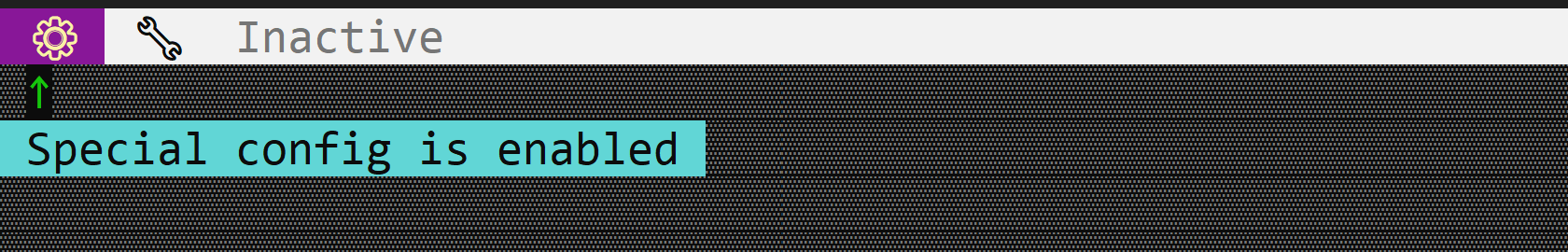
To create a toggle button, use the appbar::ToggleButton::new(...) or appbar::ToggleButton::with_tooltip(...) methods:
let toggle_button = appbar::ToggleButton::new(
"ToggleButton", // Caption
false, // Initial state
0, // Order
appbar::Side::Left); // Position
or
let toggle_button = appbar::ToggleButton::with_tooltip(
"ToggleButton", // Caption
"Tooltip for toggle button", // Tooltip
false, // Initial state
0, // Order
appbar::Side::Left); // Position
Events
To capture toggle button clicks, implement AppBarEvents on your window or custom control and overwrite the on_togglebutton_state_changed method.
impl AppBarEvents for /* Window, Desktop or custom control */ {
fn on_togglebutton_state_changed(&mut self,
togglebutton: Handle<appbar::ToggleButton>,
selected: bool) {
// Do something when the toggle button's state changes
}
}
Methods
The following methods are available for a toggle button:
| Method | Purpose |
|---|---|
set_caption(...) | Set the new caption for a toggle button. If the caption contains the & character, the next character (if it is a letter or number) will be set as a hot-key for the button. For example, "&Save" will set the hot-key to Alt+S. |
caption() | Returns the current caption of a toggle button |
set_selected(...) | Set the state of the toggle button (on or off) |
is_selected() | Returns the current state of the toggle button (selected or not) |
set_tooltip(...) | Set the tooltip of the toggle button |
tooltip() | Returns the current tooltip of a toggle button |
set_enabled(...) | Set the enabled state of the toggle button |
is_enabled() | Returns true if the toggle button is enabled, false otherwise. |
Example
The following code creates a window with three toggle buttons (⚙, 🔧 and Inactive). The ⚙ and 🔧 buttons are enabled, while the Inactive button is disabled.
use appcui::prelude::*;
#[Window(events = AppBarEvents)]
pub(crate) struct Win {
h_tb1: Handle<appbar::ToggleButton>,
h_tb2: Handle<appbar::ToggleButton>,
h_tb3: Handle<appbar::ToggleButton>,
}
impl Win {
pub(crate) fn new() -> Self {
let mut w = Win {
base: window!("'Test Toggle Button',a:c,w:40,h:8,Flags: Sizeable"),
h_tb1: Handle::None,
h_tb2: Handle::None,
h_tb3: Handle::None,
};
w.h_tb1 = w.appbar().add(appbar::ToggleButton::with_tooltip(
" ⚙ ",
"Special config is enabled",
true,
0,
appbar::Side::Left,
));
w.h_tb2 = w.appbar().add(appbar::ToggleButton::new(
" 🔧 ",
false,
0,
appbar::Side::Left,
));
let mut b3 = appbar::ToggleButton::new(
" Inactive ",
false,
0,
appbar::Side::Left,
);
b3.set_enabled(false);
w.h_tb3 = w.appbar().add(b3);
w
}
}
impl AppBarEvents for Win {
fn on_update(&self, appbar: &mut AppBar) {
appbar.show(self.h_tb1);
appbar.show(self.h_tb2);
appbar.show(self.h_tb3);
}
}
fn main() -> Result<(), appcui::system::Error> {
let mut app = App::new().app_bar().build()?;
app.add_window(Win::new());
app.run();
Ok(())
}
SwitchButton
A switch button is a button that has two states (and you can switch between them). Each state has its own caption and optionally a symbol associated with it. Clicking on the switch button will toggle between the two states.
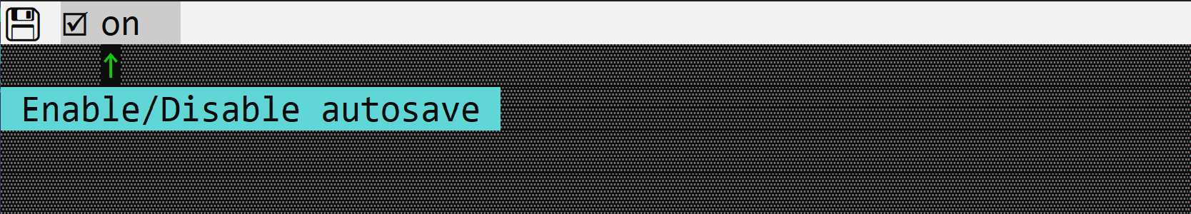
To create a switch button, use the appbar::SwitchButton::new(...) , appbar::SwitchButton::with_symbol(...) or appbar::SwitchButton::with_tooltip(...) methods:
let switch_button = appbar::SwitchButton::new(
"State-1", // Caption of the selected state
"State-2", // Caption of the unselected state
false, // Initial state (false means the unselected state)
0, // Order
appbar::Side::Left // Position
);
or
let switch_button = appbar::SwitchButton::with_symbol(
"State-1", // Caption of the selected state
"State-2", // Caption of the unselected state
appbar::SwitchButtonSymbol::CheckBox, // Symbol
true, // Initial state (true means the selected state)
0, // Order
appbar::Side::Left // Position
);
or
let switch_button = appbar::SwitchButton::with_tooltip(
"State-1", // Caption of the selected state
"State-2", // Caption of the unselected state
appbar::SwitchButtonSymbol::CheckBox, // Symbol
"Tooltip for switch button", // Tooltip
true, // Initial state (true means the selected state)
0, // Order
appbar::Side::Left // Position
);
The following symbols are available:
| Symbol | Selected | Unselected |
|---|---|---|
SwitchButtonSymbol::None | - | - |
SwitchButtonSymbol::CheckMark | ✓ | |
SwitchButtonSymbol::CheckBox | 🗹 | ☐ |
Remark: The SwitchButtonSymbol::None implies that no symbol will be displayed.
Events
To capture switch button clicks, implement AppBarEvents on your window or custom control and overwrite the on_switchbutton_state_changed method.
impl AppBarEvents for /* Window, Desktop or custom control */ {
fn on_switchbutton_state_changed(&mut self,
switchbutton: Handle<appbar::SwitchButton>,
selected: bool) {
// Do something when the switch button's state changes
}
}
Methods
The following methods are available for a switch button:
| Method | Purpose |
|---|---|
is_selected() | Returns true if the switch button is selected, false otherwise. |
set_selected(...) | Set the selected state of the switch button. |
set_enabled(...) | Set the enabled state of the switch button. |
is_enabled() | Returns true if the switch button is enabled, false otherwise. |
set_tooltip(...) | Set the tooltip of the switch button. |
tooltip() | Returns the current tooltip of a switch button. |
Example
The following code creates a window with a switch button (on and off) to enable/disable autosave.
use appcui::prelude::*;
#[Window(events = AppBarEvents)]
pub(crate) struct Win {
h_auto_save: Handle<appbar::SwitchButton>,
h_save: Handle<appbar::Button>,
}
impl Win {
pub(crate) fn new() -> Self {
let mut w = Win {
base: window!("'Test Switch Button',a:c,w:40,h:8,Flags: Sizeable"),
h_auto_save: Handle::None,
h_save: Handle::None,
};
w.h_save = w.appbar().add(appbar::Button::with_tooltip(
"💾 ",
"Save",
4,
appbar::Side::Left,
));
w.h_auto_save = w.appbar().add(appbar::SwitchButton::with_tooltip(
"on ",
"off ",
appbar::SwitchButtonSymbol::CheckBox,
"Enable/Disable autosave",
false,
5,
appbar::Side::Left,
));
w
}
}
impl AppBarEvents for Win {
fn on_update(&self, appbar: &mut AppBar) {
appbar.show(self.h_save);
appbar.show(self.h_auto_save);
}
}
fn main() -> Result<(), appcui::system::Error> {
let mut app = App::new().app_bar().build()?;
app.add_window(Win::new());
app.run();
Ok(())
}
Dialogs
Dialogs are a set of predefined modal windows that are common when using a UI system, such as:
- notification (dialogs that show an error or a message)
- save/open (dialogs that allow you to select the name of one or more files to be saved or opened)
- folder selection (a dialog that allows you to select a folder)
- window management (a dialog that provides window management throughout the entire AppCUI system)
All dialogs are available via the appcui::dialogs module.
Notification Dialogs
Notification dialogs are predefined modal windows that can be used for various purposes, such as:
- showing an error or a warning
- providing a validation (where you need to acknowledge a certain action)
- showing a message
- etc.
Errors
You can show an error using the following method:
fn dialogs::error(title: &str, caption: &str) {...}
This will create a modal window with the message provided to this method and one button (that contains the caption Ok). The following code:
dialogs::error("Error","An error has occurred during the last operation");
will produce the following error modal window:
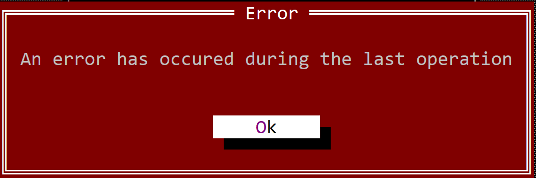
Error dialogs are often used in scenarios where an error has occurred and a specific action needs to be stopped because of it. There are, however, cases where you will also want a retry option (if an error occurs, retry the same operation in the hope of another result). If that is the case, the following method can be used:
fn dialogs::retry(title: &str, caption: &str) -> bool {...}
This method will create an error dialog with two buttons (Retry and Cancel). If you click the Retry button, the method returns true; otherwise it returns false. For example, the following code:
if dialogs::retry("Error","An error occurred while performing a copy operation.\nRetry again?") {
// retry the operation
}
will create a dialog that looks like the following picture:
Alerts
Alerts are dialogs where an error has occurred, but it is not critical for the program execution flow (it is an error from which we can recover). You can show an alert using the following method:
fn dialogs::alert(title: &str, caption: &str) {...}
This will create a modal window with the message (the content of variable caption) provided to this method and one button (that contains the caption Ok). The following code:
dialogs::alert("Error","An error has occurred during the last operation");
will produce the following error modal window:
Just like in the case of errors, if the alert is something we can ignore and continue with the execution, the following method can be used:
fn dialogs::proceed(title: &str, caption: &str) -> bool {...}
This method will create an alert dialog with two buttons (Yes and No). If you click the Yes button, the method returns true; otherwise it returns false. For example, the following code:
if dialogs::proceed("Alert","An error occurred while performing a copy operation.\nContinue anyway?") {
// continue despite the error
}
will create a dialog that looks like the following picture:
Popup messages
Popup messages are notifications of success or generic information. To show a simple message, use the following method:
fn dialogs::message(title: &str, caption: &str) {...}
This will create a modal window with the message (the content of variable caption) provided to this method and one button (that contains the caption Ok). The following code:
dialogs::message("Success","All files have been copied");
will produce the following modal window:
Validation messages
Validation messages are simple questions that determine how execution should continue from that point. To show a validation message, use the following method:
fn dialogs::validate(title: &str, caption: &str) -> bool {...}
This method will create a dialog with two buttons (Yes and No). If you click the Yes button, the method returns true; otherwise it returns false. This is used for simple validation prompts such as Are you sure you want to proceed?.
For example, the following code:
if dialogs::validate("Question","Are you sure you want to proceed?") {
// start the action
}
will create a dialog that looks like the following picture:
Additionally, a validate_or_cancel method is available with the following definition:
fn dialogs::validate_or_cancel(title: &str, caption: &str) -> ValidateOrCancelResult {...}
This method displays three buttons (Yes, No, and Cancel). The result of this dialog is described by the following enum:
#[derive(Copy,Clone,PartialEq,Eq)]
pub enum ValidateOrCancelResult {
Yes,
No,
Cancel
}
This type of dialog should be used for scenarios where you can complete an action in two different ways, or cancel it. For example, when an application exits and you need to save data, you can choose between:
- saving the data (and closing the application)
- not saving the data (and still closing the application)
or
- cancel (meaning that you will not close the application)
The following code describes a similar scenario:
let result = dialogs::validate_or_cancel("Exit","Do you want to save your files?");
match result {
ValidateOrCancelResult::Yes => { /* save files and then exit the application */ },
ValidateOrCancelResult::No => { /* exit the application directly */ },
ValidateOrCancelResult::Cancel => { /* don't exit the application */ }
}
and should create a dialog that looks like the following picture:
Open/Save dialogs
Open/Save dialogs are predefined dialogs that allow you to select a file path that will be used to save or load content. The following methods are available:
dialogs::savedialogs::open
Save dialog
A save dialog is usually used whenever your application needs to save some data into a file and you need to select the location where the file will be saved.
A save dialog can be opened using the following method:
fn dialogs::save(title: &str,
file_name: &str,
location: Location,
extension_mask: Option<&str>,
flags: SaveFileDialogFlags) -> Option<PathBuf>
{
...
}
where:
title- the title of the dialog (usually "Save" or "Save as")file_name- the default file name that will be displayed in the dialoglocation- the location / path where the dialog will be opened (see Location for more details)extension_mask- a mask that will be used to filter the files that can be selected (see Extension mask for more details). IfNone, all files will be shown.flags- additional flags that can be used to customize the dialog
The SaveFileDialogFlags type is defined as follows:
#[EnumBitFlags(bits = 8)]
pub enum SaveFileDialogFlags {
Icons = 1,
ValidateOverwrite = 2,
}
where:
Icons- show icons for files and foldersValidateOverwrite- if the file already exists, a validation message will be shown to confirm the overwrite
Open Dialog
An open dialog is usually used whenever your application needs to load some data from a file and you need to select the location of the file.
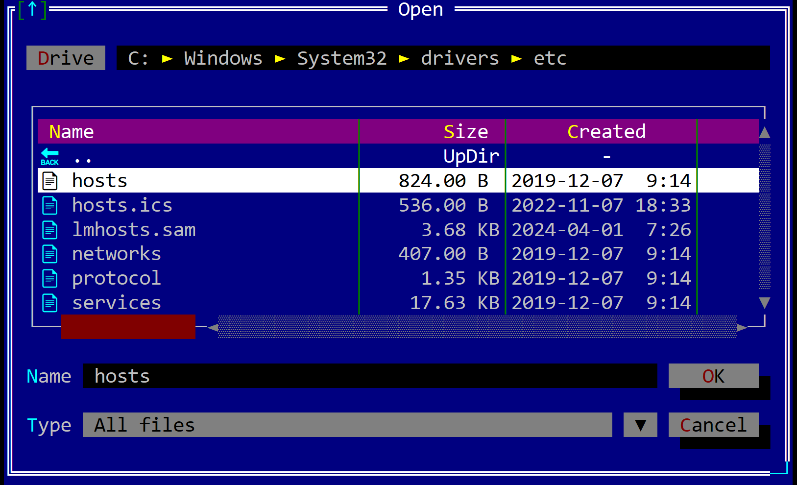
An open dialog can be opened using the following method:
fn dialogs::open(title: &str,
file_name: &str,
location: Location,
extension_mask: Option<&str>,
flags: OpenFileDialogFlags) -> Option<PathBuf>
{
...
}
where:
title- the title of the dialog (usually "Open" or "Load")file_name- the default file name that will be displayed in the dialoglocation- the location / path where the dialog will be opened (see Location for more details)extension_mask- a mask that will be used to filter the files that can be selected (see Extension mask for more details). IfNone, all files will be shown.flags- additional flags that can be used to customize the dialog
The OpenFileDialogFlags type is defined as follows:
#[EnumBitFlags(bits = 8)]
pub enum OpenFileDialogFlags {
Icons = 1,
CheckIfFileExists = 2,
}
where:
Icons- show icons for files and foldersCheckIfFileExists- if the file does not exist, an error message will be shown and the dialog will remain open
Location
Whenever a save or open dialog is opened, you can specify the location where the dialog will be opened. The following locations are available:
Location::Current- the dialog will be opened in the current directoryLocation::Last- the dialog will be opened on the last location where a file was saved or opened. If no file was saved or opened, the dialog will be opened in the current directoryLocation::Path(...)- the dialog will be opened in the specified path
Extension mask
The extension mask is a string that contains multiple items in the format display-name = [extension list], separated by commas, that will serve as a filter for the files that can be selected.
For example, if we want to filter only the images, we will create a string that looks like the following:
"Images = [jpg, jpeg, png, bmp, gif]"
If we want to have multiple options for filtering, we can create multiple strings like the previous one and separate them with commas. For example, if we want three filtering options—images, documents, and executables—we can create a string like the following:
"Images = [jpg, jpeg, png, bmp, gif],
Documents = [doc, pdf, docx, txt],
Executables = [exe, bat, sh]
"
Remarks:
- AppCUI will ALWAYS add an
All Filesoptions at the end of your options list. - The first item from the provided list will be the default mask when opening the dialog.
Example
The following example shows how to use the save dialog:
if let Some(file_path) = dialogs::save(
"Save As",
"abc.exe",
dialogs::Location::Current,
Some("Images = [jpg,png,bmp],
Documents = [txt,docx],
Executable and scripts = [exe,dll,js,py]"),
dialogs::SaveFileDialogFlags::Icons |
dialogs::SaveFileDialogFlags::ValidateOverwrite
)
{
// do something with the file_path
}
Folder Selection Dialog
A folder selection dialog is usually used when your application needs to choose a folder from which data will be loaded or to which data will be saved.
To open a folder selection dialog, use the following method:
fn dialogs::select_folder(title: &str,
location: Location,
flags: SelectFolderDialogFlags) -> Option<PathBuf>
{
...
}
where:
title- the title of the dialog (for example, "Select folder")location- the location / path where the dialog will be opened (see Location for more details)flags- additional flags that can be used to customize the dialog
The SelectFolderDialogFlags type is defined as follows:
#[EnumBitFlags(bits = 8)]
pub enum SelectFolderDialogFlags {
Icons = 1,
}
where:
Icons- show icons for folders and root drives
Location
Whenever a folder selection dialog is opened, you can specify the location where the dialog will be opened. The following locations are available:
Location::Current- the dialog will be opened in the current directoryLocation::Last- the dialog will be opened on the last location where a file was saved or opened. If no file was saved or opened, the dialog will be opened in the current directoryLocation::Path(...)- the dialog will be opened in the specified path
Example
The following example shows how to open a folder selection dialog:
if let Some(folder_path) = dialogs::select_folder(
"Select Folder",
dialogs::Location::Current,
dialogs::SelectFolderDialogFlags::None
)
{
// do something with the folder_path
}Input Dialog
An input dialog is a dialog that allows the user to enter a value of a generic type T and returns it as Option<T>.
To create an input dialog, use the dialogs::input function, defined as follows:
#![allow(unused)] fn main() { pub fn input<T>(title: &str, text: &str, value: Option<T>, validation: Option<InputCallback<T>>) -> Option<T> where T: FromStr + Sized + std::fmt::Display + 'static, { ... } }
where InputCallback<T> is defined as follows:
#![allow(unused)] fn main() { type InputCallback<T> = fn(&T) -> Result<(), String>; }
The function takes the following parameters:
title: The title of the dialog.text: The text to display in the dialog.value: An optional value to pre-fill the input field with.validation: An optional validation function that can be used to validate the input value.
The function returns an optional value of type T.
It is important that the type T implements the following traits:
FromStr- to be able to parse the input value from a string.Sized- to be able to store the value in a variable.std::fmt::Display- to be able to display the value in the dialog.
If the validation function is provided, it will be called with the input value and should return a Result with an error message if the value is invalid.
If the validation function returns an error, the dialog will show the error message and the user will be able to try again.
Examples
Some examples of how to use the input function are shown below:
-
Simple input dialog:
#![allow(unused)] fn main() { if let Some(res) = dialogs::input::<i32>("Title", "Enter a value", None, None) { // res contains the entered value } else { // the user canceled the dialog }; } -
Input dialog with validation (the value must be positive):
#![allow(unused)] fn main() { if let Some(res) = dialogs::input::<i32>("Title", "Enter a positive value", None, Some(|&value| { if value < 0 { Err("Value must be positive".to_string()) } else { Ok(()) } })) { // res contains the entered value } else { // the user canceled the dialog }; } -
Input dialog with a pre-filled value:
#![allow(unused)] fn main() { if let Some(res) = dialogs::input::<i32>("Title", "Enter a value", Some(10), None) { // res contains the entered value } else { // the user canceled the dialog }; }
Themes
Themes are a way to change the look and feel of the application. A theme is a collection of colors, fonts, and other settings that are used to draw the controls. AppCUI comes with a set of predefined themes that can be used out of the box. You can also create your own themes by modifying the predefined ones or by creating a new one from scratch.
To create a new theme, you need to create a new instance of the Theme structure and set the desired colors, fonts, and other settings. You can then apply the theme to the application using the .theme(...) method on the application Builder.
#![allow(unused)] fn main() { let mut my_theme = Theme::new(Themes::Default); // modify my_theme (colors, characters, etc.) let mut app = App::new().theme(my_theme).build().expect("Failed to create an AppCUI application"); // add additional windows app.run(); }
Alternatively, you can call the set_theme method on App later during execution.
#![allow(unused)] fn main() { let mut my_theme = Theme::new(Themes::Default); // modify my_theme (colors, characters, etc.) App::set_theme(my_theme); }
If not specified, the default theme (Themes::Default) will be used.
Predefined Themes
AppCUI comes with a set of predefined themes that can be used out of the box via the Themes enum. The following themes are available:
-
Default - the default theme used by the library.
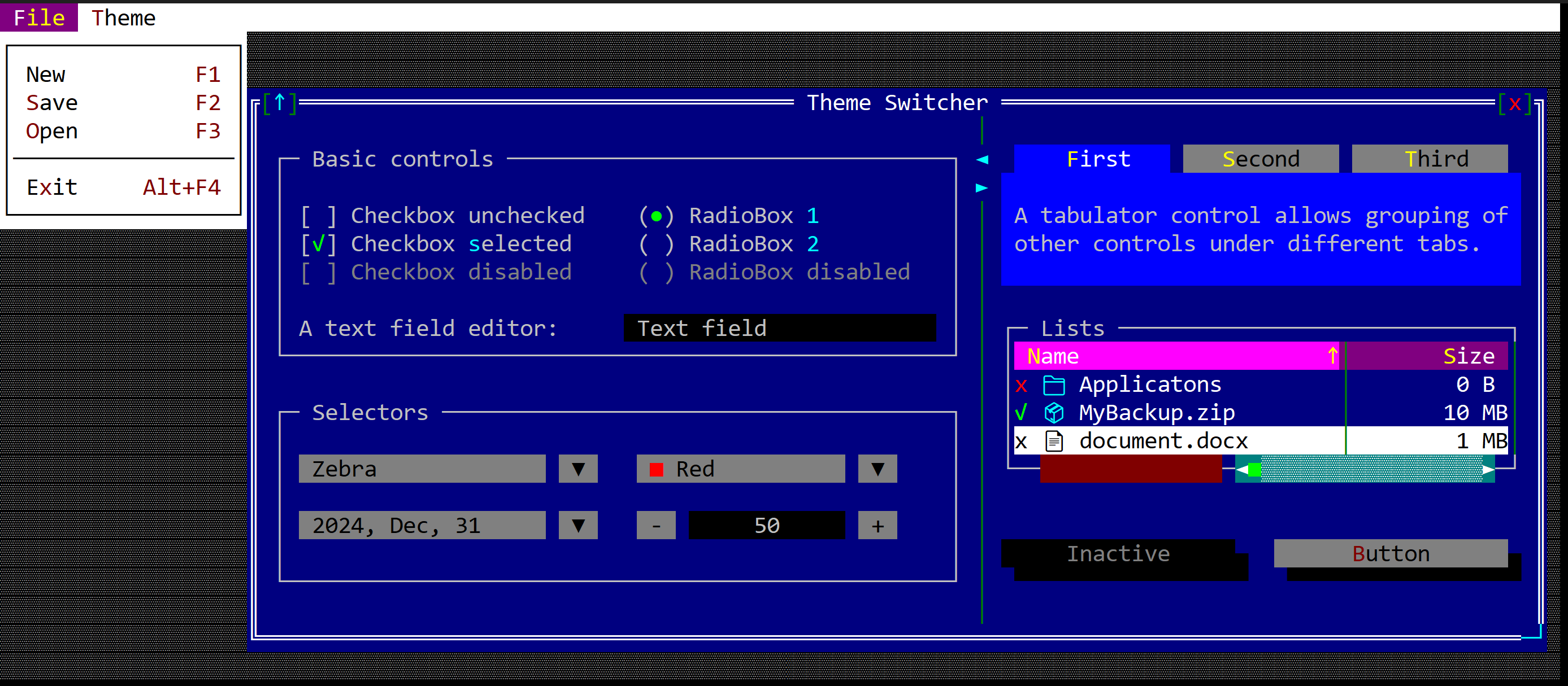
-
DarkGray - a dark gray theme.
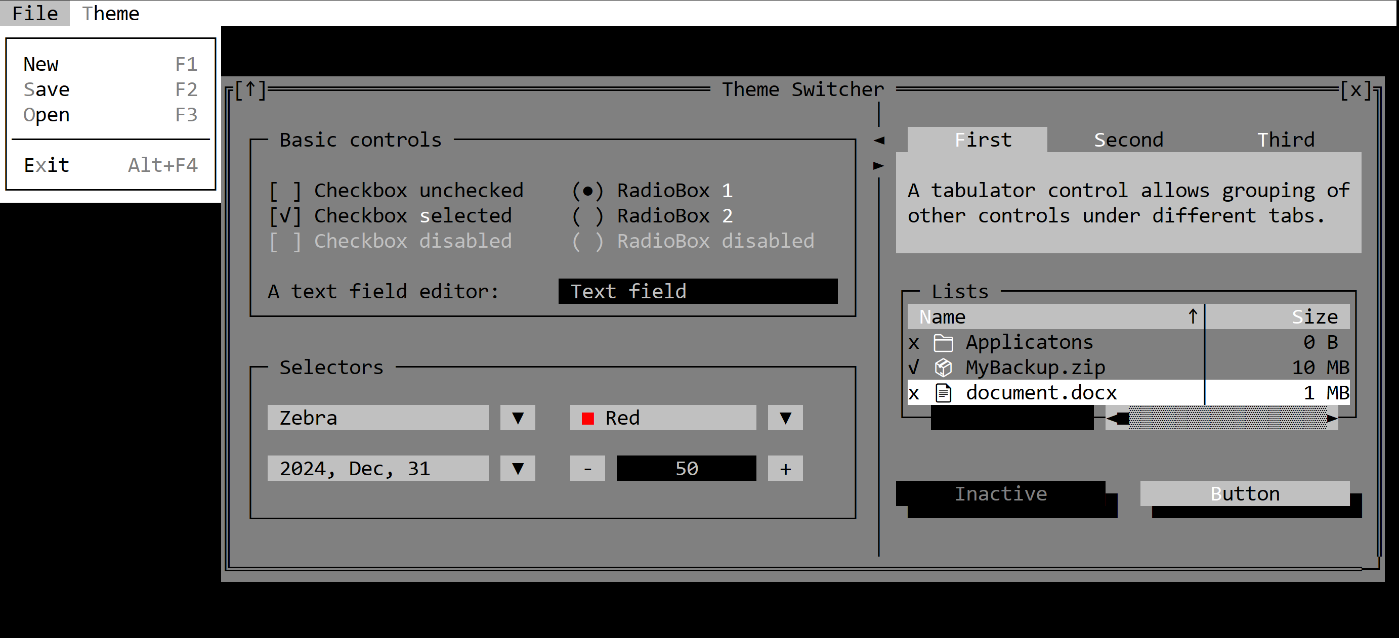
-
Light - a light theme.
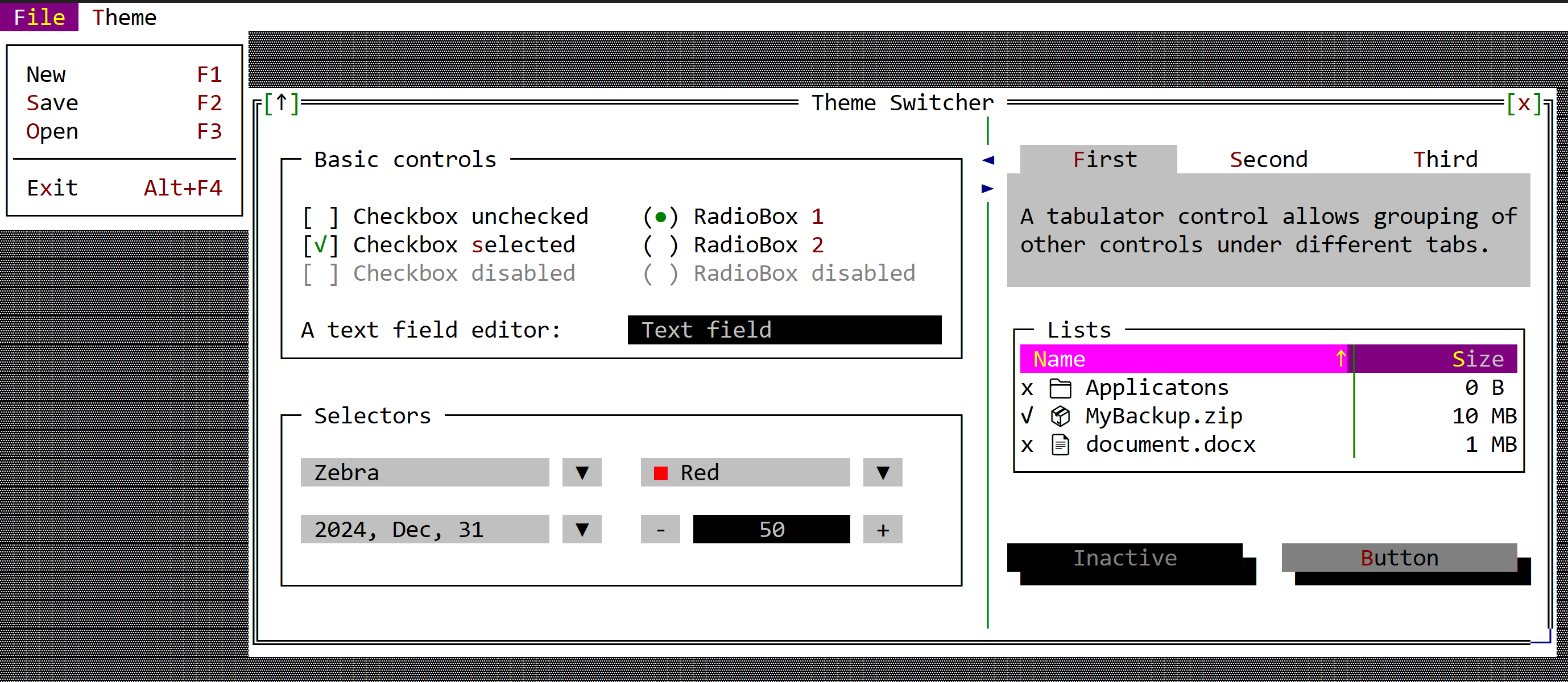
Events
Normally, the theme of the application is set when the application is created. However, you can change the theme at any time while the application is running. While stock controls automatically update their appearance when the theme changes, custom controls may need to be notified about the change. This is particularly the case when a double buffer is used to draw the control (for example, when your control has an inner Surface that is updated by separate logic and is then used in on_paint).
In these scenarios, the control must implement the OnThemeChanged trait in order to receive a notification when the theme is updated.
#![allow(unused)] fn main() { impl OnThemeChanged for MyControl { fn on_theme_changed(&mut self, theme: &Theme) { // update your inner state using the current theme } } }
Remarks: The on_theme_changed method is called only when the theme is changed, and only after the application has been started (i.e., after the run method has been called). This means you will never be notified about the initial theme applied when the application is created.
Example
Let's create a simple custom control that uses an attribute from the theme to draw itself. Such a control must be notified when the theme changes so it can update its fields.
#![allow(unused)] fn main() { #[CustomControl(overwrite : OnThemeChanged+OnPaint)] struct MyControl { attr: CharAttribute, } impl MyControl { fn new() -> Self { let mut obj = Self { base: ControlBase::new(layout!("l:1,r:1,t:1,b:1"), true), attr: CharAttribute::default(), }; // set up the attribute based on the current theme obj.attr = obj.theme().window.normal; obj } } impl OnPaint for MyControl { fn on_paint(&self, surface: &mut crate::prelude::Surface, _theme: &Theme) { // this is where we use the self.attr to draw something surface.clear(Character::with_attributes('X', self.attr)); } } impl OnThemeChanged for MyControl { fn on_theme_changed(&mut self, theme: &Theme) { // this is where we update the attribute to match the new theme self.attr = theme.window.normal; } } }
Multi-threading
While AppCUI runs on a single thread, multi-threading support is available in some scenarios, such as:
- Timers
- Background tasks
Remarks: Multi-threading support relies heavily on channels and on how terminals are implemented on the current operating system. Some features might not work as expected on some terminals, in particular if they are not designed for use with multiple threads.
Timers
Timers are internal AppCUI mechanisms that allow each control to receive a signal at a specified interval. This signal can be used to update the control's content, to animate it, or to perform other actions.
Each timer has its own thread that sends a signal to the control at a specified interval. Because of this, the total number of timers that can be used in an application is limited. By default, an application can use up to 4 timers. This number can be increased by using the .timers_count(count) method from the App builder, but it cannot be more than 255.
When a control is destroyed, if it has a timer associated with it, that timer is also closed and the slot is released.
To use a timer, you need the following:
- Access the control timer via the
.timer()method. - Implement the
TimerEventstrait for the control to receive notifications when the timer fires.
The TimerEvents trait is defined as follows:
#![allow(unused)] fn main() { pub trait TimerEvents { fn on_start(&mut self) -> EventProcessStatus { // called when the timer is started EventProcessStatus::Ignored } fn on_resume(&mut self, ticks: u64) -> EventProcessStatus { // called when the timer is resumed EventProcessStatus::Ignored } fn on_pause(&mut self, ticks: u64) -> EventProcessStatus { EventProcessStatus::Ignored } fn on_update(&mut self, ticks: u64) -> EventProcessStatus { // called when the timer updates itself // (e.g. the interval of the timer has passed) EventProcessStatus::Ignored } } }
The ticks variable represents the number of times the timer has fired. Whenever the timer starts, this value is set to 0, and it is incremented each time the timer fires.
Remarks: Return EventProcessStatus::Processed from these methods when you want AppCUI to redraw (this is usually the case if you update control content in the timer callback).
Timer object
The timer object is created by calling the .timer() method from the control. This method returns an Option<&mut Timer> object that can be used to start, stop, pause, or resume the timer. If a slot (from the list of maximum number of timers) is present, the method will return a Some(&mut Timer) object. If no slot is available, the method will return None. Once a slot is available, the timer will be created (e.g. the slot will be occupied) but no threads will be created until the .start() method is called.
The following methods are available for a timer:
| Method | Description |
|---|---|
start(...) | Starts the timer with the specified interval and resets the internal tick count to 0. If this is the first time the timer is started, a thread is also created; otherwise the existing thread for that timer is reused. |
pause() | Pauses the timer. The timer thread is paused but not terminated. |
resume() | Resumes the timer after it was paused. |
stop() | Stops the timer. The timer thread is terminated and the slot is freed so another control can use it for its own timer. |
set_interval(...) | Sets the interval for the timer. If the timer is already running, the new interval applies immediately; otherwise it takes effect the next time the timer is started or resumed. |
is_paused() | Returns true if the timer is paused, false otherwise |
is_running() | Returns true if the timer is started, false otherwise |
Typically a timer is used like this:
#![allow(unused)] fn main() { // assuming that we run in a control context (e.g. self refers to a control) if let Some(timer) = self.timer() { timer.start(Duration::from_secs(1)); // start the timer with a 1 second interval } }
Example
The following example starts a 1 second timer that updates a label control with the current time:
use std::time::Duration; use appcui::prelude::*; #[Window(events = TimerEvents)] struct MyWin { lb: Handle<Label>, } impl MyWin { fn new() -> Self { let mut w = Self { base: window!("'Timer Example', d:c, w:30, h:5"), lb: Handle::None, }; w.lb = w.add(label!("'',x:1,y:1,w:28")); if let Some(timer) = w.timer() { timer.start(Duration::from_secs(1)); } w } } impl TimerEvents for MyWin { fn on_update(&mut self, ticks: u64) -> EventProcessStatus { let text = format!("Ticks: {}", ticks); let h = self.lb; if let Some(lb) = self.control_mut(h) { lb.set_caption(&text); } // return EventProcessStatus::Processed to repaint controls EventProcessStatus::Processed } } fn main() -> Result<(), appcui::system::Error> { let mut a = App::new().build()?; a.add_window(MyWin::new()); a.run(); Ok(()) }
Background Tasks
A background task is a thread that can communicate with the main AppCUI thread and exchange information with it, as in the following diagram:
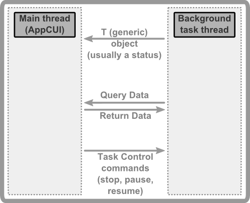
To start a background task, use the following command:
pub struct BackgroundTask<T, R>
where
T: Send + 'static,
R: Send + 'static,
{ ... }
impl<T: Send, R: Send> BackgroundTask<T, R> {
pub fn run(task: fn(conector: &BackgroundTaskConector<T, R>),
receiver: Handle<Window>) -> Handle<BackgroundTask<T, R>>
{...}
}
where:
Tis the type sent from the background thread to the main thread (where AppCUI runs). It is usually an enum that reflects status (for example, a percentage of work done) or a query payload the main thread should interpret.Ris the response type for a query: when the background thread asks the main thread with a value of type T, the main thread answers with a value of type R (seequerybelow).
A BackgroundTask object has the following methods:
| Method | Description |
|---|---|
read(...) | Reads the last object of type T sent by the background thread to the main thread |
send(...) | Sends an object of type R from the main thread to the background thread |
stop() | Requests the background thread to stop |
pause() | Requests the background thread to pause |
resume() | Requests the background thread to resume |
update_control_handle(...) | Updates the handle of the control that will receive events from the background thread. This is usually required if we want to close the window that shows the background thread |
A BackgroundTaskConector<T, R> is an object that can be used to send/receive information between the background thread and the main thread. It has the following methods:
| Method | Description |
|---|---|
notify(...) | Sends an object of type T from the background thread to the main thread |
query(...) | Sends an object of type T from the background thread to the main thread and blocks until the main thread responds with R. The method returns Option<R> (None if the send or receive fails). |
should_stop() | Returns true if the background thread should stop (the main thread requested a stop), or false otherwise. This method also handles Pause and Resume: if the main thread requested a pause, it blocks until the main thread requests resume or stop. |
Events
The BackgroundTaskEvents handler must be implemented on a window to receive events from a background task. It defines the following methods:
trait BackgroundTaskEvents<T: Send+'static, R: Send+'static> {
fn on_start(&mut self, task: &BackgroundTask<T,R>) -> EventProcessStatus {
// Called when the background task is started
EventProcessStatus::Ignored
}
fn on_update(&mut self, value: T, task: &BackgroundTask<T,R>) -> EventProcessStatus {
// Called when the background task sends information to the main thread
// via the BackgroundTaskConector::notify(...) method
// if the return value is EventProcessStatus::Processed, the main thread will
// repaint the window
EventProcessStatus::Ignored
}
fn on_finish(&mut self, task: &BackgroundTask<T,R>) -> EventProcessStatus {
// Called when the background task is finished
EventProcessStatus::Ignored
}
fn on_query(&mut self, value: T, task: &BackgroundTask<T,R>) -> R;
// Called when the background task sends a query to the main thread
// via the BackgroundTaskConector::query(...) method
// The main thread must return a value of type R
}
Flow
A typical flow for a background task is the following:
- The main thread starts a background task using the
BackgroundTask::run(...)method - The window that receives background task events should implement the
BackgroundTaskEvents<T, R>trait - The background thread will start and will send information to the main thread using the
BackgroundTaskConector::notify(...)method - The background thread should check from time to time if the main thread requested a stop or a pause (via the
BackgroundTaskConector::should_stop()method) - The main thread is notified through the
BackgroundTaskEventsimplementation when the background thread sends data
Example
-
Create the corresponding types T and R that will be exchanged between the main thread and the background thread:
enum TaskStatus { StartWithTotalItems(u64), Progress(u64), AskToContinue, } enum Response { Continue, Stop, } -
Create a window that will receive events from a background task:
#[Window(events = BackgroundTaskEvents<TaskStatus,Response>)] struct MyWindow { ... } -
Create a function / lambda that will execute the background task:
fn background_task(conector: &BackgroundTaskConector<TaskStatus,Response>) { // send a start message and notify about the total items // that need to be processed by the background thread let total_items = 100; conector.notify(TaskStatus::StartWithTotalItems(total_items)); // start processing items for crt in 0..total_items { // update the progress status to the main thread conector.notify(TaskStatus::Progress(crt)); // check to see if the main thread has requested a stop if conector.should_stop() { break; } // if needed ask the main thread if it should continue // this part is optional if crt % 10 == 0 { if conector.query(TaskStatus::AskToContinue) == Some(Response::Stop) { break; } } // do the actual work } } -
Start the background task:
let task = BackgroundTask::<TaskStatus,Response>::run(background_task, window.handle()); -
Implement the
BackgroundTaskEventsevent handler for the window:impl BackgroundTaskEvents<TaskStatus, Response> for MyWindow { fn on_start(&mut self, task: &BackgroundTask<TaskStatus, Response>) -> EventProcessStatus { // called when the background task is started EventProcessStatus::Processed } fn on_update(&mut self, value: TaskStatus, task: &BackgroundTask<TaskStatus, Response>) -> EventProcessStatus { match value { // process the task status value } EventProcessStatus::Processed } fn on_finish(&mut self, task: &BackgroundTask<TaskStatus, Response>) -> EventProcessStatus { // called when the background task is finished EventProcessStatus::Processed } fn on_query(&mut self, value: TaskStatus, task: &BackgroundTask<TaskStatus, Response>) -> Response { // return a response to the query Response::Continue } }
Example
The following example shows how to create a window that will receive events from a background task and update a progress bar:
use appcui::prelude::*;
enum Status {
Start(u32),
Progress(u32),
}
#[Window(events = ButtonEvents+BackgroundTaskEvents<Status,bool>)]
struct MyWin {
p: Handle<ProgressBar>,
}
impl MyWin {
fn new() -> Self {
let mut w = Self {
base: window!("'Background Task',a:c,w:50,h:8,flags:sizeable"),
p: Handle::None,
};
w.p = w.add(progressbar!("l:1,t:1,r:1,h:2"));
w.add(button!("&Start,l:1,b:0,w:10"));
w
}
}
impl ButtonEvents for MyWin {
fn on_pressed(&mut self, handle: Handle<Button>) -> EventProcessStatus {
BackgroundTask::<Status, bool>::run(my_task, self.handle());
EventProcessStatus::Processed
}
}
impl BackgroundTaskEvents<Status, bool> for MyWin {
fn on_update(&mut self, value: Status, _: &BackgroundTask<Status, bool>) -> EventProcessStatus {
let h = self.p;
if let Some(p) = self.control_mut(h) {
match value {
Status::Start(value) => p.reset(value as u64),
Status::Progress(value) => p.update_progress(value as u64),
}
EventProcessStatus::Processed
} else {
EventProcessStatus::Ignored
}
}
fn on_query(&mut self, _: Status, _: &BackgroundTask<Status, bool>) -> bool {
true
}
}
fn my_task(conector: &BackgroundTaskConector<Status, bool>) {
conector.notify(Status::Start(100));
for i in 0..100 {
if conector.should_stop() {
return;
}
std::thread::sleep(std::time::Duration::from_millis(100));
conector.notify(Status::Progress(i));
}
conector.notify(Status::Progress(100));
}
fn main() -> Result<(), appcui::system::Error> {
let mut a = App::new().build()?;
a.add_window(MyWin::new());
a.run();
Ok(())
}
AppCUI-rs Gallery
A visual tour of AppCUI-rs. Each category shows one quick preview; expand for more.
Animations

- Code: examples/matrix
- Elements: Custom Desktop, Menus, Timers
More Examples
| Image | Description |
|---|---|
 | Spiral Animation * Code: examples/spiral * Description: The Spiral example defines a struct that incrementally computes spiral coordinates in polar form, applies aspect-ratio correction, and updates them each frame to illustrate animated geometry generation. |
 | Fractal Animation * Code: examples/fractal * Description: The Fractal example constructs a recursive tree-like structure by generating line segments from a start point, computing endpoints using trigonometric functions, and branching at ±45° angles. Each update advances rotation, modulates scale, and regenerates points up to a configurable depth, producing an evolving visualization of recursive geometry. |
 | Globe Animation * Code: examples/globe * Description: The Globe example displays a rotating globe using a series of static images, updated via periodic TimerEvents. It provides a simple desktop with a globe and a timer to control the rotation. |
Basic Controls
- Code: examples/basic_controls
- Elements: Accordion, Button, CheckBox, ComboBox, CharPicker, ColorPicker, DatePicker, DropDownList, HSplitter, Panel, Password, RadioBox, Selector, Tab, TextArea, TextField, TreeStateBox, VSplitter,
More Examples
| Image | Description |
|---|---|
 | Char Picker * Code: examples/charpicker * Description: A CharPicker is a UI control in AppCUI-rs that allows users to select a single character from a wide range of Unicode sets, such as ASCII, box-drawing and line-drawing symbols, arrows, geometric shapes, emoji, and other predefined or custom character groups, presented in an expandable panel for easy browsing and selection. |
Lists, Trees and Graphs
- Code: examples/listview
- Elements: List View, List item, Menus
More Examples
| Image | Description |
|---|---|
 | Graph Viewer * Code: examples/graphs * Description: Various animations with graphs and trees: move nodes, display orthogonal lines, search and filter data, and more. |
 | Tree Viewer * Code: examples/treeview * Description: A simple tree view with three columns where you can navigate, select, sort, filter, and fold or unfold items. |
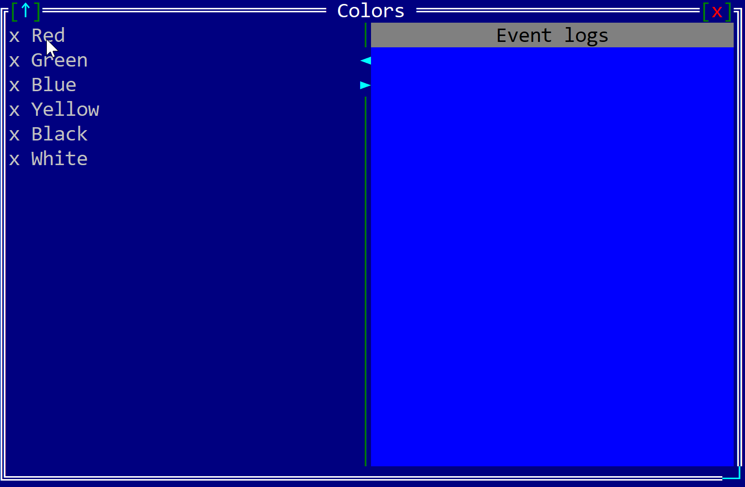 | ListBox * Code: examples/listbox * Description: A list box is a simple list of multiple items (no columns; all strings) that you can select from. |
Games
- Code: examples/games
- Elements: Windows, Desktop, Custom Controls
More Examples
| Image | Description |
|---|---|
 | Minesweeper * Code: examples/minesweeper * Description: A Minesweeper-style game: find hidden mines on a grid using the mine counts shown around each cell. |
 | Ram-It * Code: examples/ramit * Description: A simulation of the Atari Ram-It game where colored bars scroll toward the center of the screen from both sides, and the player controls a ram block that slides up and down in the middle. The goal is to push back and eliminate the advancing bars before they reach the opposite side. The action gets faster and more difficult as the game progresses. |
 | Flappy Bird * Code: examples/flappy * Description: A simple arcade game where you tap to keep a small bird in the air, guiding it through gaps between pipes without crashing; the pace is quick, and the challenge comes from precise timing. |
Application Bar, Command Bar and Menus
- Code: examples/appbar
- Elements: AppBar, Menu Button, Separator, Label, Button, ToggleButton, SwitchButton
More Examples
| Image | Description |
|---|---|
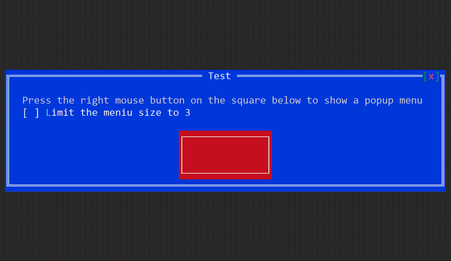 | Popup Menu * Code: examples/popup_menu * Description: A popup menu appears when the user right-clicks a control. You can control the menu size and interact with the items directly. |
Background Tasks and Timers
- Code: examples/background_task
- Elements: Background Tasks, Timers
More Examples
| Image | Description |
|---|---|
 | Timer * Code: examples/timer * Description: The Timer example displays elapsed time using ASCII-art digits on a Canvas, updated via periodic TimerEvents. It provides Start, Pause, and Resume buttons to control execution, dynamically changing digit rendering based on paused state, and demonstrates integrating timers, custom rendering, and event handling within AppCUI. |