CheckBox
Represents a control with two states (checked and unchecked):
To create a checkbox use CheckBox::new method (with 3 parameters: a caption, a layout and checked status (true or false)) or method CheckBox::with_type (with one additional parameter - the type of the checkbox).
let b1 = CheckBox::new("A checkbox",
                       layout!("x:10,y:5,w:15"),
                       true);
let b2 = CheckBox::with_type("Another checkbox",
                             layout!("x:10,y:5,w:15"),
                             false,
                             checkbox::Type::YesNo);
or the macro checkbox!
let c1 = checkbox!("caption='Some option',x:10,y:5,w:15,h:1");
let c2 = checkbox!("'Another &option',x:10,y:5,w:15,h:1,checked:true");
let c3 = checkbox!("'&Multi-line option\nthis a hot-key',x:10,y:5,w:15,h:3,checked:false");
let c4 = checkbox!("'&YesNo checkbox',x:10,y:5,w:15,h:3,checked:false,type: YesNo");
The caption of a checkbox may contain the special character & that indicates that the next character is a hot-key. For example, constructing a checkbox with the following caption &Option number 1 will set up the text of the checkbox to Option number 1 and will set up character O as the hot key for that checkbox (pressing Alt+O will be equivalent to changing the status for that checkbox from checked to unchecked or vice-versa).
A checkbox can contain a multi-line text but you will have to set the height parameter large enough to a larger value (bigger than 1).
A checkbox supports all common parameters (as they are described in Instantiate via Macros section). Besides them, the following named parameters are also accepted:
| Parameter name | Type | Positional parameter | Purpose |
|---|---|---|---|
text or caption | String | Yes (first positional parameter) | The caption (text) written on a checkbox |
checked or check | Bool | No | Checkbox checked status: true for false |
type | String | No | The type of the checkbox (see below) |
Some examples that uses these paramateres:
let disabled_checkbox = checkbox!("caption=&Disabled,x:10,y:5,w:15,enable=false");
let hidden_checkbox = checkbox!("text='&Hidden',x=9,y:1,align:center,w:9,visible=false");
let multi_line_checkbox = checkbox!("'&Multi line\nLine2\nLine3',x:1,y:1,w:10,h:3");
The type of a checkbox is described by the checkbox::Type enum:
#![allow(unused)]
fn main() {
#[derive(Copy,Clone,PartialEq,Eq)]
pub enum Type {
    Standard, // Default value
    Ascii,
    CheckBox,
    CheckMark,
    FilledBox,
    YesNo,
    PlusMinus,
}
}
The type of the checkbox describes how the checkbox state (checked or unchecked) will be represented on the screen.
| Type | Check State | Uncheck State |
|---|---|---|
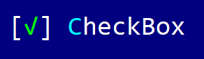
| Standard | [✓] Checked | [ ] Unchecked |
| Ascii | [X] Checked | [ ] Unchecked |
| CheckBox | ☑ Checked | ☐ Unchecked |
| CheckMark | ✔ Checked | ✖ Unchecked |
| FilledBox | ▣ Checked | ▢ Unchecked |
| YesNo | [Y] Checked | [N] Unchecked |
| PlusMinus | ➕ Checked | ➖ Unchecked |
Events
To intercept events from a checkbox, the following trait has to be implemented to the Window that processes the event loop:
pub trait CheckBoxEvents {
    fn on_status_changed(&mut self, handle: Handle<CheckBox>, checked: bool) -> EventProcessStatus {...}
}
Methods
Besides the Common methods for all Controls a checkbox also has the following additional methods:
| Method | Purpose |
|---|---|
set_caption(...) | Set the new caption for a checkbox. If the string provided contains the special character &, this method also sets the hotkey associated with a control. If the string provided does not contain the & character, this method will clear the current hotkey (if any).Example: checkbox.set_caption("&Option") - this will set the caption of the checkbox cu Option and the hotkey to Alt+O |
caption() | Returns the current caption of a checbox |
is_checked() | true if the checkbox is checked, false otherwise |
set_checked(...) | Sets the new checked status for the checkbox |
Key association
The following keys are processed by a Checkbox control if it has focus:
| Key | Purpose |
|---|---|
Space or Enter | Changes the checked state (checked to un-checked and vice-versa). It also emits CheckBoxEvents::on_status_changed(...) event with the checked parameter the current chcked status of the checkbox. It has the same action clicking the checkbox with the mouse. |
Additionally, Alt+letter or number will have the same action (even if the checkbox does not have a focus) if that letter or number was set as a hot-key for a checkbox via its caption.
Example
The following code creates a window with a checkbox and a label. Whenever the checkbox status is being change, the label will print the new status (checked or not-checked).
#[Window(events = CheckBoxEvents)]
struct MyWin {
    c: Handle<CheckBox>,
    l: Handle<Label>,
}

impl MyWin {
    fn new() -> Self {
        let mut win = MyWin {
            base: window!("'My Win',a:c,w:40,h:6"),
            c: Handle::None,
            l: Handle::None,
        };
        win.c = win.add(checkbox!("'My option',l:1,r:1,b:1"));
        win.l = win.add(label!("'<no status>',l:1,r:1,t:1"));
        win
    }
}

impl CheckBoxEvents for MyWin {
    fn on_status_changed(&mut self, _handle: Handle<CheckBox>, checked: bool) -> EventProcessStatus {
        let handle = self.l;
        let l = self.control_mut(handle).unwrap();
        if checked {
            l.set_caption("Status: Checked");
        } else {
            l.set_caption("Status: Not-checked");
        }
        EventProcessStatus::Processed
    }
}

fn main() -> Result<(), appcui::system::Error> {
    let mut app = App::new().build()?;
    app.add_window(MyWin::new());
    app.run();
    Ok(())
}