ListBox
A listbox is a control that displays a list of items.
It can be created using ListBox::new(...) and ListBox::with_capacity(...) methods or with the listbox! macro.
let l1 = ListBox::new(layout!("..."),listbox::Flags::None);
let l2 = ListBox::with_capacity(10,layout!("..."),listbox::Flags::ScrollBars);
let l3 = listbox!("x:1,y:1,w:20,h:10,items=['Red','Greem','Blue']");
let l4 = listbox!("x:1,y:1,w:20,h:10,items=['Red','Greem','Blue'],index:2");
let l5 = listbox!("x:1,y:1,w:20,h:10,items=['Red','Greem','Blue'],index:2, flags: ScrollBars+SearchBar");
A listbox supports all common parameters (as they are described in Instantiate via Macros section). Besides them, the following named parameters are also accepted:
| Parameter name | Type | Positional parameter | Purpose |
|---|---|---|---|
flags | String | No | Listbox initialization flags |
items | List | No | A list of string items to populate the listbox with. |
index or selected_index | Numeric | No | The index of the selected item (it should be a value between 0 and number if items - 1) |
lsm or left-scroll-margin | Numeric | No | The left margin of the bottom scroll bar in characters. If not provided the default value is 0. This should be a positive number and it only has an effect if the flag ScrollBars or SearchBar flags were specified. |
tsm or top-scroll-margin | Numeric | No | The top margin of the right scroll bar in characters. If not provided the default value is 0. This should be a positive number and it only has an effect if the flag ScrollBars flags was used to create the control. |
em or empty-message | String | No | A message that will be displayed when the listbox is empty. This message will be centered in the listbox. |
A listbox supports the following initialization flags:
listbox::Flags::ScrollBarsorScrollBars(for macro initialization) - this enables a set of scrollbars that can be used to navigate through the list of items. The scrollbars are visible only when the control has focuslistbox::Flags::SearchBarorSearchBar(for macro initialization) - this enables a search bar that can be used to filter the list of items. The search bar is visible only when the control has focuslistbox::Flags::CheckBoxesorCheckBoxes(for macro initialization) - this enable a set of checkboxes that can be used to select multiple items from the list.listbox::Flags::AutoScrollorAutoScroll(for macro initialization) - this will automatically scroll the listbox to the last item whenever a new item is being added. This flag is usefull for scenarios where the listbox is used as a log/event viewer.listbox::Flags::HighlightSelectedItemWhenInactiveorHighlightSelectedItemWhenInactive(for macro initialization) - this will highlight the selected item even when the listbox does not have focus. This flag is usefull when the listbox is used as a navigation menu.
Events
To intercept events from a listbox, the following trait has to be implemented to the Window that processes the event loop:
pub trait ListBoxEvents {
    fn on_current_item_changed(&mut self, handle: Handle<ListBox>, index: usize) -> EventProcessStatus {
        EventProcessStatus::Ignored
    }
    fn on_item_checked(&mut self, handle: Handle<ListBox>, index: usize, checked: bool) -> EventProcessStatus {
        EventProcessStatus::Ignored
    }
}
Methods
Besides the Common methods for all Controls a listbox also has the following additional methods:
| Method | Purpose |
|---|---|
add(...) | Adds a new string to the list of items in the ListBox |
add_item(...) | Adds a new item (text and check status) to the list of items in the ListBox |
clear() | Clears the list of items available in the ListBox |
index() | Returns the selected index from the ListBox list |
item(...) | Returns the item from a specified index from the ListBox. If the index is invalid, None will be returned |
set_index(...) | Selects a new element from the ListBox based on its index |
count() | Returns the number of items from the ListBox |
count_checked() | Returns the number of checked items from the ListBox. This method will always return 0 if the flags CheckBoxes was NOT set when creating a ListBox |
set_empty_message(...) | Sets the message that will be displayed when the ListBox is empty |
sort() | Sorts the items from the ListBox alphabetically. The sorting is done based on the text of the items. |
sort_by(...) | Sorts the items from the ListBox based on a custom comparison function. The function should have the following signature: fn(&Item, &Item) -> Ordering |
An item from the ListBox is represented by the following structure:
pub struct Item { ...}

impl Item {
    pub fn new(text: &str, checked: bool) -> Self {...}
    pub fn text(&self) -> &str {...}
    pub fn is_checked(&self) -> bool {...}
}
Key association
The following keys are processed by a ListBox control if it has focus:
| Key | Purpose |
|---|---|
Up, Down | Changes the current selected item from the ListBox. |
Left, Right | Scrolls the view to the left or to the right. |
Space or Enter | Checks or unchecks the current selected item from the ListBox. If the CheckBoxes flag was not set, this key will have no effect. |
Home | Move the selection to the first item |
End | Move the selection to the last item |
PageUp, PageDown | Navigates through the list of items page by page. |
Ctrl+Alt+Left | Scrolls the view to the left-most position |
Ctrl+Alt+Right | Scrolls the view to the right-most position |
Ctrl+Alt+Up | Scrolls the view to the top with one position |
Ctrl+Alt+Down | Scrolls the view to the bottom with one position |
When pressing an ascii key, the ListBox will start a search in the list of items. All items that are matched (ignoring case) will be highlighted while the rest of them will be dimmed. While in search mode, the following keys can be used to navigate through the list of items:
| Key | Purpose |
|---|---|
Enter | Go to the next item that matches the search criteria. If the search criteria is not met, the search will start from the beginning. |
Escape | Exit the search mode. |
Backspace | Remove the last character from the search criteria |
Any other key used while in search mode (such as arrow keys, page up, page down, etc) will exit the search mode and will be processed as a normal key press.
Example
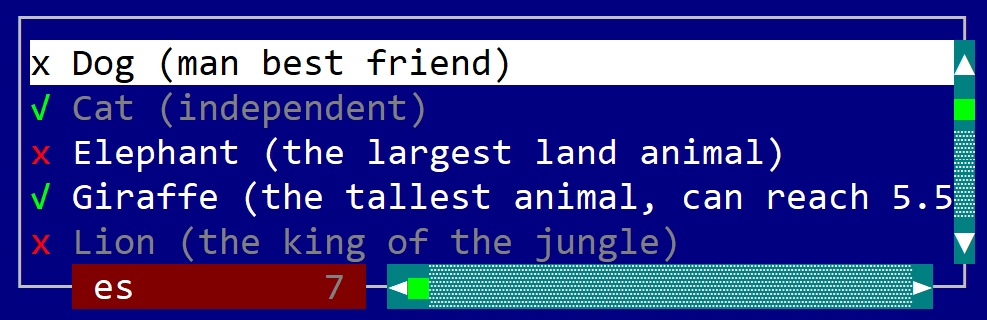
The following example creates a Window with a ListBox that was populated with various animals.
use appcui::prelude::*;


fn main() -> Result<(), appcui::system::Error> {
    let mut a = App::new().build()?;
    let mut w = window!("Animals,a:c,w:50,h:11,flags: Sizeable");
    let mut p = panel!("l:1,t:1,b:1,r:1");
    let mut l = listbox!("d:f,flags: ScrollBars+CheckBoxes+SearchBar, lsm:2");
    l.add_item(listbox::Item::new("Dog (man best friend)", false));
    l.add_item(listbox::Item::new("Cat (independent)", true));
    l.add_item(listbox::Item::new("Elephant (the largest land animal)", false));
    l.add_item(listbox::Item::new("Giraffe (the tallest animal, can reach 5.5m)", true));
    l.add_item(listbox::Item::new("Lion (the king of the jungle)", false));
    l.add_item(listbox::Item::new("Tiger (the largest cat species)", false));
    l.add_item(listbox::Item::new("Zebra (black and white stripes)", false));
    l.add_item(listbox::Item::new("Donkey (related to horses)", false));
    l.add_item(listbox::Item::new("Cow (provides milk)", false));
    p.add(l);
    w.add(p);
    a.add_window(w);
    a.run();
    Ok(())
}