SwitchButton
A switch button is a button that has two states (and you can switch between them). Each state has its own caption and optionally a symbol associated with it. Clicking on the switch button will toggle between the two states.
To create a switch button, use the appbar::SwitchButton::new(...) , appbar::SwitchButton::with_symbol(...) or appbar::SwitchButton::with_tooltip(...) methods:
let switch_button = appbar::SwitchButton::new(
    "State-1",         // Caption of the selected state
    "State-2",         // Caption of the unselected state
    false,             // Initial state (false means the unselected state)
    0,                 // Order
    appbar::Side::Left // Position
);
or
let switch_button = appbar::SwitchButton::with_symbol(
    "State-1",         // Caption of the selected state
    "State-2",         // Caption of the unselected state
    appbar::SwitchButtonSymbol::CheckBox, // Symbol
    true,              // Initial state (true means the selected state)
    0,                 // Order
    appbar::Side::Left // Position
);
or
let switch_button = appbar::SwitchButton::with_tooltip(
    "State-1",         // Caption of the selected state
    "State-2",         // Caption of the unselected state
    appbar::SwitchButtonSymbol::CheckBox, // Symbol
    "Tooltip for switch button", // Tooltip
    true,              // Initial state (true means the selected state)
    0,                 // Order
    appbar::Side::Left // Position
);
The following symbols are available:
| Symbol | Selected | Unselected |
|---|---|---|
SwitchButtonSymbol::None | - | - |
SwitchButtonSymbol::CheckMark | ✓ | |
SwitchButtonSymbol::CheckBox | 🗹 | ☐ |
Remark: The SwitchButtonSymbol::None implies that no symbol will be displayed.
Events
To capture switch button clicks, implement AppBarEvents on your window or custom control and overwrite the on_switchbutton_state_changed method.
impl AppBarEvents for /* Window, Desktop or custom control */ {
    fn on_switchbutton_state_changed(&mut self,
                                     switchbutton: Handle<appbar::SwitchButton>,
                                     selected: bool) {
        // Do something when the switch button's state changes
    }
}
Methods
The following methods are available for a switch button:
| Method | Purpose |
|---|---|
is_selected() | Returns true if the switch button is selected, false otherwise. |
set_selected(...) | Set the selected state of the switch button. |
set_enabled(...) | Set the enabled state of the switch button. |
is_enabled() | Returns true if the switch button is enabled, false otherwise. |
set_tooltip(...) | Set the tooltip of the switch button. |
tooltip() | Returns the current tooltip of a switch button. |
Example
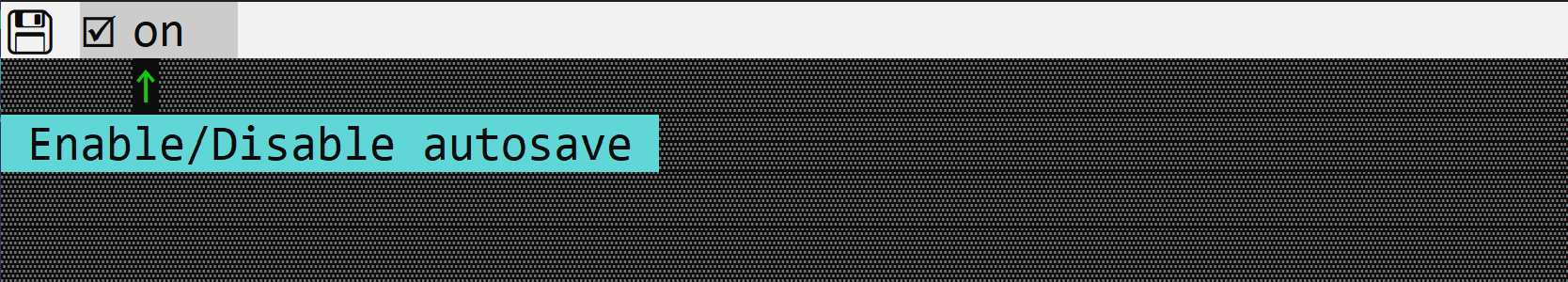
The following code creates a window with a switch button (on and off) to enable/disable autosave.
use appcui::prelude::*;

#[Window(events = AppBarEvents)]
pub(crate) struct Win {
    h_auto_save: Handle<appbar::SwitchButton>,
    h_save: Handle<appbar::Button>,
}
impl Win {
    pub(crate) fn new() -> Self {
        let mut w = Win {
            base: window!("'Test Switch Button',a:c,w:40,h:8,Flags: Sizeable"),
            h_auto_save: Handle::None,
            h_save: Handle::None,
        };
        w.h_save = w.appbar().add(appbar::Button::with_tooltip(
            "💾  ",
            "Save",
            4,
            appbar::Side::Left,
        ));
        w.h_auto_save = w.appbar().add(appbar::SwitchButton::with_tooltip(
            "on  ",
            "off ",
            appbar::SwitchButtonSymbol::CheckBox,
            "Enable/Disable autosave",
            false,
            5,
            appbar::Side::Left,
        ));

        w
    }
}
impl AppBarEvents for Win {
    fn on_update(&self, appbar: &mut AppBar) {
        appbar.show(self.h_save);
        appbar.show(self.h_auto_save);
    }
}

fn main() -> Result<(), appcui::system::Error> {
    let mut app = App::new().app_bar().build()?;
    app.add_window(Win::new());
    app.run();
    Ok(())
}